+- Crimson Daggers — Art forum (//crimsondaggers.com/forum)
+-- Forum: TOURNAMENTS (//crimsondaggers.com/forum/forum-71.html)
+--- Forum: THE CRIMSON CRUCIBLE (//crimsondaggers.com/forum/forum-72.html)
+---- Forum: CRIMSON CRUCIBLE WIPS (//crimsondaggers.com/forum/forum-73.html)
+---- Thread: Skull and spider (/thread-7986.html)
Skull and spider - crackedskull - 10-23-2016

RE: Skull and spider - crackedskull - 10-24-2016
ok done :D

RE: Skull and spider - Matthew Huntley - 10-25-2016
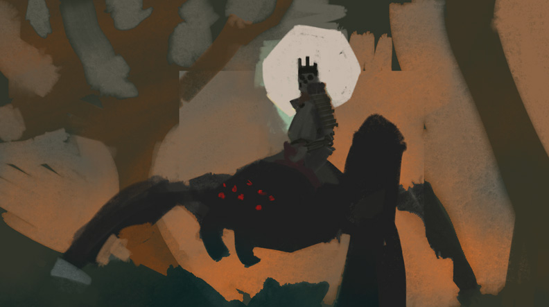
Looking good! I see just a few issues. I think the spider lacking eight legs is a design oversight, and I miss the red eyes from the original sketch. They'd really pop, especially with the spider and rider being back-lit. Finally, I feel like the background and foreground/figures all have the same level of rendering. The trees and moon in the background are at the perfect level of detail, but the rocks, grass, and spider need an extra level of polish as the piece stands now. Definitely passes the squint test though!
RE: Skull and spider - crackedskull - 10-25-2016
Thank you Matt :D
I didn't do design much, just started putting in shapes and working on getting good comp, since I challenged myself to do it in a day. I wanted to focus attention on the skelly more and the spider looks cooler without eyes. Totally agreed on rendering(and gotta refine some edges too). Once I'll make the fixes I will post the new ver in my sketchbook(and portfolio too most likely). But the image in finals thread is...final ;D