+- Crimson Daggers — Art forum (//crimsondaggers.com/forum)
+-- Forum: PERSONAL ARTWORK (//crimsondaggers.com/forum/forum-9.html)
+--- Forum: SKETCHBOOKS (//crimsondaggers.com/forum/forum-10.html)
+--- Thread: Ice's Journey (/thread-8047.html)
Ice's Journey - Ice Rider - 11-25-2016
Hello everyone, my name is Jacek, currently 20 years old. This thread is gonna be my sketchbook and journal on road to mastership ;)
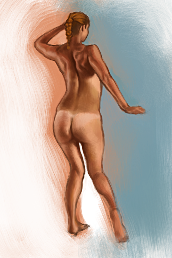
Recently I was developing my skills in drawing human, anatomy, gesture etc. So there are only works on that topic.
I don't want to put older pieces, so that you can see my current abilities.
Once in a while I will be adding a new stuff.
All comments and critics are welcomed!
RE: Ice's Journey - John - 11-27-2016
Not much to say but keep moving and keep drawing!
And you might want to scale down your file sizes a bit. Saves space and the browser loads faster! Other than that, good luck! Draw more!
RE: Ice's Journey - Artloader - 11-27-2016
Great studies Ice Rider :). I particularly like the study of the guy's back, nice indications of his trapezoids, teres major and infraspinatus.
Keep it going mate!
RE: Ice's Journey - Anton_Fort - 11-27-2016
Nothing much to say yet except that I recommend to clean up your drawings and get rid of that contour. It brokes up your figure. Keep up!
RE: Ice's Journey - mnogueira - 11-27-2016
This is a nice start!
There is not much to critique now without seeing more of your work, you may want to check your proportions by flipping the canvas, I notice some of the porportions/perspective are skewed, which may result from a tired eye and can easily be adjusted after some rest or a fresh view after a break by doing other activities.
Here is what I meant:
![[Image: CC.jpg?raw=1]](https://www.dropbox.com/s/0d9nqdqmywyagp1/CC.jpg?raw=1)
One thing you are doing right that I do not often see others doing is the use of textured background/unimportant stuff vs a soft texture on your subject to frame your piece! Great design right there!
I hope it helps. Keep grinding!
RE: Ice's Journey - Ice Rider - 11-28-2016
Thank you guys for your comments ;) I've tried to implement tips that you gave me to my new artwork, which I've just finished. It is quite simple barbarian concept, my main goal was to lead something from a scratch to the end, because in last few months I did a lot of studies and sketches, but any 'finished' pieces.
I hope this is at least something that you can base on your critics, so feel free to give me any thoughts you have :)
RE: Ice's Journey - Bledley - 12-01-2016
Looking good ice! keep em coming! just dropping a comment to stay in the loop ;)
RE: Ice's Journey - Ice Rider - 12-05-2016
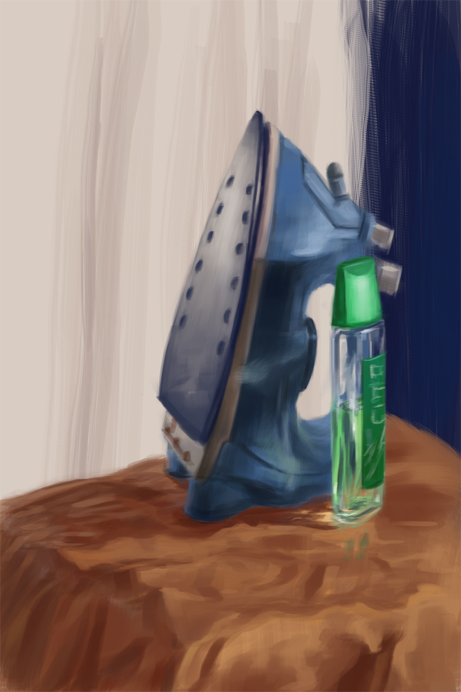
Three still life studies, in order to understand relation between light and color
RE: Ice's Journey - Ice Rider - 12-10-2016
Another still life studies
RE: Ice's Journey - Ice Rider - 12-26-2016
I'm back with my new artwork, which I was doing for a week or so.
I'd be happy to hear some constructive critics on this one.
Merry X-mass to you guys :)
RE: Ice's Journey - JavierP - 12-26-2016
Hi Ice Rider,
I like the idea behind this image a lot. There is a clear story, interesting characters and a different setting to most images like this one. That being said there are some issues with the image that are not allowing it to be as effective as it can be.
First, the drama of this confrontation is affected by the placement of the viewer and subsequently the composition. I think that simply adjusting the cropping of the image will help to increase the drama with very little effort. Moving the viewer closer to the action will increase the feeling of being involved in the story. The visual tension created by moving the characters closer to the image boundaries will also make the confrontation itself seem more tense as well.
Secondly, the value distribution of the image tends toward middle and dark values with a very small portion of lighter value. This flattens the space and also works to make the image less dramatic. Lightening the background and darkening the foreground to more evenly distribute the values will go a long way toward increasing the realism and the drama by accentuating the silhouettes of the characters. Increasing the value range will also allow you to add details without compromising the overall effect of the composition.
Third, (and this is related to the value distribution) the direction of the light and indication of form is not well defined. These two things are drawing problems. Proportion and anatomy also fall within the realm of drawing issues, but I hesitate to comment on those issues because often they are stylistic choices. I assume that the characters were lit from a diffused source from above, but it is difficult to tell based on the image. If they were lit from above, then the upward-facing planes of the form would be much lighter and the downward facing planes would be darker and shadows would be more diffused.
I made a small graphic to show you some of the things I mentioned. It is important to note that I didn't re-draw anything in your image. I merely re-cropped the image, adjusted the values (with curves), used color balance to unify the colors, and used the dodge/burn tools to accentuate the lighting from above. I used a median filter on the image to help show that the power of the image is not in its details, but in the overall effect of the shapes (ie. the composition). I hope this helps in some way. Keep up the good work.

RE: Ice's Journey - Ice Rider - 12-26-2016
Thank you JavierP for such a extansive and helpful comment! I will try to apply your tips on my artwork this week, so I could post new version before the end of the year and close the case of this one ;)
RE: Ice's Journey - Ice Rider - 12-27-2016
Okay, here's updated version after tips from JavierP.
RE: Ice's Journey - Ice Rider - 01-04-2017
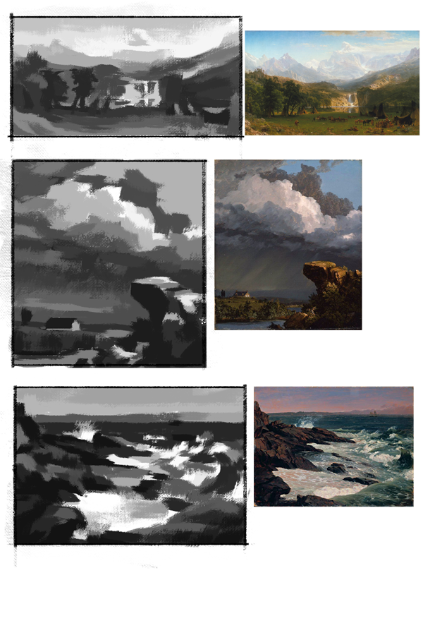
Master studies I did after watching Noah's Bradley video from Art Camp week 1 (available on yt).
RE: Ice's Journey - ZombieChinchilla - 01-04-2017
Nice stuff so far! If you're interested in environments, I'd recommend checking out the Environment Design Rocks class Amit held a while ago in the Classes section, if you haven't already. Your first couple thumbnails look great, but the last few seem a little too busy. I'd say trying the same studies but narrow it down to only black and white, and try to straighten and clean up your edges. Otherwise, your stuff look great! Keep on truckin.
RE: Ice's Journey - Ice Rider - 01-08-2017
Thanks for the comment ZombieChinchilla, after reading that I realised I probably rushed too much and made my thumbnails messy and unclear. I did those once again in only black and white as you said, and also some more similiar stuff. Moreover I recently painted illustration for a book cover contest.
RE: Ice's Journey - Ice Rider - 01-12-2017
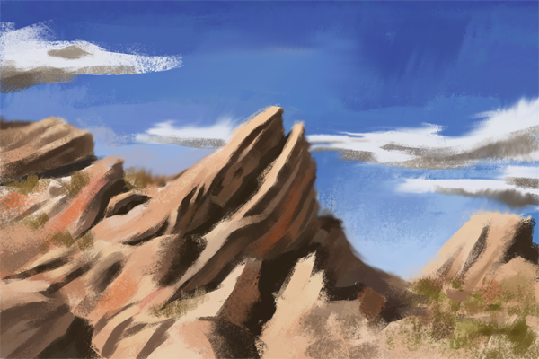
Next value studies, and also something different this time
RE: Ice's Journey - AngeliquevdMee - 01-12-2017
Hi there! I think you are well on your way but i think there is 1 thing no one pointed out and i want to say it now BEFORE IT IS TOO LATE- dun dun duuun :P I think you can use more variety in color especially your figures since you color a lot of your backgrounds red, and the figure is also reddish. But in reality the skin consists of more colors - purple, green, blue etc. So what I suggest is that you look up good quality photo's and try to zoom in best as possible while trying to pin-point the colors. I think we all had this problem but once you solve it everything will look so much better :) . PS : This doesnt only go for humans, it's also in nature. It just depends on which color the light and environment is.
RE: Ice's Journey - Ice Rider - 01-12-2017
Color definietly is one of the issues I need to focus on, thanks for pointing it out! I'm planning on doing some exercises in the near future to improve in that matter, so I'll also try to do exactly what you said about pin-pointing the colors. I hope it will help me to make better art ;)
RE: Ice's Journey - gregorkari - 01-12-2017
Yes, the latest thumbnails look great!
![[+] [+]](images/collapse_collapsed.png) Spoiler
Spoiler


