+- Crimson Daggers — Art forum (//crimsondaggers.com/forum)
+-- Forum: PERSONAL ARTWORK (//crimsondaggers.com/forum/forum-9.html)
+--- Forum: SEEKING CRITIQUE/PAINTOVERS (//crimsondaggers.com/forum/forum-36.html)
+--- Thread: Commission help. WoW-wedding (/thread-8153.html)
Commission help. WoW-wedding - DunkSlammins - 01-21-2017
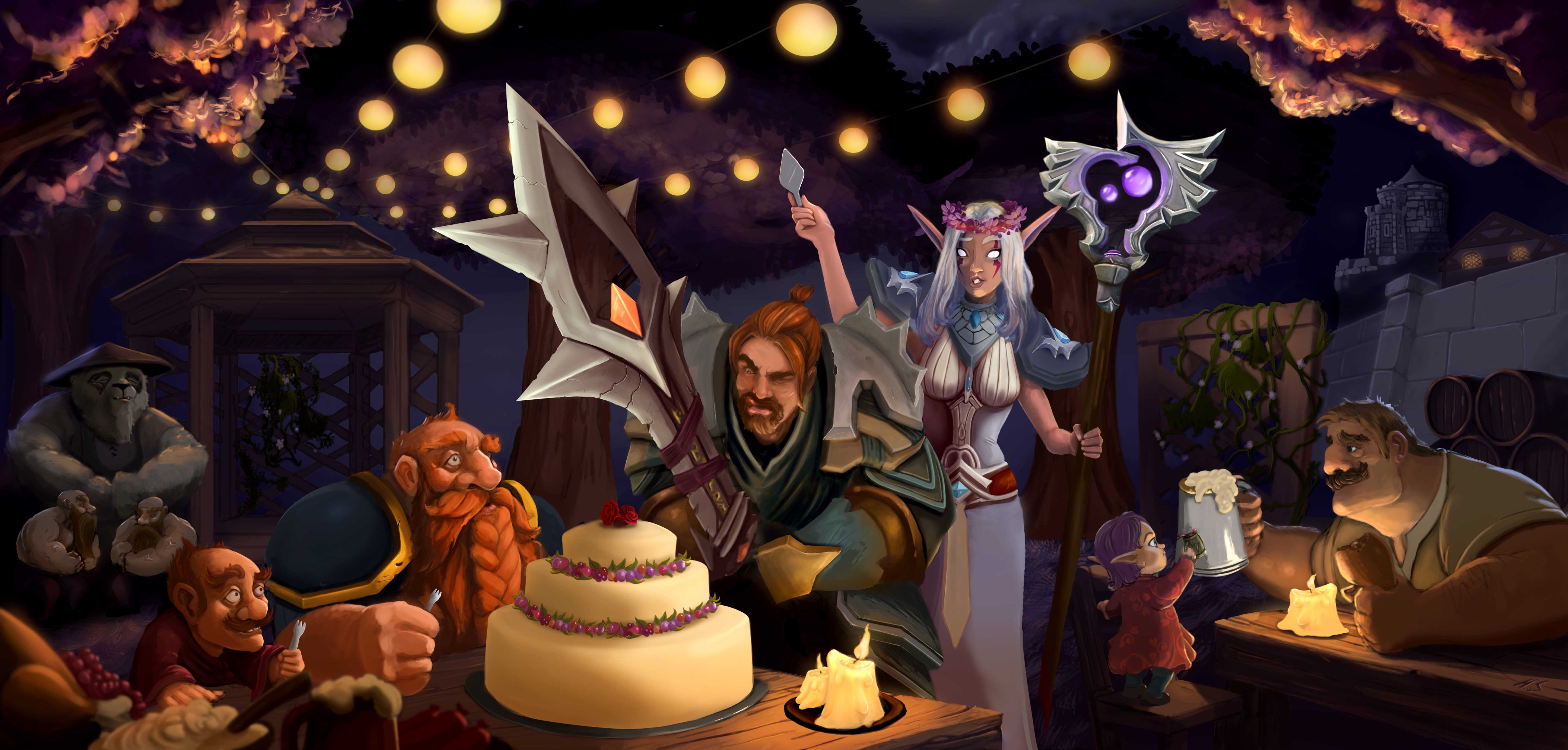
I made this for a couple that met in wow, and got married some time ago. This was a comission from a friend of the couple that wanted a painting with their wow characters in a wedding-party. I also included their child (little elf-girl in right corner) I tried to paint it as close as I could to the hearthstone/wow style, and dot in as much i could from other friends characters (two bare-chested dwarves flexing in the back and such) The client was happy with the result. But i would like to go over it again and make it better, but I have worked on it for so long that I cant see anymore :P Any critique would be super helpful. Thanks :)

RE: Commission help. WoW-wedding - Adam Lina - 01-21-2017
Your cake is out of perspective. I fixed it as close as i could estimate.
RE: Commission help. WoW-wedding - DunkSlammins - 01-21-2017
oh dang! Thank you very much, Adam! :D I'll fix it.
RE: Commission help. WoW-wedding - devinn - 01-21-2017
If you study or just observe some textures, you can push this piece a bit further. Try pushing some dark values too, maybe?
But I really like the style and the drawing seems to be fairly solid beneath the painting.
I'd recommend that you observe some materials and practice describing the form of an object a bit better if you want to bring this to a higher level of completion.
If you study deliberately and consistently, you're bound to improve beyond this in a fairly short amount of time.
RE: Commission help. WoW-wedding - DunkSlammins - 01-21-2017
(01-21-2017, 08:29 AM)Jaktrayter Wrote: If you study or just observe some textures, you can push this piece a bit further. Try pushing some dark values too, maybe?
But I really like the style and the drawing seems to be fairly solid beneath the painting.
I'd recommend that you observe some materials and practice describing the form of an object a bit better if you want to bring this to a higher level of completion.
If you study deliberately and consistently, you're bound to improve beyond this in a fairly short amount of time.
Thank you so much, Jaktrayter! Ok so darken it a bit? I do struggle with describing form, it is known. Gonna sit myself back down with the scott robertson book. And study textures! But really, thanks a lot. :)
RE: Commission help. WoW-wedding - meat - 01-22-2017
Your image needs a focus area that is the brightest and that’s where the cake is. Right now it feels there’s light in every grid of this image and my eyes are darting all over the place. Here are my suggestions which you can try out to see how well they work for you:
Dim the tree/flower, as well as the ball lanterns except the first 2 rows. Darken the purple grey wall/sky/background to nearly black, leaving only the wall behind the wooden barrels to come out of the darkness of night. Dim the spire above the wall with wood barrels just a bit to separate it from the wall and push it back, thus creating stronger sense of retreating space. Enlarge the bottom left corner items to really separate foreground from the middle ground (where the action is). Add more details to the cake to really make it lavish, befitting a fantasy world.
RE: Commission help. WoW-wedding - DunkSlammins - 01-23-2017
(01-22-2017, 05:50 AM)meat Wrote: Your image needs a focus area that is the brightest and that’s where the cake is. Right now it feels there’s light in every grid of this image and my eyes are darting all over the place. Here are my suggestions which you can try out to see how well they work for you:
Dim the tree/flower, as well as the ball lanterns except the first 2 rows. Darken the purple grey wall/sky/background to nearly black, leaving only the wall behind the wooden barrels to come out of the darkness of night. Dim the spire above the wall with wood barrels just a bit to separate it from the wall and push it back, thus creating stronger sense of retreating space. Enlarge the bottom left corner items to really separate foreground from the middle ground (where the action is). Add more details to the cake to really make it lavish, befitting a fantasy world.
Hot damn! Thank you for all the awesome feedback! I agree. Gonna do some more specific material-study and revise this piece middle of next week. I was trying to make it all light in a night-time setting, and I see now that you mentioned it that there is light everywhere and not really any focus area. Thank you! I really appreciate it
RE: Commission help. WoW-wedding - aks9 - 02-20-2017
Real great painting! And awesome idea for a gift :)
I haven't gone through the prev crits specifically, so forgive me if there's any overlap (Which might be a good sign if there is)
I think the lighting from the bulbs needs to show stronger on the characters, for example the main figure's shoulder armour plates. The individual lighting that you have going on sculpting out the figures is all really great, it just doesn't seem the overhead lighting is casting its lights too well. Adding in some more texture-ridges into the various materials would help with this lighting situation.
If we could see the main guy's hands holding the sword I think it'd be a little clearer
Real nice job with the table and candle rendering!
Cake definitely needs texture work, looks far too smooth
Cake-guys's face needs more value-contrast. I couldn't tell until I opened the image full-size that he had his tongue sticking out! That's a crucial part of his gesture so make that stand out clearly. Needs darkness and occlusion shadow in the closed eye too.
Some value separation between him and the Elf woman behind him would help a little I think. Her hand would have some of the light from the lamps showing on it, but would get progressively darker as it goes down the fore-arm (currently the whole thing is 1 value, impossible!). Nice work on her flower-head-dress, clothing, staff, etc :)
Naked dwarf guys look a little out of place because value-wise they correspond exactly to the torso of the panda (I thought they were his hands holding huge beer mugs initially). Maybe shift them (or the panda) over to the right of the image a little so that there isn't the vertical match-up between the dwarfs and the Panda's scarf.
Funny tiny forks haha
Values on background castle and mid-ground wall are too close, perhaps lighten the sky with a soft gradient and have the castle blend in with atmospheric perspective
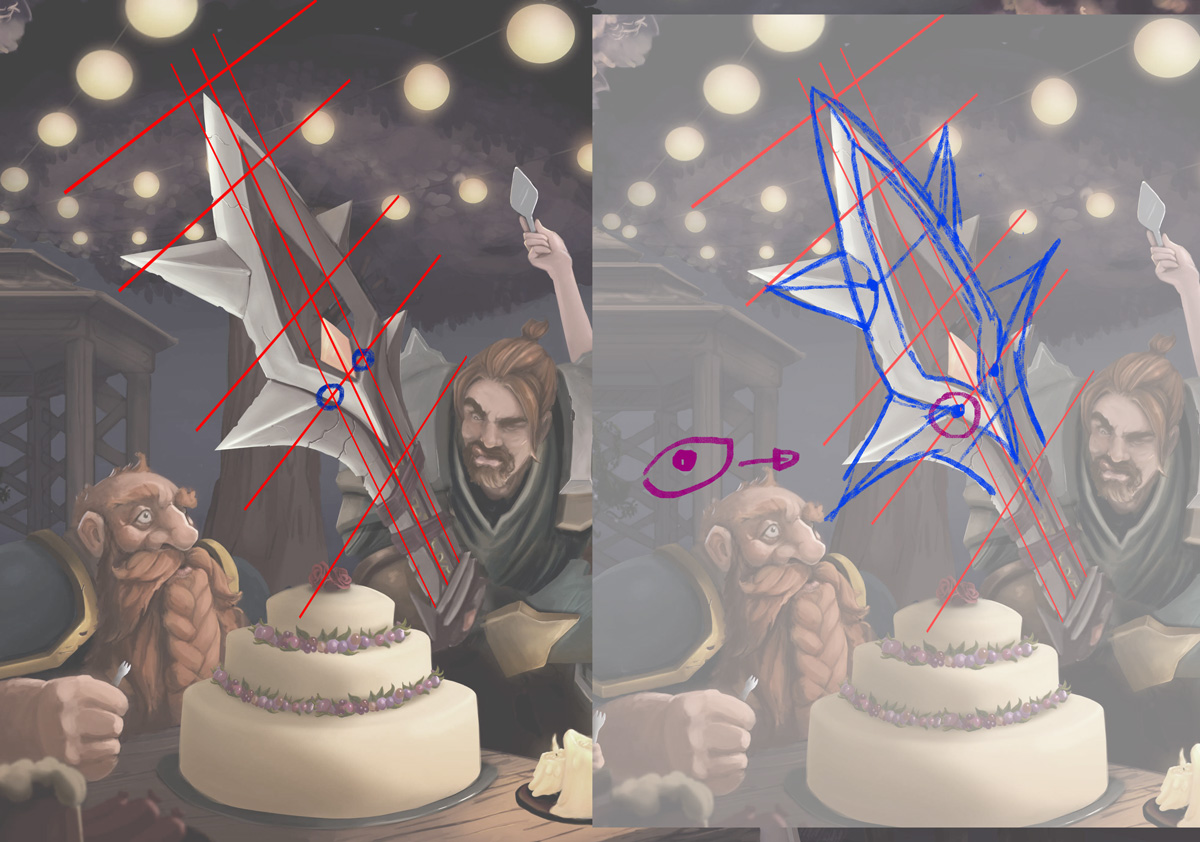
Finally I think the sword's upper part has some broken perspective. The base of the blade (rectangular part) seems to have a different perspective than the top part of the blade (fork-diamond structure), and I'm not sure the fork structure's own perspective is internally consistent , i'll try and point that out:

There are various angles you could choose to do and this red-grid is just an example and not a suggestion but hopefully it gets the point across
Anyway 'hope that was helpful, either way its a great piece, thanks for sharing!