+- Crimson Daggers — Art forum (//crimsondaggers.com/forum)
+-- Forum: PERSONAL ARTWORK (//crimsondaggers.com/forum/forum-9.html)
+--- Forum: SKETCHBOOKS (//crimsondaggers.com/forum/forum-10.html)
+--- Thread: xGhostx7's sketchbook (/thread-8273.html)
Pages:
1
2
xGhostx7's sketchbook - xGhostx7 - 06-04-2017
Hi,
Its time to get started with my sketchbook
I'll try to keep posting here every day.
RE: xGhostx7's sketchbook - dangelowallaceart - 06-05-2017
Nice, clean start. I'm interested to see what else you have to show, keep up the updates!
RE: xGhostx7's sketchbook - xGhostx7 - 06-05-2017
(06-05-2017, 03:34 AM)dangelowallaceart Wrote: Nice, clean start. I'm interested to see what else you have to show, keep up the updates!
thanks man
RE: xGhostx7's sketchbook - Artloader - 06-05-2017
I like your flowing lines xGhost :). Keep going!
RE: xGhostx7's sketchbook - xGhostx7 - 06-06-2017
(06-05-2017, 04:21 PM)Artloader Wrote: I like your flowing lines xGhost :). Keep going!
thanks Artloader
RE: xGhostx7's sketchbook - John - 06-08-2017
Quote:I'll try to keep posting here every day.
Here's to holding you accountable for what you said :)
Don't let up. Keep drawing.
Now you got two cheerleaders. Not in the traditional sense. Sadly, Loader and me are older men wearing skimpy clothing cheering you on.
RE: xGhostx7's sketchbook - dangelowallaceart - 06-08-2017
(06-08-2017, 12:31 AM)John Wrote:Quote:Sadly, Loader and me are older men wearing skimpy clothing cheering you on.
^ And if you ever run out of ideas for illustration, there's always that.
RE: xGhostx7's sketchbook - xGhostx7 - 06-09-2017
Thank you guys for supporting.
Unfortunately, facing severe power cuts here these days. Power supply was off throughout the night last night and it's look like tonight will be the same.
Hopefully it will be fixed soon and I will be able to use my PC again.
RE: xGhostx7's sketchbook - xGhostx7 - 06-10-2017
finally I can upload my sketches.
RE: xGhostx7's sketchbook - xGhostx7 - 06-11-2017
Thumbnails
RE: xGhostx7's sketchbook - xGhostx7 - 06-14-2017
Castle WIP
RE: xGhostx7's sketchbook - xGhostx7 - 06-18-2017
wip Day 7
 .
.
RE: xGhostx7's sketchbook - xGhostx7 - 06-19-2017
Still not done with it, but it started to look better.

RE: xGhostx7's sketchbook - xGhostx7 - 06-22-2017

RE: xGhostx7's sketchbook - xGhostx7 - 07-09-2017
Hi,
Need your comments on anatomy of this character before I add more details.

RE: xGhostx7's sketchbook - John - 07-10-2017
Hi.
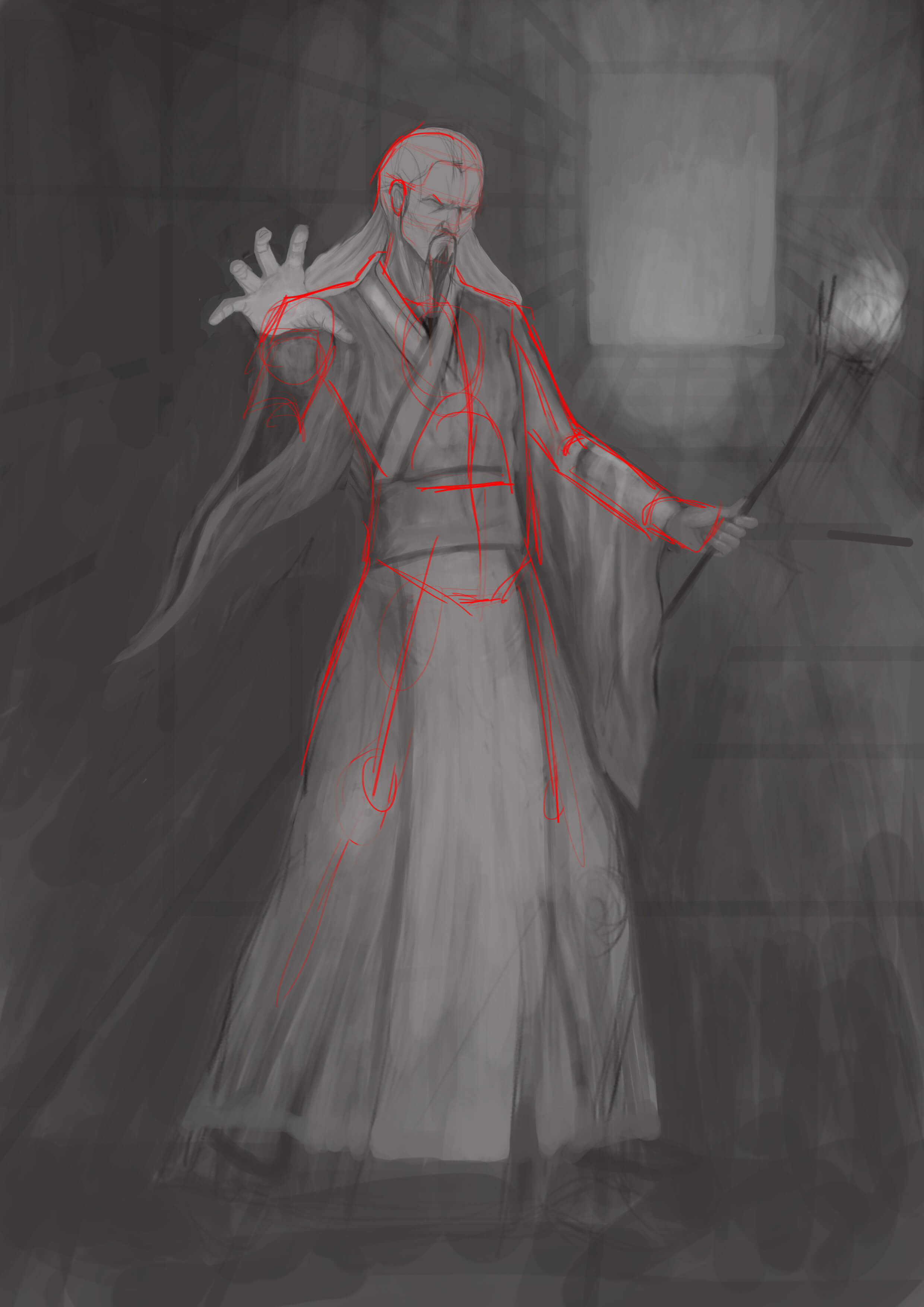.jpg "Filename: Sketch09072017 (1).jpg
Size: 232.38 KB07-10-2017, 02:04 AM")
Anatomy:
1. I follow Loomis' proportions for the shoulder to shoulder. Should be around 2 - 2 and 1/3 heads wide. I think yours is a bit on the narrow side.
2. The way you put on the clothing looks it's painted on the skin rather than actual fabric on the body. I put a red line just above the shoulder where you initially marked where the clothing should be to suggest volume.
3. Arm with the torch looks long.
4. I have no solution for the foreshortened hand coming towards the viewer. It seems to be right. But err on the safe side by making sure you got references for this.
Others:
1. Might be a good idea to lessen the wrinkles of the fabric to make the garment feel has a thicker quality to it. Plus, too many wrinkles and folds focuses the viewers attention to there. Unless that's the intention, probably best to design the fabric thicker.
2. Be wary of your light sources and how it's going to light the figure and environment going forward. Objects, unless you introduce a highly reflective material, shouldn't be as light as the light source.
Not sure with all my observations, so feel free to use your discretion above anything else. Good luck with this Ghost.
RE: xGhostx7's sketchbook - xGhostx7 - 07-10-2017
(07-10-2017, 02:17 AM)John Wrote: Hi.
Anatomy:
1. I follow Loomis' proportions for the shoulder to shoulder. Should be around 2 - 2 and 1/3 heads wide. I think yours is a bit on the narrow side.
2. The way you put on the clothing looks it's painted on the skin rather than actual fabric on the body. I put a red line just above the shoulder where you initially marked where the clothing should be to suggest volume.
3. Arm with the torch looks long.
4. I have no solution for the foreshortened hand coming towards the viewer. It seems to be right. But err on the safe side by making sure you got references for this.
Others:
1. Might be a good idea to lessen the wrinkles of the fabric to make the garment feel has a thicker quality to it. Plus, too many wrinkles and folds focuses the viewers attention to there. Unless that's the intention, probably best to design the fabric thicker.
2. Be wary of your light sources and how it's going to light the figure and environment going forward. Objects, unless you introduce a highly reflective material, shouldn't be as light as the light source.
Not sure with all my observations, so feel free to use your discretion above anything else. Good luck with this Ghost.
Thank you John, Appreciate the feedback and I will work with what you gave me.
RE: xGhostx7's sketchbook - xGhostx7 - 07-11-2017
WIP

RE: xGhostx7's sketchbook - xGhostx7 - 07-12-2017
wip

RE: xGhostx7's sketchbook - xGhostx7 - 07-15-2017
Done with it for now.
