
+- Crimson Daggers — Art forum (//crimsondaggers.com/forum)
+-- Forum: PERSONAL ARTWORK (//crimsondaggers.com/forum/forum-9.html)
+--- Forum: SKETCHBOOKS (//crimsondaggers.com/forum/forum-10.html)
+--- Thread: Stark Sketches (/thread-8335.html)
Pages:
1
2
Stark Sketches - Riley Stark - 08-10-2017
So, I started an account here a while back, but I never really got around to posting with it. Now I'm looking to level up and I need to seriously buckle down, so I thought I'd dust off this account and start a sketchbook.
I'm a self-taught artist and I consider myself to currently be at an intermediate skill level -- I have a hang on most basics, but I need to improve a lot of everything to get to the next stage. (I do take illustration jobs, but I'd consider myself a low-level professional at this point.) I hope to get better at anatomy, color usage, composition, and just about everything else you can think of.
Here are some pieces I recently finished to start things off:
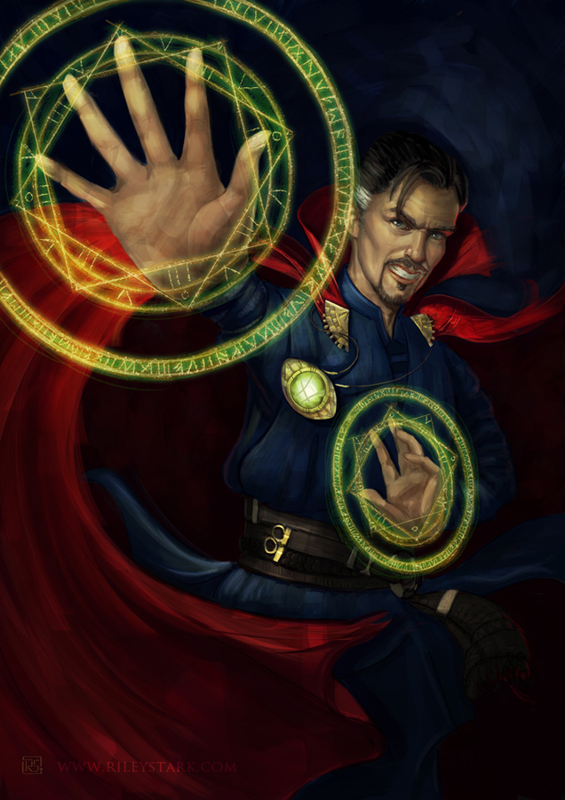
Doctor Strange -- trying something a little more dynamic in the pose than I usually do. My pieces often feel very static, so I tried to work on that in this one a bit. (Both with pose and with brushwork.)
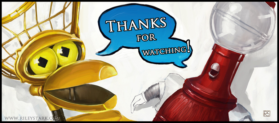
Just a 'thank you' piece for hitting a watcher milestone on DA. (Who doesn't love some MST3K?)
Check out the links in my signature for more samples of previous pieces. (And feel free to comment on anything here -- I welcome ALL feedback and I love criticism! The harsher, the better I will get!
 )
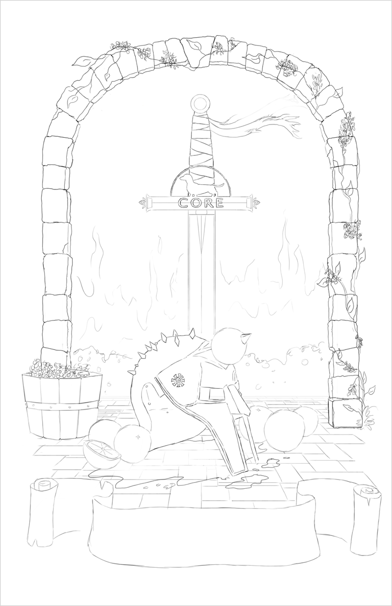
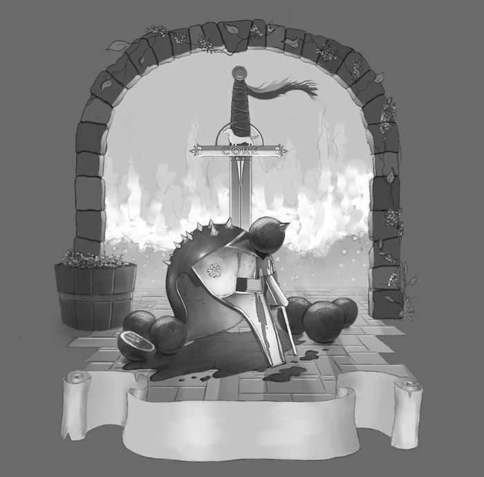
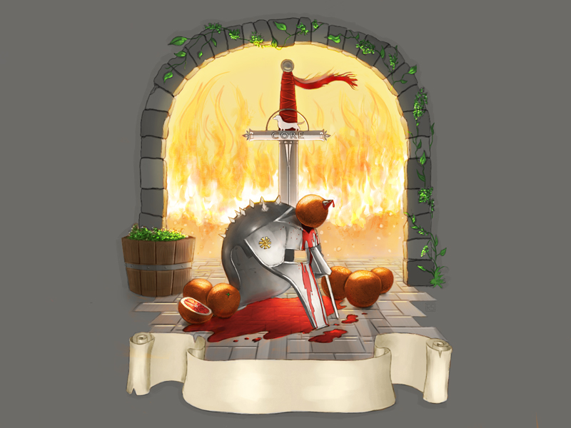
)This is a piece I'm currently working on for a beer label/advertising poster for a brewery down south. The illustration elements are based off their upcoming blood orange IPA, which is themed after one of their employees. (The helmet and whatnot are a reference to jokes supposedly about him.) I just finished up the line work and I've sent it over for approval before I start painting everything in. (Comments on composition will be especially helpful!)
RE: Stark Sketches - Riley Stark - 08-10-2017
Daenerys from GoT
1 hour (so far)
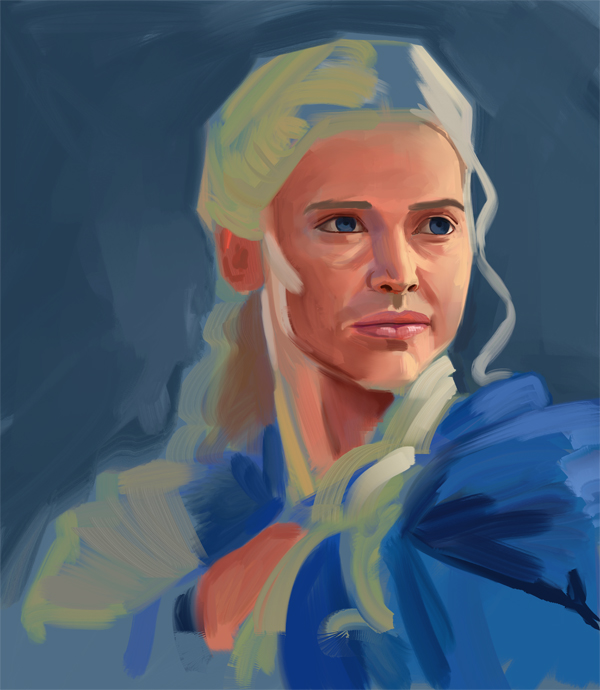
Trying to loosen up my brush work.
Messed up the eyes and I think I made the tip of the nose a bit too small. (Eyeballed the proportions, need to get better at that.)
May work on this a bit more in future.
RE: Stark Sketches - Riley Stark - 08-13-2017
I started adding in values to the beer label to work out the lighting. I'll be trying to add color shortly, I think. (I always have trouble adding color to greyscale. Any suggestions about how best to do so would be welcome!)
RE: Stark Sketches - UKRAINIANWOLF97 - 08-13-2017
(08-13-2017, 07:01 AM)Riley Stark Wrote: I started adding in values to the beer label to work out the lighting. I'll be trying to add color shortly, I think. (I always have trouble adding color to greyscale. Any suggestions about how best to do so would be welcome!)
KEEP IT UP )
RE: Stark Sketches - Riley Stark - 08-13-2017
@Ukranianwolf97 -- Thanks for the encouragement!
Colored label. Critiques would be very welcome!
RE: Stark Sketches - Riley Stark - 08-20-2017
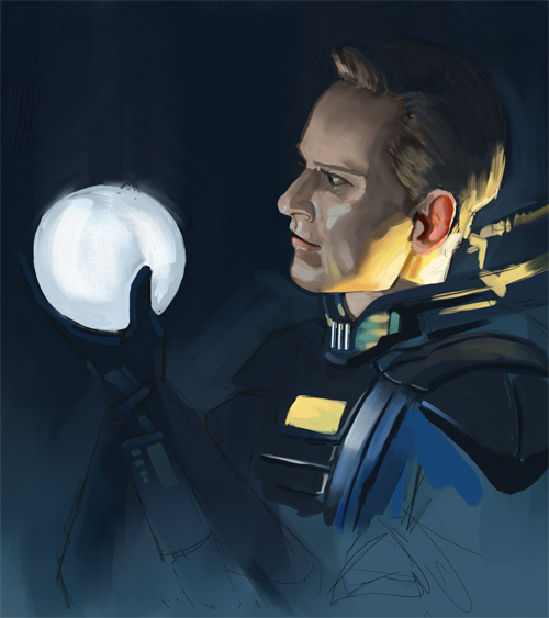
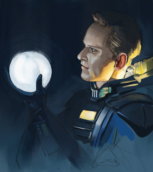
Started a David piece from Prometheus. Trying to keep my brushwork loose. (Something I struggle with. I always over-render. >.<)
Rough sketch:
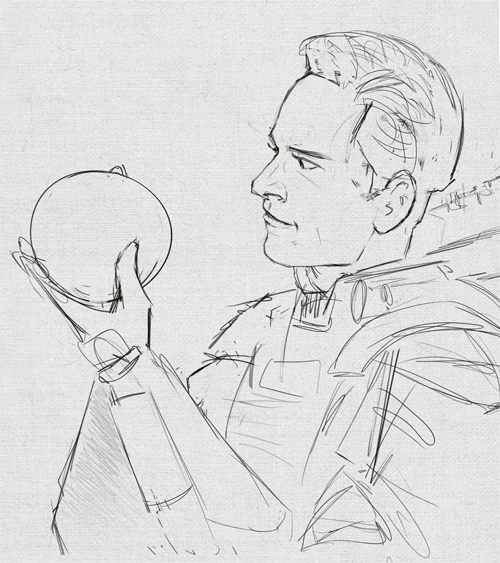
(Just noticing that I made the hand too small.)
Painting so far:
RE: Stark Sketches - Riley Stark - 08-21-2017
A little more work on David.
I know the major planes of the face fairly ok, but I'm having trouble knowing where to put my strokes to keep the likeness of the person and acknowledge how light would be hitting the face in this scenario. I don't know if I need to study the more subtle plane changes or if I simply lack the confidence to leave a stroke just as it is, without feeling the need to blend everything in. (I feel like the blending has become a bit of a crutch that I'd like to kick out from under myself.)
Ideally, I'd love to do work like Sargent or even more loosely like Greg Manchess' stuff. I've done several Sargent studies, but never a Greg one -- maybe I should try that before I continue to try and tackle this? Any advice/criticism would be very welcome!
RE: Stark Sketches - Riley Stark - 10-03-2018
UPDATE:
So, I never followed through with uploading to this sketchbook last year and want to snap myself back into making progress. I recently got an iPad and I can now sketch and paint much more frequently, so I really want to jump on the improvement train this year. (And I need all the feedback I can get, so please don't be shy to pipe up if you're casually going through this thread!)
I recently acquired an agent here in the city and I've been taking illustration jobs through them (which has been great!!), but I really need to level up my skills all around. I want to eventually be able to compete with the agency's top artists for work and be really proud of the stuff I'm putting out! Ideally, I think I want to specialize in book covers. Ultimately something in the range/style of Greg Manchess', Jon Foster's, and Julie Dillon's work. Love all of them!)
Here's my present portfolio on their site. ANY FEEDBACK WELCOME!
This past year I fully illustrated two children's (educational) books through my agent (still under NDA), did several portraiture pieces for various publishers (also presently NDA'd), and took a few private commissions here and there to round things out. I have now left my daytime job to do illustration full time, so it's really important for me to get on the ball and do studies going forward. I don't feel like I have grown much as an artist skill-wise this past year (despite taking jobs), but now I've got the time to really devote to doing studies and I'm excited to go!
To start things off, here's a piece I've been fooling around with. I sketched the idea out the other night, nothing terribly ground-breaking, just something from a story everyone knows -- Alice in Wonderland. The issue I feel like I'm presently having --> I like a lot of my sketches, but start to hate them once I go and start rendering things in. They just feel... wrong... and I can't put my finger on why. They seem to work compositionally (in sketch phase) and, when I convert to black and white after moving to block in, they largely work value-wise, so I'm not sure why I'm having trouble moving forward. I'd really love someone to help me point out where I'm going wrong so I can start this piece over and do it correctly! Attached is the sketch I did (on my iPad), plus where I've gotten to blocking-in-wise with values/colors. (Did that on main computer, not iPad.)
Help!
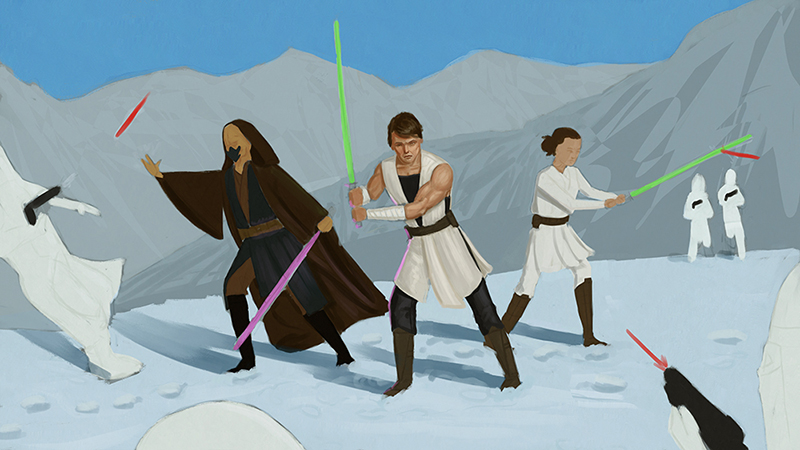
Also, I'm also currently working on a private Star Wars commission. I've blocked things in roughly and I'm getting ready to make corrections to the anatomy/poses and start pushing forward with rendering. (Context: they want their OC and two other friend's OC's fighting Snowtroopers on some Hoth-esque world. I have nothing to do with the one character being sleeveless in the snow, not my outfit design. I just do as I'm told. lol) Any feedback on this piece going forward is very welcome, too!
Now I'm off to do master study or set up a still life to paint from. (Thinking the master study might be more helpful at this point, so I can continue to work on composition, as well as rendering.) I've slowly been switching my workflow from Corel Painter over to Photoshop, so that's been a thing I've been working on too. Slightly different brush engines, but I like that my iPad and computer will be similar now tools-wise. (I love Corel, don't get me wrong, but I think I have a tendency to over blend because it's so easy to do so in that program. I'm hoping that swapping for Photoshop will eventually make my brushwork more purposeful and 'brushy' as I improve. Besides, Photoshop is pretty much the industry standard anyway and Corel currently has no ability to prep files in CMYK anyway, which I need to be able to do now, so... yeah.)
Will post progress, even if it's only incremental. Hoping to post here at least a couple times a week, if not more. I just joined the group on Discord, so hit me up on there under 'stark' if you'd like. :)
RE: Stark Sketches - Artloader - 10-03-2018
Hi Riley, welcome back :).
You are already at a decent level in my humble opinion judging by your portfolio.
I will try to be as helpful as I can with a few comments and observations.
Looking at your Star Wars figures I feel like you would benefit from doing more figure studies to give your figures more realism.
The Alice piece looks nice, if it was me I would push your values more for added impact (make your dark's darker and your lights lighter). Personally I like a more textured brushwork than you have used here and as you mentioned brushwork, I will assume you want to achieve that too. Master studies will help you here, choose a master painter who's brushwork you like and try to work out how they achieved their style. For me I have just started using the smudge tool alongside some textured brushes in Clip Studio Paint. Photoshop will have it's equivalents.
Anyway I hope this helps, if not please ignore :).
All the best anyway!
RE: Stark Sketches - Riley Stark - 10-03-2018
@ Artloader: Hello and thanks a bunch! :)
You're totally right -- I definitely need to do more figure (and gesture) studies. My figures always feel somewhat stiff once I've drawn them out. I think I get so caught up in trying to get the anatomy correct that I lose focus on the figures having any feeling of movement, if that makes sense? (I mean, everybody loves robots 'n all, but I don't always want my figures to have that sort of look. lol) I bet these kinds of studies would be great to do at night so I can focus on relaxing (myself and my figure work) while I wind down for the day.
Yes, I'm definitely striving to have looser/more textured brushwork. I struggle with over rendering a lot of the time. It's difficult to make a mark and just leave it alone... I always want to fiddle with it after the fact. I think it may be a confidence thing (perhaps tying into my stiff figure work even) -- I'm always too worried about trying to get everything 'correct' and then it kills the life of the piece a bit as a result.
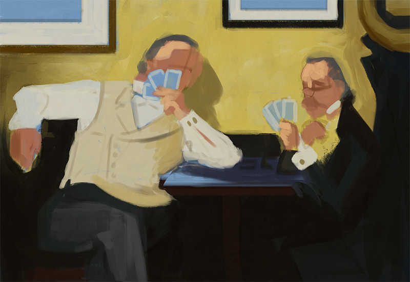
Today I decided to start a master study of a Norman Rockwell piece that I like. Two older gentlemen playing cards. (Started it on my computer, but I may swap it over to my iPad a little later when I continue, since I want to also get more comfortable painting on that.) I blocked in the colors/composition for everything, then overlaid the original to see how off my placement estimations were. Most things were relatively in place, but the gesture of the figures was slightly off, so I adjusted them.
Here's a link to the original and here's where I'm currently at:
RE: Stark Sketches - Fedodika - 10-03-2018
Hey Riley, Im gonna give you some advice i give to many folks and that is the ol, draw more than you paint. Spend less time rendering, more time learning. Your rendering skills are already decent, its just time to catch up that drafting skill. Biggest thing that helped me personally was investing in an online program, be it schoolism, new masters, watts, proko, etc. and focus in on the drawing aspects.
I think the biggest thing for you is to learn to break away from reference and not be controlled by it. The obvious quality difference in your alice piece and your referenced work shows you gotta train more in understanding and invention, which is what youll need since you said you want to compete with Manchess and the like.
and for critiques you can always post your work in the critters cave for a good assblasting, Im a bit too tired at the moment to write up an in depth critique on your starwars piece, but i can try as you get further along with it ;)
RE: Stark Sketches - Riley Stark - 10-03-2018
@Fedodika: Hi!
You’re definitely right about needing to draw more. I think I get impatient to get to painting (because that’s the fun part for me), so I probably don’t construct things as solidly as I should from the drawing up. (I think I kind of inadvertently learned how to run before actually learning how to walk, so the old saying goes.) Even when starting a study (master or otherwise), I’ll usually loosely just block in the big shapes with color/value, then whittle down as I go. I would probably benefit from drawing things out almost entirely, solely to work on drafting, then paint once that’s set.
I’m actually currently subscribed to the self-paced Schoolisim courses. (Love it!) I recently started the Craig Mullins class on painting, but maybe I’d benefit more from Fundamentals of Drawing course by Thomas Fluharty? Perhaps I’ll put Craig on a back burner for now and swap courses. (Certainly can’t hurt, right?)
No worries about being tired — your points about drawing were very helpful! It made me stop and think about my process, which I don’t really think I’ve done in a while. (As weird as that sounds. I know.) Thank you! <3
RE: Stark Sketches - Fedodika - 10-03-2018
sure thing :)
From what i remember, the better drawing courses were stephen silver, alex woo, the seiler caricature course (where he will beat you over the head with the importance of drawing,) I really didnt care much for the fluharty stuff personally, but it could help you. Overall i think the best one would actually be the seiler course but you already have a decent grasp on reference drawing. So in that case stephen silvers and alex woo will help you a lot with design and invention.
Also watch as many of the critiques as you can stomach, even though its someone elses work it helps build your eye and see how a master would tweak things, take as many notes written as you can, even things that seem trivial. So much of art is repetition.
And yea, see how long you can go without painting. If your line drawings arent really turning heads on their own, i think thats something to work on. A painting is just a finishing touch, the foundation is what truly matters. And composition would be a good thing to follow up with once you improve your drawings, spend a lot of time doing small thumbnail studies, I prefer by hand on paper, try to do hundreds if you can as composition is the very heart of what we're doing ;). Nathan fowkes course on it is decent, hes just really boring imo, i really liked robert watts specialty course on watts atelier. its masterclass, so you can just buy it once and take it, definitely very extensive and engaging. I cannot STAND boring teachers, id rather not take the class at all
RE: Stark Sketches - RickRichards - 10-04-2018
Hey Riley! Welcome!
Your Alice in Wonderland piece grabbed my attention. I like the composition, the character design and clear storetelling.
I think your piece can go easily to the next level and become a quite strong piece to put on your portfolio, and if you´re like me it takes forever to finish a folio piece.
I find some things that i will not delve in, just mention; 1- Her face should be more on a 3/4 angle, it´s almost a mixture of profile and 3/4. 2- Maybe a bit more space (ground or sky) so the comp. may breathe 3- The colours are popping each one for attention, that´s not the colours fault but the value build that´s still missing some elements.
Now, on the value, hope you don´t mind my paintover, just my two cents. All notes i left within the image posted.
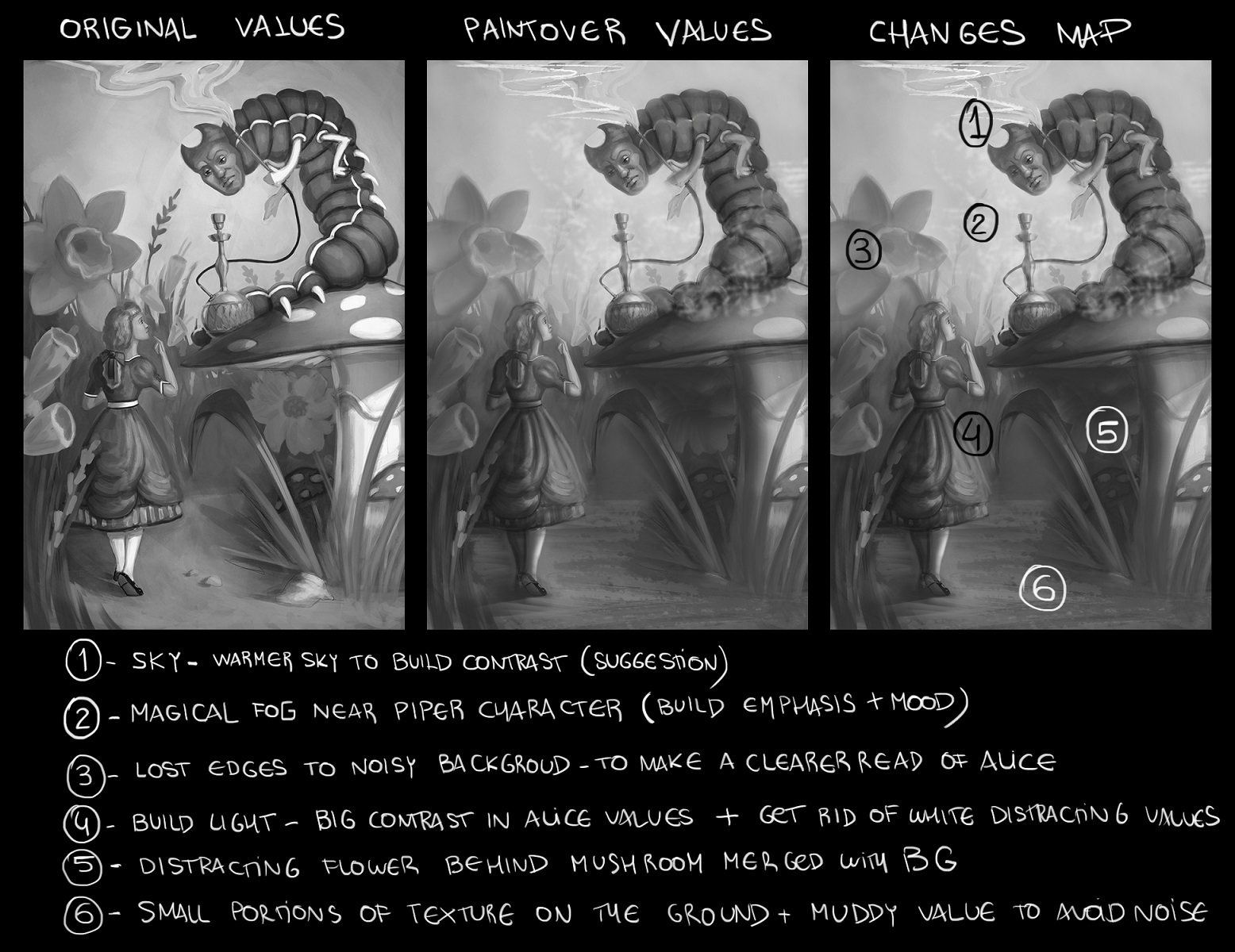
In essence, values in a nutshell; 1- Consistent midtones, shadow areas and light, then when those three are detected, everything else will start building. 2- Lost edges and muddy value when attention is not required, grag attention with value where you want it (i.e. Alice and the piper)
PS; This image of your has solid values; https://cdna.artstation.com/p/assets/images/images/012/801/382/large/riley-stark-piratecavetreasure.jpg?1536599874
I sense a strong artist in the making haha.
Cheers!
RE: Stark Sketches - Riley Stark - 10-04-2018
@Fedodika: Out of curiosity I swapped over to Fluharty's class this morning. I've been going through the lessons, but I think I'm a bit beyond this class. I may skim through the last two lessons, but it seems to be largely stuff that I'm already aware of. I think I may swap courses again for the Alex Woo one on gesture drawing because I'll probably get a lot more use out of it.
I agree about boring teachers. It's very difficult to learn from someone when you don't feel like you can quite connect to what they're saying due to their teaching style or whatnot. (It's almost always a recipe for failure, IMO.)
@RickRichards: Oh, wow! Thank you so much for taking the time to do that paint over and show me how to work the piece better -- super helpful to see! I was definitely getting thrown trying to add depth to things through the values. I think I was being very indecisive about how prominent I wanted Alice to feature and was maybe trying to pop her out against the background, but it works much better when she's (and the white contrasts, too) toned down.
I agree that the image you linked to came out ok value-wise, but I feel like it looks more cartoony than I would have liked over-all. I think that seems to be a consistent problem I have when I get away from working with direct reference. I'm sure more solid-appearing realism from imagination will come with TONS more practice and time, but it's hard to be patient when you want results immediately. (A feeling I'm sure we can all relate to. lol)
-- Now I'm off to check out Alex Woo's class and hopefully up my game in figure drawing. Wish me luck!
RE: Stark Sketches - Riley Stark - 10-05-2018
I wound up watching the last Schoolism lesson from Thomas F. on composition. It was interesting and going through the student feedback was, of course, helpful. Good input.
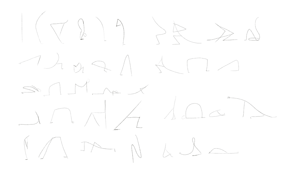
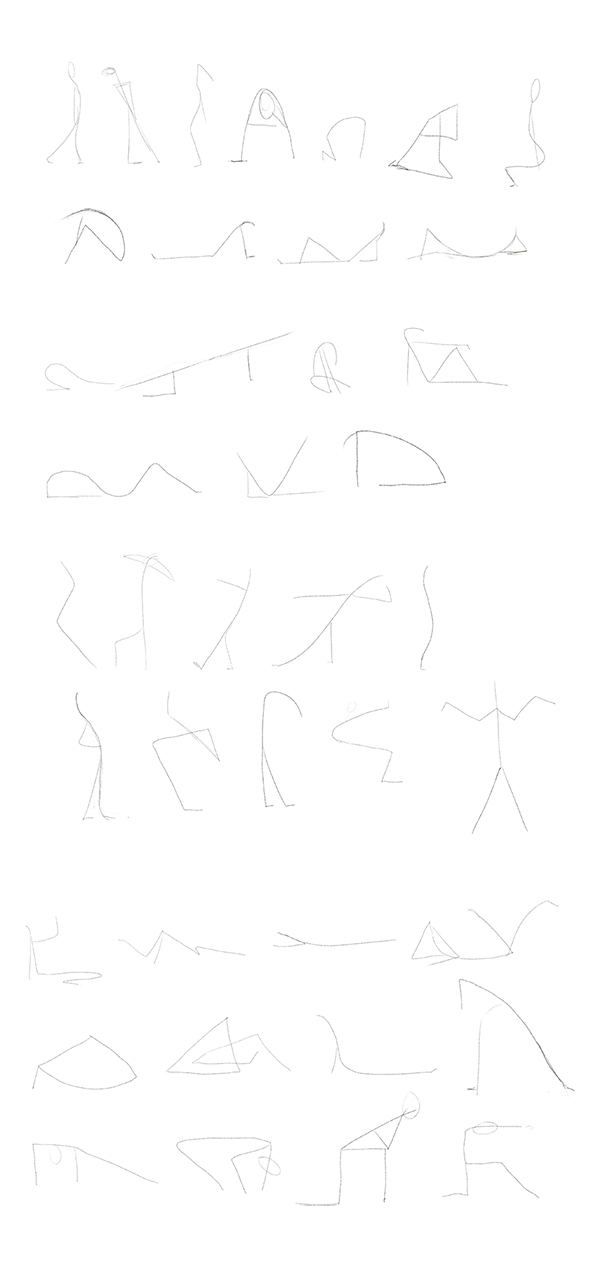
Today I went through the first lesson of Alex Woo's class on gesture and followed along with the exercises. I think I got the gist of it, but there would be a few things I'd probably do a bit differently having now watched the student feedback videos. (Softening/rounding certain areas to indicate female body, adding more 'attitude' to some of the poses.) I can definitely see this being good shorthand for getting initial ideas down on paper. The way I was doing this before was sort of like this, but much more stick-figureish. (Think Loomis figures.)
These are from doing the lesson exercises. Not much to critique or comment about with these, but still progress!
RE: Stark Sketches - Fedodika - 10-05-2018
cool!
RE: Stark Sketches - Riley Stark - 10-12-2018
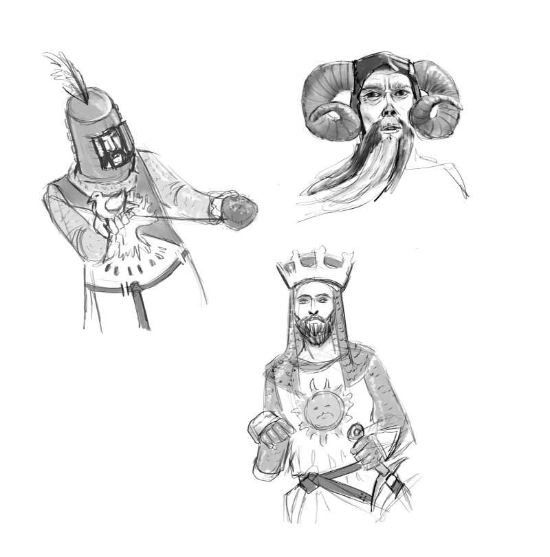
Laying in bed, watching Monty Python. Quick 5 min (ish) sketches on my iPad because randomness.
RE: Stark Sketches - Shinkasuru - 10-13-2018
You have some really nice work, Riley. I will admit that I do not have as much 2D art experience as many others here, and my eye may not be as sharp as some of yours is, but I will do my best to offer feedback if I think it will be helpful. It has been said already about some of your figures looking a little stiff. I think that is a problem for a lot of artists. I think gesture drawing can really help resolve that issue, and I know you already mentioned you are taking Alex Woo's class on Schoolism. I had thought about subscribing for a few months and trying out some of the classes.
I like the quick studies you did on your iPad. Are those from imagination or using reference? I need to try to draw characters with some clothes. I find I often just draw portraits and avoid full figure drawing altogether. It's probably a combination of really loving portrait drawing but also having a fear of figure drawing because I feel it's a whole other area for me to try to master and I have avoided it for too long. I do occasionally do some gesture drawing and basic figure studies and I find they are not all that bad. So I should really spend some more time with it because I would like to improve.
I think gesture drawing will help you create more fluid and dynamic poses. You mentioned something about not being all that confident in going from grayscale to color. How are you approaching it? I'm new to digital painting so I can't say what works best so far, but I'll post a few examples in my sketchbook my grayscale to color studies. I used the soft light blending mode in photoshop for both and then mostly normal mode, although i think I used overlay for some shadows.
I hope you are enjoying your new iPad. I plan on purchasing one next month. I have been waiting for the new models to come out. I draw in a sketchbook a lot and I do keep a sketchbook beside my bed because I sometimes like to draw right before going to sleep for the night, but I have been wanting to paint in bed, too. At this point I just have a tablet on my laptop and that is set up at my desk. So I'm very eager to be able to paint on the go or in bed at night. I'm also hoping I will find the motivation to spend more time drawing and painting on the iPad.
Keep up the great work. I'm interested to see more of your postings.
RE: Stark Sketches - Riley Stark - 10-16-2018
@Fedodika: Thanks!
@Shinkasuru: Hi! Thanks for dropping by!
Stiff figures are a very popular struggle. I think it goes back to trying to construct things with simple shapes, but then forgetting that those shapes aren't actually just hinged together (once you get beyond the construction phase) and that gesture is a different thing than construction. Movement = / = construction. You have to understand the basic shapes you're drawing, but actually adding life to those shapes is the next step to conquer.
For the Monty Python sketches -- I was just randomly pausing the screen as I was watching. Quick ref'd, NBD.
I'm getting better at going from grayscale to color now that I've watched a few more people do it in tutorials. (And now that I'm working in Photoshop, not Painter. Seems to be easier to do in PS.) I really like a method Julie Dillon uses in first toning the drawing with 'Selective Color' (under Image/Adjustments menu top bar), then adding more definitive colors/tones with 'Hard Light' under layer settings. I tried for a long time to simply add color on a 'Color' layer, but it just was never quite doing it for me in a way I felt happy with. (Felt more like a color wash. More transparent.) 'Overlay' and 'Multiply' are options, too, but I feel like they change the base values too much when I use them. 'Hard Light' seems to be a good mix of value and saturation. (Not sure I'm explaining all that in a way that's helpful for anyone else, but it makes sense to me visually when I actually do it.)
I'm really loving my iPad. I tried working in Procreate for a while, but I've actually completely fallen in love with the Artstudio Pro app. (It's essentially a clone of Photoshop, but for the iPad.) I like Procreate's simple interface, but I hated that I couldn't import my PS brushes into it or crop images as needed. Artstudio Pro lets me do both of those things easily, which was a big plus for my workflow. I can import/export large file sizes (6,000px +) without issues, quality of the brushwork holds up going from iPad to larger Cintiq screen later on. I really like it and would definitely recommend trying it once you get your iPad.
Being able to lay in bed and sketch/do work at night is a nice option. Sometimes I just get tired of sitting at my desk and now I can really work equally as well on my iPad, so I can easily change scene if I want to, which I never could do before. It's also nice to have it as a back up plan incase my Cintiq/computer goes down for some reason. (I have an original 20wsx Cintiq. Had it for 8 years now, I think? I got it when I started drawing/painting, so it's somewhere in that ballpark. It's in fantastic condition for its age, but you never know if problems could suddenly arise simply due to years of service.) Always good to have a backup plan when you have deadlines pending... just incase.
Anyway.
Just finished up the second gesture drawing class exercises. First round was draw the line of action, then the second round was draw quick figures based off the lines of actions you did previously. (Here are both as separate uploads, but they can be directly overlaid on each other if you check.)
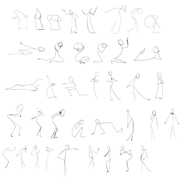
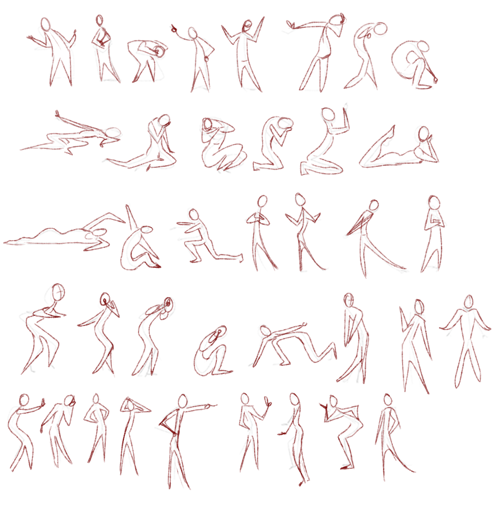
I'm starting to feel like I'm understanding how to not be as rigid with my figures, based off quick idea drawings like these. It all still feels a bit weird when I do it (because it's new), but I'm seeing how much better a method it is than construction from base up. (Which, while I do know how to do, I always get too caught up in.) It's certainly a lot faster, if nothing else.
Started rendering the Star Wars commission a little bit. Didn't get very far, but I should make good progress this week -- I'm hoping to have a good chunk of it done before next Monday, just so I can push it out and move onto the next project. Any feedback going forward is always welcome!
Also, side note, uploads may be a little sporadic going forward -- we're about to start a kitchen renovation and one of the fun aspects of living in a Manhattan apartment is always the tiny bit of space you have to work with. Everything from the kitchen will be getting pushed into the living room for a few weeks, making it a maze of boxes and furniture. This also happens to be the room my work desk is and it may be off limits for a day or two at a time due to working logistics (moving things around, the construction guys possibly temporarily turning off electricity while they rewire/install things, etc.) Thank goodness for my iPad -- I may be doing a lot of work on that coming up, all while stuck in my tiny bedroom with my cat to stay out of the worker's way. (Because she can't come out while they're working during the day and I also don't want her to be alone all the time.) This is all supposed to last for about 4 weeks, but I'm hoping it will all go faster than that. Artstation Pro will allow me to upload straight to my sketchbook here with the way it exports files. (I've found some apps are a little wonky with uploading image files directly to threads. It worked the other night when I uploaded the Monty Python sketches, thankfully.) So, I say all that to say this: I will be working during that time, but if I don't answer a comment straight away, I may just be caught up in renovation issues for the moment -- hang in there, I will answer as soon as I can!
:D