+- Crimson Daggers — Art forum (//crimsondaggers.com/forum)
+-- Forum: PERSONAL ARTWORK (//crimsondaggers.com/forum/forum-9.html)
+--- Forum: SEEKING CRITIQUE/PAINTOVERS (//crimsondaggers.com/forum/forum-36.html)
+--- Thread: I need help :/ (/thread-8442.html)
I need help :/ - yangdaniel027 - 01-17-2018
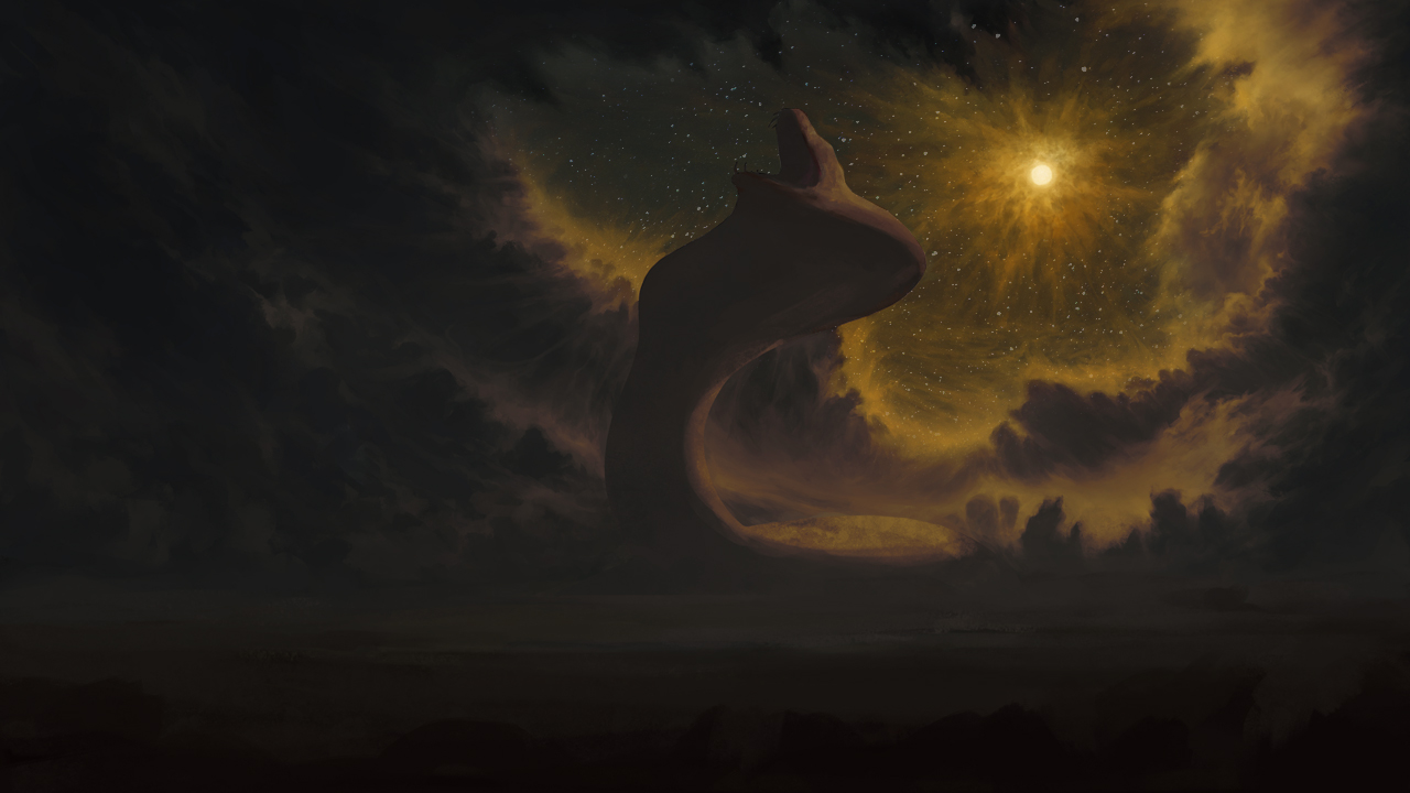
Okay guys I need a ton of help with this one. The original concept is the awakening of a giant Naga roaring at night in a sort of jungle/forest setting. A lot of the colors were inspired by Ivan Konstantinovich Aivazovsk's work. It's supposed to be a night scene with the moon radiating a strange light due to the Naga, or maybe the Naga awakening due to the moon being in the right phase.
Here's where I think my problems are: I have a desurated shadows/ saturated light scheme contrast going on, which seemed to work fine for the clouds, but it's just not jiving with me for the Naga. Something about it just doesn't look right to me. I can't give it saturated colors either because that'll pull it into the foreground. As we got closer to the foreground, I wanted to push deeper saturated colors and have more of an atmospheric perspective thing going on, but that doesn't sit right with me either....maybe I just fucked up the colors :/
I can't make up my mind on whether the shadow side of the Naga should be completely dark or if I should have reflected light revealing some forms. If I add reflected light, that should probably go into some of the clouds too.....
Help......:/
RE: I need help :/ - RottenPocket - 01-17-2018
Hi,
I think it's a great concept and it's good to see you analysing your own work. It's not so much that your shadows are too desaturated in comparison to the lighting, but more that your entire painting exists mostly in the same hue. By keeping contrasts in the same hue, your values appear dull.
Overall, the image is very warm. You said this was meant to be the moon emitting a strange light. I would have thought this was a desert setting on a world near a dying or far-away sun. By keeping this 'strange light' in the same hue as the rest of the image, it doesn't seem strange. Film is a great example of how directors use colour to unify their scheme. If you're trying to set it apart, there needs to be a lot more complimentary cool tones to flesh it out. i.e. purples and blues are on the opposite side of the spectrum as yellow and orange so they compliment each other. By picking those colours in cool/warm opposition you also increase vibrancy without having an over-saturated look.
Also, on the note of night-time setting... Stars. The moon is much smaller and much closer than the sun so there's actually not much light-pollution drowning out starlight. It would help portray the setting more to include stars.
I've attached a bit of an example of what this all would do, but ultimately it depends on what your intensions are and what you choose to do:

RE: I need help :/ - yangdaniel027 - 01-18-2018
Ahhhhhh!...holy crap that makes so much sense. In my initial block in, I did have a more blue/green versus yellow color scheme but really lost that contrast when I got carried away detailing. I was focused on separating values but didn't even consider separating hues. The stars idea is a nice touch too, I can't believe I didn't even think about that.
Thank you so much, you helped save this painting!
RE: I need help :/ - RottenPocket - 01-18-2018
I'm glad! You already had such a great base to work with. Your art has a good amount of detail in that background and makes me think of Tim Barton's space scenes. I think because of the amount of blending you didn't stray from the same colour gradient. The way light is read as colour in life is so subtle with changes sometimes, in structures like clouds I can imagine it would be a nightmare to blend that way. It is worth experimenting with - if you compare these two, you'll see that the values haven't been altered [except the night-sky] but by using those complimentary colours it really reads differently. You can make a quick edit by going to colour adjustment and increasing blues to see if your initial application still reads. You can use a transparency layer to affect hue and paint it in manually. You could in photoshop add a gradient map layer, cool dark purple on the left and warm bright yellow/orange on the right, with the gradient favouring the yellow. Given your technique, you might refer to artists like James Zapata who start a painting under a gradient map so colour is adjusted as they're painting values. It's a good way to apply something quickly with minimal effort while having it read really well as three dimensional, rather than a pixel-by-pixel approach.
Be sure to update here for us!
RE: I need help :/ - xelfereht - 01-19-2018
@RottenPocket
-great solution!
I know it wasn't what you said you were having trouble with but i think could improve the snake shape
maybe tie in a glowing eye to relate it to the moon. maybe even make it radiate the same way the moon is to make it super obvious. also atmosphere wise maybe that big a thing might kick up some dust lifting its head up. could even put some trees falling from it to show scale and power of it. i just chucked some birds in there to also give sense of size and so on.
just a quickie, maybe it helps maybe not but wish you the best!
![[Image: yd_po_by_andrew_gibbons-dc0dtvc.jpg]](https://orig00.deviantart.net/703f/f/2018/018/3/6/yd_po_by_andrew_gibbons-dc0dtvc.jpg)