
+- Crimson Daggers — Art forum (//crimsondaggers.com/forum)
+-- Forum: PERSONAL ARTWORK (//crimsondaggers.com/forum/forum-9.html)
+--- Forum: SKETCHBOOKS (//crimsondaggers.com/forum/forum-10.html)
+--- Thread: Skeffins Sketchbook (/thread-9076.html)
Skeffins Sketchbook - Skeffin - 11-29-2020
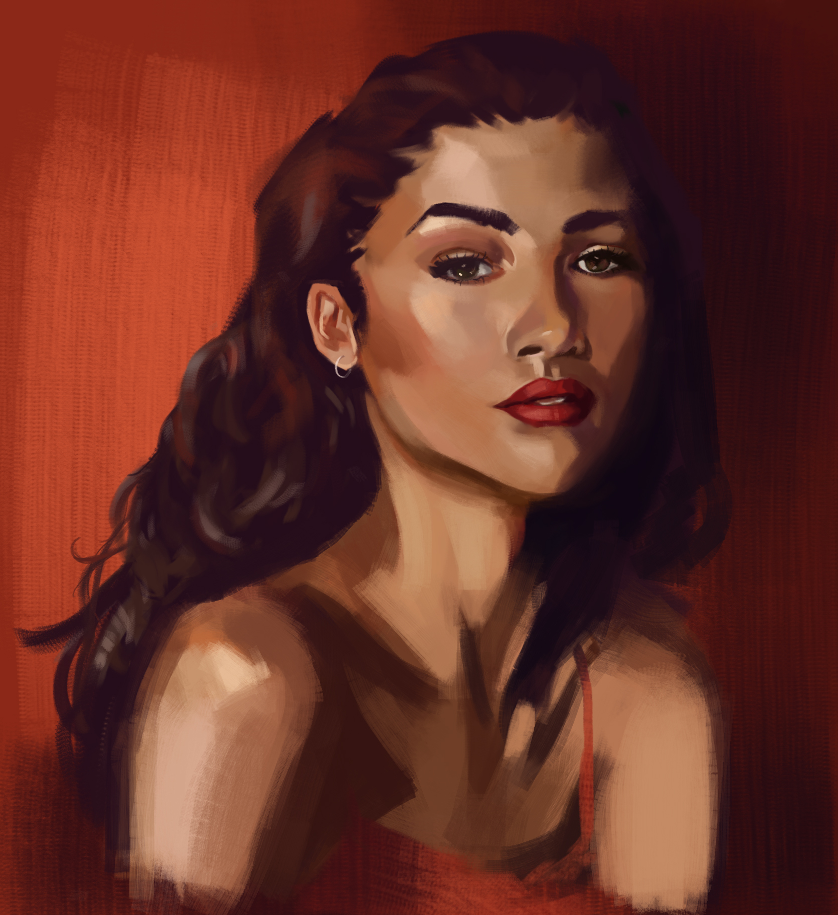
Hey guys,
I'm opening a sketchbook here that'll be mainly full of daily studies as I'm still working on the fundamentals.
Any critique or feedback is always welcome!
RE: Skeffins Sketchbook - Skeffin - 11-29-2020
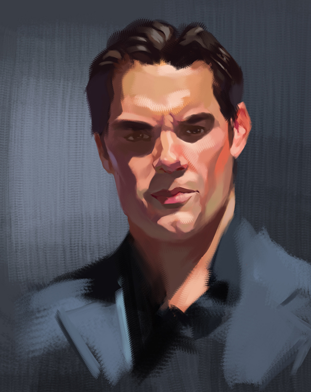
Right, can't figure out how to resize/remove that first image so it's not huge, here are a few of the other things I've done recently
RE: Skeffins Sketchbook - Artloader - 11-30-2020
Hi Skeffin, welcome to the forum, nice painting :) - I love the shapes in your brushwork.
Looking forward to more :).
RE: Skeffins Sketchbook - Zorrentos - 12-01-2020
Some very nice color and brushstrokes in your work! Keep up the good work!
RE: Skeffins Sketchbook - Skeffin - 12-01-2020
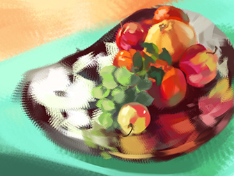
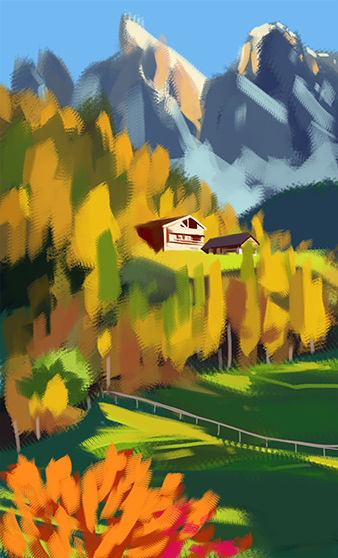
Todays colour studies from photos - what with work and other commitments, there's usually only time for 1 -2 on a week day.
RE: Skeffins Sketchbook - JyonnyNovice - 12-02-2020
welcome to crimson daggers! Beautiful studies and paintings : )
Do you have something specific you're tackling right now in terms of fundamentals? Just trying to absorb and polish your knowledge and skills?
RE: Skeffins Sketchbook - Skeffin - 12-02-2020
(12-02-2020, 02:52 AM)JyonnyNovice Wrote: welcome to crimson daggers! Beautiful studies and paintings : )thanks :) yeah right now I'm working on colours and portrait studies. Still need to continue on with Scott Robertsons how to draw and how to render studies too, best £50 quid I've ever spent. Would be open to any recommendations or advice on other weak areas though. Drawabox is already in the backlog.
Do you have something specific you're tackling right now in terms of fundamentals? Just trying to absorb and polish your knowledge and skills?
RE: Skeffins Sketchbook - JyonnyNovice - 12-02-2020
Probably you've heard of 'Colour and Light' by James Gurney? It's a good compliment for How to Render, still has science stuff but much more of a practical painting angle. Also Marco Bucci's youtube videos, especially this one https://www.youtube.com/watch?v=4LhcNbFMkTw&t=530s could be really useful for you to get more harmony with your paintings. I really like your colours but a couple of them feel like, just a little bit too heavy with saturation.
You're in the uk too?
RE: Skeffins Sketchbook - Skeffin - 12-02-2020
(12-02-2020, 07:46 AM)JyonnyNovice Wrote: Probably you've heard of 'Colour and Light' by James Gurney? It's a good compliment for How to Render, still has science stuff but much more of a practical painting angle. Also Marco Bucci's youtube videos, especially this one https://www.youtube.com/watch?v=4LhcNbFMkTw&t=530s could be really useful for you to get more harmony with your paintings. I really like your colours but a couple of them feel like, just a little bit too heavy with saturation.ah yeah, I got Colour and Light already! Haven't heard of Marco Bucci so cheers for the heads up. My paintings used to be too desaturated across the board but now I think I've swung too far the other way and need to balance out the saturated colours with some more muted ones. And yeah, I'm also in the UK
You're in the uk too?
RE: Skeffins Sketchbook - Skeffin - 12-02-2020
Todays studies and also some old creature doodles that I dug out and finished. Don't usually do buildings/interiors or coloured sketches, as I have too little patience to make sure my lines are straight / within the lines ( I'm working on it ).
Also not happy with the landscape study as it looks more like a tacky nature poster than anything.
RE: Skeffins Sketchbook - Atceterra - 12-03-2020
You've got some pretty good painting skills! Though I would recommend some thing but take this is with a bucket of salt cause I'm also still learning, maybe try researching on atmospheric perspective and organizing values to lead the eye. Also, the first post has some wonky proportions on the eye which I myself am also struggling in.
Hope you enjoy crimson daggers, I'm also pretty new here
RE: Skeffins Sketchbook - wld.89 - 12-04-2020
hey there, nice sketchbook ! keep practicing landscapes since it looke like your weak spot !
Try working with bigger brushes, don't focus much on details, especially if you are doing quick studies, getting the general mood is more important imo !
RE: Skeffins Sketchbook - Skeffin - 12-04-2020
(12-03-2020, 08:53 PM)Atceterra Wrote: You've got some pretty good painting skills! Though I would recommend some thing but take this is with a bucket of salt cause I'm also still learning, maybe try researching on atmospheric perspective and organizing values to lead the eye. Also, the first post has some wonky proportions on the eye which I myself am also struggling in.
Hope you enjoy crimson daggers, I'm also pretty new here
hey newish person :) I'm trying really hard to notice said wonky eye proportion and I honestly cannot see it. It would help me out a lot if you pointed out the specifics of whats wrong!
RE: Skeffins Sketchbook - Skeffin - 12-04-2020
Watched Marco Bucco's video on colour theory (thanks Jyonny, it was really useful) and attempted to apply it to my next few studies, with uh , varying success. I think the study with the mountains and fields started off strong and then went downhill, did spend a lot of time trying to fix it although still not happy with the end result
Also @wld.89, yeah I keep accidentally end up putting in too much detail - thanks for the reminder that I need to actively cut back on that
Probably going to do some more personal stuff instead of studies over the weekend as I've been neglecting those
RE: Skeffins Sketchbook - Skeffin - 12-05-2020
Got the idea for this piece during a bout of insomnia. Did some thumbnails, was actually kind of happy with the first one given my composition skills are poor. Picked out some google images for the colour board, then did a colour thumbnail. While I do like the col scheme on the right , I didn't think it fit well with the mood I wanted. So did a second. more blue toned thumbnail which I'll use for the final version
RE: Skeffins Sketchbook - melolon - 12-06-2020
(12-05-2020, 11:50 AM)Skeffin Wrote: Got the idea for this piece during a bout of insomnia. Did some thumbnails, was actually kind of happy with the first one given my composition skills are poor. Picked out some google images for the colour board, then did a colour thumbnail. While I do like the col scheme on the right , I didn't think it fit well with the mood I wanted. So did a second. more blue toned thumbnail which I'll use for the final versionThe angle you chose is neat! It offers a serene tone to the scene you painted.
If you're worried over composition, just practice it! Some folks like to run through dozens of thumbs just to exercise their options; movie stills, manga panels, animation shots, all are something you can look through as well!
RE: Skeffins Sketchbook - Skeffin - 12-07-2020
finished piece. Still not too happy with the colours tbh - I think I need a more structured approach to my colour studies as the only improvement I see is guessing less when it comes to picking colours for personal artwork that aren't studies. Alternately I'll move onto studying composition/ values as I feel like those are holding me back more.
RE: Skeffins Sketchbook - xelfereht - 12-07-2020
Overall i think you could control the use of saturated colours a bit more to put emphasis in areas and use it as a tool of composition.
the latest piece is really nice, some of the surrounding environment feels a bit uniform in shape and spacing, taking away some of the organic feel and some more practice with soft and hard edge placement will surely let you push your images further.
your'e doing some nice work, well done.
RE: Skeffins Sketchbook - Skeffin - 12-11-2020
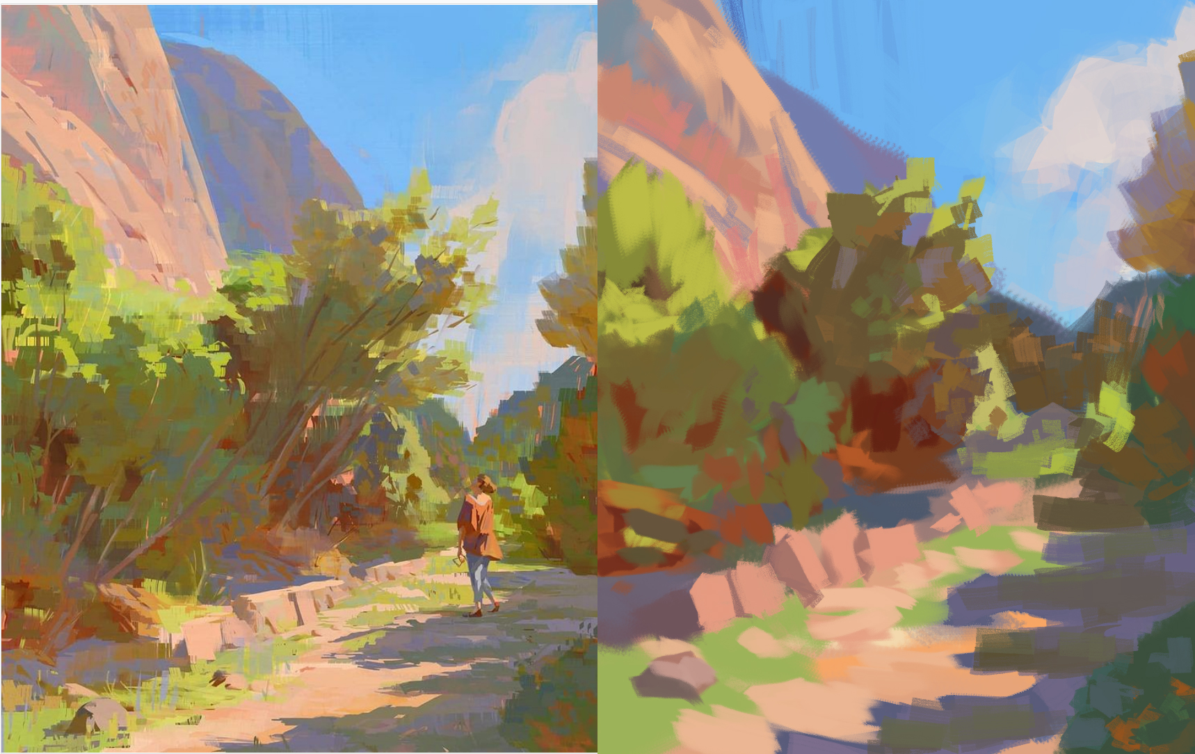
Thanks for the feedback Xelfereht. Overly saturated colours across the board is something I'm struggling with atm, and er, these following ones don't seem to show much improvement in that area. Maybe in the top 2 mountain doodles. Marco Busso's video that got recommedned seems to move from grey to more colourful areas, although I find it more intuitive to apply flat base colours first, then decrease the saturation in areas that need it
Colour study from slaweck on instagram, and then some doodles experimenting with colour and a more illustrationy style. I think for now I may get more use from doing master studies instead photo studies, to see how they control saturation, then attempt to apply what I learn in some more original work/work based on studies
Huh, also just realised that on my phone, the yellow skirt on the last picture is horrifyingly saturated, but on my laptop screen it's more muted and less eye watering. Not sure which one reflects the real colour more accurately.
RE: Skeffins Sketchbook - Skeffin - 12-17-2020
sketch dump, more illustraty stuff is done from imagination, more photrealistic were photo studies