+- Crimson Daggers — Art forum (//crimsondaggers.com/forum)
+-- Forum: PERSONAL ARTWORK (//crimsondaggers.com/forum/forum-9.html)
+--- Forum: SEEKING CRITIQUE/PAINTOVERS (//crimsondaggers.com/forum/forum-36.html)
+--- Thread: need opinion about design (/thread-9158.html)
need opinion about design - RonyaSekira - 02-13-2021
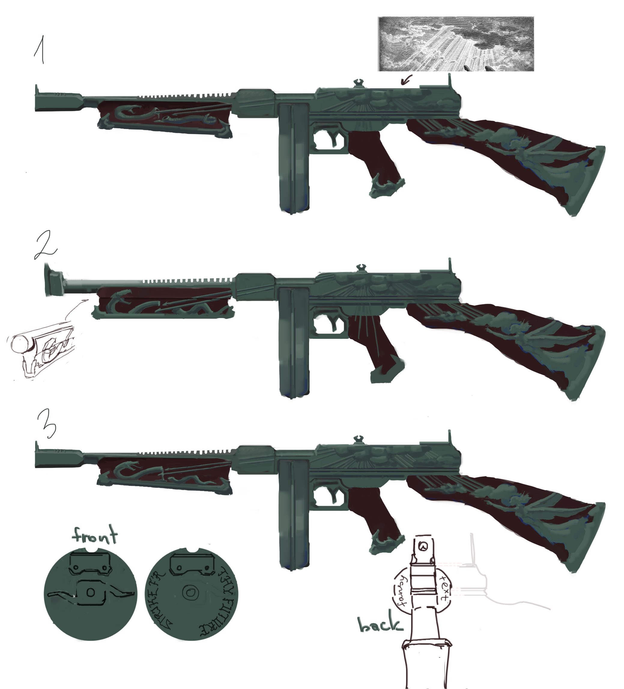
So I'm doing Thompson submachine gun 'redesign' for challenge. Kinda a new skin for it as if it were in game. There is one rule that its drum type magazine should be inclided. Never done something like it.

It's basically the same concept just with simple variations, I'm trying to figure out what looks more harmonious(if anything at all). As for the drum I think I'll keep it simple and close to the original
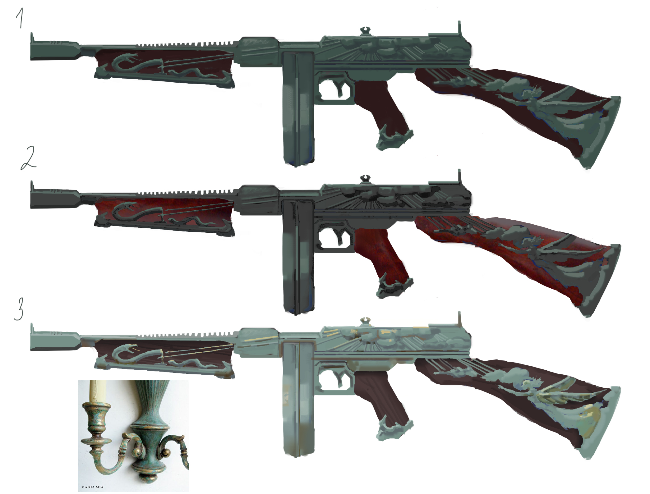
And these are some plans for color

In general I fear that maybe it is too overwhelmed with ornament. What do you think?
RE: need opinion about design - darktiste - 02-13-2021
If your cloud don't read like cloud that not a good sign.I recognize the angel and the snake but i highly suggest you need to simplify your shape for better read if you want to add the cloud. Also the light ray probably.Also remember that contrast and light source direction can do alot for you to describe your form so think about doing some test on light intensity and light direction by iterating and finding the best light source combination.I personally suggest that you do not present the gun on a white background not only does it flatten image the fact that this a side view doesn't help either so try to add as little as possible of a background that will compliment your object in the best possible way possible also a white background are hard to look at for the eye i find.There also something i want to say if you want your form to read as 3d you need to seperate your form. Right now they look like there one solid piece the best way to achieve separation is to understand what your drawing and add the according shadow it all about that sweet understanding of how to get the value that reflect the change in light.
Good luck.
RE: need opinion about design - RonyaSekira - 02-13-2021
(02-13-2021, 12:13 PM)darktiste Wrote: If your cloud don't read like cloud that not a good sign.I recognize the angel and the snake but i highly suggest you need to simplify your shape for better read if you want to add the cloud. Also the light ray probably.Also remember that contrast and light source direction can do alot for you to describe your form so think about doing some test on light intensity and light direction by iterating and finding the best light source combination.I personally suggest that you do not present the gun on a white background not only does it flatten image the fact that this a side view doesn't help either so try to add as little as possible of a background that will compliment your object in the best possible way possible also a white background are hard to look at for the eye i find.There also something i want to say if you want your form to read as 3d you need to seperate your form. Right now they look like there one solid piece the best way to achieve separation is to understand what your drawing and add the according shadow it all about that sweet understanding of how to get the value that reflect the change in light.Oh man sorry for that painful white background, I just constanly keep eye comfort mode enabled on monitor and forgot white is exhausting to look at! I haven't thought about the final image yet, but yeah not gonna make it with pure white background.
Good luck.
I agree on everything about values and unclear cloud forms. Can you specify on rays? Are they unreadable too or what. Also which variation is most pleasing for you (and color type as well)?
RE: need opinion about design - darktiste - 02-13-2021
Well i cannot give my opinion until you test with different background there is no right design just right combination.As for the ray i think you need slightly less of them and larger one.
RE: need opinion about design - gerbenpasjes - 02-14-2021
Hey RonyaSekira! Cool challenge and awesome gun; the Thompson is a classic.
Besides the problems with the rendering, I think there's another problem you need to solve before going to render; the design itself.
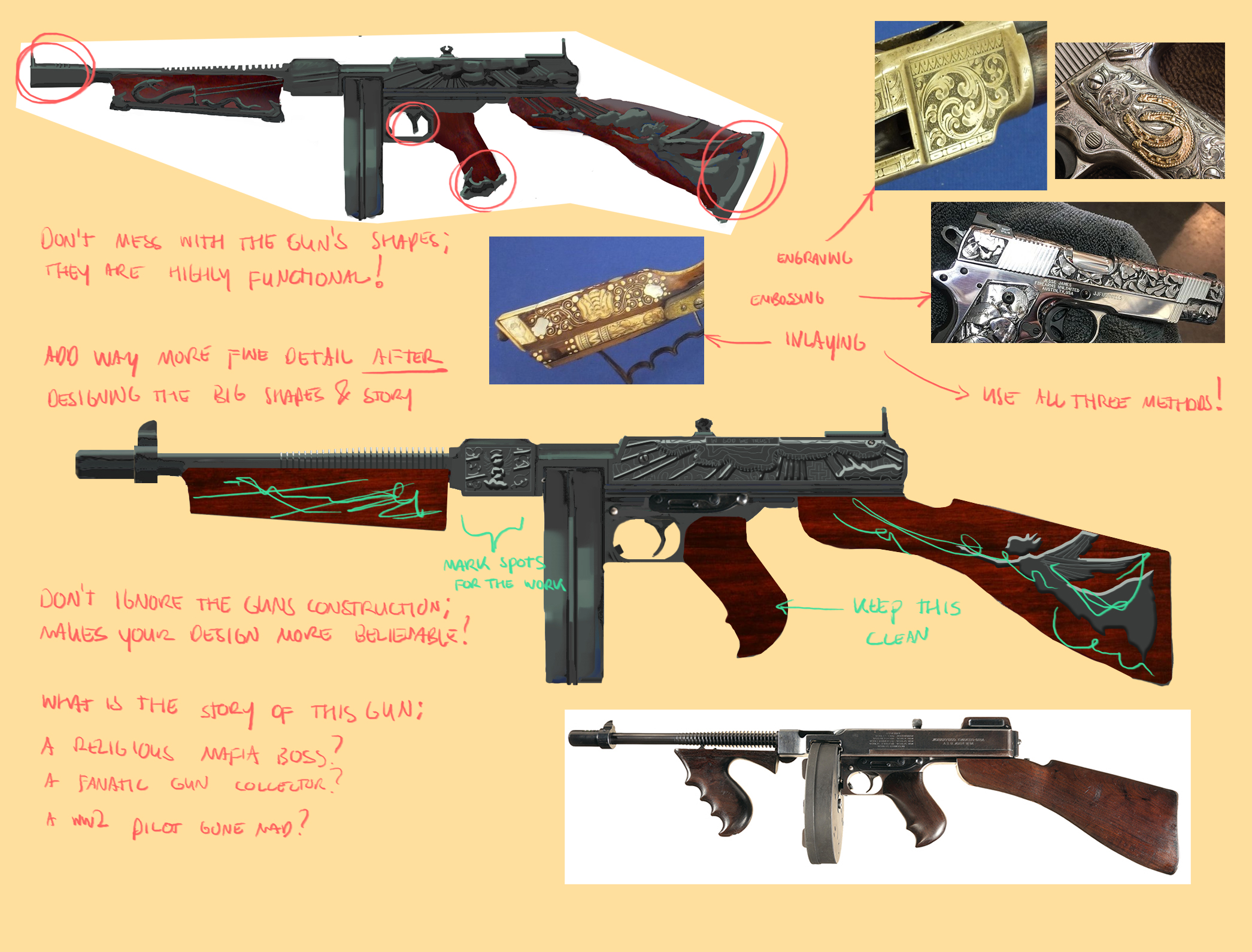
I did half a paintover to show you some of the thoughts I had going into it. I used my personal favorite concept design thinking: combine a (1) story with good (2) reference and (3) technical construction. In this case I imagined the Thompson to be (1) the property of some Italian mobster-boss who used this gun to save his life. He engraved it after, using a mix between (2) embossing, engraving, and inlaid work. But because it's a working gun (3) there are still screws in it, which the artist who engraved the gun had to work around.

I used a simple bevel and emboss in PS for the bigger shapes, don't do that yourself because it looks a little flat. But you could do it just to get the design going you know.
Hope it helps!
RE: need opinion about design - darktiste - 02-15-2021
gerbenpasjes
-I don't agree with the comment that say don't mess with the shape of the gun shape in the image.It misleading something can be highly functional but as to be thoughly reshaped.When something require it function to be clear as i keep hearing it function over rendering not necessarly in the meaning that function overide design but that the functionality need not to be lost to the viewer this mean you need to balance between a recognizable function and not to much detail that would dramatically change the understanding of what the viewer is seeing and decoding(shape)
Also never forget that something don't necessarly have to be functional it could totally be a musuem piece of somekinda that doesn't require the same level of functionality so context is important.Functionality is mainly about selling the idea that this object part move or change shape a certain way.If you design something from the future, functionality is not necessarly evident in that case. In this case take inspiration from object with similar functionality would be advised.
RE: need opinion about design - RonyaSekira - 02-15-2021
gerbenpasjes, darktiste really thank you for your comments and graphic note, it's very helpful!
I have to confess I have almost zero knowledge of guns, but I watched some vids about Tompson in order to understand what I can change without big threat to functionality. My main style inspiration was guns from Bloodborn.
I saw other participants works and many of them look absolutely bizzare and cartoonish, but very cool. As to my concept the plan was to make it look less modern, more like flintlock gun and ideally to retain functionality of Tompson.
I should have had stated all of this in post and ask opinion under these reference points but couldn't put my thougts together.

Gonna think more about current shapes
main ref for look ↓
RE: need opinion about design - darktiste - 02-15-2021
Well from my own reasearch there was nothing that could shot bullet quickly around that time so what was the common practice was to put a serie of barrel from which bullet could be fired improving the firing rate.I am not a mechanical guy so i am not really knowledgable when it come to inventing mechanism that look real.I admire your ambition to move toward functionality but it i have the impression you would need more research so i would suggest you instead focus on clarity and good design decision instead .I don't know what time frame is left so it to your advantage to decide if more study are necessary or if you should spend your energy problem solving the old design.
RE: need opinion about design - gerbenpasjes - 02-16-2021
Ah yes if you're going into a more fantastical setting instead of just "skinning" a gun, then you can go a bit wild. I imagined this was like a Call of Duty of CounterStrike gun skin, in which case you can't change the model (that much). Keep us posted :)