+- Crimson Daggers — Art forum (//crimsondaggers.com/forum)
+-- Forum: PERSONAL ARTWORK (//crimsondaggers.com/forum/forum-9.html)
+--- Forum: SEEKING CRITIQUE/PAINTOVERS (//crimsondaggers.com/forum/forum-36.html)
+--- Thread: Help mee! Crit/paintover (/thread-9341.html)
Help mee! Crit/paintover - _spec - 01-16-2022
Hey!
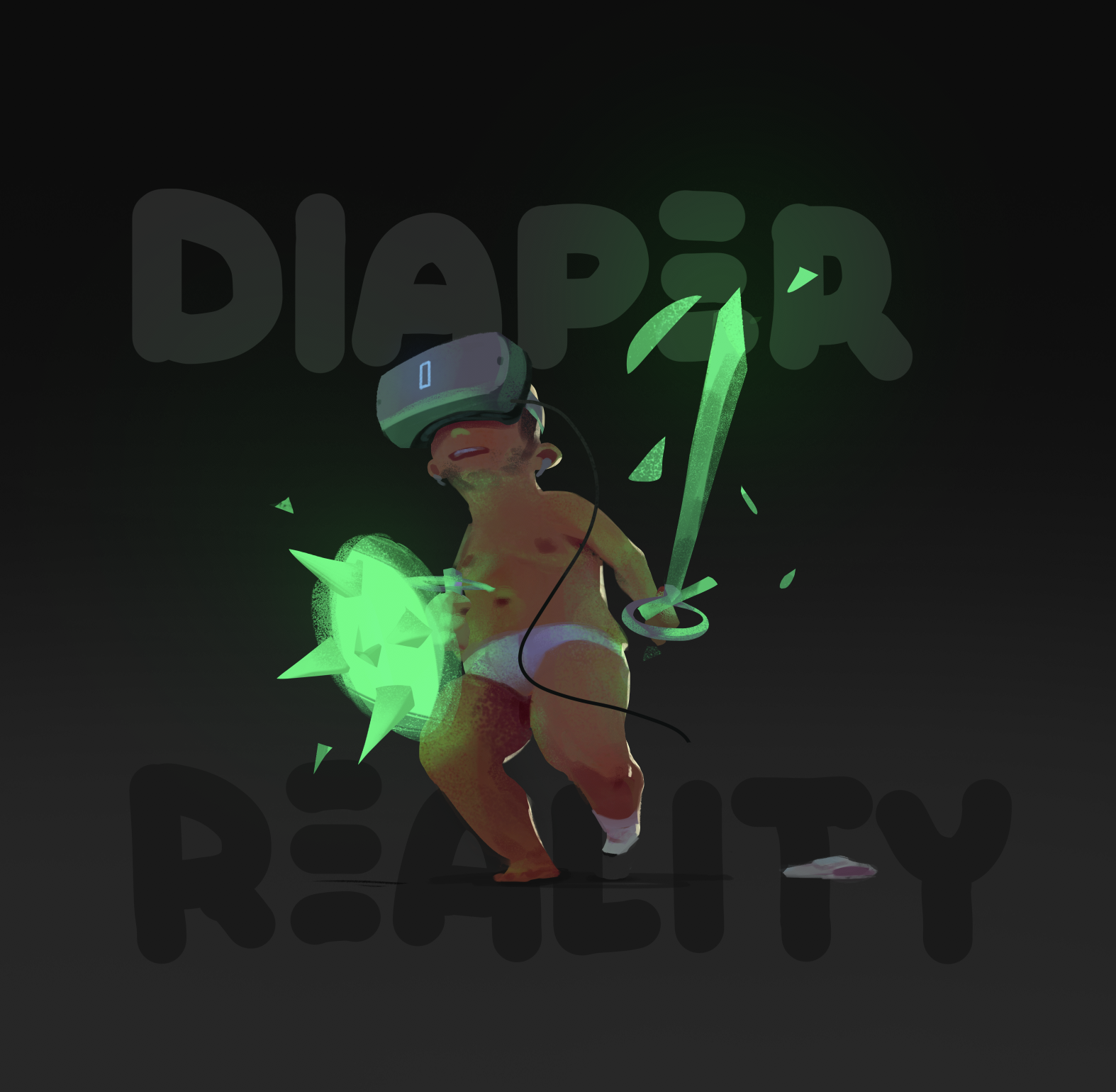
I painted this weird VR-themed character, but some things about it feel kinda off. I.e. the way the green light casts from the virtual sword+shield onto his skin- maybe some parts of his skin are too saturated?? idk. Could his pose be made more clear and easy to read?
Any anatomy tips would be super appreciated too... or really anything you might see that can make the image better/more effective! (maybe with exception of the type haha, just ignore that)
Thanks for looking y'all!

RE: Help mee! Crit/paintover - darktiste - 01-16-2022
I rarely ever see glowing shield but i could be wrong(maybe there a reason).To me the shield is just to bright and saturated also the spike lead the eye outward and that not a good thing because it the brightest and most saturated spot so naturally the eye goes there first.If the sword is self illuminating why is it less saturated toward the handle?The glow fade to abrutly i think a pretty large soft brush would be preferable. Also if the shield is self illuminating why are the spike outside the glow?
Why not make a wireless headset it nice to have the flow of the cable but it look unfinish like that.
I think the text should be over is head and not split in two but i don't like how it break the ground plane.
Overall the background suggest a dark environnement so the value don't really match this maybe that your issue.