
+- Crimson Daggers — Art forum (//crimsondaggers.com/forum)
+-- Forum: PERSONAL ARTWORK (//crimsondaggers.com/forum/forum-9.html)
+--- Forum: SKETCHBOOKS (//crimsondaggers.com/forum/forum-10.html)
+--- Thread: Lunatique's Sketchbook (/thread-9535.html)
Lunatique's Sketchbook - Lunatique - 11-21-2023
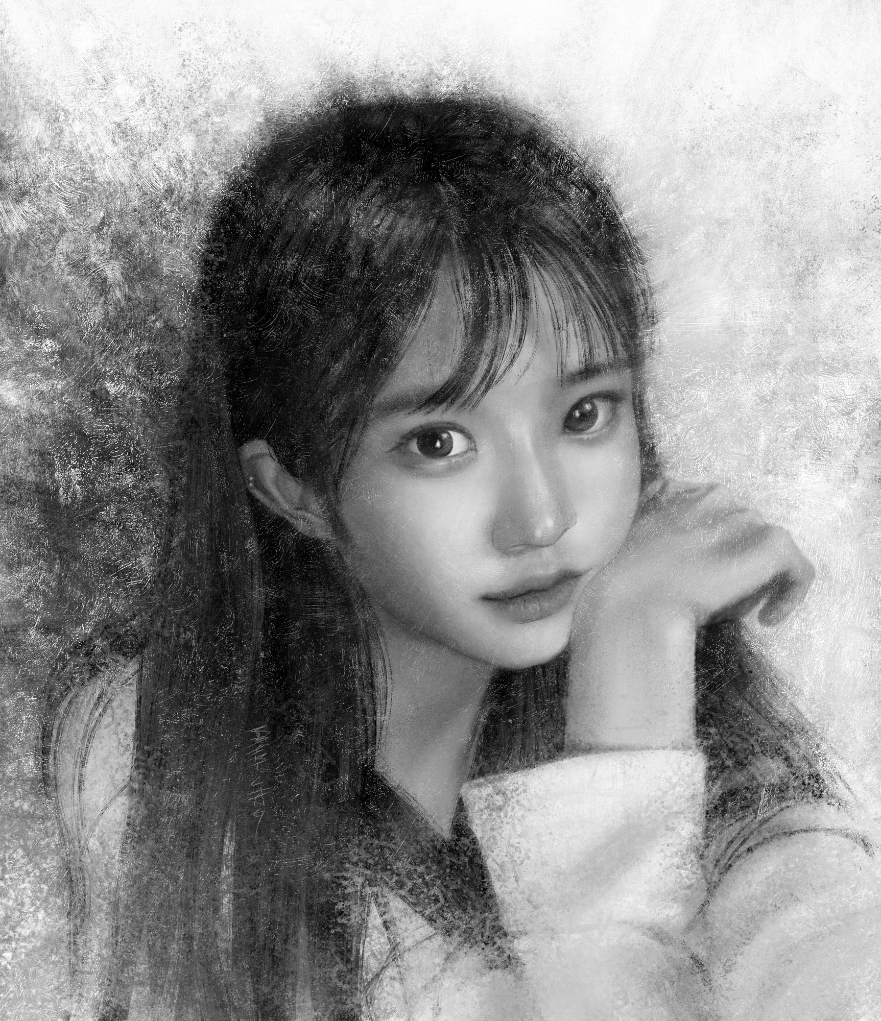
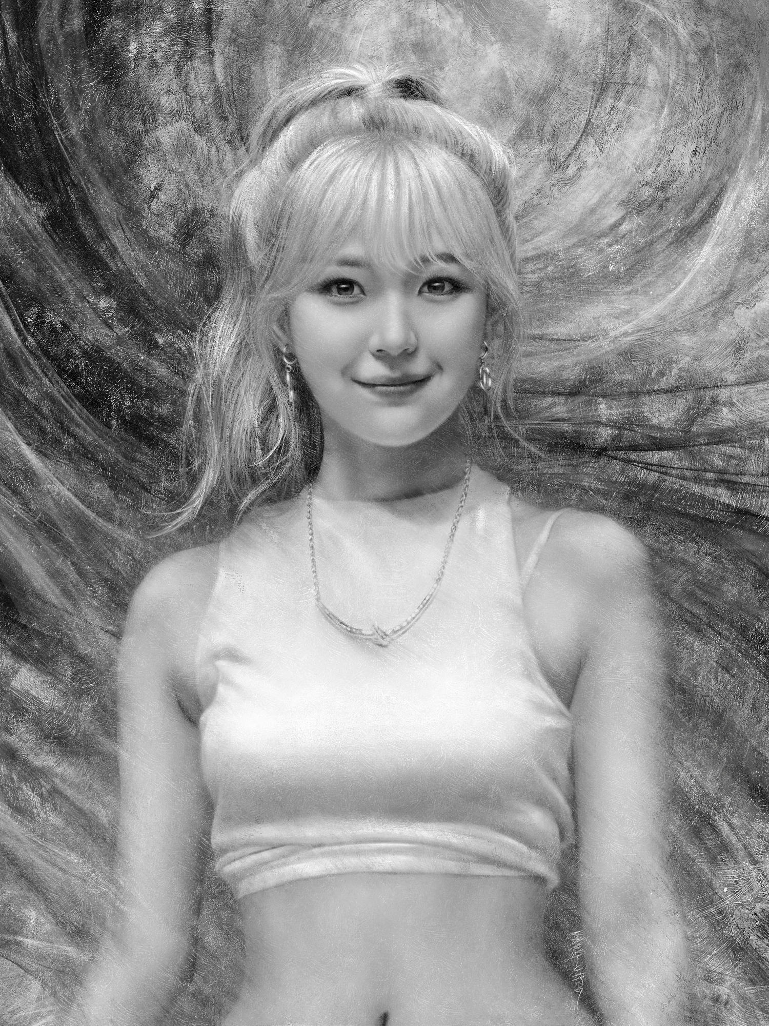
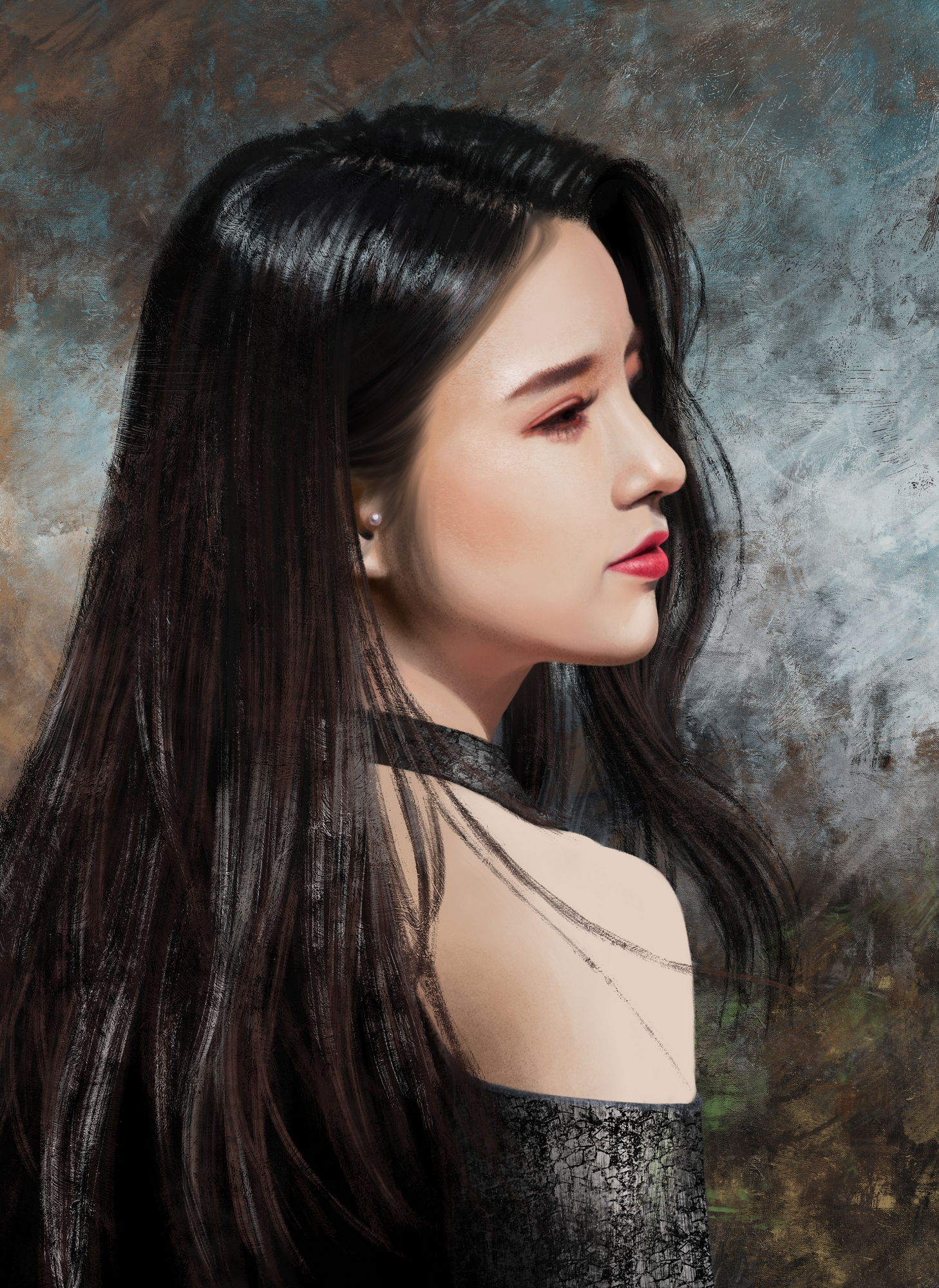
For the last few years I've been mainly doing portrait studies because that's what I enjoy the most. In the past decades (since 1991) when I worked in comic books, animation, video games, and illustration, I did a lot of stuff that's on the entertainment side like sci-fi, fantasy, horror, spanning from anime-influenced to comic book superherors to realism, but the older I get, the more I find myself preferring more classical subjects like portraits and landscapes. I've loved them even in my youth and spent equal amount of time admiring sci-fi/fantasy illustrators, comic book/animation artists, golden age illustrators, and 19th century painters. Also, I think because I spend so much time writing novels that I prefer to use my imagination with words than with images, because prose gives me more freedom than drawing and painting. Or maybe I just did so much imaginary stuff professionally that I just don't find them as interesting anymore. I do a lot of teaching these days and most students want to be concept artists, so I haven't left that side completely behind.
I'm not quite sure where to post for some of these, because the finished work forum seems to have very little traffic, while some people seem to post fniished work in their sketchbook thread too, and I like the idea of keeping everything in one place, so maybe I'll just post everything in here. I hope that's okay.
I'll start off posting a mixture of recent and older works.
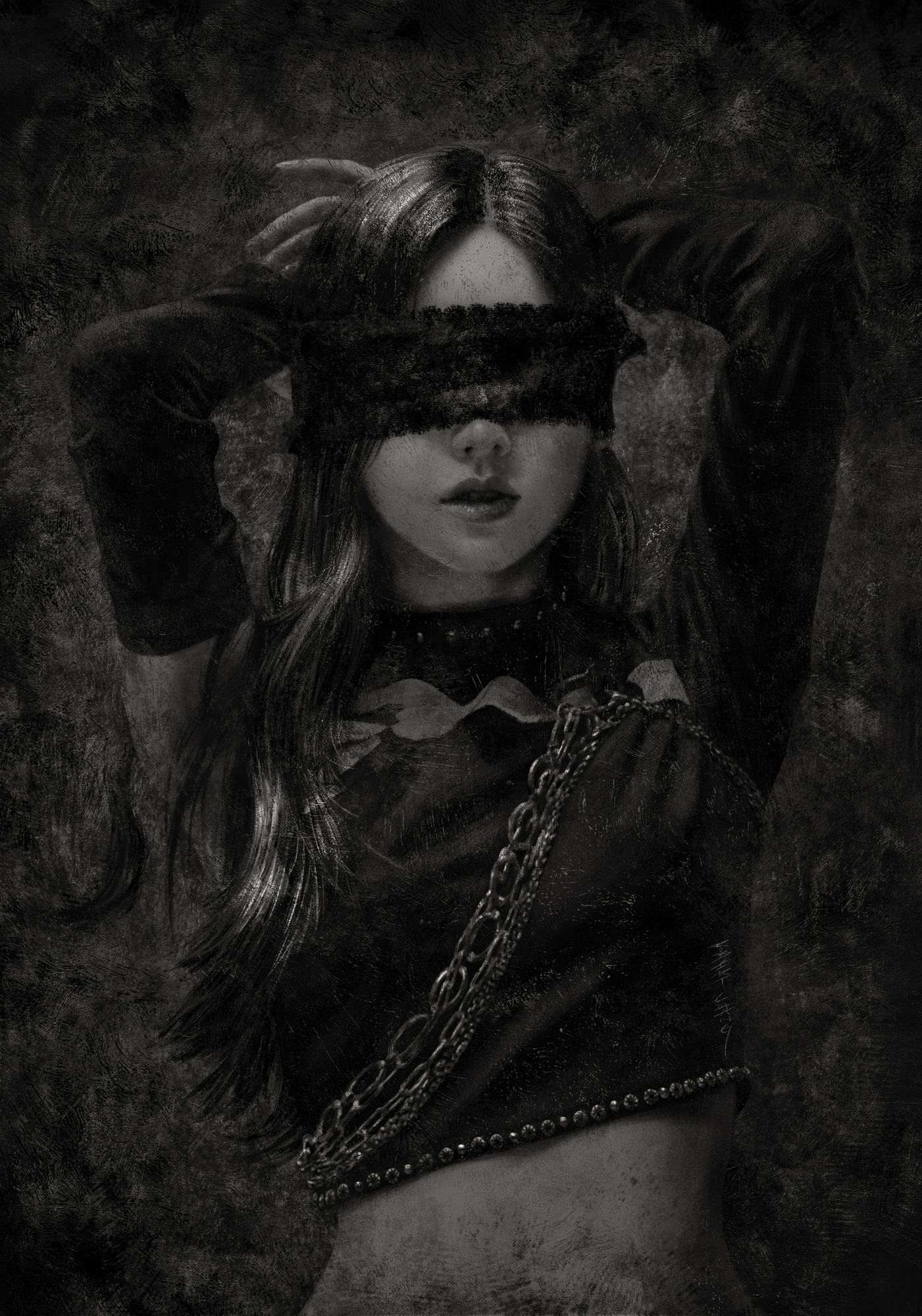
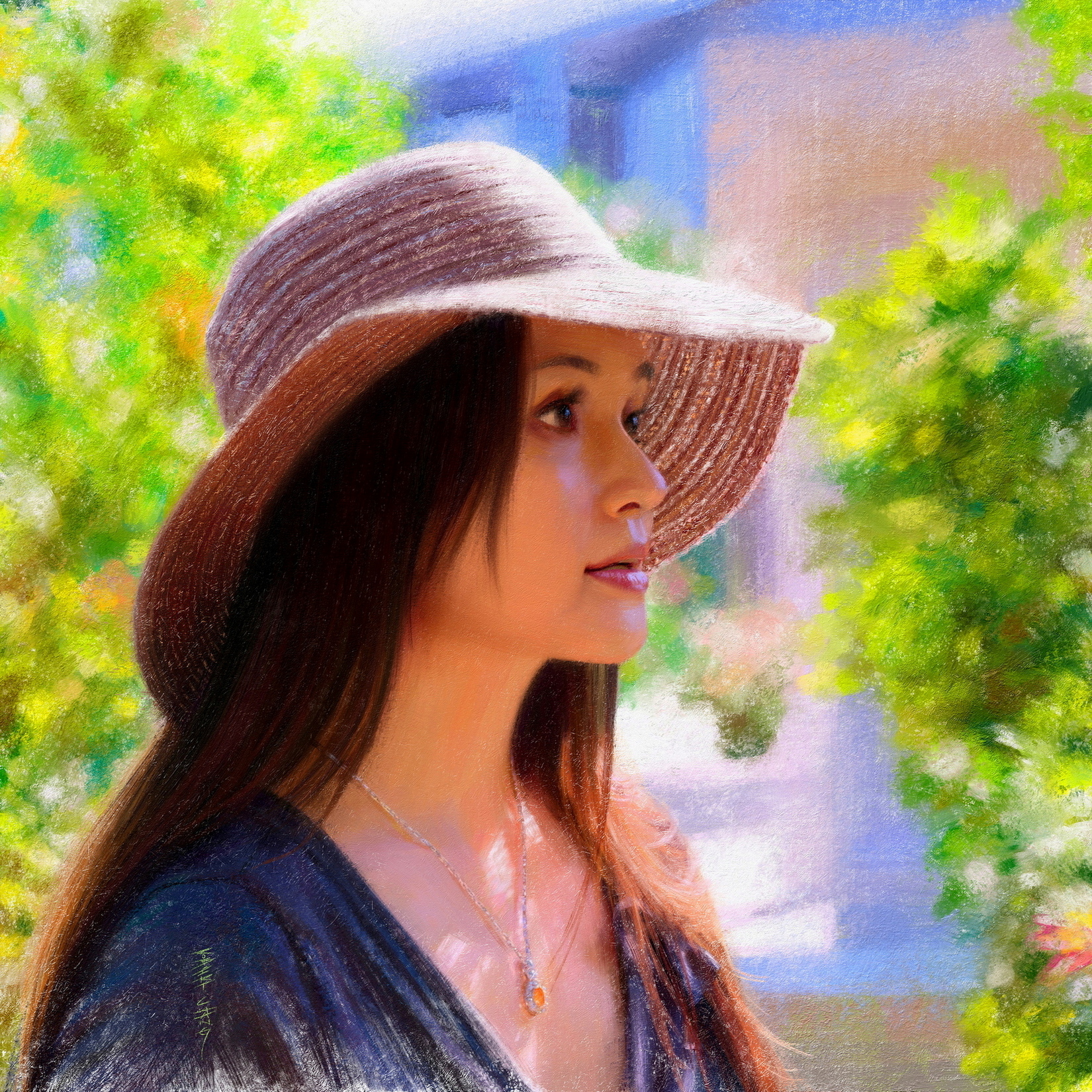

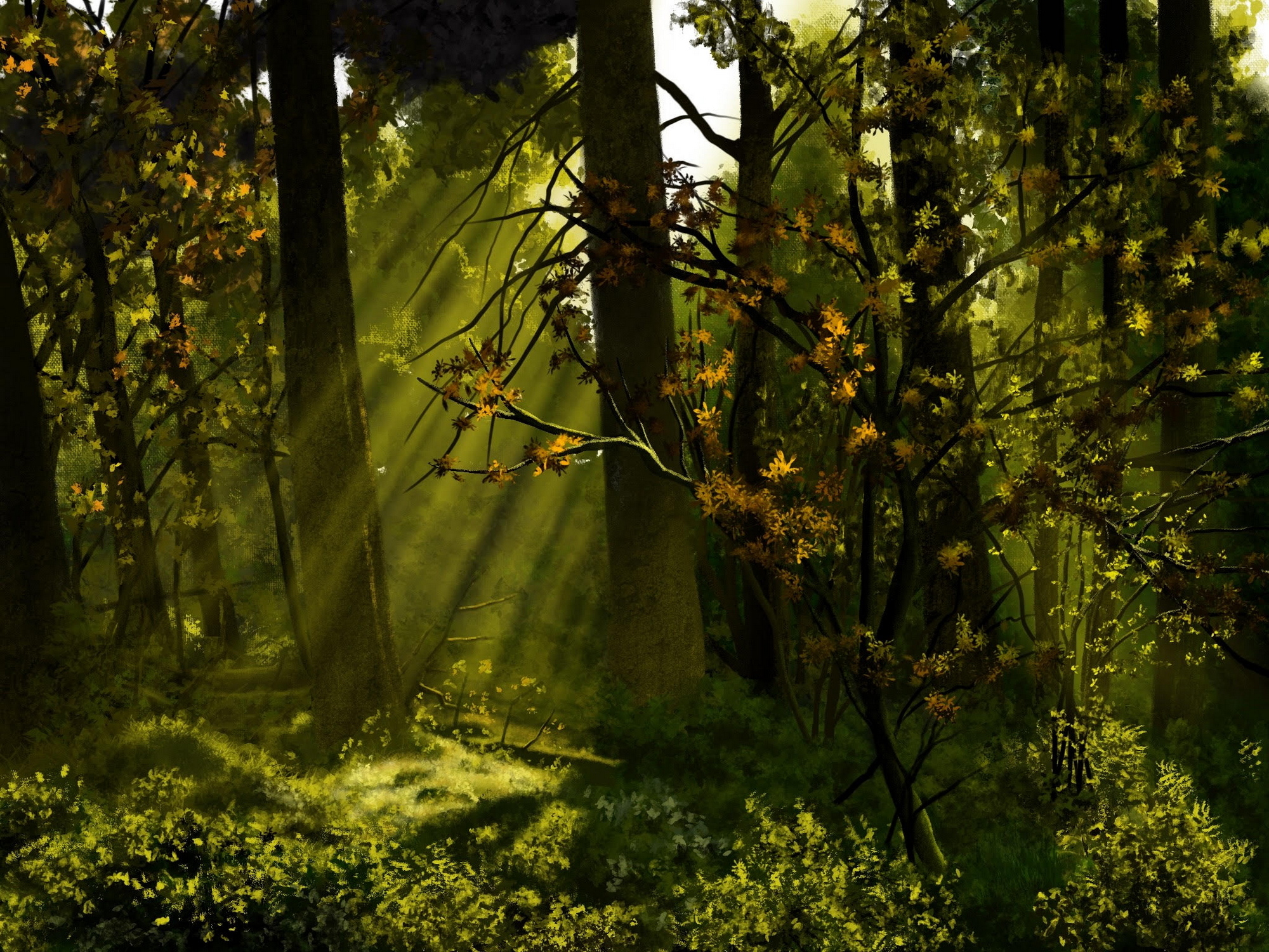
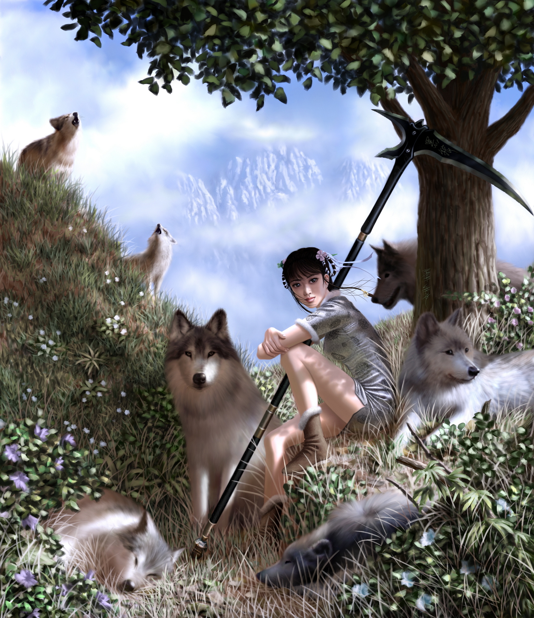
.jpg)
RE: Lunatique's Sketchbook - JosephCow - 11-22-2023
holy crap, the colors on the portraits are gorgeous! The brushwork and eges look so much like oil paint but I assume they are digital? Was second guessing it for a second on the two colored portraits.
Also yeah we are mostly posting all our stuff in our own sketchbooks and just offering suggestions or critique there instead of spreading things over the tons of threads. I kind of treat mine like a diary, I don't post a ton of actual sketches
RE: Lunatique's Sketchbook - one_two - 11-22-2023
The portraits look great, especially the first one. Nice gradations and edges.
RE: Lunatique's Sketchbook - Lunatique - 11-22-2023
Thanks! Yes, everything I posted was digital. The colored portraits were painted in Rebelle, which is my current favorite digital painting software for that realistic natural media look. I have tested and compared all the notable desktop and mobile digital drawing/painting software on the market and Rebelle is by far my favorite one, although for certain types of brushwork Photoshop still can't be beat--until Rebelle catches up in that area, which I think they soon will, especially with the upcoming version 7 (which I was invited to beta test recently, and have been working with them on the improvement of their brush engine since version 5). And hopefully they'll release a mobile version for iPad Pro soon, because I'm just not a fan of mobile art apps in general, with the exception of Artstudio Pro, but that basically has a similar brush engine as Photoshop so it can't do what Rebelle can do.
Funny thing is, I used to be all traditional analog and hated digital, back when I first encountered digital back in the mid to late 90s. I hated how clunky it felt to use a Wacom tablet (first generation) compared to real drawing and painting tools, and how sterile the digital brushes behaved and looked. But then Spooge (Craig Mullins) showed us how even the most basic hard-edged round brush can be used to paint compelling digital paintings that had the vibe of traditional painting, if you knew how to use it right. Then as digital art software evolved and became more advanced and the brush engines became capable to replicating the nuances of natural media, I started to favor digital for its flexibility and power and stopped using traditional analog altogether.
RE: Lunatique's Sketchbook - JosephCow - 11-22-2023
I read through your post comparing different painting programs. I think I will try Rebelle! I haven't spent much time trying to really emulate traditional strokes with digital, and when I started with digital I didn't really like how that looked, because like you mentioned in that post, a lot of like Corel Painter and PS brushes were kinda not it. A lot of kinda cheesy or tacky effects. plus those types of brushes lagged my computer big time lol. But now seeing how far it has come I think it makes sense.
RE: Lunatique's Sketchbook - Lunatique - 11-23-2023
There's a big sale going on right now so definitely jump on it. Normally it's $149.99 and now it's just $29.99. https://www.escapemotions.com/products/rebelle-7
The new metallic paint looks incredible, and I can't wait to paint with it.
RE: Lunatique's Sketchbook - Lunatique - 11-23-2023
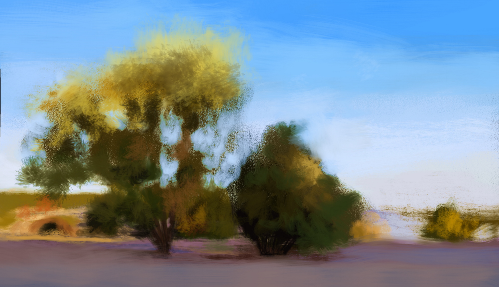
A couple of WIP I've been working on here and there. It's odd that as much as I love looking at landscape paintings, I don't seem to enjoy doing them nearly as much as portraits. I'm not sure exactly why that is. I think there's just something about a person capable of emotions and thoughts that appeals to me more?

@one_two Thanks! Those are the areas I pay a lot of attention to, and I'm glad you noticed. Here's an image showing the steps:
![[Image: IVIcjfq.jpg]](https://i.imgur.com/IVIcjfq.jpg)
Steps for a few others I posted:
![[Image: 1rsiWBH.jpg]](https://i.imgur.com/1rsiWBH.jpg)
![[Image: cXpnhwZ.jpg]](https://i.imgur.com/cXpnhwZ.jpg)
![[Image: IhXyxm6.jpg]](https://i.imgur.com/IhXyxm6.jpg)
![[Image: Dgw5S5Q.jpg]](https://i.imgur.com/Dgw5S5Q.jpg)
RE: Lunatique's Sketchbook - Leo Ki - 11-25-2023
Portraits never get old indeed - except maybe those from past centuries in which everybody looked impossibly stiff. I especially like your gray scale ones where you can play with contrasts more. Thank you for posting the steps.
I think that landscape and architecture can have some personality when capturing the general impression and omitting or suggesting the boring parts. I'm not sure how to express this, so I'll wait for the next steps of your WIPs to see if I can put that into words.
RE: Lunatique's Sketchbook - Lunatique - 11-25-2023
[quote pid="137521" dateline="1700875658"]
Portraits never get old indeed - except maybe those from past centuries in which everybody looked impossibly stiff. I especially like your gray scale ones where you can play with contrasts more. Thank you for posting the steps.
I think that landscape and architecture can have some personality when capturing the general impression and omitting or suggesting the boring parts. I'm not sure how to express this, so I'll wait for the next steps of your WIPs to see if I can put that into words.
[/quote]
What I struggle with is the overall design of the composition--not in the sense that's typical to what people think of like placement of shapes and arrangement of contrast, but more nuanced like where to have selective detail, where to get looser with the brushwork, how busy or abstract or contrasty to make the background, etc. I love impressionist-influenced realist painters like Sargent, Zorn, Schmid, etc., and all the digital painters who were also influenced by them like Craig Mullins and everyone else that came after him. I find my own sensibility when I don't reign in myself, tend to veer into over-rendering stuff, and that's because I grew up with illustrators like Boris Vallejo, Michael Whelan, Jim Burns, and old masters like Bouguereau. My taste changed as I got older, but those habits are extremely hard to shake.
I agree about landscapes and architecture, and when I look at the work of artists I love, those are the things I admire. When I paint them myself, I find I don't have the same amount of patience as I do for portraits. Maybe it's just that I paint almost exclusively portraits of attractive females, and in comparison, landscapes and architecture just can't compete for my lizard brain's attention.

RE: Lunatique's Sketchbook - darktiste - 11-25-2023
Comfort zone it get worst if you don't become aware of them but it could be worst you could be drawing many subject matter and never master any of them.So confort zone are double edge sword.They let us know what we might enjoy or have done repetitively and they also kinda make it hard to try new thing because we become generally become good overtime doing those thing and it can feel like a chore to try new thing but overtime you get less satisfaction doing the same thing over and over.
Comfort zone can end up becoming what we are know for so it not always for the worst.''Oh it that person that draw portrait with x,y,z influence yeah i really like that those are some of my favorite artist'' and she combine those influence with such a nice personal touch''
Beauty is in the eye of the beholder.
RE: Lunatique's Sketchbook - Lunatique - 11-26-2023
In my case, I think it's more about interest than comfort. Landscapes and architecture are actually easier for me than portraits, but I enjoy doing portraits more. Even in paintings where it's a full scene with both characters and background, I always enjoy painting the characters more. Back during my early years as a professional artist when I was working full-time in comics (from my late teens to mid-twenties), I felt the same way. Panels that required me to draw a bunch of buildings, cars, trees, street signs, furniture, etc., felt like a chore, but not when I was working on the characters.
I also discovered during that time period that I actually enjoyed writing the story more than illustrating it, and realized my main creative focus should be on writing/storytelling instead. The simplest way I can explain this is that I have never shed a tear or felt rage or despair or ecstatic joy when looking at or working on a drawing or painting, but I do all the time when I read or write. Tears would fall as I type an emotional scene, and that would never happen when I paint an emotional scene. Books, movies, TV shows, and video game cutscenes can make me feel things a single static image cannot. And I also find photojournalism to be a lot more resonant emotionally and intellectually than paintings because photos capture the most direct impact of reality.
I think that's the main reason I don't do visual storytelling in my paintings as much anymore like I used to. I spend my energy for storytelling on my writings, and with paintings, I focus on brushwork and visual design and imparting a certain aura.
One thing I do find that's unique with visual storytelling in a single image, is that it's very good at making the viewer curious, because often single image artworks excel at asking questions instead of answering them. The reason is because in order to answer the questions it asks, we need to see what happens next, and single image narratives are a split second frozen in time, so they cannot answer the questions unless the artist does a series of them (which is the root essence of comic books). Single image artworks that show the conclusion instead of asking the question have their own unique power, as they show the punchline without the setup, but compared to mediums that can set up the question and then answer it, it's inherently a bit less satisfying on a purely primal level.
RE: Lunatique's Sketchbook - Lunatique - 11-27-2023
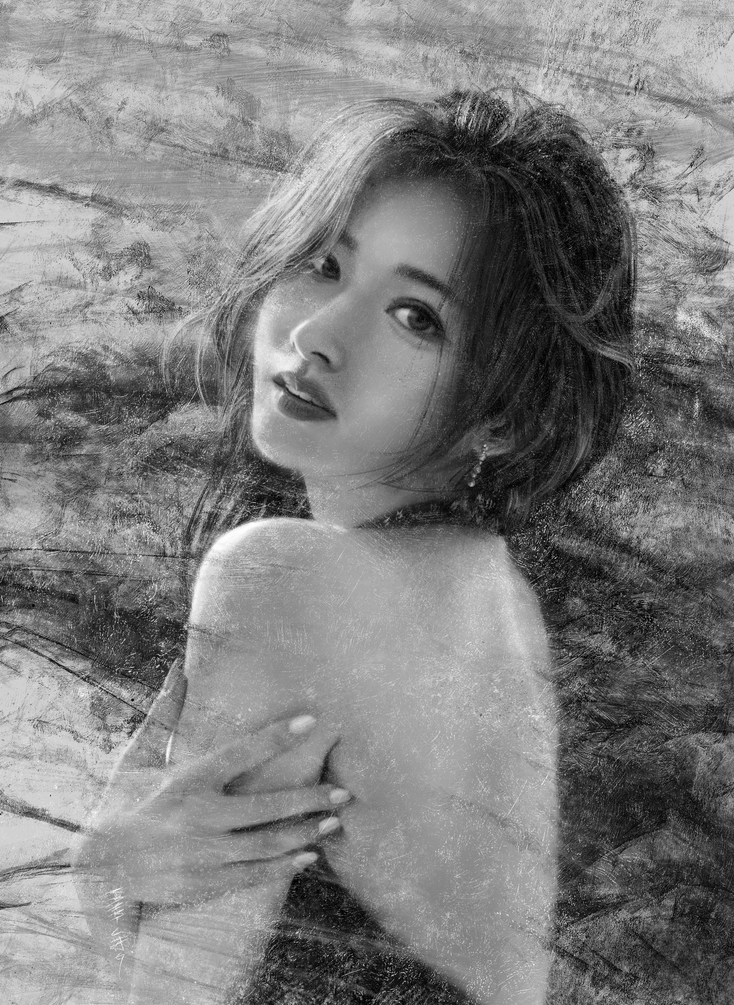
Some more newer and older artworks:
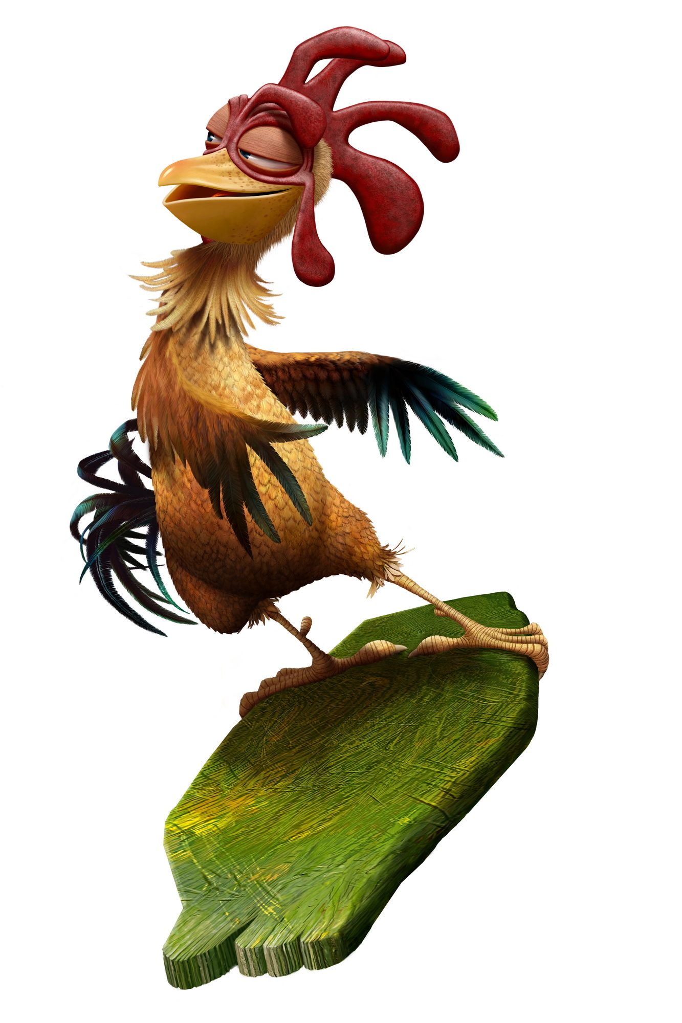

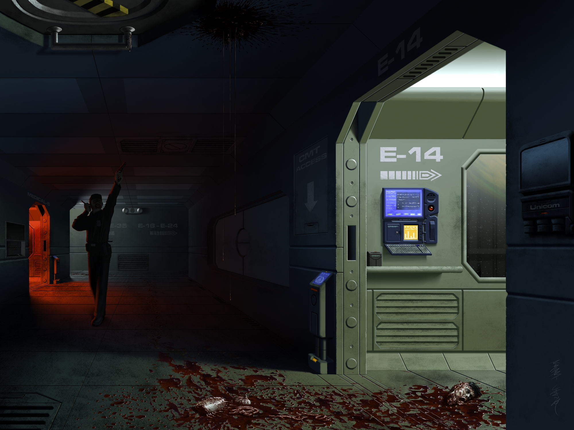
.jpg)
RE: Lunatique's Sketchbook - Lunatique - 11-27-2023
Made a few changes to this one just now, mainly to the archer, and adjusted the amount of fog for the lake monster a little.
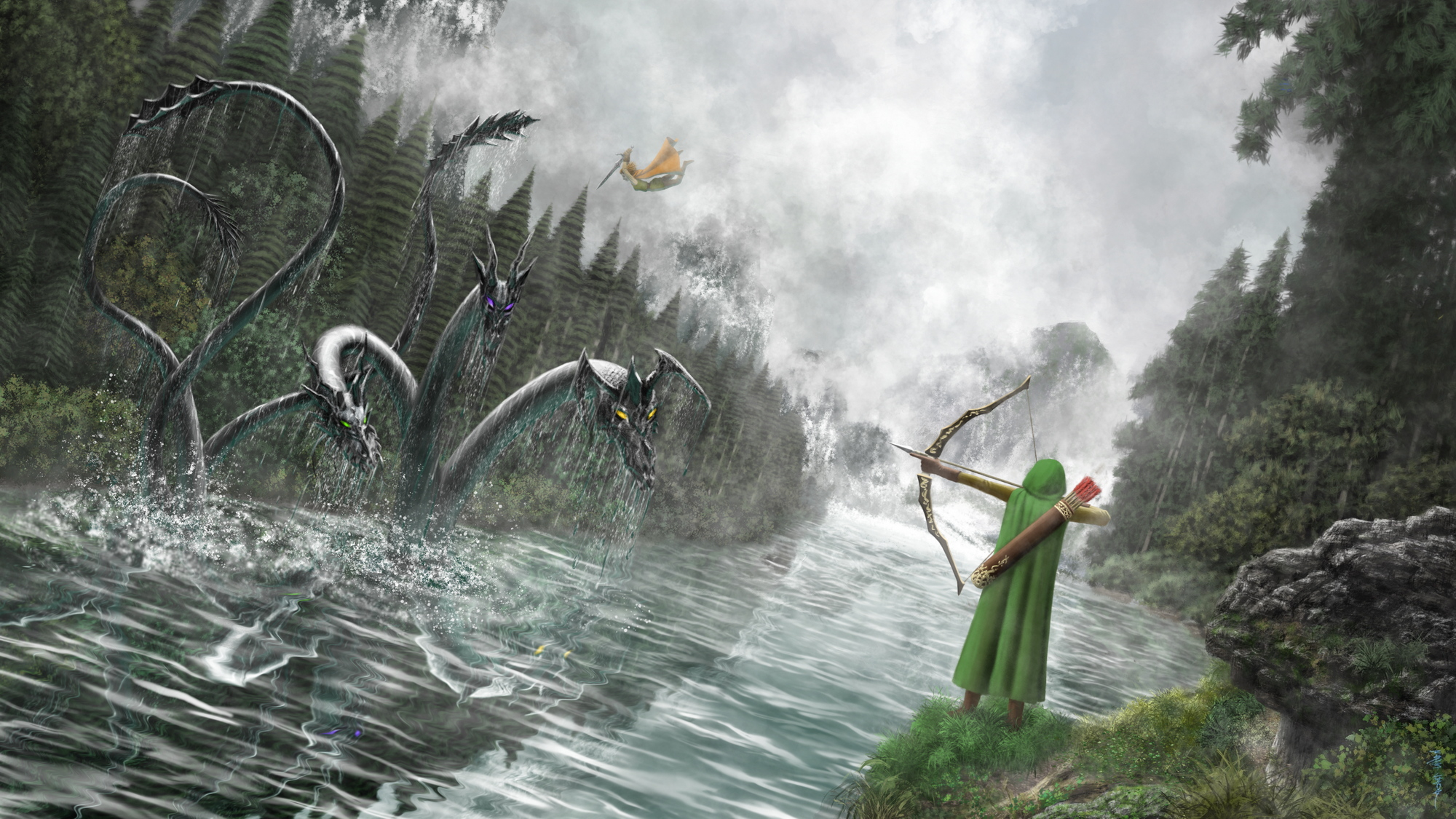
Here's the timelapse video of the painting process:
https://youtu.be/eCEkGRk_yOA?si=zUbK4nJK-iuikKf7
RE: Lunatique's Sketchbook - Leo Ki - 11-27-2023
I'll have some thoughts to share about lizard brains and narrative power when I get more time, but right now just a quick feedback on the archer: I don't feel the push of the quiver on the cape and the push of the quiver strap on the side.
RE: Lunatique's Sketchbook - Lunatique - 11-27-2023
Good point. The older version actually takes that into consideration a little more (although still not enough). I actually forgot about it when I was repainting some areas on the newer version. I'll do another fix.
RE: Lunatique's Sketchbook - darktiste - 11-28-2023
I personally feel like the archer position is off it not aiming at anything signicant useful.But i see that it that way for the narrative effect.
The archer silhouette is well define against the background which make him the focus right away which is great and it scale also help to establish that visual hierachy.
But i feel like the monster is to far away for that warrior to be diving this way(obviously i know nothing about is super power)you gotta assume people know nothing about the setting like is it a classical fantasy type of setting where human are simple human making heroic feat or is this the type of fantasy where everyone as a spell up is sleeve.Without some kind of visual effect that give us the idea that they have some kind of power up it hard to believe he or she could achieve that feat i am just gonna put it like that.
A bit of history if this an hydra as you might know weapon are pretty much useless against them as they grow more head the more you chop and they have pick the worst time possible to fight one because torch would be render useless by the weather.It just to let you know that the more you learn the better your story are because you can extract information to infuse your story.
For example if you knew that you would have change the weather and equip them with some kind of fire source.
The problem with setting certain parameter in a creature such as multiple head is that it can approch what i would call the myth valley which make any creature design that resemble the apparence of a certain creature become blur with the quality of that myth.For example it would be hard to make a one eye creature that also giantic and humanoid not be mistaken as a cyclop.It not to say that creature design should stay as far as possible from the myth valley but that i think good design ride at the edge of that valley it familiar enough and borrow from myth with a twist.
RE: Lunatique's Sketchbook - Lunatique - 11-28-2023
The painting was done as a live demonstration for students in class. We brainstormed the idea and they followed me every step as I painted while they worked on their own version, watching my progress as reference and guidance. I would answer whatever questions they had or elaborate on a difficult part, or explain the logic behind certain aspects like why the lighting behaves the way it does on that surface, and so on.
I don't think the term hydra was used--it was meant to be just some monster in a lake that the travelers came upon and battled. There's a bit of a backstory, since before that painting, we worked on a portrait of an elven archer, and this is basically extended his story with a fellow elf as a traveling companion. And being fantasy elves, they have super-human ability.
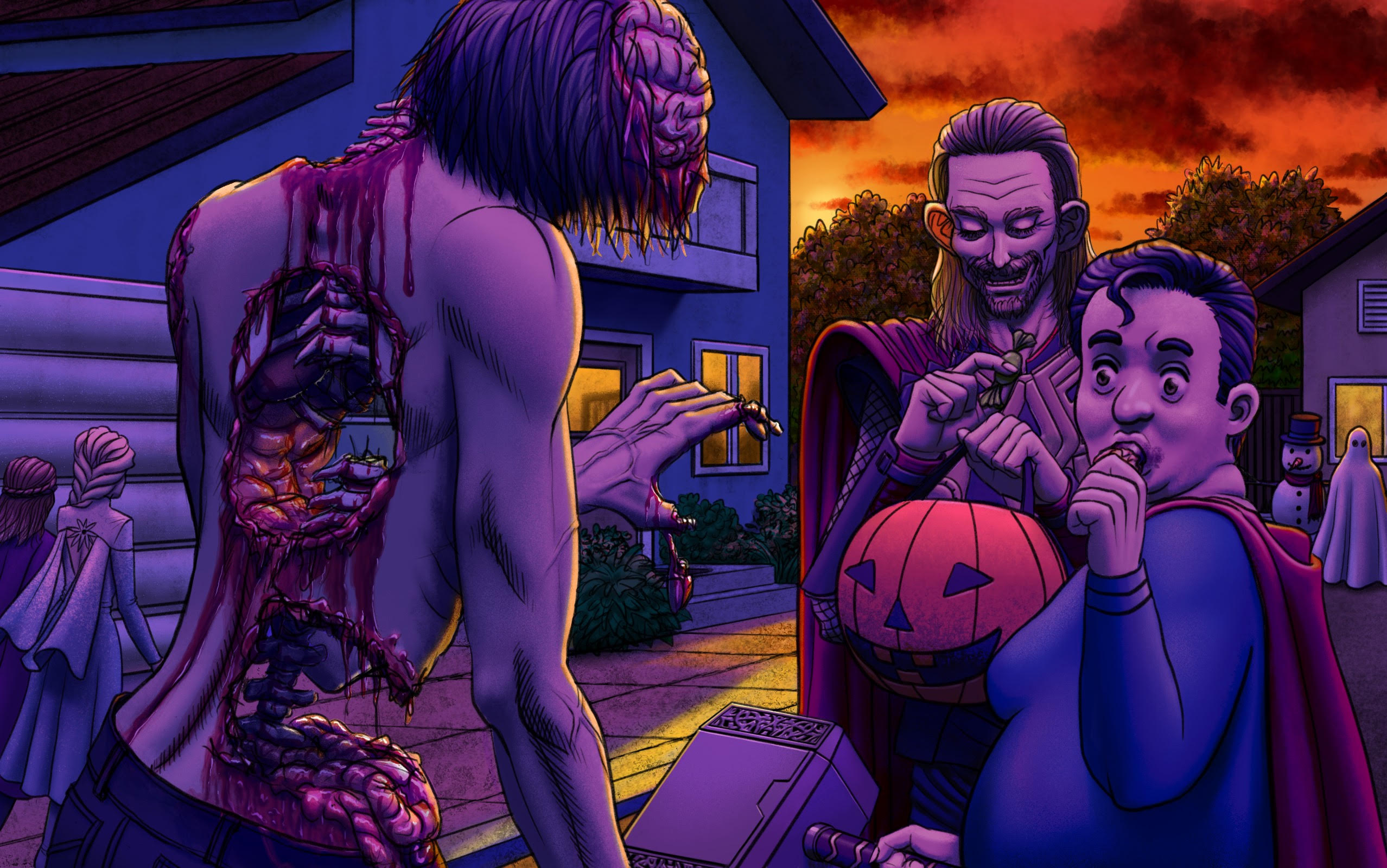
I very rarely share the stuff I do as demonstrations for students to the public, since they are usually meant to instruct or have a lot of student input for the idea and stylistic direction, and usually not something I'd have done for myself. In this case, it contains enough of a landscape and the narrative isn't too silly, so I decided to share it.
Here's an example of one of the past ideas we had done, and it's by far not the weirdest/silliest:
RE: Lunatique's Sketchbook - cgmythology - 11-30-2023
Huge fan of your work, you're actually one of the first digital artists I've been exposed to when I first began digital painting, was very inspired by the work you were producing back then. The portraits look stunning, the lighting is well captured and you have an excellent sense of color, very lively! Keep it up, and thanks for dropping by my sketchbook as well, you offered some great input there which I appreciate!
RE: Lunatique's Sketchbook - Lunatique - 11-30-2023
(11-30-2023, 01:52 AM)cgmythology Wrote: Huge fan of your work, you're actually one of the first digital artists I've been exposed to when I first began digital painting, was very inspired by the work you were producing back then. The portraits look stunning, the lighting is well captured and you have an excellent sense of color, very lively! Keep it up, and thanks for dropping by my sketchbook as well, you offered some great input there which I appreciate!
Thanks! I thought your style looked familiar. I wasn't sure if it was you but your links in your profile confirmed it. I see your posts on FB now and then, and it's good to see you're still working hard at it.
RE: Lunatique's Sketchbook - Lunatique - 12-01-2023
Some more old and new works



.jpg)