
+- Crimson Daggers — Art forum (//crimsondaggers.com/forum)
+-- Forum: PERSONAL ARTWORK (//crimsondaggers.com/forum/forum-9.html)
+--- Forum: SKETCHBOOKS (//crimsondaggers.com/forum/forum-10.html)
+--- Thread: Legend's Sketchbook_001 (/thread-9561.html)
Legend's Sketchbook_001 - Lege1 - 01-17-2024
After almost forgetting that sketchbooks were a huge part of a site like this and being inspired by all the other great visual artists here, I have decided to go ahead and start a sketch book for myself to observe, get critiqued, and ultimately improve my work. This is exciting!


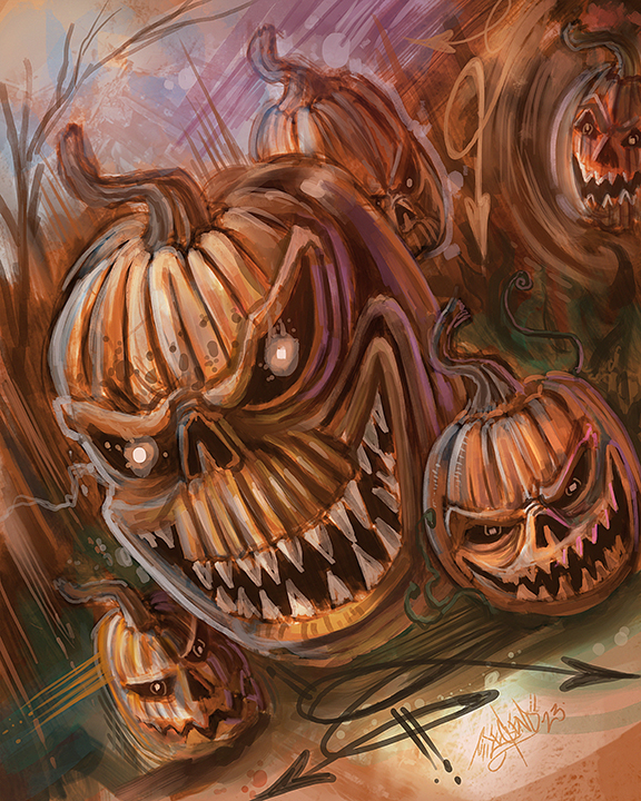


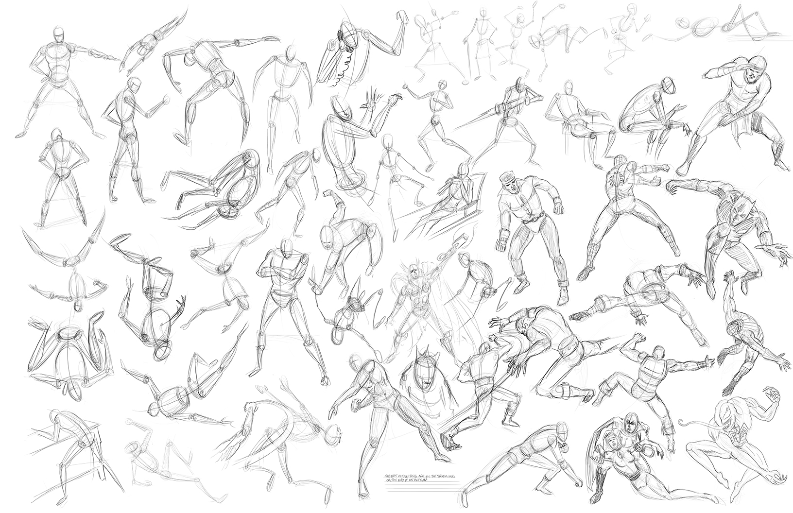


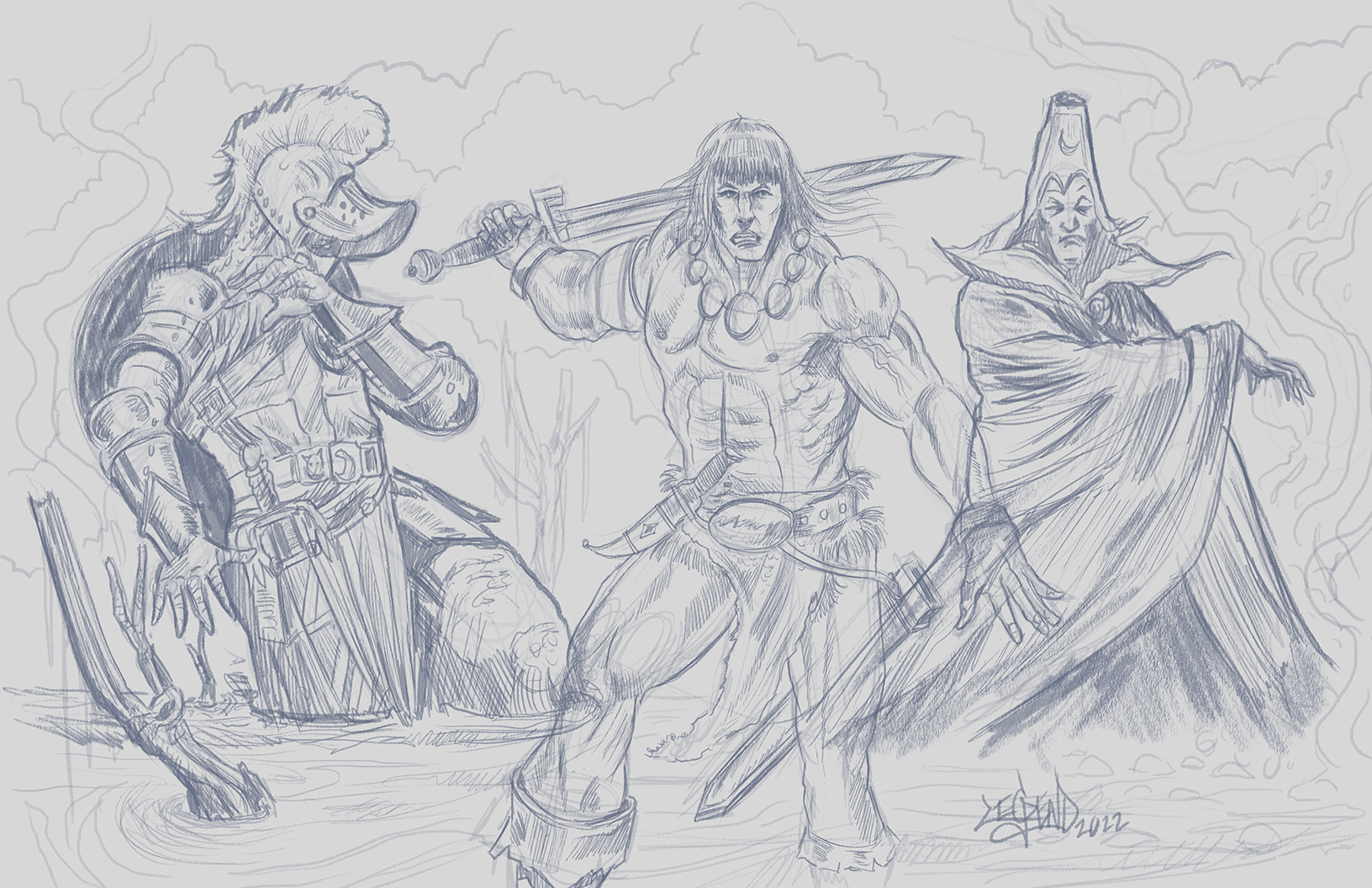
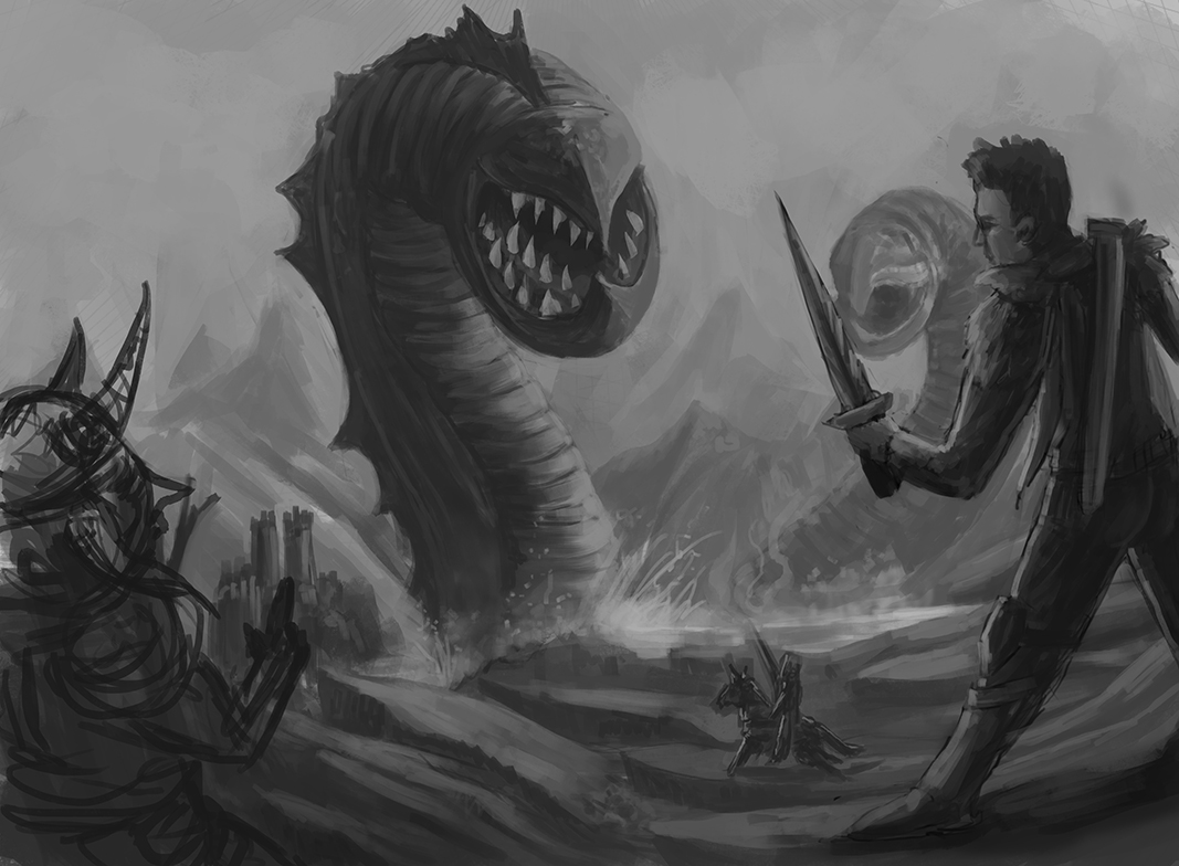

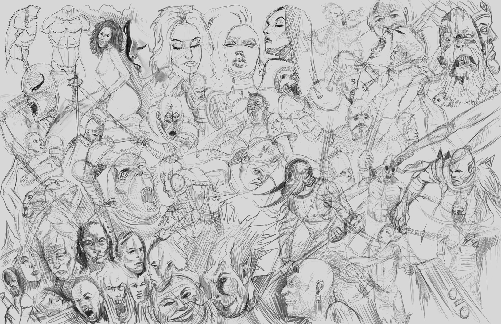


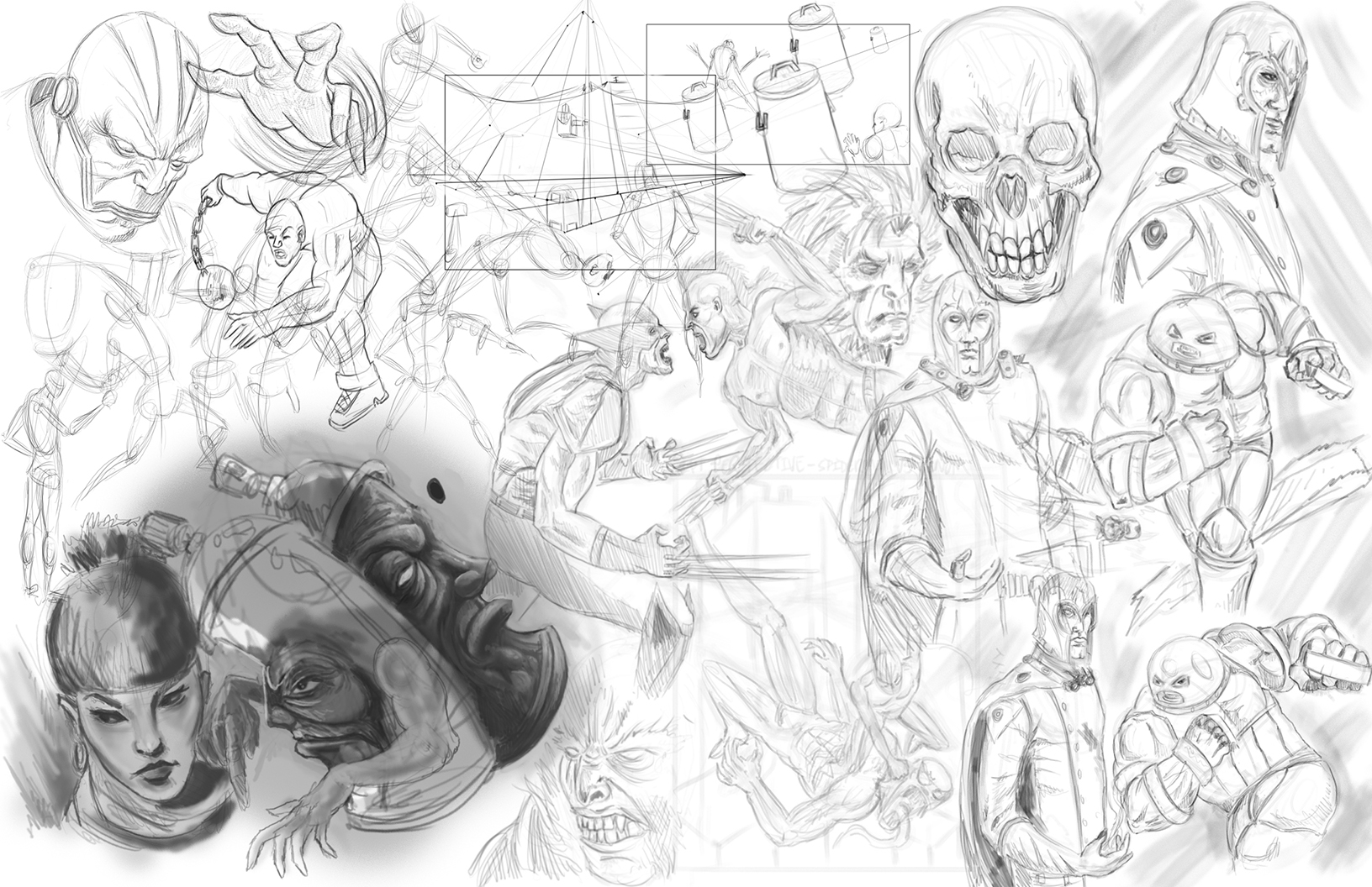

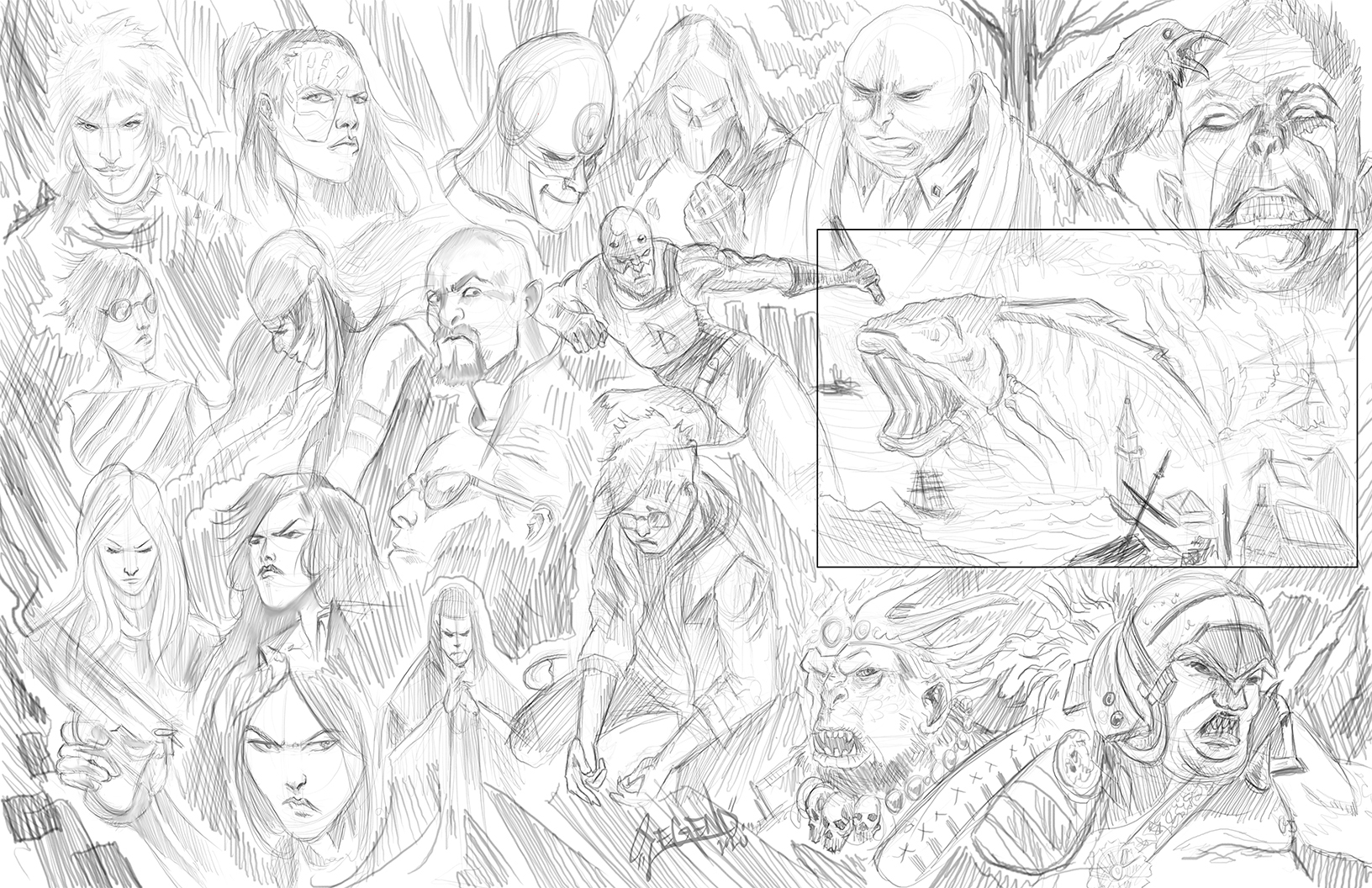


RE: Legend's Sketchbook_001 - darktiste - 01-17-2024
Good to see you on your own path.It an other format then to be always waiting for the next community challenge.
I see you are taking alot of your fundamental from how to draw superhero by stan lee.Have you already been familiarize with the work of loomis? He goes a bit more in depth with dealing with the human anatomy and perspective.
RE: Legend's Sketchbook_001 - Lege1 - 01-17-2024
Darktiste thank you my friend on the good words and yes, I stay very busy behind the scenes. I love the community challenge but I definitely don't hold my breath for them, lol. Yes I like the Stan Lee fundamentals and do have Loomis studies in the works. Loomis is fantastic, especially for using a more formulaic approach to head angles. I'm a big fan of Christopher Harts Comic anatomy books, George Bridgeman, and Burne Hogarth.
RE: Legend's Sketchbook_001 - FallowGround - 01-17-2024
Awesome to see such a large volume of studies. Really lights a fire under the ass to do more lol.
Your stuff really reminds me of old school concept art from the early 2000s. I'm thinking Blizzard or newgrounds-adjacent stylisation. It's really neat! I feel like it's kinda hard to find that today online, unless someone is purposfully trying to recreate it, like this resurgence of early deviantart sparkle-creature art. It's really soulful.
If you're looking to get feedback with your figures/practice sketches I'd be a bit neater with how you set up the pages. With the space-filling hatches it's hard to actually focus on your draftsmanship, and the art gets harder to read. It's definitely cool to see a filled page, but it can be useful to you as well to be able to tell what the drawing is about at a first glance when you're reviewing your own work later. That way every single drawing also 'matters' a bit more, since it's not just space filler, but a more deliberate study.
RE: Legend's Sketchbook_001 - darktiste - 01-18-2024
Filling space is great for compositional awareness and playing with overlap to create a sense of depth that would otherwise require more perspective plotting. One exercise to practice 4 fundamental at once is to draw a cityscape it practice spacial awareness(how object occupy space),composition(how object are arrange in a pleasing way),perspective(how those objet are represented) and finally overlap (How those object flow into one or an other)
Those fill page remind me of mural like poster but to create to direct the eye and help thing look a bit more natural there empty space to create contrast between the area of interest and where the eye rest.
It already pretty apparent that you have that comic influence and it not surprising knowing how influential comic was in the last 50 years but specially if you were a kid growing up reading or watching them.
With hatching i am not an expert but i would say the trick would be to a master of understand light and shadow and to use the directionality of the hatching to achieve flow in the piece. Obviously that apply to if you to have unity and it not just random accident being put onto a page.
I am talking about those page you did in such a mural way because of your graffiti background.Would it not be amazing to have one of those picture on a wall?How cool is that?
I also know that it natural for graffiti artist to draw over other people work so i am not surpris to see that your drawing sometime seem to come from different universe which create those different perspective point.
RE: Legend's Sketchbook_001 - JosephCow - 01-18-2024
Nice! Glad to see you made a sketchbook! You have so many sketches, the little pose/mannikin studies are looking good
RE: Legend's Sketchbook_001 - Lege1 - 01-18-2024
(01-17-2024, 06:43 PM)FallowGround Wrote: Awesome to see such a large volume of studies. Really lights a fire under the ass to do more lol.
Your stuff really reminds me of old school concept art from the early 2000s. I'm thinking Blizzard or newgrounds-adjacent stylisation. It's really neat! I feel like it's kinda hard to find that today online, unless someone is purposfully trying to recreate it, like this resurgence of early deviantart sparkle-creature art. It's really soulful.
If you're looking to get feedback with your figures/practice sketches I'd be a bit neater with how you set up the pages. With the space-filling hatches it's hard to actually focus on your draftsmanship, and the art gets harder to read. It's definitely cool to see a filled page, but it can be useful to you as well to be able to tell what the drawing is about at a first glance when you're reviewing your own work later. That way every single drawing also 'matters' a bit more, since it's not just space filler, but a more deliberate study.
Thank you so much for the compliments and critique. I just do what I do, and your recommendation about the full pages make sense. I tend to work very chaotic, most likely a reflection of my over creative mind and thoughts. I'm definitely considering your advice and thank you so much man!
RE: Legend's Sketchbook_001 - Lege1 - 01-18-2024
(01-18-2024, 02:50 AM)darktiste Wrote: Filling space is great for compositional awareness and playing with overlap to create a sense of depth that would otherwise require more perspective plotting. One exercise to practice 4 fundamental at once is to draw a cityscape it practice spacial awareness(how object occupy space),composition(how object are arrange in a pleasing way),perspective(how those objet are represented) and finally overlap (How those object flow into one or an other)
Those fill page remind me of mural like poster but to create to direct the eye and help thing look a bit more natural there empty space to create contrast between the area of interest and where the eye rest.
It already pretty apparent that you have that comic influence and it not surprising knowing how influential comic was in the last 50 years but specially if you were a kid growing up reading or watching them.
With hatching i am not an expert but i would say the trick would be to a master of understand light and shadow and to use the directionality of the hatching to achieve flow in the piece. Obviously that apply to if you to have unity and it not just random accident being put onto a page.
I am talking about those page you did in such a mural way because of your graffiti background.Would it not be amazing to have one of those picture on a wall?How cool is that?
I also know that it natural for graffiti artist to draw over other people work so i am not surpris to see that your drawing sometime seem to come from different universe which create those different perspective point.
Thank you so much Darktiste and everything you said there makes much sense, FallowGround mentioned the clustered full pages not being the best for visual readability so I will make some changes in future posts. I appreciate the good words and glad you can understand me better as an artist, my background, and why I do certain things. I was influenced heavily by comics as a kid and have friends that are well known artists in the industry, so the influence has been strong. I would consider myself a reject of the visual arts because instead of focusing on one topic or subject matter I have become a tornado of many different influences and mediums. That is an awesome picture you posted there, definitely very inspiring and always cool to see that 90's style of comics with the line art. Thank you again on the compliments, mentions, and critiques.
RE: Legend's Sketchbook_001 - Lege1 - 01-18-2024
(01-18-2024, 07:17 AM)JosephCow Wrote: Nice! Glad to see you made a sketchbook! You have so many sketches, the little pose/mannikin studies are looking good
Thank you so very much JosephCow, your sketch book was a big part of me doing this, so thank you for being an inspiration and motivation for me.
RE: Legend's Sketchbook_001 - darktiste - 01-18-2024
When i was saying from different universe i was referring to the perspective of the character not the subject matter.
Anyways the concept of multiverse and cross over as become more and more of a thing lately... specially in video game a good example of that is mortal kombat. So nothing bad about liking different influence...
Also you can totally fill space with drawing but it require a bit of thought.Look at how he use the hatching here does it move your eye?I think it does.Look careful even the shading doesn't make sense but he still get away with it...
Here a example and let no one discourage you that this look dope.Sure it not everyone cup of tea.
RE: Legend's Sketchbook_001 - Lege1 - 01-18-2024
(01-18-2024, 02:21 PM)darktiste Wrote: When i was saying from different universe i was referring to the perspective of the character not the subject matter.
Anyways the concept of multiverse and cross over as become more and more of a thing lately... specially in video game a good example of that is mortal kombat. So nothing bad about liking different influence...
Also you can totally fill space with drawing but it require a bit of thought.Look at how he use the hatching here does it move your eye?I think it does.Look careful even the shading doesn't make sense but he still get away with it...
Here a example and let no one discourage you that this look dope.Sure it not everyone cup of tea.
Ah ha, very good, yes that is very nice how that piece is rendered. This reminds me of solid shading vector illustration and probably is, I see the west coast artist OG Abel doing a lot of cool stuff with shading like this. I do understand what you say about liking many different things and I'm glad this works. I'm still trying to make my diverse interests work in my favor from a business end of things, I feel like I'm getting closer each day. Thanks for that image share and I love that they got the Santa Cruz Screaming Hand in there, I used to skateboard and that was one of the boards I always wanted as a kid but never got, I did end up with a really awesome xenomorph though by Danny Way back in the early 90's. Early 90's skateboard deck art was a big influence on me also, I used to love looking at all the deck designs in the deck catalog of the Trasher magazines..

RE: Legend's Sketchbook_001 - Lege1 - 01-19-2024
A fun graffiti-esque inspired sketch page....This pages are not to be taken too seriously; I'm just having a good time, studying what interests me, and enjoying the journey. I will get some hardcore anatomy and portrait studies going soon...

RE: Legend's Sketchbook_001 - ballpoint - 01-20-2024
Impressive studies! I the chaos and and fullness of it. Kinda miss doing that. But I agree from above, giving some space eventually will lend itself to better readability.
RE: Legend's Sketchbook_001 - CBinnsIllustration - 01-20-2024
Great start to the sketchbook dude! So much cool stuff in here already, you have been busy! I gotta say I love your graffiti inspired work, it really sets you apart and gives it a unique look. The studies are really cool to see too. Is it something you are looking to incorporate into your work to get more anatomically accurate? I find It’s a fine balance between accuracy and stylized, too much either way and you can lose your uniqueness or run the risk of creating work that you’re not happy with. I look at studies as a way to gather a understanding of form and structure that I can use in my own style, it may not always suit some folks and you will always get the cliche critiques of “ you need to study more anatomy…” but that’s ok, as long as your loving what you’re doing. And I can tell you are enjoying yourself. Keep it up dude, looking forward to more!
RE: Legend's Sketchbook_001 - Lege1 - 01-21-2024
@ballpoint Thank you so much on the kind words towards my studies. Yes it can be nice to see things spread out and sometimes I just like cramming everything together. I'm being more conscience of that.
@CBinnsIllustration Thanks so much man and some of the work is new and some old, but yes, I have been keeping myself pretty busy. I'm glad you like the graffiti style work, most people in general don't, but it's something I have always been passionate about. I just like doing studies to improve in every way possible and keep my hand sharp. I feel like most creatives in the respect that if you don't use it you'll lose it, so it's good to always stay doing something and most importantly learning, and enjoying the journey.
You're doing it right with learning and incorporating understanding of anatomy through your own filter; Frazetta did this, people gave him shit, and he's still Frazetta; same with many of the other artists. I think it's good to consider people's advice but to always just take it as an opinion cause it can be more damaging to you as an artist and your journey to follow what people say than if you did your own thing and figured things out in your own way; after all, that is what will make you stand out from all the other millions of artists out there already. Some of the greatest artists were criticized for doing things their way, or un-conventionally, against academic protocol, and procedures, etc...
We can never please everyone, and it will never be good enough in general, just like there is no best artist, just ones that are exceptionally good at certain subject matter, or niches. I always look back at my younger self and that quickly reminds me why I do what I do. I have always enjoyed making images since I was a kid, and nothing changed as I aged here in life. The world tried to beat, kidnap, and ultimately take that inner child away from me, but I have always conveniently rebelled and have always followed my heart in doing my own thing. If I'm not enjoying anything in my life, I'm going to make it a point in my life to try and make it enjoyable or abandon ship and seek, or find something else I can enjoy.Life is too short to be miserable, it really is, and me just doing my art has always been there for me regardless of whatever other shit storms were occuring in my life, my art makes me happy. My art gives me my prime meaning and purpose in life where otherwise I don't have much of a purpose here aside from showing love and trying to treat the world and people kindly. I just keep on doing my best each and every day, and staying in my lane and just enjoying the journey. Thanks for the kind and encouraging words bro 100

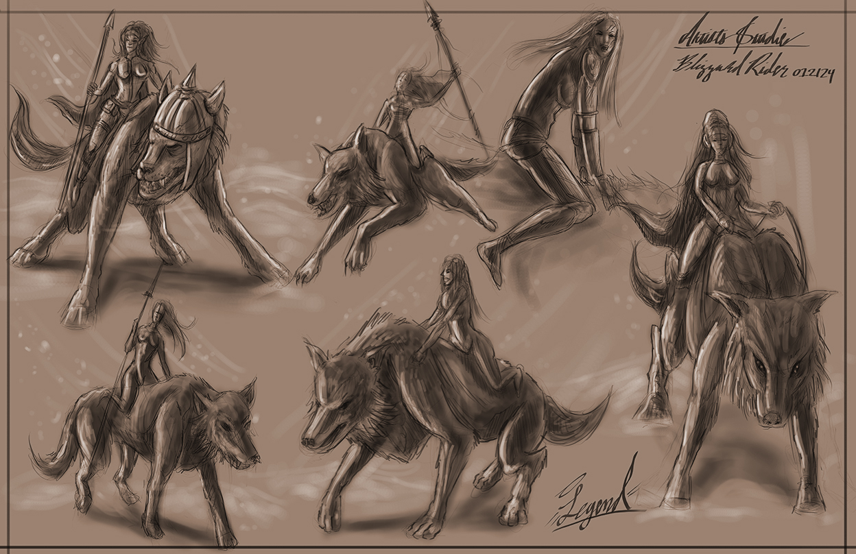
[attachment=129952]
RE: Legend's Sketchbook_001 - Lege1 - 01-26-2024
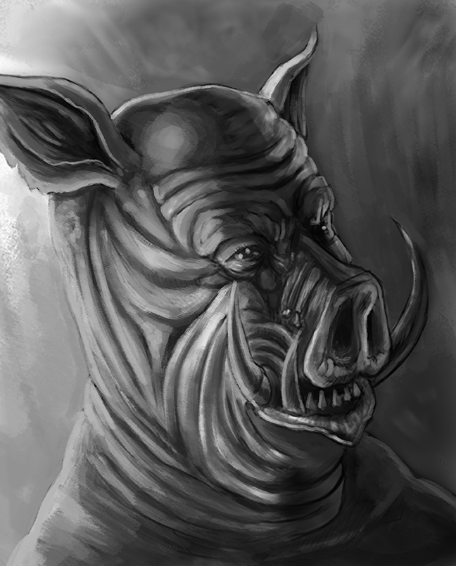
Got into this little imaginary study last night where I decided I'd like to apply a lighting scenario / values to one of the older pig head sketches I posted above. So here it goes....I will be updating with a color final


RE: Legend's Sketchbook_001 - Lunatique - 01-27-2024
One thing I noticed in your sketchbook is the overuse of strong contrasts everywhere. When depicting form and the lighting, try to put less emphasis on micro contrasts and plan your macro contrasts better. Too much micro contrasts everywhere will create too much visual noise. Some areas are not supposed to have sharp contrast of values, especially in the shadows. Simply the values management of the entire image down to just around 5 basic values, then only put more micro contrasts in areas where you really want the viewer to pay attention, while downplaying the contrasts in areas that aren't as important.
RE: Legend's Sketchbook_001 - Lege1 - 01-28-2024
(01-27-2024, 02:36 PM)Lunatique Wrote: One thing I noticed in your sketchbook is the overuse of strong contrasts everywhere. When depicting form and the lighting, try to put less emphasis on micro contrasts and plan your macro contrasts better. Too much micro contrasts everywhere will create too much visual noise. Some areas are not supposed to have sharp contrast of values, especially in the shadows. Simply the values management of the entire image down to just around 5 basic values, then only put more macro contrasts in areas where you really want the viewer to pay attention, while downplaying the contrasts in areas that aren't as importantPerfect advice and you are very right on what you say. In reading your comment I was relating to things visually by music, like how there are highs and lows in classical music especially. I'm going to try and do better with the lighting all over the place and thank you =)
RE: Legend's Sketchbook_001 - Lunatique - 01-28-2024
Sorry, there was a typo in my post. It's supposed to read:
..." then only put more micro contrasts in areas where you really want the viewer to pay attention..."
RE: Legend's Sketchbook_001 - Lege1 - 01-28-2024
(01-28-2024, 04:55 AM)Lunatique Wrote: Sorry, there was a typo in my post. It's supposed to read:
..." then only put more micro contrasts in areas where you really want the viewer to pay attention..."
That's what I was pretty sure you meant and how I actually took it. Thank you again, you make a great point with everything said there again. I try to improve every image I make and then some.