05-02-2013, 01:29 AM
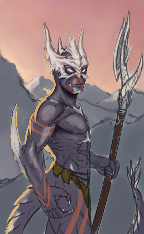
Hey guy, here a little something I'm working on... Tell me what you think so far! C&C is very welcome

|
Dragon guy WIP
|
|
05-02-2013, 01:29 AM
Hey guy, here a little something I'm working on... Tell me what you think so far! C&C is very welcome

05-02-2013, 12:57 PM
Hi Michael. It's a pretty straight forward illustration. I think it could be enhanced by taking your lighting a bit further. You clearly intend for there to be a stong light source coming from the left, which I presume is the sun. If the sun is hitting him like this, it must be pretty close to the horizon which would cast shadows everywhere including your background. Unless there is a secondary light source that's keeping the character illuminated, much of him should be in shadow. While there is reflect light that would allow you to make out many of the forms, keep in mind that he is still promarly in shadow and that the value scheme should at least be much more narrow beyond the terminus. Here's a quick example.
05-02-2013, 05:29 PM
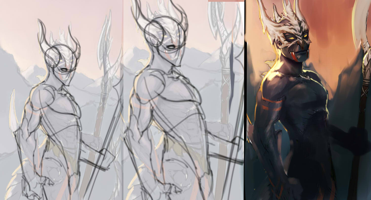
yo cool concept... but i will look more great if you focus more on fixing his anatomy first.. before adding some details... try to fix his pose... always flip canvas so you can see whats wrong or awkward with his pose... you can put details later on... but here you go i did some quick paint over... dont have much free time bit i wish it helps you
05-03-2013, 01:14 AM
Hey guys, thanks a lot for the replies and paint-overs! I worked a little bit on it (before reading your replies, so there might not be much of your advices implemented yet).
@ndhill: you're right about the lighting situation, though your paint-over seems a bit dark to me, I did not necessarily intend to make the scene as dramatic. Tried to implement more bounced light from the sky. I also plan to add another lightsource at the bottom right to make it more interessting (probably blue-ish). As for the background, I haven't worked much on it yet, but I too, want it to be darker being partially lit by the sun. @karnxjiro: I really like what you did with the pose, he looks a bit skinnier. I'll probably implement that. Your take on the lighting is similar to ndhill's, quite dramatic but it looks rally cool. Maybe I can go towards that direction a little bit. But it's quite sinister and I'm not sure yet if that's what I'm going for. Anyway, heres some progress (again, before reading your comments), maybe you guys have more to say about it. Thanks again for taking the time, I reall appreaciate it! :) 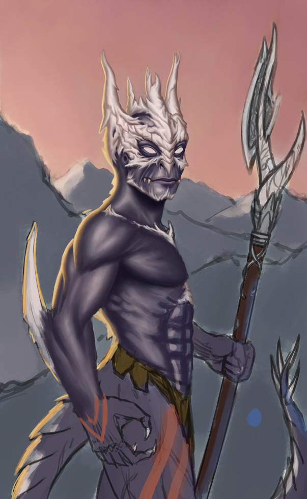 |
|
« Next Oldest | Next Newest »
|