+- Crimson Daggers — Art forum (//crimsondaggers.com/forum)
+-- Forum: STUDY GROUP (//crimsondaggers.com/forum/forum-5.html)
+--- Forum: MENTORING (//crimsondaggers.com/forum/forum-59.html)
+---- Forum: CLASSES (//crimsondaggers.com/forum/forum-61.html)
+---- Thread: Portfolio Class- Character Development! (/thread-1539.html)
RE: Portfolio Class- Character Development! - Thomas Mahon - 10-25-2012
@Tadas good job with the latest post! I much prefer this style of headwear to the other, feels a lot more like an Arthur in my opinion. Keep up the nice work everyone :D
Here is some experimentation with different elements. I think I need to 'fantasy' up the costumes abit, having trouble with approaching it that way though. I'm aware that these designs look a little evil, and probably wont be used for the final. Tell me what you think please, anyone! haha - p.s sorry if they're abit big, photobuckets resize feature is messed up.
no ref used
![[Image: arthurconept3_zpsa44516ef.jpg]](http://i1255.photobucket.com/albums/hh638/thomasmahon/arthurconept3_zpsa44516ef.jpg)
RE: Portfolio Class- Character Development! - malan - 10-25-2012
Nice Thomas! I really like how these look! they actually look somehow evil, maybe it's the horns and the mask, that way you can't see his face, something that I guess is an important thing for Arthur. But you are understanding pretty well your theme :)
Keep it up!
RE: Portfolio Class- Character Development! - Thomas Mahon - 10-25-2012
(10-25-2012, 08:33 AM)malan Wrote: Nice Thomas! I really like how these look! they actually look somehow evil, maybe it's the horns and the mask, that way you can't see his face, something that I guess is an important thing for Arthur. But you are understanding pretty well your theme :)
Keep it up!
"I'm aware that these designs look a little evil, and probably wont be used for the final" - cheers man, i know, i was just experimenting a little :) might save these for the mordred design, who knows
little study of a great reference sam and dan showed me
![[Image: samuraistudy4.jpg?t=1351119069]](http://i1255.photobucket.com/albums/hh638/thomasmahon/samuraistudy4.jpg?t=1351119069)
RE: Portfolio Class- Character Development! - xaero84 - 10-25-2012
Here I put my sketches for the excalibur for the african king arthur, I´m deciding the material of the weapon, maybe stone, ivory or crystal...
![[Image: Weapons%2BMartin.jpg]](https://3.bp.blogspot.com/-gI0kZLM68tI/UIhxcbJjRKI/AAAAAAAAAIc/MH1AfH2_PqQ/s1600/Weapons%2BMartin.jpg)
RE: Portfolio Class- Character Development! - malan - 10-25-2012
Ok, some crappy sketches. I had a bit of problems with the costumes, but Im getting it. These are exploration ideas, trying to figure out the costumes and stuff. Yet nothing fancy, but I'm getting it. Some quick simple line studies and playing a bit with the stuff I learned.
I will post some characters later in the night!
Cheers! :)
![[Image: est1.jpg]](http://i1310.photobucket.com/albums/s641/langogh/est1.jpg)
RE: Portfolio Class- Character Development! - malan - 10-25-2012
Here's a character idea sketch, still very rough, but trying to experiment with the clothing, not very happy with it, but I will do more variations. :)
![[Image: 1.jpg]](http://i1310.photobucket.com/albums/s641/langogh/1.jpg)
RE: Portfolio Class- Character Development! - BenFlores - 10-25-2012
nice work everyone :) heres a sketch i did without using any reference, ill try to do more tomorow
![[Image: character-development-4.jpg]](http://i1057.photobucket.com/albums/t398/eyedias/character-development-4.jpg)
RE: Portfolio Class- Character Development! - malan - 10-25-2012
Ok, I just watched this "Mists of Avalon" movie, but there is a thing I would like to point out. Here, Morgane is represented as a "good" character, not an antagonist, and the movie is told from her point of view. However, as Dan said on the first post, she has to be portrayed as an antagonyst, a version of her (from what I have been researching) different from this movie. It looks that there are a lot of interpretations and stories about the characters and stories, so, we should have that in mind.
Maybe this is too obvious, but it's something I wanted to say after telling you about the movie. :)
Cheers daggers!
RE: Portfolio Class- Character Development! - malan - 10-25-2012
Another one! this time improvising a bit more. I didn't like it so much, but here goes. Hope to have more tomorrow.
Sorry for so many individual posts, the next time I will submit all images together :P
![[Image: 2.jpg]](http://i1310.photobucket.com/albums/s641/langogh/2.jpg)
RE: Portfolio Class- Character Development! - Dan Warren - 10-25-2012
ok, as promised, time for some mid week crits! maybe ill stream some advice tomorrow, we will see. AS FOLLOWS!
Thomas-
off to a really good start. tons of great studies and research. Its time to nail down the look for arthur tho so you can have it ready for sunday. you uploaded some really cool value sketches of samurai earlier, and one had a crossed cloth across armor. armor over cloth over armor is a cool way to layer and create interest when something is otherwise very recognizable. with some creative symbolism in embroidery and design in the metal, ev en more narrative can be worked in. The samurai helmet is also a cool way to substitute a crown- just make sure you play up the regality of it so its not a normal helmet. again, not over the top, but enough to generate unique interest. a good mix of cloth and armor is going to be essential here, so work on a good balance.
on the second page, you had some more cool studies with a mask. if you go this route, make the mask relevant. If we cant see the characters face, then the mask covering has to convey the character in its place. Arthur's line bears the standard of a red dragon, so this might be a theme to play with- If not in the mask, then elsewhere.
good stuff altogether. work on his sword. It needs to look powerful and ancient, and cant just be a regular katana. awesome work!
Tadas-
your second round of uploads are looking like a cool direction to take. I like the use of the upward crown as a nod to osiris, it also avoids being too stereotypical with a king tut mask. the pose looks good as well, but dont be afraid to sketch around some more to see if youd prefer another. the longer cloth going down to the feet feels far more kingly than the exposed legs, so id go with that. I also really like the girdle and cross belt, and they offer cool oppertunities to inlay gold designs as well as symbology. (the second design- on the right- feels much stronger, use that one as a basis.) other things to consider to make the silhouette feel stronger might be a cape (full or shoulder) to push a more triangular form. because Arthurs mythology represents a dawn of a golden age, he is sometimes figuratively associated with the sun, which works well with egypt. this might be a cool motif to work into the crown and/or armor. good stuff! start refining and godspeed.
Malan-
cool designs on page 1, they will work well when you get to the ornamental finishing touches of your characters. your 2 full characters have cool elements id like you to play with on a third. your second design is much stronger, though elements of the first work well. problems with the second design you can improve on are the symmetry and the feel. in terms of symmetry- make sure his costume isnt completely mirrored. offset it with something to create contrast and interest. a crossed belt, a pauldron on one side, cloth wrapped over one soulder, anything like this helps break up the mirroring problem of a symmetrical design. I liked the one shoulder pauldron over cloth from design 1, maybe reinterpret that. Dont cover his face completely. this approach could work well for arthur or morgane, but its too mysterious and hidden for a character like arthur. and of course, remember, that hes a king. add some special nods here and there both to his office and wealth.
good stuff all around, guys. a few things all of you can improve on:
that sword! its the symbol of what and who he is, and without it he would not be king. make sure it isnt normal or boring, while at the same time not overdoing it.
<3
RE: Portfolio Class- Character Development! - Dan Warren - 10-25-2012
as for the rest of you, ill give crits on stream. promise. <3
RE: Portfolio Class- Character Development! - Melanie - 10-26-2012
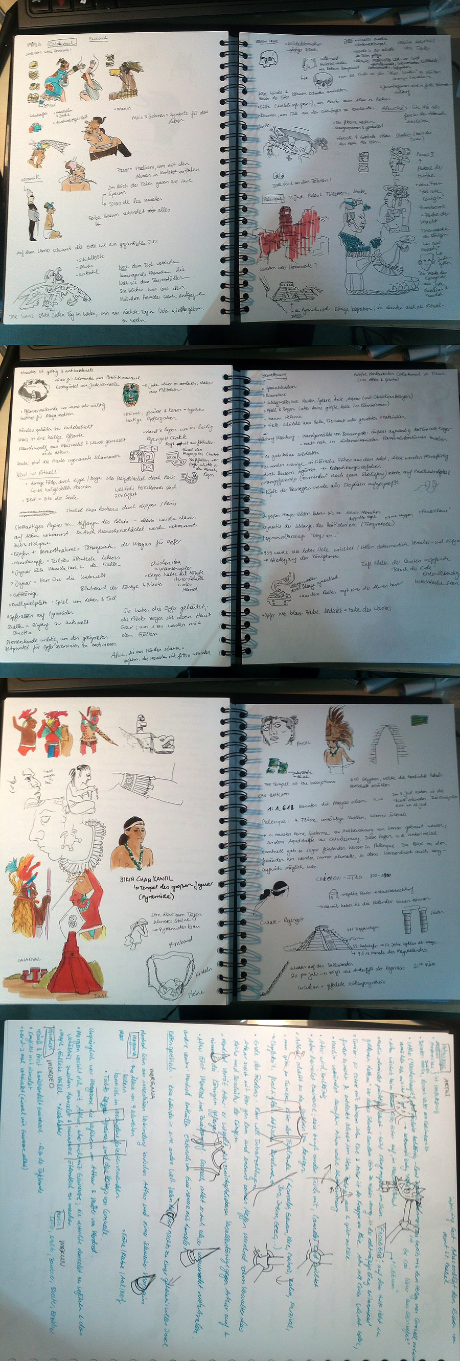
Well.. I think it is time to share my process.
First of all: after consulting Dan, I choosed the classical Mayan period as starting point to develop my four character designs.
Day 1: Research
Reading, watching documentaries and making notes (including quick ballpoint sketches, colored with markers)
A) Wikipedia: http://de.wikipedia.org/wiki/Maya
B) Watching documentaries about the Mayan people:
About the Mayan Empire, part 1: http://www.youtube.com/watch?v=5ml7Co0w22M
About the Mayan Empire, part 2: http://www.youtube.com/watch?v=n69-Ng_D9xI&feature=relmfu
About the Mayan Empire, part 3: http://www.youtube.com/watch?v=bCc47vfIgcs&feature=relmfu
Arte (german only :(), part 1: http://www.youtube.com/watch?v=7wfcjiM10oU
Arte (german only :(), part 2: http://www.youtube.com/watch?v=v9OPjBeY68k&feature=relmfu
Arte (german only :(), part 3: http://www.youtube.com/watch?v=SRsw_nQrLrM&feature=relmfu
C) Gathering googled images from 1. Original Sources (pictures on stone walls, paper, ceramics, sculptures,...), 2. more or less scientific illustrations, 3. Maya reenactement (for tourists), 4. Apocalypto.
!!! Before my research I thought the designs in Apocalypto are far away from reality, so much individualism and body modification - but after my research I found out that in fact the designs are pretty good and in fact closer than lots of the reenactement costumes.!!!

Day 2: More research
A) Gathering more images, reading about the Artus Saga on wikipedia, reading about Artus, Merlin, Morgana and Mordred - also on wikipedia
B) Thinking about things
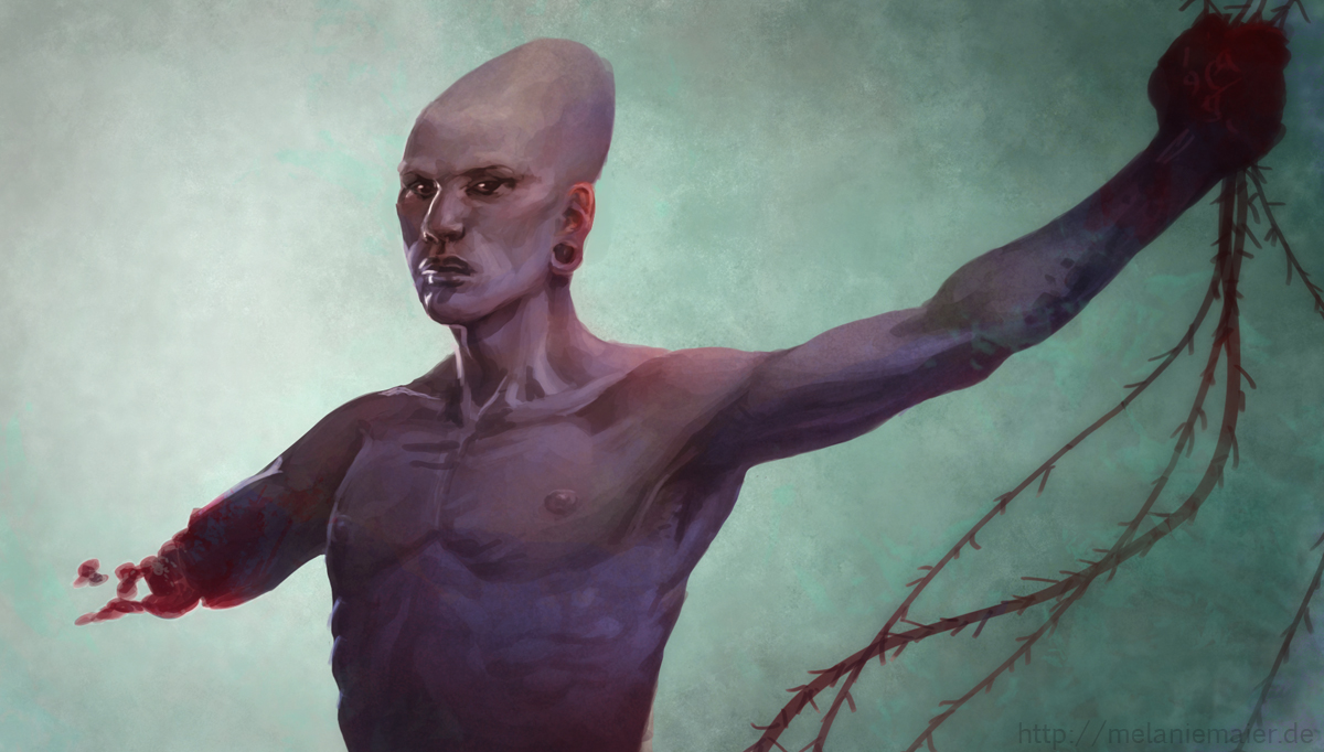
C) Researching bones and skull deformations
D) Night Doodle with mayan skull deformation and blood sacrifice theme.
E) Artus = King (as Pakal II. e.g.) with lots of jade (jade was the most valuable material, more worth than gold), Merlin = supernatural priest, a living soul of an ancestor... maybe I'll paint his body translucent.. he has to have some animal mask/headgear - important animal: the feathered serpent (rain and visions), Morgana = upper class woman with lots of animal symbols that tell that she can transform into them - especially the jaguar is important as a theme, cause it stands for the underworld, Mordred = upper class warrior with lots of evil looking body modifications.. maybe fat cause he loves to drink and eat (gluttony motif).. maybe very sexual cause he loves to have sex with women or rape them (not sure how evil my mordred should be), Excalibur = Spear with a jade spearhead (Exjadebur or so.. haha)

Day 3: First non-rushed study
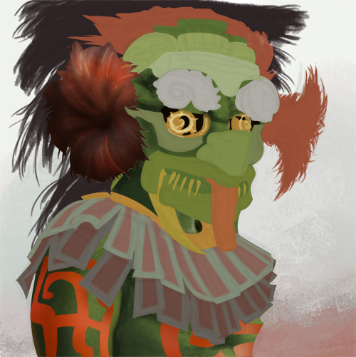
Priest from Apocalypto (2h, unfinished, will continue it tomorrow). Not sure yet if Merlin should wear a mask or not. I'll do 3 studies from apocalypto priests - 2 with masks, 1 only with headgear and body modifivations. Maybe I should study only with linework the following priest studies, cause color takes so much time. On the other hand, I get a deeper understanding how the mask works when I have to color it, because then I have to think about threedimensional forms.

I got a new source from a historian friend with scans of original codices: http://www.famsi.org/research/graz/index.html
Please give me critique and tipps. I have the impression that my studies and observations take a lot of time and I am wondering if this is really important. I love deep research, but maybe this is not helpfull.
RE: Portfolio Class- Character Development! - donJonSwan - 10-26-2012
Here's a quick outline of where I'd like to take it.
![[Image: 8Ll5gl.jpg]](http://i.imgur.com/8Ll5gl.jpg)
Going for an American Civil War style. I've got a rad Civil War museum around the corner for quick reference. Going to play with the values and lighting to make him less evil and more imposing. Also going to push the arthurian references in details, red welsh dragons on the throne
RE: Portfolio Class- Character Development! - Thomas Mahon - 10-26-2012
@donJonSwan
I think the throne element makes it an illustration rather than a character concept, maybe try a quarter view of a standing character?
Also it looks a little like:
http://gamefa.com/wp-content/uploads/2012/10/ACIII_DLC_KingGeorgeWashington3.jpg
Hope you don't take offense to my post! just trying to be helpful.
RE: Portfolio Class- Character Development! - BenFlores - 10-26-2012
another sketch
![[Image: character-development-5.jpg]](http://i1057.photobucket.com/albums/t398/eyedias/character-development-5.jpg)
RE: Portfolio Class- Character Development! - donJonSwan - 10-26-2012
No offense at all Thomas, appreciate the crits very much.
That reference of Washington from AC3 has been a big point of inspiration for the mood of this sketch for sure (lighting/pose).
The first few prep drawings I did were 3/4 views but they felt kind of flat and didn't have enough emotion (maybe it was just shitty costuming on my part). I felt like I'd be able to more clearly sell the "Arthur" character with him on a throne, and try to pull that off without sacrificing much in terms of his costumes details.
Maybe I should re-evaluate what the goal of this series is... and work more earnestly towards cool concept/design than traditional painting/illustration.
Here's my full reference sheet I should have included with my first post:
http://i.imgur.com/QJVF8.jpg
RE: Portfolio Class- Character Development! - malan - 10-26-2012
Hey Melanie! pretty nice research! I had the chance to work on some Mayan proyects this year, one for an archaeologist, and the other for a museum here in Mexico, and reading what you have found, I can tell you that you are getting important things. Just some points that hope can help you.
About Apocalypto, we also used that movie as a reference! haha, it actually has a lot of accurate elements for the costumes and stuff like that, just as a note, many of the characters don't have Mayan facial features, and that was a very important thing (they used a native north american actor for the main character, for example) look at their profiles on the codex from FAMSI, the nose and eyes are very important on the mayan faces, look at indigenous people from Merida, Yucatan and those places, watch out for the skin color :P
About jade, yeah, that's the main valuable material, very connected to the gods and royal stuff, they also had gold, but, for what I was told, it was imported from the aztecs, so it was something royal people could wear. You could use a lot of animal stuff for the costumes (skins, teeth, claws) mainly jaguars and crocodiles (both have a lot of meanings for them). They were mainly hunters.
About the mask, I believe those were used by some type of priests that made the human sacrifices, there's supposed to be 4 of them, one for every cardinal point of the world, and every one of them has a different color. They can be seen on Apocalypto, holding the feet and arms of the sacrificed man (it's supposed to be 4 of them, one for every arm and leg of the victim)
About the headgear, take special attention to that, you can go crazy about them, it's supposed to have a social meaning, so the bigger and more impressive headgears are used by royal people, while simple hairdress is for the lower classes, specially on men. And about skull deformations, they told me that it was only done to royal people, but I'm not very sure haha.
And lastly, read about their gods and cosmogony, everything they did was related to the gods, everything.
If you wish... you could check out my blog, I have a small post there about a mayan market I did for the archaeologist :P
Sorry for the long speech haha, hope it helps. Keep it up! :)
RE: Portfolio Class- Character Development! - Melanie - 10-26-2012
Wow.. thanks for your informations, malan. That was very interesting to read. It's a pitty you don't understand my german notes - maybe we should skype and I tell you what I know and you tell me what I don't know. Haha :D
How can you come in contact to archeologists as clients? I would love to paint and draw for science - illustrating historic/native items and costumes and body modifications.
RE: Portfolio Class- Character Development! - malan - 10-26-2012
Of course! I will send you my skype user on a PM :)
And, I really had the chance to work for them, because I'm here in Mexico, and there are always job for those things. The University has special departments for archaeological research and there are several museums and magazines that publish stuff. Maybe contacting directly to them and showing portfolios should work! I can tell you better on skype haha :)
RE: Portfolio Class- Character Development! - Thomas Mahon - 10-26-2012
after Dans crit I decided to go ahead and develop an idea of what Arthur is actually going to look like, I'm building on an earlier sketch I made. I'm going for more subtle details like the embroidery on the cloth, it's of a japanese dragon, and I'm going to design an emblem for his helmet which will be a japanese dragon design too. Still need to incorporate more themes of Arthur in there but I think it's an okay start. Going to go for the royal Gold/Red colour scheme. (Also I want to be wes burt)
![[Image: ShogunAsa-KingArthur.jpg?t=1351193726]](http://i1255.photobucket.com/albums/hh638/thomasmahon/ShogunAsa-KingArthur.jpg?t=1351193726)
not current work
maybe abit of an ego booster for me, but this is what i was doing in february earlier this year. oh wowww. that anatomy! WHY ARE THEY MIDGET SAMURAI!
![[Image: samuraiposes2.jpg?t=1351194444]](http://i1255.photobucket.com/albums/hh638/thomasmahon/samuraiposes2.jpg?t=1351194444)
![[Image: samuraisketchcopy.jpg?t=1351194477]](http://i1255.photobucket.com/albums/hh638/thomasmahon/samuraisketchcopy.jpg?t=1351194477)