+- Crimson Daggers — Art forum (//crimsondaggers.com/forum)
+-- Forum: TOURNAMENTS (//crimsondaggers.com/forum/forum-71.html)
+--- Forum: THE CRIMSON CRUCIBLE (//crimsondaggers.com/forum/forum-72.html)
+---- Forum: CRIMSON CRUCIBLE WIPS (//crimsondaggers.com/forum/forum-73.html)
+---- Thread: smrr's CC 2 | (/thread-7457.html)
Pages:
1
2
RE: smrr's CC 2 | - Amit Dutta - 04-23-2016
Cool, love where it's going. Haha, see it doesn't seem to matter if we give two weeks or three weeks or three months...all the real work gets done on the last week. :) Hope you get it done!
RE: smrr's CC 2 | - Black Phoenix - 04-23-2016
Love the composition!
RE: smrr's CC 2 | - smrr - 04-23-2016
Amit - ahahahahaha yeah you're not wrong ;_________; why the hell is that I wonder? I've noticed my artist's "eye" kicks nearing the deadline ... so then I change a bunch of things and stress out :D I have a lot to work on haha
Black Phoenix - thanks a lot <3
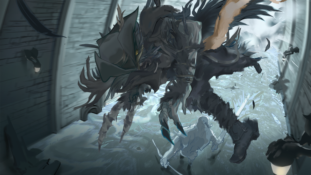
Final:

Thoughts: I need to take the time to work on my process and technique, big timeeeee.
Was happy with the composition somewhat. I've always wanted to do a dynamic piece (as dynamism is something that inspires me hugely) -- and what better challenge than a keyframe illustration? Did I nail what was in my head? Nope D: but, that's why I'll keep pushing!
I'll probably make my next illustration a dynamic one to apply what I learned n_n
Feelin' scared whether I hit the mood of Bloodborne or not. Not sure if it'll be instantly recognisable and stuff
Hmm
Now to make some tea
Thanks for all the support Dagz
Also, I need to be more involved in the community - I sorta just hit and ran updates without checking out other threads, cause I'm a dumbass.
RE: smrr's CC 2 | - neopatogen - 04-24-2016
The comp is great, I reduced your entry size to thumbnail size and it was still reading! And the contrast is awesome, it's what I failed to apply to my piece. I think the design of Henry figure is in Bloodborne style but I'm not sure about the environment and the figure below. If I played the game I would say for sure! And something happened with the face, I think it was reading better on earlier stages.
RE: smrr's CC 2 | - smrr - 04-24-2016
Cheers neo <3 yeah totally agree with your crits, thanks for them! What I was going for with the background being so lit > was that Henry killed some beast up the other end of the tunnel and so when it died, it kinda did a thing like dragons do in Skyrim and its soul was pushed out haha
I watched that vid Amit linked it lit looked like Bloodborne has a similar mechanic... Idk I pushed it too far, but at least the thumbnail reads lmao
RE: smrr's CC 2 | - John - 04-25-2016
It's sad to know that you're probably sitting out the next CC. In the early part of the competition, you're thread was one of the few threads that made me go like "Holy shit, I better bring something as good as these guys to the table". Jesus, those pencil sketches are gorgeous. Thanks for that kick in the ass.
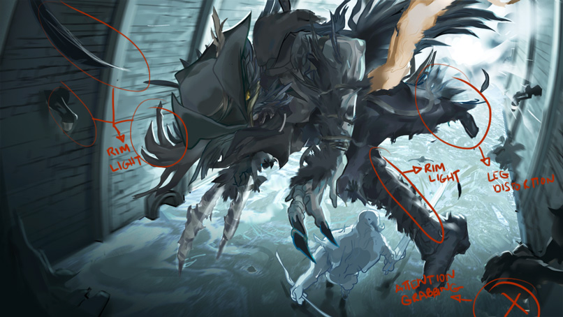
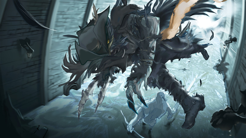
Now that that's out of the way. Here's my quick overpaint and critique.


Changes:
*Added more rim lights to take advantage of the light source behind the subject.
*Made leg larger because of perspective distortion.
*I broke the lamp found at the lower right side of the piece because it grabbed my attention more than it should. I'm sure there's a fix if you really wanted the lamp to be there.
*Turned off the lamp on the left.
*A little bit of light showing through feathers.
Stylistic changes:
*Made your darkest darker, and lightest lighter.
*Tinted your background a bit with more saturation.
Comments:
I wasn't quite sure what was shooting out of Henry's hip, so I decided not to comment on that. I just think it looks cool. I like the way Henry is about to crash into the camera. I am a huge sucker for that storytelling device because I envy those who pull the perspective distortion off nicely. Stylistically speaking, I quite like the exaggeration you did. I love how you rendered water. I played around with the colors but don't get me wrong, I like your color choices. And the Henry the Raven design looks killer.
As to your question of "does it hit the mood of Bloodborne". It does, or at least it was going into that direction like how Animatrix still feels like the Matrix. That strong but different artistic interpretation, but the gist is there. I only wish you were given more time to better shape your illustration up into the world of Bloodborne. Probably a few pillars, a few overgrown vines, a happy dead NPC floating on that body of water or anything that can help tie it back to that world.
RE: smrr's CC 2 | - Triggerpigking - 04-25-2016
It looks awesome man.
Bloodborne generally does have a very grim dark tone light and colour scheme almost all the time so this does look a bit on the cartoony side and the lighting imo seems a bit over the top, also as I recall the bosses do not explode into light, maybe the old ones do though.
But overall the design aspects of it like the clothing and background look very similair to bloodborne, as John said you got the gist of it down.