+- Crimson Daggers — Art forum (//crimsondaggers.com/forum)
+-- Forum: PERSONAL ARTWORK (//crimsondaggers.com/forum/forum-9.html)
+--- Forum: SEEKING CRITIQUE/PAINTOVERS (//crimsondaggers.com/forum/forum-36.html)
+--- Thread: andy the messenger robot (/thread-2498.html)
andy the messenger robot - par gin - 03-12-2013

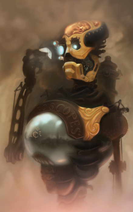
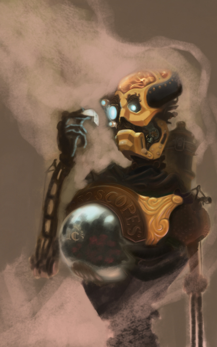
this is my (loose) take on a stephen king character from the dark tower books. In the book, he's obsessed with horoscopes and has kind of a snide personality. i always picture him being programmed with a british accent, but he was super high-tech in the book.
in my version, the gum ball machine in his chest dispenses horoscopes for a penny, and his skull looks like a plasma globe (weird sentence). i was kind of thinking of tesla coils and stuff like that when i made that decision.
please crit; it still doesn't feel finished to me. thanks guys.
RE: andy the messenger robot - JabyReART - 03-12-2013
Hey ParGin, I like your design a lot, but I found that its to gray so I will give it some contrast and highlight some detail that you probably want to point out, in the eyes and in the letter, loosing the bolt in the jaw (it attracts too much atention), below my paintover.
Hope it will help you!
Keep drawing!
RE: andy the messenger robot - par gin - 03-12-2013
(03-12-2013, 10:21 PM)JabyReART Wrote: Hey ParGin, I like your design a lot, but I found that its to gray so I will give it some contrast and highlight some detail that you probably want to point out, in the eyes and in the letter, loosing the bolt in the jaw (it attracts too much atention), below my paintover.
Hope it will help you!
Keep drawing!
Thanks for the crit, jabyreart. You're right, my contrast was pretty weak. I'm going back and bumping up some details here and there now. It's making a big difference. I'll post the finish when I'm done. Thanks!
RE: andy the messenger robot - Markus - 03-12-2013
Hey man, I did another paintover for you. If you've already gone about making your needed corrections or moved on with the piece, maybe these things can be considered in the future.
As you draw an imaginary subject, remember that you are the expert on how it looks and works in a three dimensional environment.
The more light sources you have, the more you have to consider things like reflection, refraction, ambient effects... it can be a pickle sometimes. I'd suggest keeping it simple, and going about expressing light considerately. If you can make a convincing light setup, it will help make the piece look so much closer to a realistic thing.
That, and what JabyReART told about contrast. For the gold on the chest I laid out some purple on an overlay layer, this is more of a personal preference but it does gives it a nice deep warmth.
I hope you can find this helpful, looking really good otherwise.
RE: andy the messenger robot - par gin - 03-13-2013
Ah, I'm pumped about this piece now. You guys are giving me awesome feedback. Do you see any compositional weaknesses or missed opportunities?
RE: andy the messenger robot - Markus - 03-14-2013
I feel I'm inadequate when it comes to compositional issues, but for example I'd say the bottom has some space to spare, whereas the top gets a bit too tight.
RE: andy the messenger robot - par gin - 03-15-2013
(03-14-2013, 07:52 PM)Markus Wrote: I feel I'm inadequate when it comes to compositional issues, but for example I'd say the bottom has some space to spare, whereas the top gets a bit too tight.
I'm the same way. I don't feel like it was ever explained to me in art school in any sufficient manner. It's always been intangible mumbo jumbo to me. Like, we learned about root rectangles and the golden ratio/rule of thirds, that stuff, but it seems like that only goes so far, and gets repetitive and stale after a while...my pieces aren't very dynamic. I also feel a gap in knowledge about balance.
Anyway, I'll try moving him down the page a little and see what happens. Thanks for the tip. I'll post an update here soon. My day job doesn't leave that much time for painting, so it's going slow.
RE: andy the messenger robot - par gin - 03-15-2013

Here's where it stands right now. Still not sure about some of the values, like maybe more contrast between the background and the figure to make him pop some more.
And I just realized I posted that one about 30% smaller than the others.
RE: andy the messenger robot - Amit Dutta - 03-15-2013
To me it looks overly airbrushed and soft. The entire canvas edge is blurry and his chest ball thing is as well. I'd say you need to bring in some hard edges and choose specifically and with good reason where you're going to have some edges disappear into softness. Do you want his face to be the focus or the chest ball, because at the moment they are both competing for attention.
The light source is a little indistinct, perhaps picking a more definite direction would help you render those forms out. The arms for example are just silhouette and almost don't seem to interact with the light at all. The gold bits on his face could show the material more with some highlights and maybe some scratches and wear and tear for interest. Everything is pretty clean.
I really dig the design btw. Just tighten up in bits, choose your focus and detail and be less airbrushy :) Hope that helps
RE: andy the messenger robot - Mike086 - 03-17-2013
I repositioned your robot to follow some techniques I picked up from Dan Warren's talk about portraiture and composition.
http://www.youtube.com/watch?v=LlkT04o77js
You can watch that video here, skip to 0:16:16 and he'll break down portrait painting through art history.
I livestreamed my critique for you, you can listen in and watch my explanation of the placement here: http://www.livestream.com/mciii
I fixed some lighting/suggest you do so, and the planes of the face were off a tad, but I go over that in the livestream.
