+- Crimson Daggers — Art forum (//crimsondaggers.com/forum)
+-- Forum: PERSONAL ARTWORK (//crimsondaggers.com/forum/forum-9.html)
+--- Forum: SEEKING CRITIQUE/PAINTOVERS (//crimsondaggers.com/forum/forum-36.html)
+--- Thread: THOR Crit if you please (/thread-4198.html)
THOR Crit if you please - Elmst - 10-23-2013
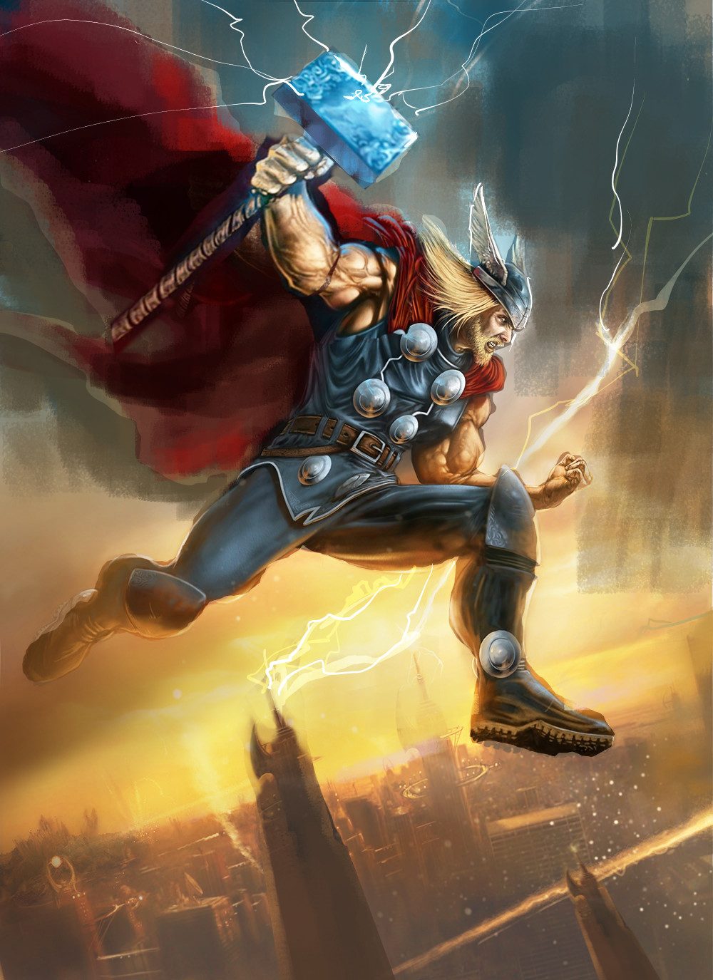
I would really appreciate a crit. What I am looking for is weather I can push, value wise, a few things around.
Is the city to dark?
Can I bring more emphasize to the hammer without disrupting the overall comp?
Any thoughts would be greatly appreciated.

RE: THOR Crit if you please - Amit Dutta - 10-24-2013
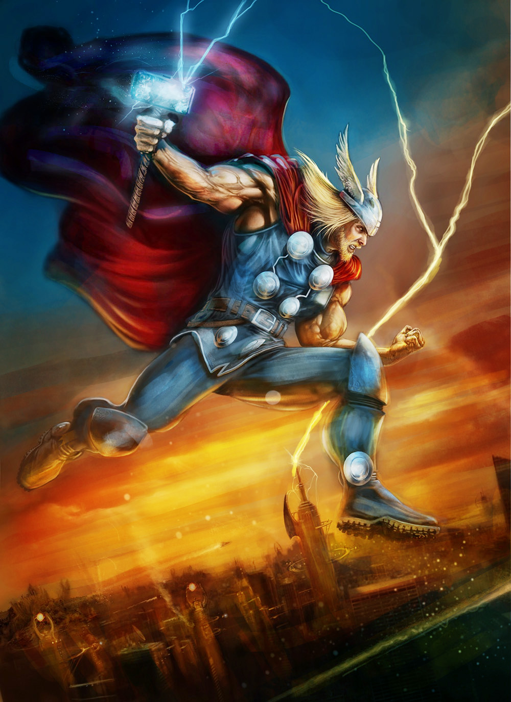
Right so I thiink it is fairly dark overall and can do with a bit of pumping up for contrast especially as it is comic style. I tend to go overboard in POvers so you can always dial it down so it's not so saturated, like in the yellow sky. Most of what I did was obvious. I did tweak the comp a little bit (moved his hammer arm to suggest foreshortening and fix the really disjoint shoulder proportions , just to bring the hammer head into a secondary focal point as you wanted a bit more emphasis on it. I also tweaked larger shapes in the comp, such as his cape,hammer angle, the clouds, building and lightning and overall background value structure to try and accentuate this cool diagonal you have going.
I'd also say use the cape as a compositional element, and render the broad fold structure (using some reference) the folding isn't very accurate and I think doesn't need to show as much detail as you have atm
Useful I hope.

RE: THOR Crit if you please - DertyPaws - 10-28-2013
Really nice work.
Didnt mess with the comp but pushed the colour and value to punch things out a bit more.

RE: THOR Crit if you please - Elmst - 10-30-2013
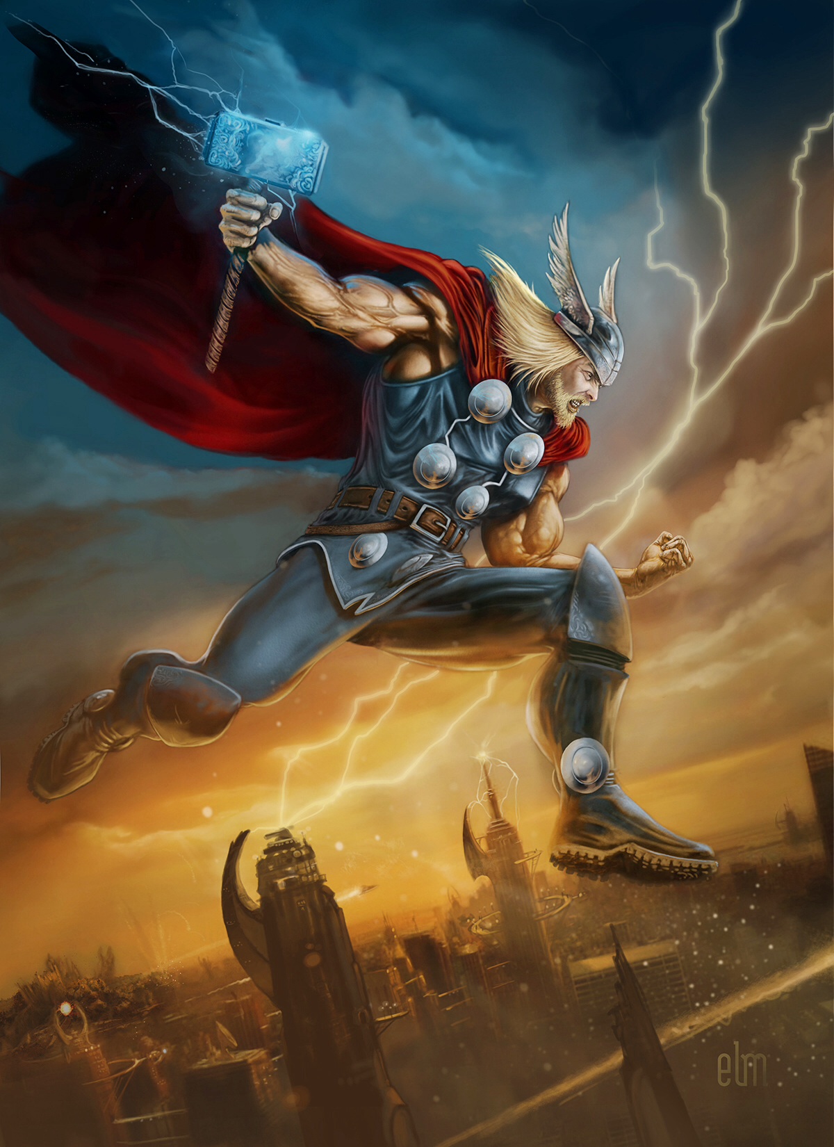
Thank you both for the critique. Monkeybread it is funny how I beat the drum about using photo reference and then not use it, I even gathered all my reference for the cloak and then I got this hair brained idea and scraped the reference, DAAAHHHHH, I also lightened the overall painting and blah blah blah. I basically had to rework the complete piece. I attached the rework. Let me know if you guys see anything else.
Thanks so much.

RE: THOR Crit if you please - Amit Dutta - 10-30-2013
Awesome man, it looks much better! I'm still not 100% on the near shoulder anatomy, just the way the deltoid wraps over into the bicep looks overly ropey and the shadowing a bit too strong. There are a few perspective issues in the city now that its rendered up...mostly the ovals in the midground building. I thought that streak across the bottom was a river before, but now it is clearly an exhaust trail. It actually sends a bit of a conflicting message with the perspective because it acts like a false ground plane. Perhaps instead of taking it all the way off canvas you could bring whatever made it into the canvas a bit so it's clear it's not part of the ground. With a bit of motion blur to the object it could add even more dynamism to the image. Either that or make the building behind it more visible at the bottom of canvas so it is clearly in front of them. I know they aren't the focus but I find the building rendering a bit too messy. You don't need to add more detail just clean up edges and simplify. That's it man. Great job its looking nice.
Edit...ooh perhaps a bit of motion blur on bits of thor would help too?
RE: THOR Crit if you please - ChantalFournier - 11-01-2013
I like the colors you got going in his left arm, there is a little of that in his right arm, but not enough, also his face is way too desaturated. I know he's not some rosy cheeked maiden but he needs some reds and maybe oranges and other colors to make his face as interesting as his arm. Even his boots get more love in the color variety side. I also think you went a bit overboard lightening his hair, something between now and the previous incarnation would be good to preserve form.