+- Crimson Daggers — Art forum (//crimsondaggers.com/forum)
+-- Forum: PERSONAL ARTWORK (//crimsondaggers.com/forum/forum-9.html)
+--- Forum: SEEKING CRITIQUE/PAINTOVERS (//crimsondaggers.com/forum/forum-36.html)
+--- Thread: Warlord dude WIP (/thread-5291.html)
Warlord dude WIP - NuclearWarrior - 07-29-2014
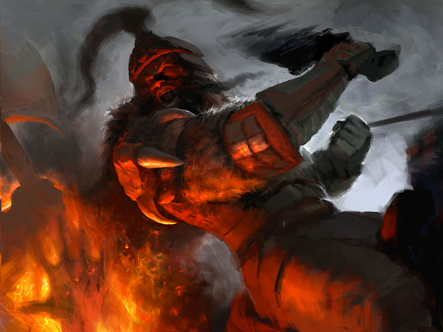
Been working on this personal piece. Pretty much every personal illustration I do is in the aspect ratio for Magic cards, which is what I would like to illustrate at some point. Same with this piece. Just looking for any and all issues, preferably bigger ones at this stage, with the piece. Thanks for looking.

RE: Warlord dude WIP - Jonas Jerde - 07-30-2014
Since he is up high on a horse, I think he should be looking down into the flame more. Right now, he is sort of just looking of to the side at eye level. I would also get rid of the dude with the ax on the left and just leave the fire there. You can still tell he's going to chop something without a guy being there.
Other then that it's looking pretty good so far.
RE: Warlord dude WIP - NuclearWarrior - 07-31-2014
Thanks for your thoughts on the piece! I actually worked on it since this post, so this is not taking into account your critique.
I do see what you mean about the face needing to look a bit more down rather than to the side, so I will try to adjust that.
As for removing the guy with the axe, as you can see I actually added even more crap on the side, but they act as compositional elements to point at the main character. Still not sure about them though.
I also changed his shoulder pad thing. This was hard for me because it's less cool, but I feel like the shoulder/arm movement can be read easier with that change.
RE: Warlord dude WIP - Jonas Jerde - 07-31-2014
Ok, I think if you want to keep something on the left you should only show the ends of the weapons, just to enforce the sense of height that the rider should have... I like the spear/sword things you added but I still think the hand with the axe needs to go. The fact that you can see the hand holding the axe makes it seem like the horse is really short or something... or maybe in a ditch.
As for the shoulder pad. The goal is to make the image as cool as possible, so I wouldn't settle for something less interesting. I'm sure there is a way to make the other shoulder pad look good on his arm, just use the new one as a guideline.
RE: Warlord dude WIP - NuclearWarrior - 07-31-2014
I'll ditch the axe guy, that makes sense. And while I would like to maintain clarity for this piece at a smaller size (as Magic cards need to do), you are probably right about the shoulder pad thing, just have to figure out a design for it that doesn't hurt the gesture.
Thanks again for your help.
RE: Warlord dude WIP - NuclearWarrior - 08-03-2014
Still working on it, here's the latest.