
+- Crimson Daggers — Art forum (//crimsondaggers.com/forum)
+-- Forum: TOURNAMENTS (//crimsondaggers.com/forum/forum-71.html)
+--- Forum: THE CRIMSON CRUCIBLE (//crimsondaggers.com/forum/forum-72.html)
+---- Forum: CRIMSON CRUCIBLE WIPS (//crimsondaggers.com/forum/forum-73.html)
+---- Thread: BrushNoir CC 2 WIP (/thread-7452.html)
RE: BrushNoir CC 2 WIP - Hobitt - 04-12-2016
Thats a cool spider man! Ohh and the skecthes are nice too, looking forward to the final.
RE: BrushNoir CC 2 WIP - Arapersonica - 04-14-2016
Really liking those hat designs, especially that one in the bottom left. If you're going for elegance, that reminds me of a swan~
RE: BrushNoir CC 2 WIP - neopatogen - 04-14-2016
Great Hunter sketches!So you use that spidernan as a mannequin? His joints move, right? I want to buy some cheap small wooden mannequin for reference.
RE: BrushNoir CC 2 WIP - BrushNoir - 04-14-2016
Thanks all!
@neopatogen Yeah I can pretty much bend him the way I want, even his fingers bend. I have the wooden one aswell but for me it does not really work.
RE: BrushNoir CC 2 WIP - BrushNoir - 04-15-2016
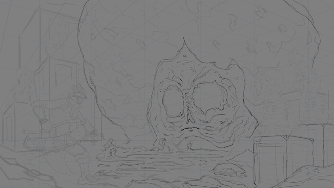
Started the linedrawing ^^
RE: BrushNoir CC 2 WIP - Hobitt - 04-15-2016
Nice! do watch out for the figures proportion the head is a bit small, looking forward to the finished one.
RE: BrushNoir CC 2 WIP - BrushNoir - 04-17-2016
@Hobitt Yep thanks, some things are off and will be fixed up to the level I can hehe.
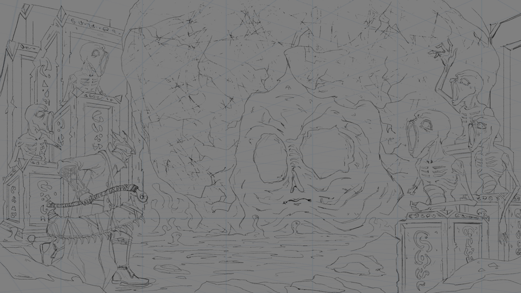
WIP 2 lines pretty much done, should be able to start painting it.
RE: BrushNoir CC 2 WIP - Amit Dutta - 04-17-2016
holy big giant head batman!
XD Keep it going man, you're doing good!
RE: BrushNoir CC 2 WIP - Legion Brewer - 04-17-2016
Nice, very cool scene! Almost like Bloodborne has a mother brain.
RE: BrushNoir CC 2 WIP - Arapersonica - 04-18-2016
Oh god the nematoad statues!! Hahaha I love them!! And that face... hng, I would not want to walk in on that.
RE: BrushNoir CC 2 WIP - Nada_H - 04-18-2016
that head looks soo cool man! can't wait to see how it'll turn out
RE: BrushNoir CC 2 WIP - BrushNoir - 04-19-2016
Thank you all! Much appreciate it. Here is WIP 3

RE: BrushNoir CC 2 WIP - BrushNoir - 04-20-2016
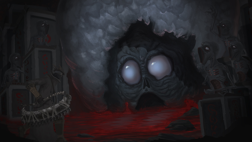
WIP 4, changing/fixing few things along the way.
RE: BrushNoir CC 2 WIP - Adam Lina - 04-21-2016
Looks creepy! I'd add more structure and form shadows to the monsters face.
RE: BrushNoir CC 2 WIP - BrushNoir - 04-22-2016
@Adam Lina I tried that now.
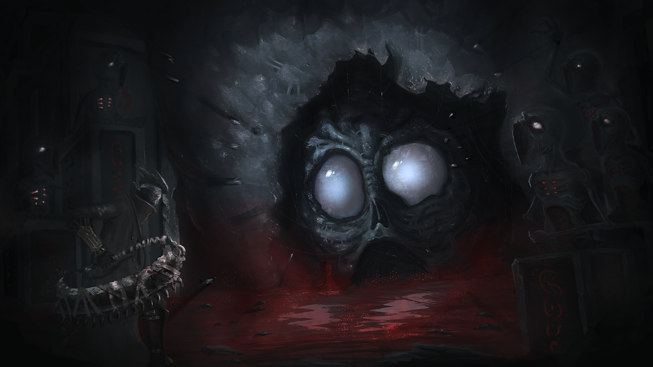
I think I'm pretty much done at this point
RE: BrushNoir CC 2 WIP - Amit Dutta - 04-22-2016
SOrry to say it man...your previous update was much more readable. Bring back some of those silhouettes because they indicate depth better. Also differentiate the character from his background a little more...he blends in a lot. Also try and get a bit of material differentiation in there.. Good luck
RE: BrushNoir CC 2 WIP - BrushNoir - 04-22-2016
@Amit Dutta Thanks for pointing that out!
Made some adjustments trying to fix it.
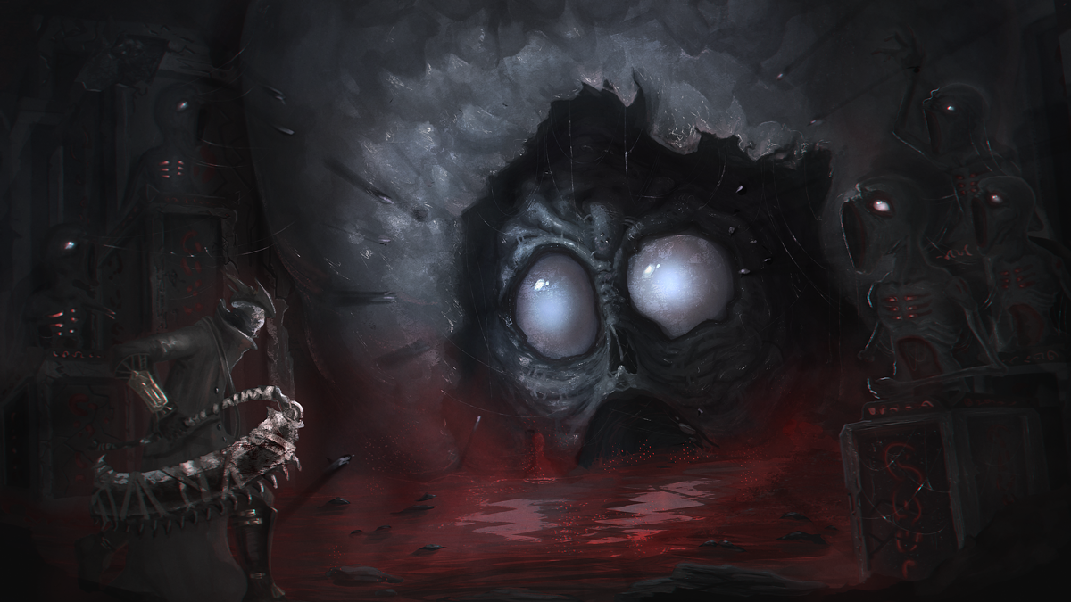
RE: BrushNoir CC 2 WIP - kazenodino - 04-24-2016
Powerful comp! love it!!
RE: BrushNoir CC 2 WIP - smrr - 04-24-2016
I really like how your final turned out man! It's a creepy ass comp, really bloodborne!
I think the perspective of the pedestals on the left could use some TLC, but yeah, smashed it!
RE: BrushNoir CC 2 WIP - BrushNoir - 04-24-2016
@kazenodino Thank you! :D
@smrr Thanks alot! Sorry to ask, but what's TLC? *shameface*