
+- Crimson Daggers — Art forum (//crimsondaggers.com/forum)
+-- Forum: PERSONAL ARTWORK (//crimsondaggers.com/forum/forum-9.html)
+--- Forum: SKETCHBOOKS (//crimsondaggers.com/forum/forum-10.html)
+--- Thread: Lyraina's sketchbook (/thread-2412.html)
RE: Lyraina's sketchbook - Cruptic - 07-09-2014
Hi Lyraina! Stumbled upon your sketchbook since I had some time after drawing and before leaving again and I love what I see here. It's definitely a fantastic place and I regret not having any popcorn to eat while flipping through the pages here.
I seriously dig your environments even if you don't think of them as interesting pieces, your color palettes are working so good in most cases and how you use those brushes in your latest post i.e. is really beautiful.
I'll come by here more often now I promise haha, your commitment is awesome keep it up :)
RE: Lyraina's sketchbook - Lyraina - 07-11-2014
Cruptic, thank you! It is very encouraging to hear that others seem to like my enviros, since they never seem to satisfy me. Thanks :)
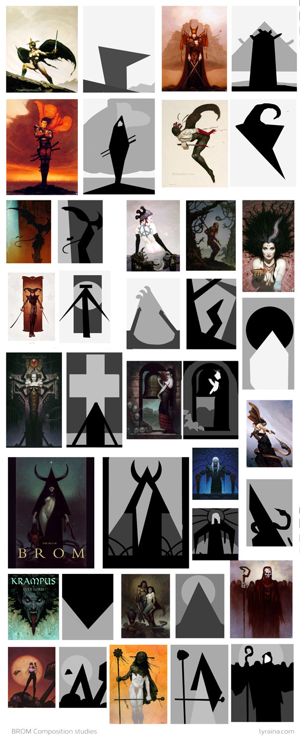
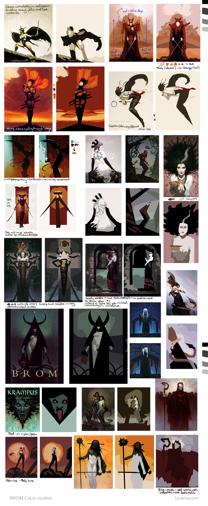
BROM STUDIES! Unfortunately I was so tired that I don't know how much I gained from them -_-
- Very strong use of very strong shapes
- Often contrasts strong sharp forms (triangle, diagonals etc), combined with very round forms (circles, curves)
- Uses some shapes (that are not extremely common) repeatedly through his work
- Uses VERY unusual compositions deliberately (for an alienating effect?), like strong horizontals crossed with strong verticals
- relatively simple, one-figure compositions but placed for great effect
- Contrasts high-key areas with low-key areas in the same image
- Images work mostly through very strong silhouettes and value hierachy, which then gets supported by very deliberate use of colors
- often uses very few colors (or only one and black), but uses the whole range of values and saturation
-> often staying in a very limited part of the color wheel
- repeated use of same colors in whole image
- uses colors to create a certain mood, e.g. uncomfortable or heroic or pleasant
- seems to like the desaturated red, red/orange/yellow spectrum
- complementary contrast
- very subtle hue shifts in very desaturated areas give lots of richness to an image. contrasted by strong, saturated color accents
- desaturated, cold purple/blue/grey skin can look good surrounded by saturated colors
RE: Lyraina's sketchbook - Lyraina - 07-17-2014
Bloodsport 7 WIP, following a tutorial by Patrick Brown
RE: Lyraina's sketchbook - meat - 07-23-2014
I think your first BROM study page will be more useful than the second, because the second has too many shades and organic shapes and is starting to look more like half-way paintings. But having not done much of that kind of studies myself, it's only an outside observation. What those studies truly teaches you only you can know, and so only you can decide how useful they are to do.
Latest BS: I love Gannon's robe shadings and the whole environment. Did you keep the shapes of shades on separate layers to keep their edges so clean?
RE: Lyraina's sketchbook - Lyraina - 07-24-2014
meat: Yeah I agree, but also because the strongest thing in Brom's work are values and composition. I used the value breakdown as a starting point for the color examination, so that was quite helpful to not have to concentrate too much on the painting aspect.
I did not do the shadows on separate layers, but instead had a layer for each color (plus lineart on top) with locked transparency. Then I used lasso selection and gradient tool for the shadows, sometimes in several steps when I wanted more detail. Sometimes I also used a huge soft brush first. For the highlights I used a soft burn tool set to highlights (sometimes midtones), again with lasso selections where needed to keep it clean. It is kind of destructive to work like that, but with the separated flat colors you could just start from the beginning if something doesn't work out. I like that it doesn't get too messy as it does with using clipping masks etc.
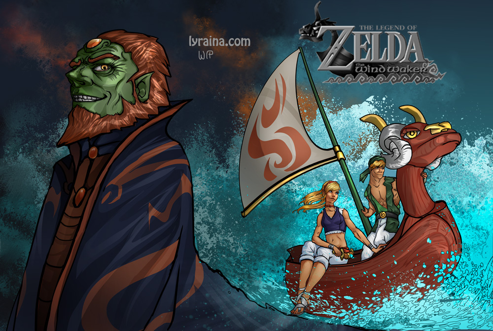
Trying to work with strong value and shape language (after those Brom studies). Not 100% there yet. On a side note – it is funny in what situation inspiration sometimes strikes. This one is actually inspired by a skirt I bought for my brother’s wedding (although it looks nothing like the one I painted).

RE: Lyraina's sketchbook - Lyraina - 07-26-2014
There is so much to do and to learn, it is really overwhelming sometimes... and whenever I think I have achieved something, I see someone else kicking so much more ass than I do, that I feel like I will never, ever get to a decent level D:
Kaladin finished?

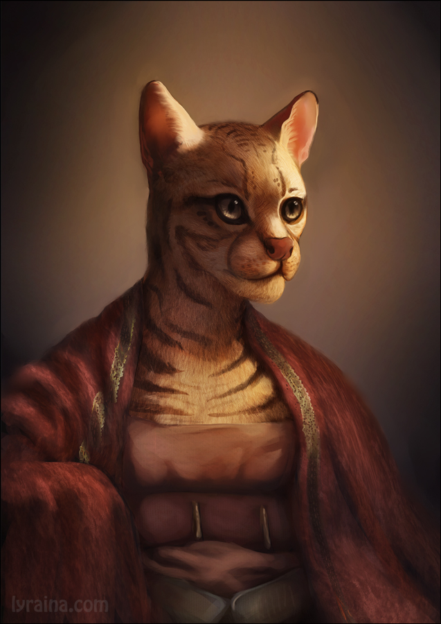
And I think I didn't post this yet. Magic Box homework.
RE: Lyraina's sketchbook - Mr. Toodles - 07-26-2014
Getting so gooood girl :D I love your composition shapes and the cat lady <3
RE: Lyraina's sketchbook - Triggerpigking - 07-26-2014
Hi Lyraina, really nice sketchbook you've got here, have'nt had the chance to look through all of the pages yet but I will when I get the time too :).
Them Brom Studies are really interesting, you did a really good job of applying them to that piece as well.
on a slightly unrelated note, never seen brom's work before but damn it is awesome.
also I like that piece you did of the guy in the rain, I must be tired as fuck though I did'nt notice the fairy thing for a while there XD.
Anyway I can't really see anything I could crit about your stuff(wind waker boat looks a bit weird to me but that could be my inner zelda purist :P) so i'll just say keep up the awesome work
RE: Lyraina's sketchbook - pnate - 07-27-2014
Yesss, wonderful updates :) Love the body gesture in that value piece, very designy. It does feel overwhelming sometimes, doesn't it? It's that type of thing that Brad talks about: the dark side of the force. The feelings of inadequacy and such. I haven't quite figured out how to harness that for good, but I figure it will get easier as we level up. You are truly gaining massively with each page though, so keep up the awesomeness!
RE: Lyraina's sketchbook - meat - 07-28-2014
There's more to see than can ever be seen, more to do than can ever be done. <--Lion King
You're on a tour of endless new scenes, wouldn't that make your tour ticket a good deal and worth it? And life good deal for Life?
RE: Lyraina's sketchbook - Lyraina - 08-02-2014
Mr. Toodles: Thank you <3
Triggerpigking: Thanks! Yeah Brom's awesome! Really solid compositions.. values..colors.. and I like the somewhat abstract weirdness in his stuff. Haha, funny you didn't see Syl (that's the fairy thing) at first! Maybe she played a trick on you and hid for a moment before appearing ;) Would fit her character!
pnate: Thank you. Yes, I think it will get easier with time - if just because with repeating the fail - success - fail circle often enough, I'll get more confident that frustration is only a temporary state that has to be worked through.
meat: Definitely a good deal, that is a beautiful way to put it!
And that's a good quote. To be honest, I find it quite thrilling to know there's more out there than one could learn in a lifetime, it just means life will never, ever be boring.
I have been a bit lazy with updating, had kind of a rough week. I've mostly been trying to focus more on quantity than quality so there's not always something worth posting. But I really want to improve my imagination and design skills and I think that's the way to go. I'll post something when I had time to sort out the worst crap.
Here's something I struggled with, but kind of like now (high saturation = Lyra happy). I think it needs some more punch in the lower left are though, not too happy with the green stuff I added for that reason.

Also, this terrible thing is giving me a headache. I just don't know how to get the light situation to work, not even to mention that by now I've painted and copy-pasted everything so much that I don't know how to make it look pretty anymore. Need to study night scenes it seems!

RE: Lyraina's sketchbook - Lyraina - 08-03-2014
screencap studies (2001: space odyssey)
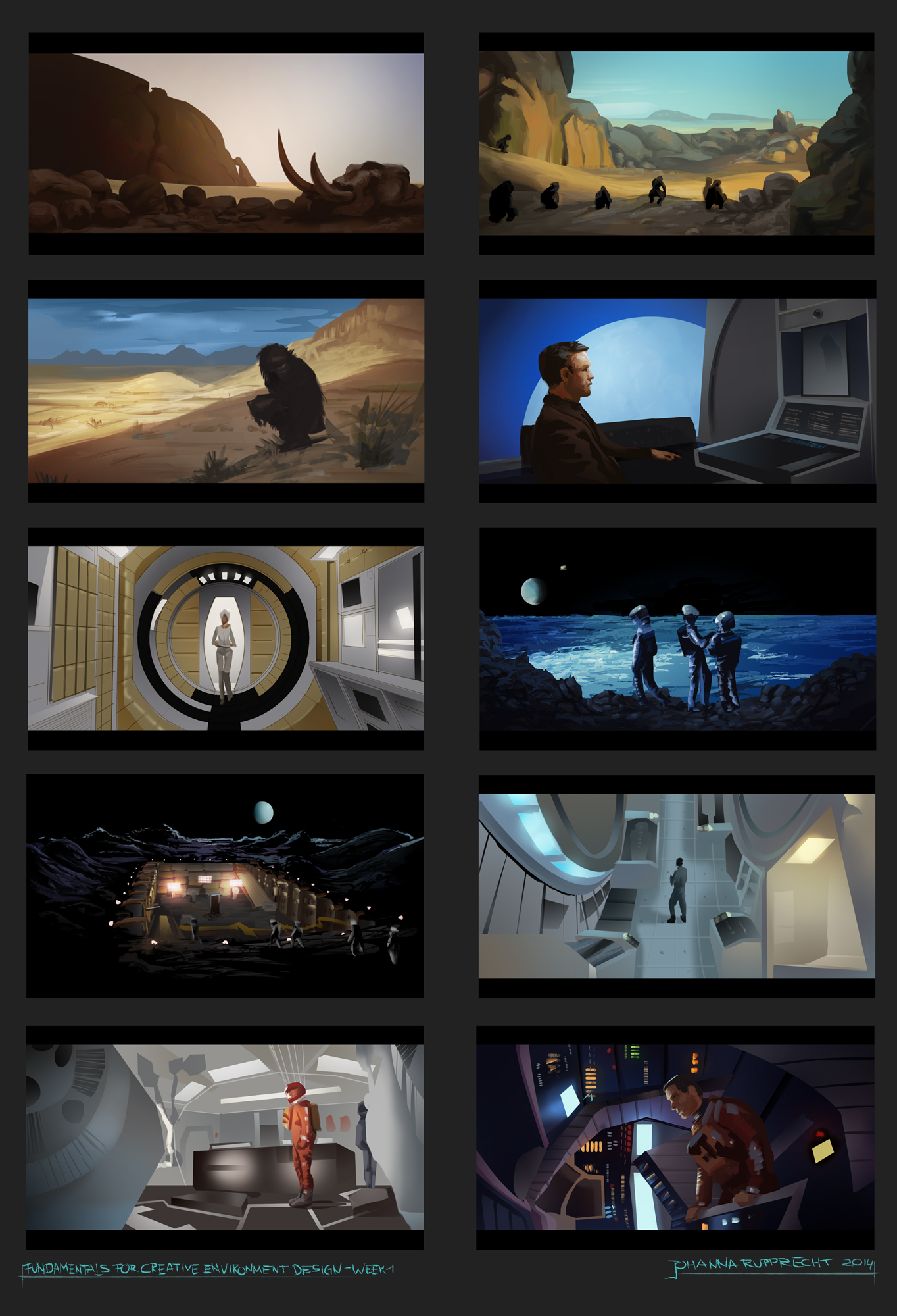
originals: link
RE: Lyraina's sketchbook - Ursula Dorada - 08-03-2014
woo! great work
RE: Lyraina's sketchbook - rafa zanchetin - 08-03-2014
These thumbnails are looking veeery polished, looking very good but i'm stunned with that purple landscape, it is fucking amazing, can't stop looking at it.
RE: Lyraina's sketchbook - Fedodika - 08-03-2014
great lanscape!!!
RE: Lyraina's sketchbook - RenatoCaria - 08-03-2014
awesome thumbnails Lyraina :O looking gooood!
RE: Lyraina's sketchbook - Jaik - 08-03-2014
Man, my control panel isnt telling me when you update anymore :( All your stuff is looking sooo good and the purple enviro looks great! Love it.
Nice job on the movie thumbnails too :) No crits from me. You really are killing it :)
RE: Lyraina's sketchbook - Suira - 08-04-2014
Daaaayum! Totally impressed with the quality that you got going on here! I specially dig the thumbs and the enviros! This last update is showing really good understanding of perspective and efficient workflow , really sweet, seriously, it would take me an eternity to get 4 of them done, not to mention all of those and up to those standards!
The enviro experiments with color are also looking awesome, I don't know how you donsider that terrible. Maybe it's not a 100% accurate but it's very efective conveying mood and it makes enough sense as to the viewer not questioning the lighting of it.
The only weak spot I've seen in some of your pieces is when you do portraits from mind, something about the structure and the edge work, but I really don't know what to say, because in the recent work the problem seems to be completely overcome, so keep up what you're thinking when painting, cause it's working.
Sweet stuff, gonna be stalking this SB, so you earned yourself a creeper! :D
RE: Lyraina's sketchbook - Lyraina - 08-05-2014
Sula, Rafa, Fedodika, Renato Caria: Thanks a lot! <3
Jaik: Been quite inconsistent with updates lately, maybe your panel doesn't like that D: Thanks!
Suira: Thank you! Understanding of perspective, now that's new to hear, haha. I agree about the portraits, especially those from mind are really weak, need to work on that! Thanks for the reminder :)
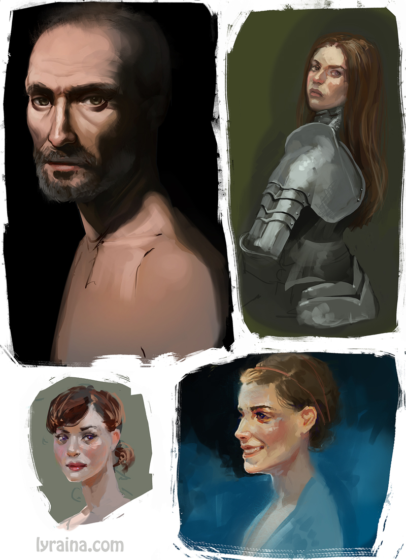
random quick warmups. I need to get that dull colors out of my skintones. I don't get how other people make grey or cool skin tones in shadows etc look good. I need to know! ò_ó

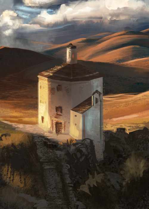
stuck with this... don't know how to continue

also trying to get my imagination going, so ... here's some quantity instead of quality D:

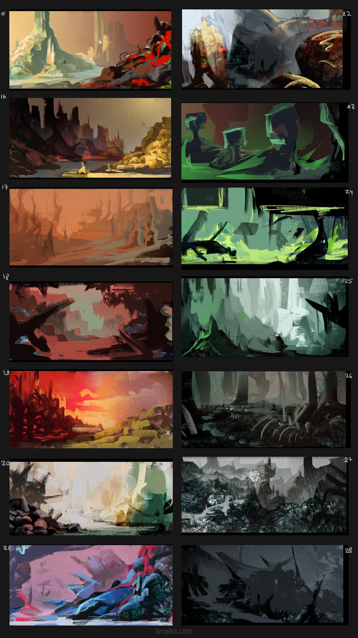
more screencap studies, thinking a lot about values and such

RE: Lyraina's sketchbook - Suira - 08-05-2014
Jesus Christ! That's some godamnned productivity right there!! Tons of good stuff, when you said more quantity than quality you're wrong. It's more quantity and less refined, but the quality remains. Cool to see you're really focusing your studies into making more compeling illustrations. The Road has such awesome values doesn't it? ^^
Really digging this update, as for the painting you say you're stuck with , maybe include some figure in the water or close to it, some kind of character that conveys a sense of story there? I don't know it looks pretty cool to me, but it needs some more story going.
The skintones are looking nice! The only idea I can give for that is maybe focus for a while on working within the 8-9'8 value range, and see how you can play with that combined with saturation
to separate areas and show ambient or reflected light.
In any case, great stuff, you don't disapoint lady! ( you're not a dude right? xD)