
+- Crimson Daggers — Art forum (//crimsondaggers.com/forum)
+-- Forum: PERSONAL ARTWORK (//crimsondaggers.com/forum/forum-9.html)
+--- Forum: SKETCHBOOKS (//crimsondaggers.com/forum/forum-10.html)
+--- Thread: Lyraina's sketchbook (/thread-2412.html)
RE: Lyraina's sketchbook - Patrick Gaumond - 11-05-2014
I don't know what your workflow is like for that forest painting, but you have the digital advantage. Use it! Work with layers, masks, groups textured brushes etc to get as much out of the medium as possible. Workin on one layer is a good exercise, but in my opinion using many layers for different groups of trees (I usually do it Foreground middle ground background) is really helpful in keeping things organized, especially in something that has a lot of individual elements like a forest.
Also, when doing a forest, don't forget the majority of it will be in shadow due to the canopy. I see its an autumn scene, however you have kept a lot of the foliage there which is good for you because then you get to use them to cast shadows. What that really means is:
1) You don't /need/ to cast shadows from the trunks
2) you don't need to concern yourself with rendering them all as cylinders, since the contrast will be lower and therefore requires less work to render
Both of which make painting forest easier. Think of ways to summarize the scene rather than render them all individually. Keeping a lot of things in shadow or in low contrast, and having the lit areas be a minority albeit an important one, will also help your composition a lot
Here's some examples of implied forests from some old painters. I know it strays a lot from the style/mood you have going right now, but maybe theres some ideas you can borrow to imply the density of the trees, of the foliage etc. Like how the branches under the leafy areas are shadowed, how the leaves are very simply rendered (shadow first then simple textures on top)
http://www.oilpaintingswholesalefromchina.com/oilpaintingshop/Impressionist/Jean%20Baptiste%20Camille%20Corot/031.jpg
http://www.crazyfish.com.au/Upload/Products/5460/b10102603265836403927.JPG
http://media-cache-ak0.pinimg.com/236x/11/8f/62/118f626ec03b404da2c4ecc15d0a4d24.jpg
RE: Lyraina's sketchbook - meat - 11-05-2014
The amount of sky and light you see here it's like you're at the edge of a forest looking out to a great open (a meadow or a cliff or something). Is that what you're going for?
Oh go on and befriend the scary witch. I'm sure all she wanted was a hug. I'll stay safely on my idling space ship set for Antler Planet should you start that world domination plan.
RE: Lyraina's sketchbook - Jaik - 11-07-2014
Step 1 of doing a paint over - Know what the hell you are doing...
Well.. Failed 1/1 so far..
Anyway, mostly, if you look at forests the bottom of the trees will rarely put themselves into the ground with no visible roots. The exception being Palm trees and desert plants, or at least thats all I can think of at the moment. This is because that a) most water in non-desert areas is on the surface b) stability, now most of the stabilizing roots go down into the ground, generally the 'root ball' of a tree is the exact same size as the top of the tree. In many areas though, perfect soil doesnt exist so a lot of trees cant put the big roots straight into the ground but instead spread outwards as well. (None of this is fact, just what I have picked up here and there)
So basically you never get the 'planted flower' look
The tree trunks themselves are very very thin in your image, this makes the forest look sparsely populated, as mat mentioned, but also, trees cant really survive like this, because of wind force they will just be uprooted and flung away. However, this allows you to make it look a lot denser without having to draw many trees.
Not sure about the rest of the world, but I have never seen a flat forest either, I'm not sure how much of the world is flat, no where I have been has been like that.
Play with light and dark, have a strip of light, then a strip of dark (I tried to demonstrate this badly in the paint over) This leads the eye and gives the piece some rhythm.
Change the shapes a bit, all of the shapes looked roughly the same size, made for a static image.
Choose a focal point, I recently learnt this with trying to take pictures of cool stuff in the bush near where I live. All of my images are heaps confusing because I just snapped and then I cant 'see the trees, from the forest' kind of effect happening. So the big tree is now the FP because it is being lit. Not sure if that was the plan.
The horizon line probably wouldnt be visible in a forest, too dense, which is why people get lost so easily.
Those trees in the background, in perspective would be like Californian redwoods if they were that big (Which is cool, but then you would need some of them in the foreground too, just to bring it in)
Canopy.. Sorry for the dodgy brushstrokes, but you needed more leaves.
Sorry it also looks like crap. I included my reasoning with each point because I generally learn better if I know the why of something in a very real sense. Dont know whether I communicated that. Love the colours! Which I screwed up....
RE: Lyraina's sketchbook - Lyraina - 11-08-2014
Beardley: Thanks a lot! That's the problem - can't seem to find a good workflow for forests, or any image where lots of stuff (like many trees) is going on, for that matter. Working on layers I am, just lacking organization yet, because I had trouble ...
Thanks for the advice on shadows - randomly spotted light works a lot better than those trunk shadows (which felt already weird when I added them). I'll try to follow the 'lit area vs. low contrast'! Thank you for the help!
meat: I was mostly trying to make it as friendly and happy as possible - so I avoided much undergrowth, thus resulting in that "open" look - not really a forest, that's true. I made it a bit more dense now (not as much as in your OP, becauese I don't know how to keep that from getting a mess). You don't really think that you're safe on that ship - or Antler Planet - do you? That one is next goal after rule on earth is established.
Jaik: Thank you! I partly agree on the 'trunk connecting to ground' part - after looking up some refs, beech forests or conifer forests (or let's just say "less wild" forests - those that I know best) seem to connect way more straight to the ground than anything rainforest or 'wild' forest related. Not as neatly as I painted it though, so I'll correct that next - thanks for pointing it out! Focal point will be near the trunk in the left foreground, I'll place some badly drawn figures there, later on T_T Good point about the horizon line. One could think I've never been in a forest, lol! Thanks for the paintover and help! <3
-
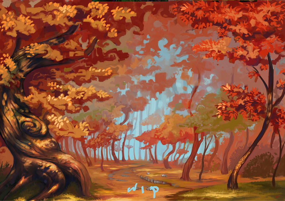
WIP2, thanks for all your feedback!. The leaves in foreground are just a test so far - trying out if different kinds of leaves look good (round vs pointy), or if I should keep it consistent. What do you think?
I think the different shades of read don't work too well, so I fear I will have to eliminate the cooler red on the right, despite liking the color. Maybe add some green instead, to make it not so overwhelmingly warm. I wonder if there is any way to "reset" color seeing after staring for many hours at something like this - similar to "flip canvas" for composition and form? Invert colors isn't exactly helpful...
don't ask
RE: Lyraina's sketchbook - Mike - 11-08-2014
I'm so sorry for ruining your artwork but maybe some of this will be helpfull :) I am a lousy painter, especially environment but there is a couple of things which I think would help your image. Since this is wip you of course could paint it later. If so, then feel free to yell at me :p So let's get into it.
1. First of all, I think more contrast would help a lot. Especially that left down corner tree. Making it more dark makes it pop out more. Foreground feels more defined that way. Also making more shadows on the ground and lighter spot lights make it more believable to me.
2. As have been said before that blue background seems empty. Putting there some trees or soft hills would help. Just to point out that there is still forest down there and that the ground is not so flat.
3. This is just my opinion and it totally depends on the style but I've discovered that when I paint trees it works better if paint them with straight lines, not so much with the curves. But again, It's what you like and what you want to achieve.
4. More branches ;) In your piece trees have almost no branches. If it's intentional that's cool of course but I think that trees should not be so lonely :( And they are almost all the same. Putting some in different angles and different shapes would make it more interesting. That pointy shaped leaves look nice, more natural I think.
5. Again, just me. I think there is too much red colour. I would add some greens, yellows, browns even. Especially on that front big tree. With red colour it looks weird.
6. I've put a little stream just to add something interesting in the midground. It balances the red as well.
Almost all of this is what I would personally do. Some of this you would propably do later since this is wip but I thought I mention it just in case. A lot depends on the style and personal preferences. I know I repeat this but I feel really weird giving people advice when I have so much to work on myself. But if there is a chance that some of this will help you then It's great :) I did a fast paintover just to show what I meant. I'm curious how the final version would look like so don't be discouraged. Overall autumn mood looks really great :)
![[Image: lalala_by_afternoon63-d85ljyi.jpg]](http://fc08.deviantart.net/fs71/f/2014/311/0/9/lalala_by_afternoon63-d85ljyi.jpg)
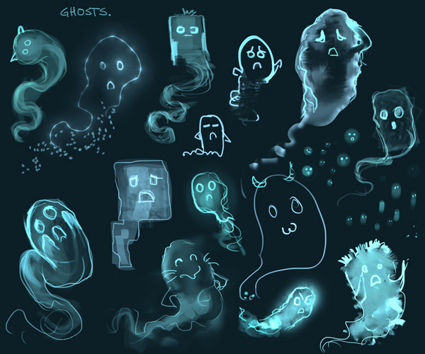
Btw. Those ghosts are so cute :d
RE: Lyraina's sketchbook - meat - 11-08-2014
You don't know Antler Planet..... We, have Commander Shepard. Come and try.
What do you think of clusters of fallen leaves on the ground? Those leaves are supposed to fall after all. Sky is usually even whiter at the bottom, closer to touching the ground. It'll be more convincing to make that celestial gradient more obvious.
...are those will-o-the-wisps? Did you find yer fate? [/Scottish accent][/Brave ref]
RE: Lyraina's sketchbook - Lyraina - 11-09-2014
Mike: Thanks for the feedback!! You're right. I added more contrast - trying to stay above 10% darkness though. BRANCHES! You know, I have this huge fat reminder saying "Branches!" written on the image (not visible on those I posted) but still almost forgot, lol :D So thanks for the reminder! I do like the stream that you added - would look nice, can't do it though because there will be figures standing next to the tree :P Thanks a lot for the help and paintover. And please don't apologize for helping out, I really appreciate any feedback!
meat: I don't know Antler Planet yet....!
Added some leaves. I think I wanted to do that anyway .. just not sure how many ... so those will have to do :P You're completely right about the sky! D:
The ghosts are whatever you want them to be :P
wrapping this up now.
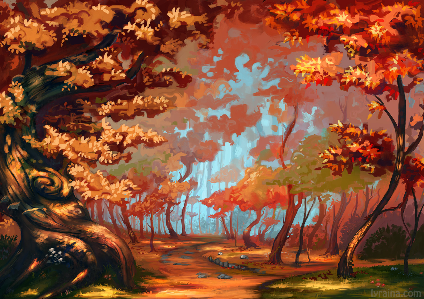
that's how it'll look, and some text in the middle/right area.
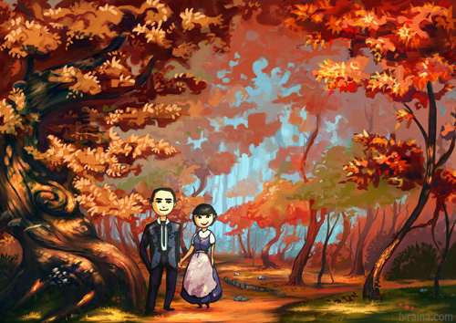
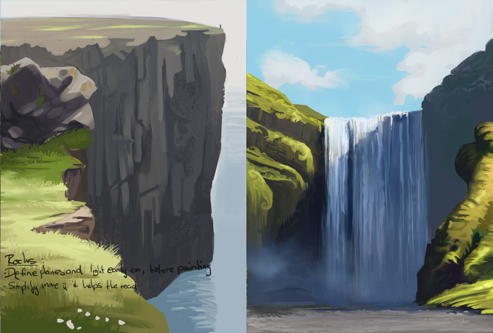
my new friend the smudge tool: I'm liking some of the hard edges it's giving me, while keeping some more variation than hard brush, and also the feeling of pushing around colors. But not the "dirtyness" and need to clean up a lot afterwards, nor the "smudged" look it easily makes, and that it makes layer management hard.
how to pencil. I still don't know.
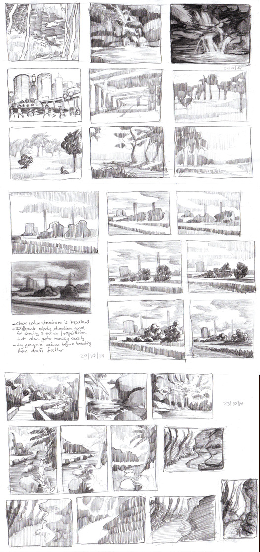
RE: Lyraina's sketchbook - Lyraina - 11-19-2014
will be gone for ~2 weeks, cya then :)
photo study
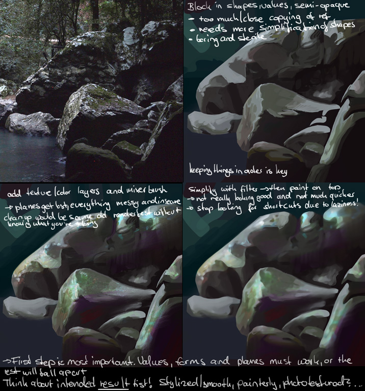
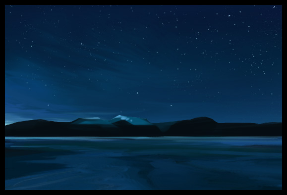
someone made me do these >.> and I probably should be doing more
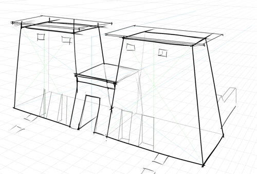
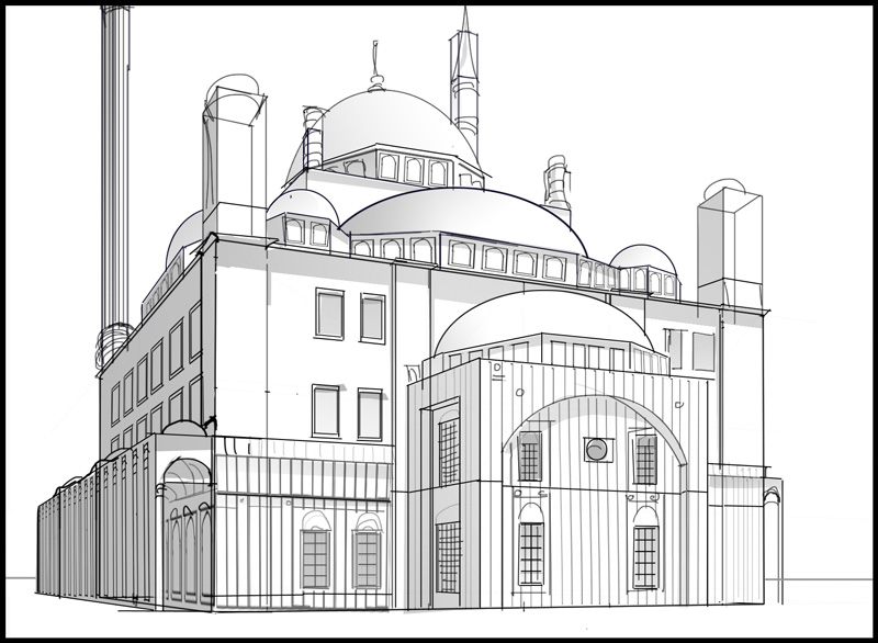
wip, still figuring out workflow
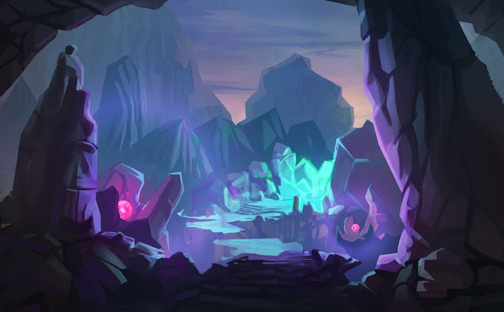
RE: Lyraina's sketchbook - pnate - 11-19-2014
Hope you are getting some awesome vacation time! Your environments are improving so quickly, even from just a few pages back, it's crazy. A small crit on that autumn piece - I think the contrast is a tiny bit too strong on that foreground tree. It looks nicer to me in your previous version, or how mike demonstrated. Keep up the good stuff and have a good two weeks!
RE: Lyraina's sketchbook - ramalooke - 12-08-2014
nice. love how you improved your environments. if i may have a word of advice. try to add more dynamism to your brush strokes. i think your work will benefit from doing it. but yeah. your newest updates are really inspiring. i'm like 'i should do more of what you're doing'. cheers xD
RE: Lyraina's sketchbook - Lyraina - 01-02-2015
pnate: Thanks mate!
ramalooke: Thank you. Yeah, definitely need to work on my brush work, especially ‚brush economy‘…
It’s been a while, hasn’t it? I hope you all had a lovely Chrimstas time & New Year’s Eve. Happy New Year everyone!
Here’s some randomness.
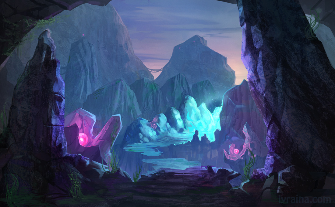
master study
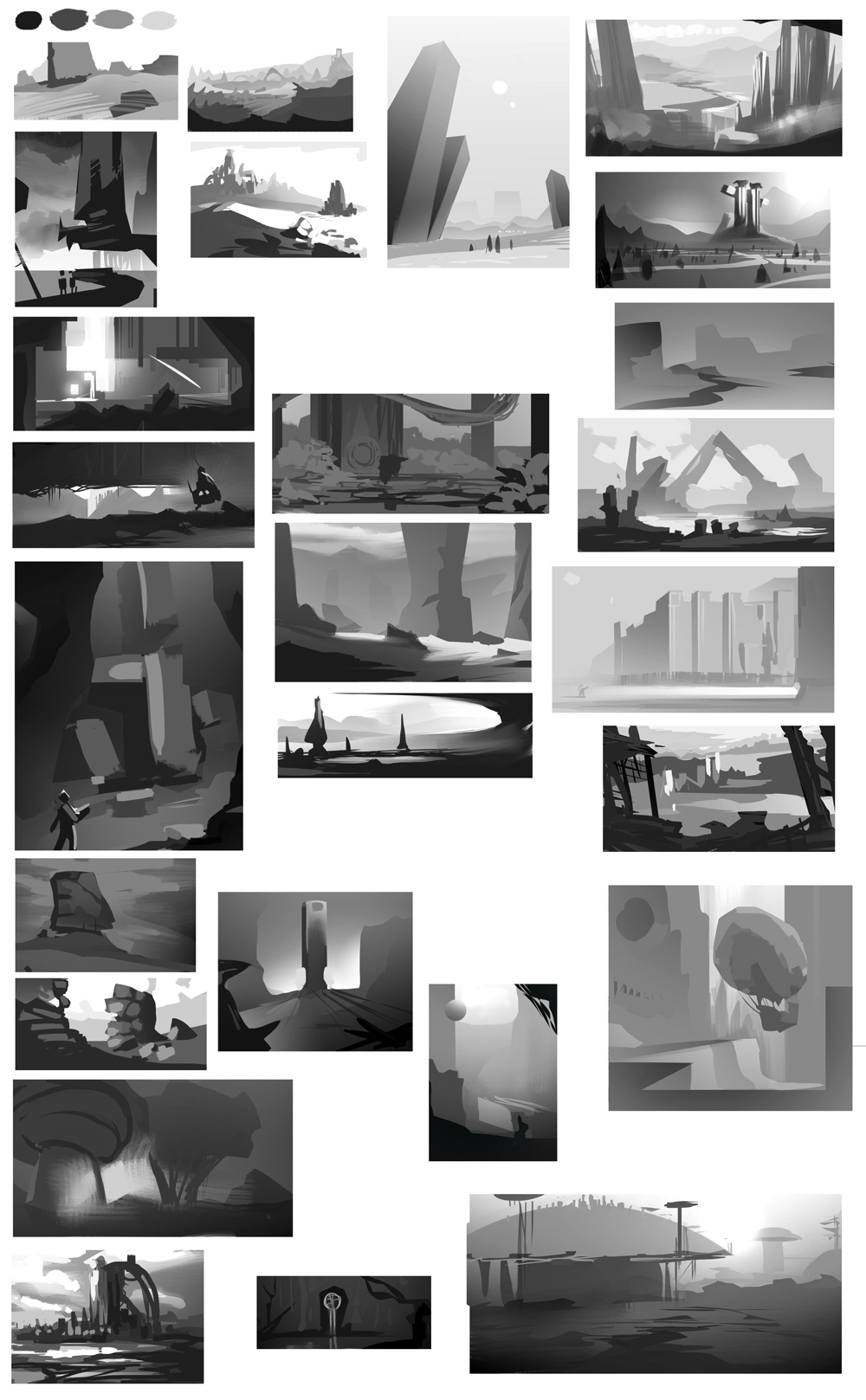
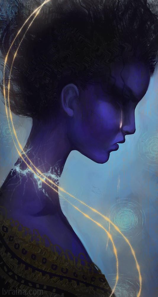
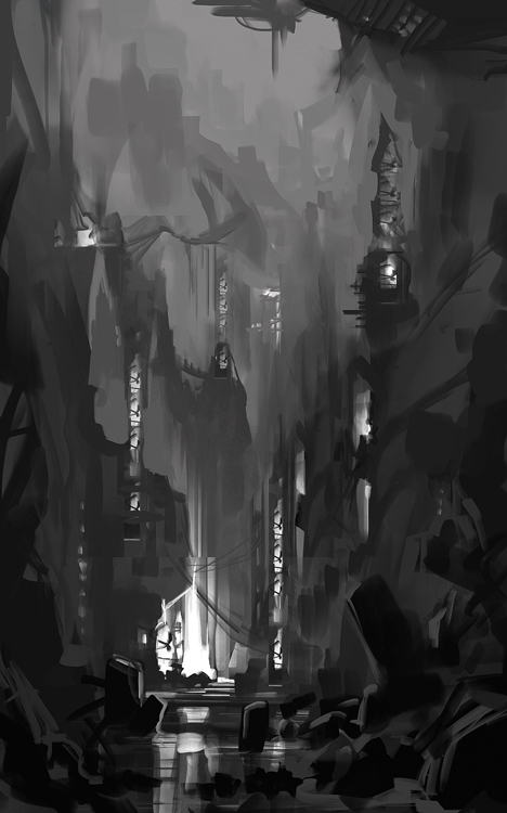
what is this I don't even
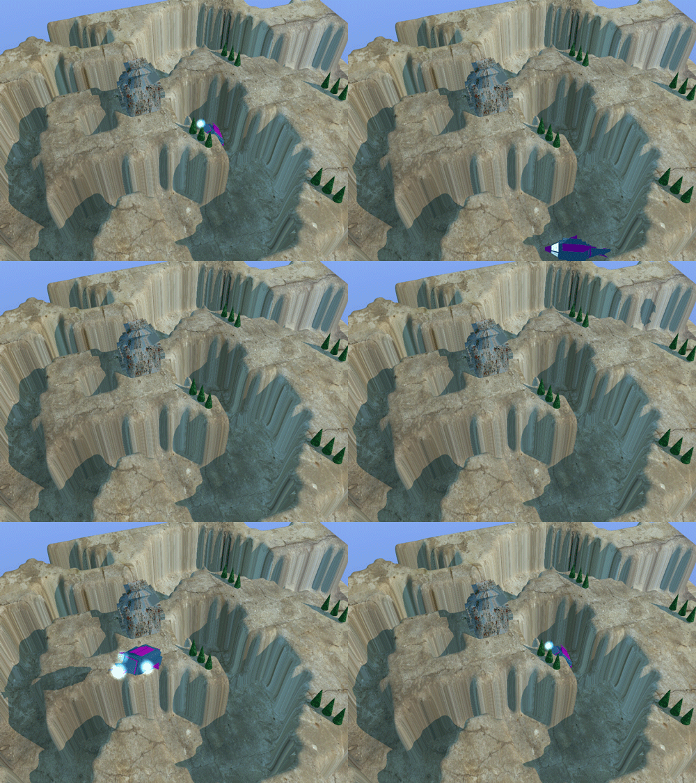
RE: Lyraina's sketchbook - The Aether Technician - 01-02-2015
Happy New Year!
I'm likin' those thumbnails there- who are you studying?
I've noticed that your painting style is very clean, with large areas of flat value- that great!, but I don't think it mixes well with photo textures and randomiser brushes. Who know though- you could probably make it work with some further exploration.
That .gif is....I don't know what to say. I don't think I can help you. I'm not sure anyone can help you.
RE: Lyraina's sketchbook - Adam Lina - 01-02-2015
The master studies are looking great, Lyra! I agree with Aether about the textures. Maybe you could use them a bit more sparingly. Im not sure if this is helpful but heres a video by Peter Mohrbacher about using textures more subtly. https://www.youtube.com/watch?v=Cz387Vy0Ps0
RE: Lyraina's sketchbook - meat - 01-06-2015
Did I hear you whine about not having design ability and creative ideas at some point? Your environment and that portrait loudly protest otherwise... Did you made that animation?
RE: Lyraina's sketchbook - Lyraina - 01-06-2015
The Aether Technician: In that case those are random enviros from my enviro inspiration folder.. don’t know the individual artists. Sorry! I definitely need more exploration and experimentation to find something that works for me. And I know, I’m beyond help :P
Adam Lina: Thanks for the feedback, and for the link! :)
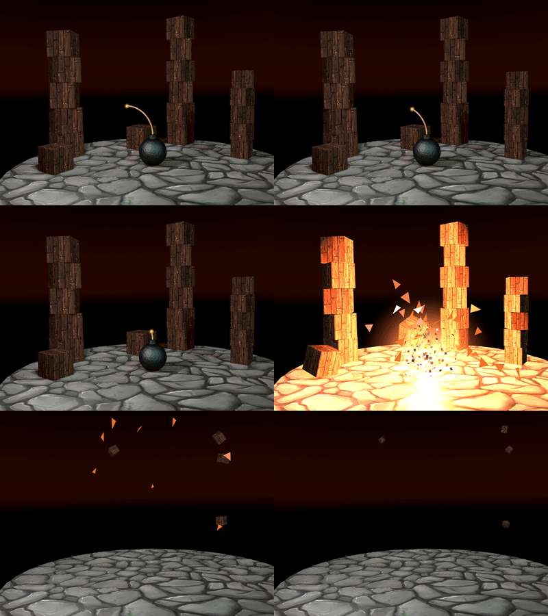
meat: I surely did not whine, merely state the obvious… but thank you :P I made that animation thing closely following a tutorial, so not much skill on my part, just repeating steps until I get a bit of an idea how to handle 3d tools:
http://greyscalegorilla.com/blog/tutorials/cinema-4d-for-absolute-beginners/
http://greyscalegorilla.com/intro-to-cinema-4d (part 1)
Finally there's a use for those textures I painted 2 (??) years ago:
RE: Lyraina's sketchbook - Tien - 01-07-2015
Happy New year ! Your work is insane ! Are you going into 3D Animation ? I really like your Black and white work and your thumbnails =o
RE: Lyraina's sketchbook - Lyraina - 01-10-2015
Tien: Thank you, hope you’re having a good 2015 too! I don’t plan on going into 3D animation, I just want to learn some 3d to broaden my skill set, and started literally with the first tutorial for absolute beginners, and that’s what came out.
WIPs.
![[Image: johannarupprecht_assignment1_contemporary_colors.jpg]](https://lyraina.files.wordpress.com/2015/01/johannarupprecht_assignment1_contemporary_colors.jpg)
![[Image: johannarupprecht_assignment2_fantasy_colors.jpg]](https://lyraina.files.wordpress.com/2015/01/johannarupprecht_assignment2_fantasy_colors.jpg)
RE: Lyraina's sketchbook - Jonas Jerde - 01-10-2015
wth, you got so much better so quickly. Your environments are definitely cool., the colors are nice and the compositions are pretty solid. The blue portrait is super neat as well.
The last one is coming along well, The only thing that looks off to me is the platform at the end with the steps. The perspective or the way it connects to the water looks off. It also creates sort of a weird focal point at the edge of the canvas too, since everyone's eye will probably end up looking to where the bridge ends. Maybe if it just continued on it would be less of a problem, or maybe shift the angle a little bit to you could see the structure at the end a bit better.
Either way its looking good, just some stuff to keep in mind.
Good job though, its all looking nice.
RE: Lyraina's sketchbook - Suira - 01-11-2015
Well I'll be damned, awesome stuff Lyra, glad to see you didn't slow down while I was gone, those moods are sweet as fuck, dat perspective is awesome, I've been struggling with enviros a lot lately and I can really appreciate a lot more now how mindblowing is that you get such awesome results.
The value control is pretty fucking awesome too. Crits? None, really, none. You clearly are focused on environment design and you're doing everything right in order to get there, so kudos!
Now, if you're bored one day or need to spice up the variation, maybe some face studies, but really, you're doing everything right, keep it up lady. Whenever I have time to drop by the forums and see you guys' stuff I just can't help but to kick myself in the butt and work harder.
Hope you're doing great! :D
RE: Lyraina's sketchbook - Lyraina - 01-24-2015
JJ Aaron: Thanks for the feedback. You’re right on the platform… it doesn’t work very well. I’ve had to scrap that concept anyway though, because I couldn’t keep up with doing twice the requested amount of work…
Suira: I would LOVE to do some face studies man! But I’m just glad if I get some sleep in, this mentorship thing is kicking my butt XD Thanks for coming by!
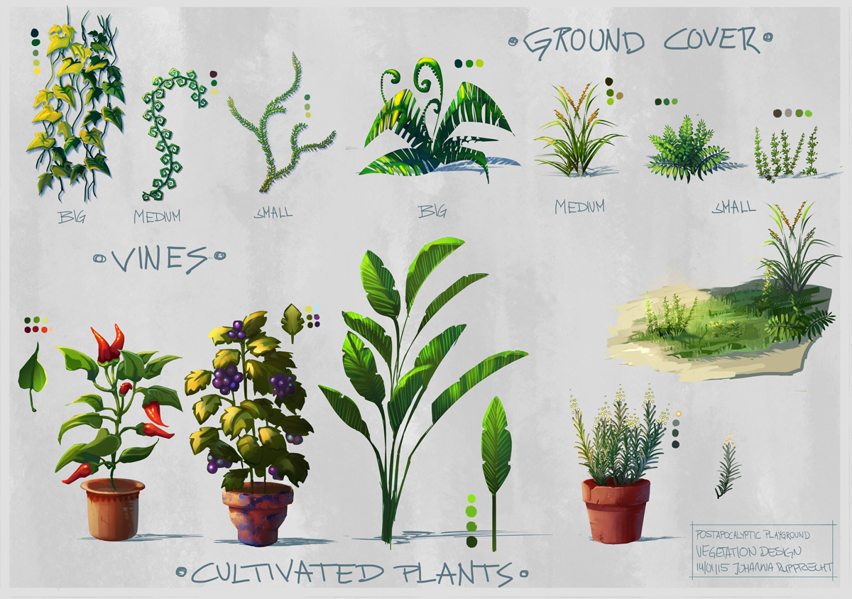
plants
LINES
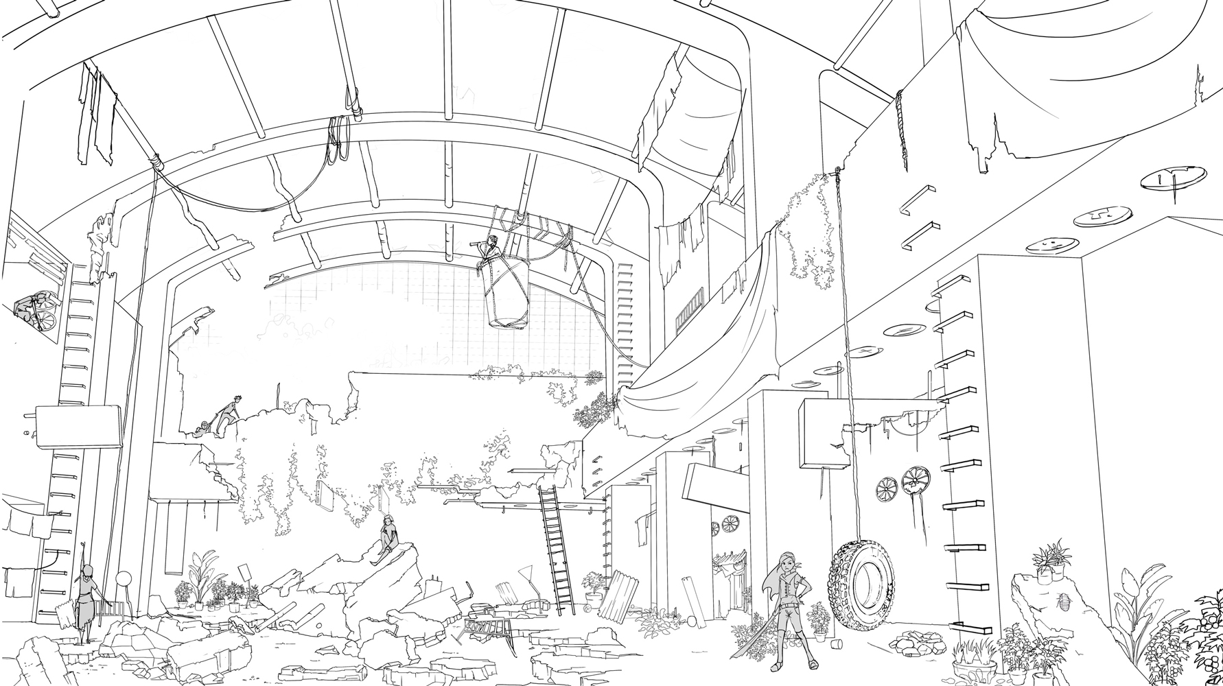
more to come