+- Crimson Daggers — Art forum (//crimsondaggers.com/forum)
+-- Forum: PERSONAL ARTWORK (//crimsondaggers.com/forum/forum-9.html)
+--- Forum: SKETCHBOOKS (//crimsondaggers.com/forum/forum-10.html)
+--- Thread: PurpleScissors' Sketchbook (/thread-6788.html)
RE: PurpleScissors' Sketchbook - Vornag - 02-10-2016
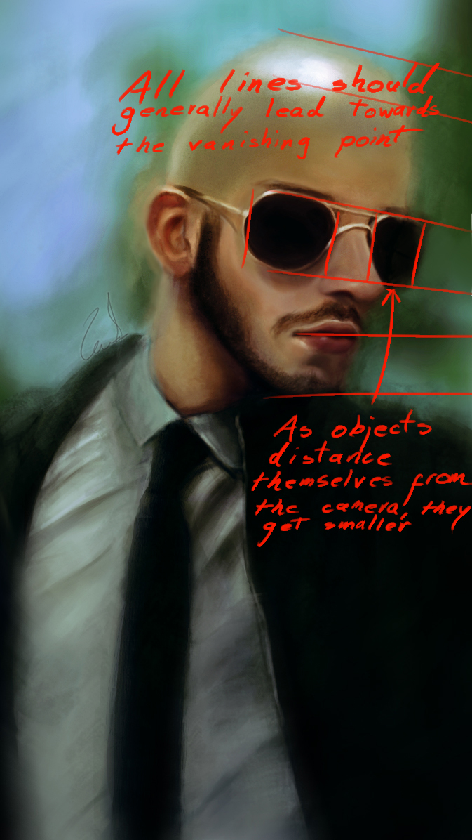
Heya purple. Got a quick and sloppy oh-god-I-don't-have-time redline for ya.

All that was changed was the size of the glasses and the angle of the lips. Flipping the canvas makes you notice those mistakes a lot easier. When you're in doubt, simplify the masses and check if they align with your chosen perspective. The nose also looks a bit off; it should be facing the camera a bit more.
Aside from that, your proportions are looking good, but slightly off sometimes.
Keep it up!
RE: PurpleScissors' Sketchbook - PurpleScissors - 03-01-2016
@Vornag thanks for the detailed explanations it looks much more accurate.
@yangdaniel027 thanks for the advice, I will try it.
I'm working on this illustrations for some time. Do you have any suggestions and critics? I especially having a hard time on painting the bed. Perspective and lightning challanges me.
![[Image: 1Ssxu9S.png?1]](http://i.imgur.com/1Ssxu9S.png?1)
RE: PurpleScissors' Sketchbook - Piotr Jasielski - 03-09-2016
Hey, as for the last piece I'd advise you to not go into such darks in the shadow areas. Shadows are never completely dark, there is always some bounce or dispersed light hitting the surface. It'd be probably best if you started with base colors and slightly darkened the shadow areas.
Also it's good to do as many studies as you can before creating your own piece. It really helps with understanding what you should do.
Anyway keep this up and see you in the Crimson Crucible challenge!
RE: PurpleScissors' Sketchbook - PurpleScissors - 03-10-2016
Thank you Piotr
 You may see the final piece below. I finished it, before seeing your comment. About the darkness; I know the rule you have pointed but I wanted to focus the light beam to create a more dramatic effect. The only light source is the light beam so I thought it's okay to leave the rest in dark, I thought about the bouncing light but I didn't think the light could reach to the bottom part of the image where there is only the bed. Still, I might be wrong. So, can you point out the parts where light should have bounced.
 -
The second attached image is a speedpaint created without any linework. (Ref image: a screenshot from Vikings!! )
And RGD sketches I did at work :D
![[Image: lGTjq9f.jpg?3]](http://i.imgur.com/lGTjq9f.jpg?3)
![[Image: n9RdOjq.jpg?1]](http://i.imgur.com/n9RdOjq.jpg?1)
RE: PurpleScissors' Sketchbook - Piotr Jasielski - 03-10-2016
I did a quick paintover. adjusted some areas in shadows. You can zoom in for better visibility. It's a slight change but it really makes a difference, especially on a monitor designed for graphics.
If you want to achieve some dramatic lighting, try implementing some hard shadows. Below just an example of idea.
I hope this helps
RE: PurpleScissors' Sketchbook - PurpleScissors - 03-11-2016
Oh god! Yes that's exactly what I wanted. But could not figured it out for some reason while I'm painting it. Thanks so much! I get the idea and I'll correct it tonight.
RE: PurpleScissors' Sketchbook - BrushNoir - 03-11-2016
Nice sketchbook! Looks like you're learning, keep it up.