
+- Crimson Daggers — Art forum (//crimsondaggers.com/forum)
+-- Forum: PERSONAL ARTWORK (//crimsondaggers.com/forum/forum-9.html)
+--- Forum: SKETCHBOOKS (//crimsondaggers.com/forum/forum-10.html)
+--- Thread: Rotohail's "Reclusive" SketchBook (/thread-8728.html)
RE: Rotohail's "Reclusive" SketchBook - darktiste - 10-18-2019
Not sure if i am adding to chubby_cat comment or if i am just repeating what she meant but try to catch the eye with strong saturation on the point of interest and desaturated toward area of rest.I am not even sure if this would work since i didn't experimented with the concept so far.
RE: Rotohail's "Reclusive" SketchBook - Leo Ki - 10-19-2019
OK I understand what you're saying about the profile's pose. I think the expression on her face looked a bit scared to me and contradicted the feeling of self-assurance, hence my hesitation.
Magical effects in day light are somewhat difficult indeed, I had this problem at some points - and I think I cheated by darkening the overall atmosphere. There must be a better way and you will find it.
The liveliness of the skulls is actually a skill that you have been applying all along, I believe, in all your cartoon or semi-cartoon drawings. Does it make sense or am I off base?
RE: Rotohail's "Reclusive" SketchBook - Rotohail - 10-22-2019
(10-18-2019, 08:00 PM)chubby_cat Wrote: Gotta join the bandwagon and say I love those skulls!
I think your use of colour is interesting, but I also think it could be done a touch more effectively where you make certain portions of the image pop with colour, and leave some places where the eye can relax. What is interesting is if you colour pick your latest image (the one with the red and purple skulls/demons) it's very saturated, but the value read itself isn't actually strong. Proof Colors if your using PS, zoom out and have a look at it in greyscale. Does it read clearly? Can you still see what's going on?
I adore your images because they are a lot of fun to look at, but my main advice is just experiment with colour (or lack of saturation, in this case) and see how far you can push things while still maintaining the essence of you.
I know the style is far from realistic, but don't forget to carry the intense lighting to all reflective surfaces. She's got a red titty but what about the other one? Considering how purple and bright her hands are, she should probably have a purple titty too :)
I did a grayscale check and the white&red one, the white value could be lower, so thanks for pointing that out! I rarely do that, I should do it more often. I also could lower the saturation by 10% and get the same read I have, but lower and it starts to lose appeal, to me at least.
Ha! I actually thought about adding purple and yellow reflection on the armor but ended up leaving it aside, reflections sometimes scare me, I don't want to over-complicate something. But it would tie everything together better. I just need to get better at understanding reflections.
Many thanks again!
(10-18-2019, 09:29 PM)darktiste Wrote: Not sure if i am adding to chubby_cat comment or if i am just repeating what she meant but try to catch the eye with strong saturation on the point of interest and desaturated toward area of rest.I am not even sure if this would work since i didn't experimented with the concept so far.
Well the issue I had with that one is having those 2 opposing things which are actually the main reads of the picture, then her as a 3rd read? Like I wanted to show that tug of war, but first read should be those two energies jumping out, pulling out, but being reeled in. So it's a hard composition but I tried to go with my gut lol. I don't have a clue how to do something like that. Like it's easy when you do a portrait or a single thing, you want that thing above all else, but when you have a scene with many things you want to show, man, that is troubling. It would probably work better on a sequence or animation since you can change the order/timming of what to show. Or change focus.
Thanks for your comment!
(10-19-2019, 01:20 PM)Leo Ki Wrote: OK I understand what you're saying about the profile's pose. I think the expression on her face looked a bit scared to me and contradicted the feeling of self-assurance, hence my hesitation.
Magical effects in day light are somewhat difficult indeed, I had this problem at some points - and I think I cheated by darkening the overall atmosphere. There must be a better way and you will find it.
The liveliness of the skulls is actually a skill that you have been applying all along, I believe, in all your cartoon or semi-cartoon drawings. Does it make sense or am I off base?
I think at first I had sort of frowned stare? But went after a more blank one. I really didn't want any emotion to it. Does it read now like that? Good point though, if it read as fear to you turning the torso makes sense, also lower her center of mass, bending the legs, stuff like that.
Well honestly everyone does that! Darken the surrounding, my issue was how much before you change the setting. That's the kind of stuff I want to try. I think Marvel movies as of late have done that pretty well overall so I probably will have to study them.
Hmm, I'm not sure, I feel like I need to exaggerate and improve at design and gesture way more, to control it better. Like it's not something you get once and you are done. You can always push more or change something to get a better read, depending on your goal, so I'm always left uneasy. It's fun though! So I'm good with the uncertainty.
Thanks for your comments!
Leaving a WIP for my next page. Need to work on the main one, and make changes overall. Not sure where I want to go with some of the things I have as of now. Hope I can fix it tomorrow or next 2-days and start coloring. Crows and one chair are from photos/reference.
Quickfix Edit: Hoping this makes more a bit more sense now.
RE: Rotohail's "Reclusive" SketchBook - Fedodika - 10-22-2019
loving the chairs... and howloween, very cute! i dunno whats going on in the squire dudes picture, in a forest maybe? composing forests is hard because we wanna draw roots and trees everywhere, but it takes a real expert to cut it down to just a few important elements to read as a forest me thinks :)
RE: Rotohail's "Reclusive" SketchBook - Jephyr - 10-22-2019
Hi,
You've got a nice mixture of studies and characters etc here. I like that you're exploring cartoony and fantasy styles.
I actually really like your vibrant color choices. I struggle with that myself.
Keep up the great work
RE: Rotohail's "Reclusive" SketchBook - Leo Ki - 10-24-2019
I can't wait to see where you take the two larger images further - and if you're going to use a dark background in the forest to make the fairies pop out ;)
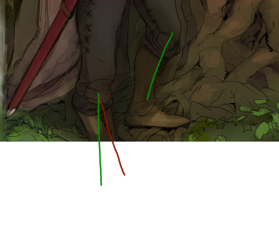
Woods guy has a broken tibia I feel (left facing leg), unless he has a very supple knee.
RE: Rotohail's "Reclusive" SketchBook - bluehabit - 10-24-2019
Great Halloween sketch, really gets me in the spirit of the holiday! Love the chair perspective sketching too.
RE: Rotohail's "Reclusive" SketchBook - Matheus Chastinet - 10-26-2019
Hey! I loved your sketchbook! Those small perspective studies are gorgeous! Do you have any personal project in mind??
RE: Rotohail's "Reclusive" SketchBook - Rotohail - 10-26-2019
(10-22-2019, 04:21 AM)Fedodika Wrote: loving the chairs... and howloween, very cute! i dunno whats going on in the squire dudes picture, in a forest maybe? composing forests is hard because we wanna draw roots and trees everywhere, but it takes a real expert to cut it down to just a few important elements to read as a forest me thinks :)Yeah I barely never do studies of trees yet I keep trying to use them on my drawings. Guilt is really eating away at me. Alright next page thjere' gonna be tree studies.
(10-22-2019, 05:26 AM)Jephyr Wrote: Hi,Thanks man! Well I saw on your SB you use pastels so vibrancy with those must be tough! I guess maybe try acrylics? Something thicker? Or markers!
You've got a nice mixture of studies and characters etc here. I like that you're exploring cartoony and fantasy styles.
I actually really like your vibrant color choices. I struggle with that myself.
Keep up the great work
(10-24-2019, 08:02 AM)Leo Ki Wrote: I can't wait to see where you take the two larger images further - and if you're going to use a dark background in the forest to make the fairies pop out ;)Ha! If you want do any redline or draw over what you see wrong with the leg, I encourage it! I dunno, I feel I wanted to do a curved view but ended up half-assing it a the end! Legs bother me a bit but I can't put my finger if it's one or both that need changing.
Woods guy has a broken tibia I feel (left facing leg), unless he has a very supple knee.
(10-24-2019, 01:03 PM)bluehabit Wrote: Great Halloween sketch, really gets me in the spirit of the holiday! Love the chair perspective sketching too.Thanks man! Are you going to do something for the season? It's a good excuse to try sketching something fun!
(10-26-2019, 12:53 AM)Matheus Chastinet Wrote: Hey! I loved your sketchbook! Those small perspective studies are gorgeous! Do you have any personal project in mind??Heya! What perspective studies? The boxes and chairs and all that? I wouldn't call them studies, I construct them to warm up. Is industrial design stuff! Practicing drawing shapes and forms, and doing cuts. Peter Han touches on that if you are curious! Check him out!
Personal project? Well, just improve overall my quality and do better. Maybe that's more my personal goal... ha! maybe project would be what I do now? I have usually a target in mind or something I want to improve on so I make some kind of exercises to try out new stuff, these are sort of that I guess? Do pages weekly where I do a mix of illustrations/sketching mixed with studies or anything else that catches my attention, trying to follow some theme.
Leaving the last page colored. I feel I should probably work it out more but, is already been a week with this one and I'm starting to get all jittery wanting to start a new one. So gonna wrap it like this.
Overall howloween could had turned better with more cheerful colors I feel but tried to go for darker/muted colors, I would had liked to do fur better, so studies on that soon. I would also would think the fantasy one could use darker values on certain points, but I wanted a sort of whimsical feel to it too. Also again trying daylight with magical effects. I think the answer to do these would be always keeping the effects behind a dark place or shadow area, or broken within points like those so you can show well enough the brightness without darkening the whole scene.
RE: Rotohail's "Reclusive" SketchBook - Matheus Chastinet - 10-26-2019
Why don't you play with some colour notes? Do you know the work of Yan Kyohara or Pedro Kruger? Maybe they work will create on you some spark of new things to try out. Maybe Even Amundsen and Mike Azevedo you already know, they are good inspiration of problem solving in painting and character design. Hope to see more things from you, you inspired me bro! Don't lose your steam! :D
RE: Rotohail's "Reclusive" SketchBook - Coinhero - 10-26-2019
Yooo that Halloween image is so great, I love it! You should widen the bg a bit so that it's not touching the edges of the clouds and letters and maybe add one more small element coming out of the frame on the right the same way the pumpkins do. A little bit more work and you have a masterpiece :D
RE: Rotohail's "Reclusive" SketchBook - Fedodika - 10-27-2019
i like the bulge on the squire, very hot; howloween is cute. the bent squire leg is kinda strange, also thanks for all the tips in my sb :)
RE: Rotohail's "Reclusive" SketchBook - Leo Ki - 10-27-2019
Here is the redline. Green shinbones are where I see them, red shinbone is where it seems to be:
I like how peaceful the scene is. The guy may be slightly annoyed by the fairies or concerned by something they say but also amused.
I had imagined the Howloween rendering much darker, especially the clouds, but I understand the characters must remain salient.
I like the (apparently) simple brushwork on the small raven study.
RE: Rotohail's "Reclusive" SketchBook - Rotohail - 11-02-2019
(10-26-2019, 04:08 AM)Matheus Chastinet Wrote: Why don't you play with some colour notes? Do you know the work of Yan Kyohara or Pedro Kruger? Maybe they work will create on you some spark of new things to try out. Maybe Even Amundsen and Mike Azevedo you already know, they are good inspiration of problem solving in painting and character design. Hope to see more things from you, you inspired me bro! Don't lose your steam! :D
Color notes? Like accents? I'm trying to keep my colors simple because is the main thing I'm trying to learn currently, I'm trying to stay within triads or split-complementaries for the time being.
Not a clue about the first two but I'll check them out! I see stuff from Azevedo and Amundsen from time to time on Artstation, I think Amundsen is overall my favorite pick, superb line control, shape/form, gesture and color in all their characters, while still keeping that realistic edge. The thing is though, they are too advanced for me to understand how they approach what they do lol, can't wrap my head around it yet. Gotta keep moving forward!
(10-26-2019, 03:02 PM)Coinhero Wrote: Yooo that Halloween image is so great, I love it! You should widen the bg a bit so that it's not touching the edges of the clouds and letters and maybe add one more small element coming out of the frame on the right the same way the pumpkins do. A little bit more work and you have a masterpiece :DSounds like a spot on idea! I'm terrible at designing frames lol. For now I prefer to leave it like that, and hopefully in the future redo it completely to see what can I improve.
(10-27-2019, 05:24 AM)Fedodika Wrote: i like the bulge on the squire, very hot; howloween is cute. the bent squire leg is kinda strange, also thanks for all the tips in my sb :)
HA! Well that dark line sure must go, but hey! Tastes. Yeah the legs turned out kinda off, need to work on that. No problem! I see you are doing great so far.
(10-27-2019, 03:37 PM)Leo Ki Wrote: Here is the redline. Green shinbones are where I see them, red shinbone is where it seems to be:
I like how peaceful the scene is. The guy may be slightly annoyed by the fairies or concerned by something they say but also amused.
I had imagined the Howloween rendering much darker, especially the clouds, but I understand the characters must remain salient.
I like the (apparently) simple brushwork on the small raven study.
Oh yeah now that you mention it it does feel like it bends a bit too much, oh well, gonna have to practice those views. That was my idea! Ha ha, I'm glad you got the same vibe, like I was in between making him annoyed or amused! Those things are mischievous, but playful. Hmm, I guess I could go darker but honestly I never push it enough. I think to practice that I should focus on inking and using dark shakes to define stuff. That probably will give me a slap.
That's mostly my lack of control ha ha, I need to seriously improve my brushwork! I keep reminding myself to slow down and not scratch too much but is not coming together yet, but thanks! Anything you liked about it well, it was a fluke.
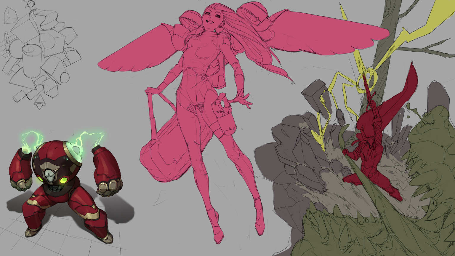
So I've been since the start of the week sick lol, it had been a while since I had one of these, fever, dizziness and stomach ache, all in one perfectly wrapped "fuck you!" lol. I tried a page but it wasn't turning out too well, so I moved onto this one in between yesterday and today . Leaving a WIP for now. Need to clean and color the main stuff, hopefully during the weekend. I tried to go safe on this one, back to my comfort zone. Next page backgrounds again.
RE: Rotohail's "Reclusive" SketchBook - Fedodika - 11-02-2019
I LOVE SKEENY WIINNY GIRLS!!
RE: Rotohail's "Reclusive" SketchBook - Leo Ki - 11-02-2019
I hope you are crushing that sickness, Rotohail. Be well!
Might be your comfort zone, but the three pieces have good design and posture. The knight pulling the dragon's tongue is ace.
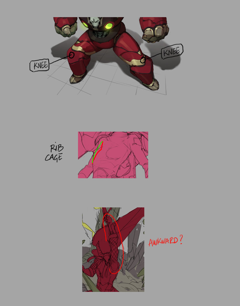
Here are a few critiques in this drawover. Let me know if they are not clear and I will elaborate. I might be wrong on the last one - I'm assuming he's about to strike but that may not be the case.
RE: Rotohail's "Reclusive" SketchBook - Rotohail - 11-04-2019
(11-02-2019, 07:36 AM)Fedodika Wrote: I LOVE SKEENY WIINNY GIRLS!!O-Okay..! Ha. I'm glad you do! *Thumbs up*
(11-02-2019, 11:05 AM)Leo Ki Wrote: I hope you are crushing that sickness, Rotohail. Be well!
Might be your comfort zone, but the three pieces have good design and posture. The knight pulling the dragon's tongue is ace.
Here are a few critiques in this drawover. Let me know if they are not clear and I will elaborate. I might be wrong on the last one - I'm assuming he's about to strike but that may not be the case.
I was done for until Friday, but I'm rocking myself once again. Sunshine everywhere now. Ah.. so nice. Thanks Leo Ki.
I think the dragon/monster didn't came off all too well, I need to study lizards next I guess!
Thanks for the critiques! Yeah I fucked up the robots legs, I have that issue where I don't match designs and I don't even notice, I'm trying to work on that, pay more attention, but till. Happened the same with the girl! I left it there but I noticed the pattern around the groin doesn't match, also another bit below the knees, don't match. Those things I only notice after some time! Which is troublesome. Hoping with experience I can notice them faster so I can fix before moving onto other stages. I guess more drawing! Is on the menu, ha. What's new?!
The girl, more than the ribcage, I think the issue were the breast, poorly placed. I think I fixed it now? Maybe not.Let me know.
I reworked the guy, I think the arm raised was way to long? Also gutted the shoulder without noticing. Hope now it works better/is more consistent.
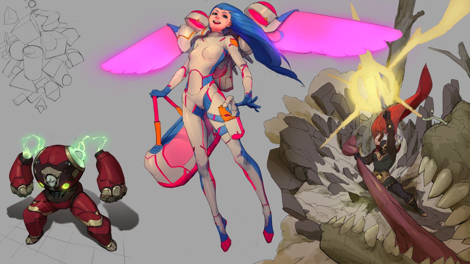
Anyhow colored page, rushed it and should had done more with colors but maybe keep things simpler might help me not overwork stuff. Or just being plain lazy! Dealer's choice. The girl I wanted more cheerful, magical girl vibes, which I don't usually do but they fit the mood. So Upping that saturation there! The warrior is too bright, I would darken more shadow points to give more contrast, taking notes. Contrast seems to always be an issue that keeps coming over to spend the night and then never let's me have any rest. Oh well, at least makes me company. #Marrying-your-bad-habits
RE: Rotohail's "Reclusive" SketchBook - 879 - 11-04-2019
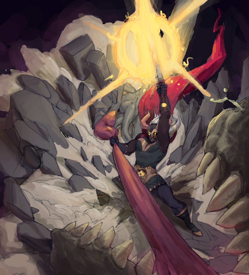
I don’t understand the contrast it’s a nice style. I was noodling in procreate to try to figure out what you mean but I think your color temps might be fucked or I messed something up it’s easier to figure out in photoshop. I don’t know what you mean by contrast just more values but it looks gaudy that way yours is tasteful. sorry idk what your getting at but I’m bad at reading. Also ignore the fucked up paint over lines thing I did to your art I shouldn’t blame tools but procreate is hard I couldn’t fill anything.
RE: Rotohail's "Reclusive" SketchBook - Rotohail - 11-04-2019
(11-04-2019, 03:34 PM)879 Wrote: I don’t understand the contrast it’s a nice style. I was noodling in procreate to try to figure out what you mean but I think your color temps might be fucked or I messed something up it’s easier to figure out in photoshop. I don’t know what you mean by contrast just more values but it looks gaudy that way yours is tasteful. sorry idk what your getting at but I’m bad at reading. Also ignore the fucked up paint over lines thing I did to your art I shouldn’t blame tools but procreate is hard I couldn’t fill anything.
I would have liked to push the darker areas into blacks more! I think I missed out on that! Well I really like the looks you have going on here now! The red afterglow on the mouth, bottom right corner, and the darker background fill. Also better defining the muzzle, which I did not do. I was trying to make the shadows be yellow tinted and more saturated than the light areas, but having a main yellow light source only. It might have been a boring idea now that I see the aftermath! Ha. Is that what you mean with the temperature being fucked? Anyhow I did a quick color-balance/level edit to show what I meant with more contrast, but is not as punchy overall or has the mood you got sadly. Oh well, taking notes. Thanks for the comment!
RE: Rotohail's "Reclusive" SketchBook - 879 - 11-05-2019
The color temp thing I think one side of the value spectrum should be desaturated to make it less muddy. I think Schmidt’s alla prima has the answers that’s on my growing study to do list sorry I can’t help more. I really love the swoosh thing you do with the smoke effects it has a nice comic effect that’s really nice.