Posts: 151
Threads: 2
Joined: Oct 2019
Reputation:
20
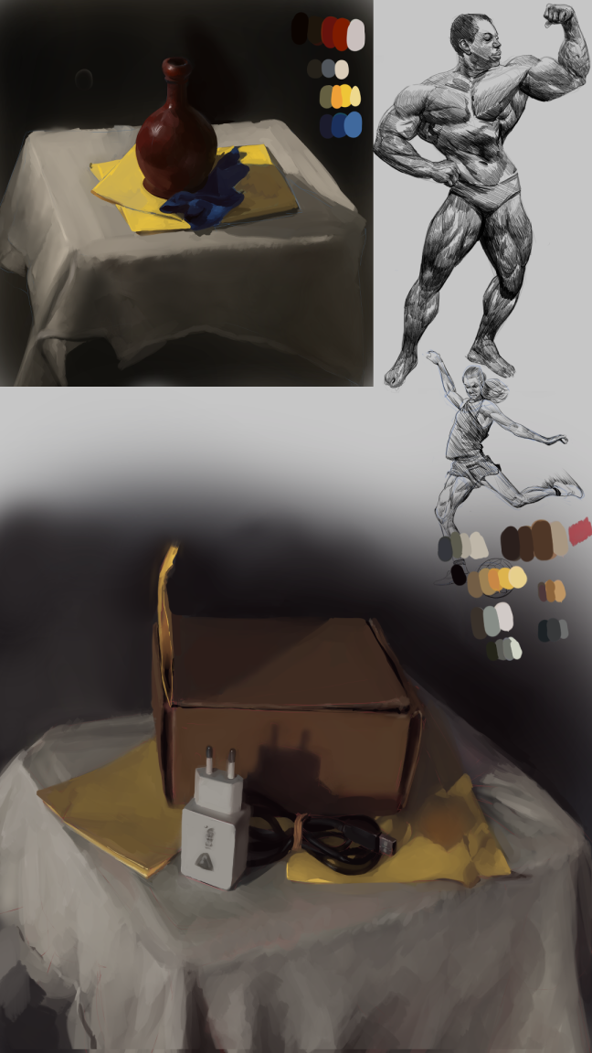
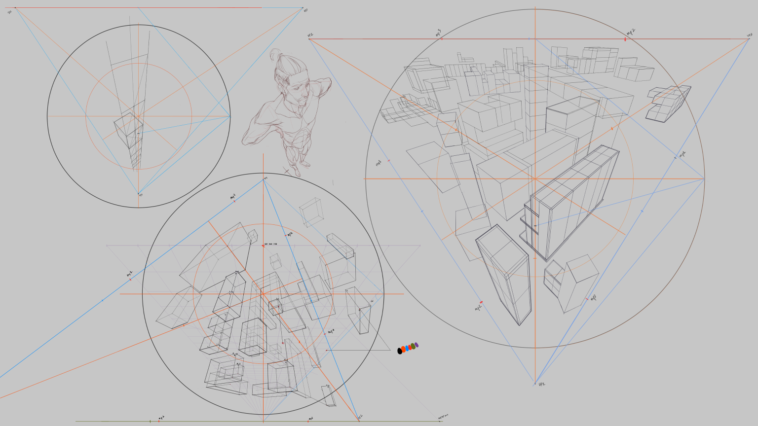
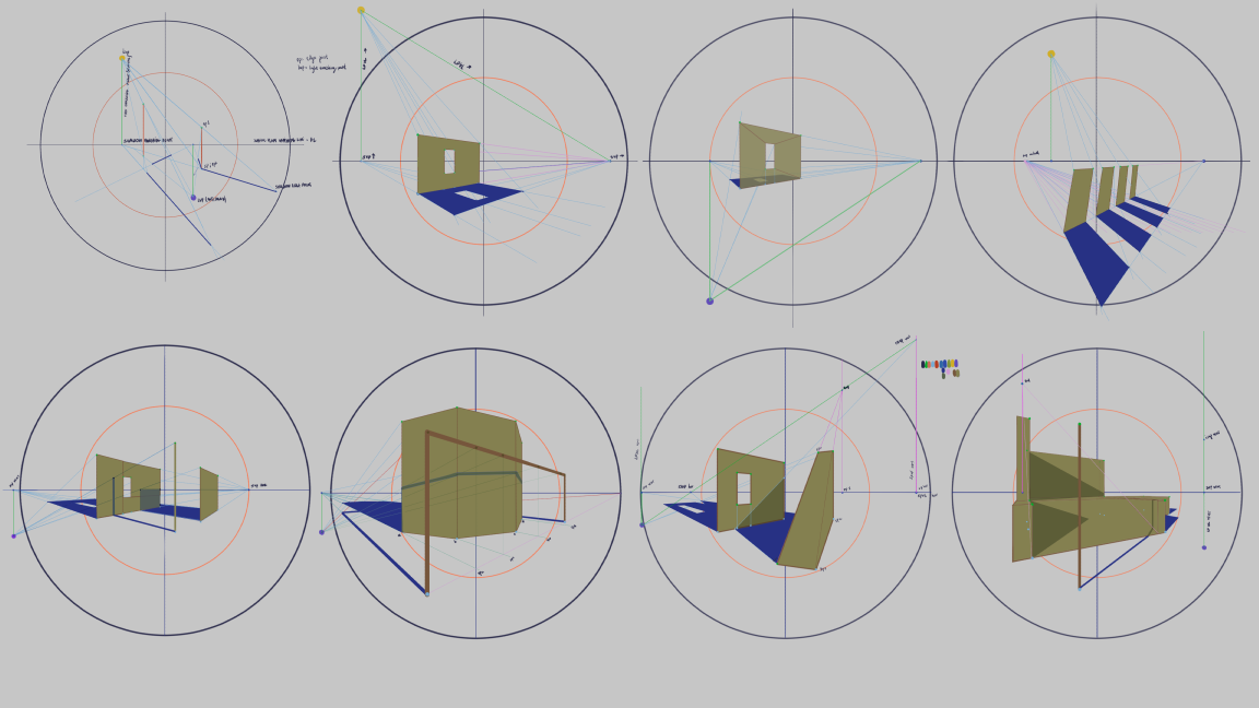
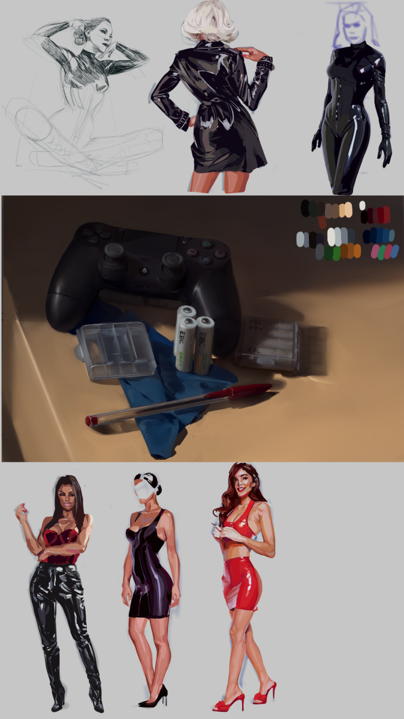
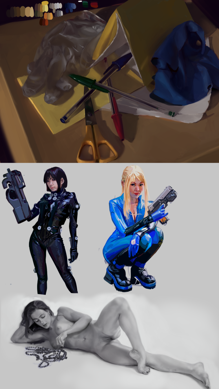
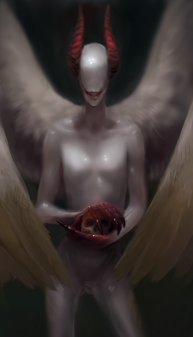
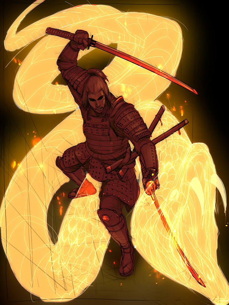
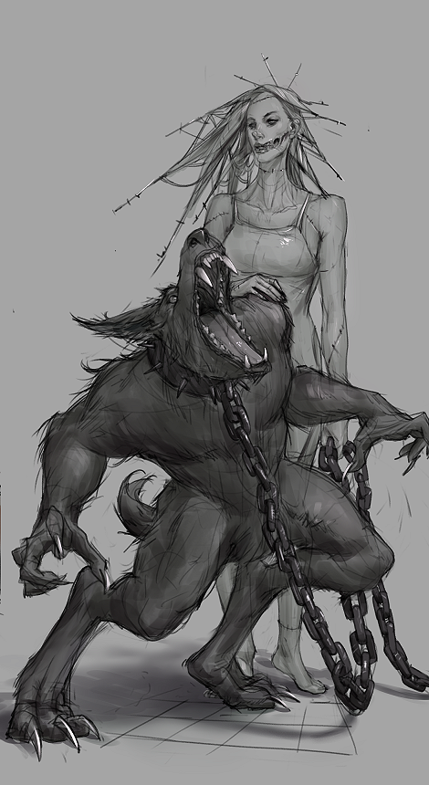
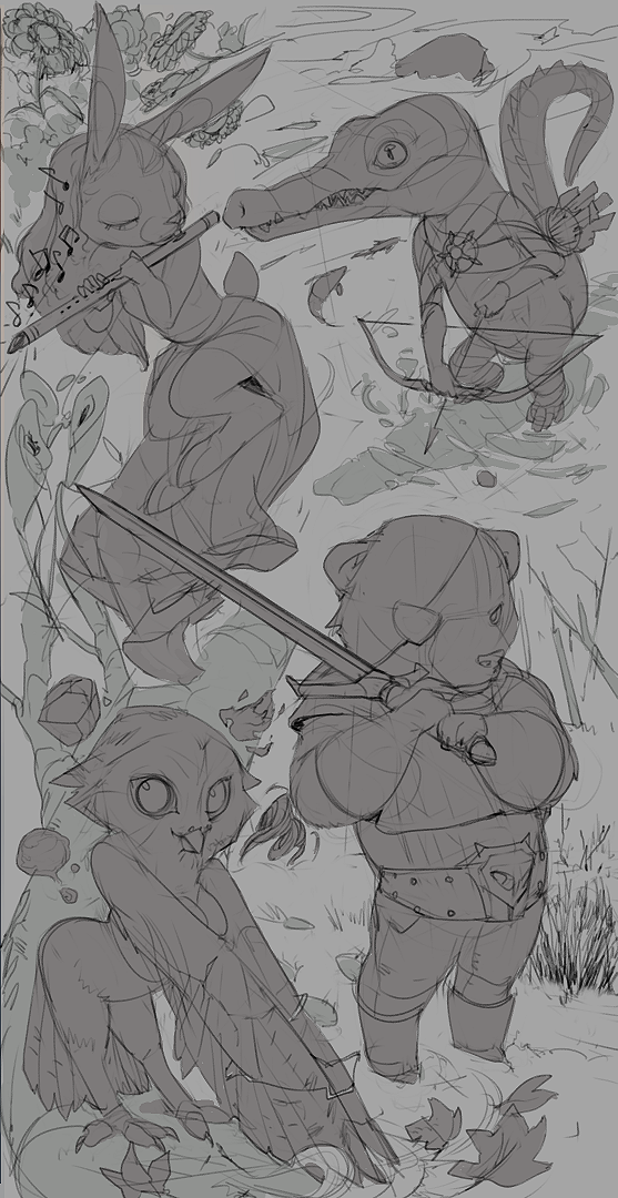
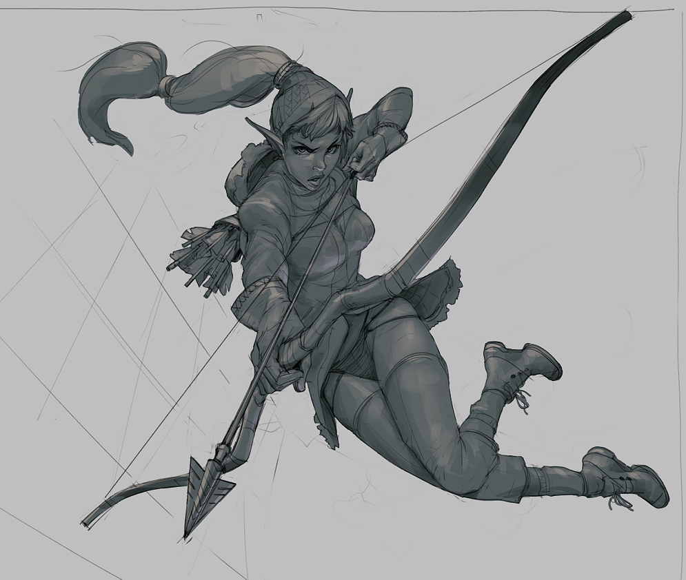
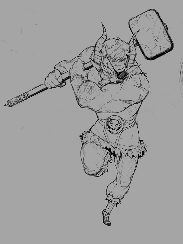
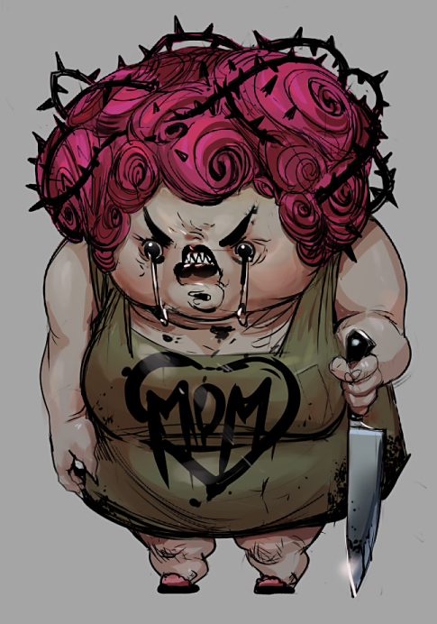
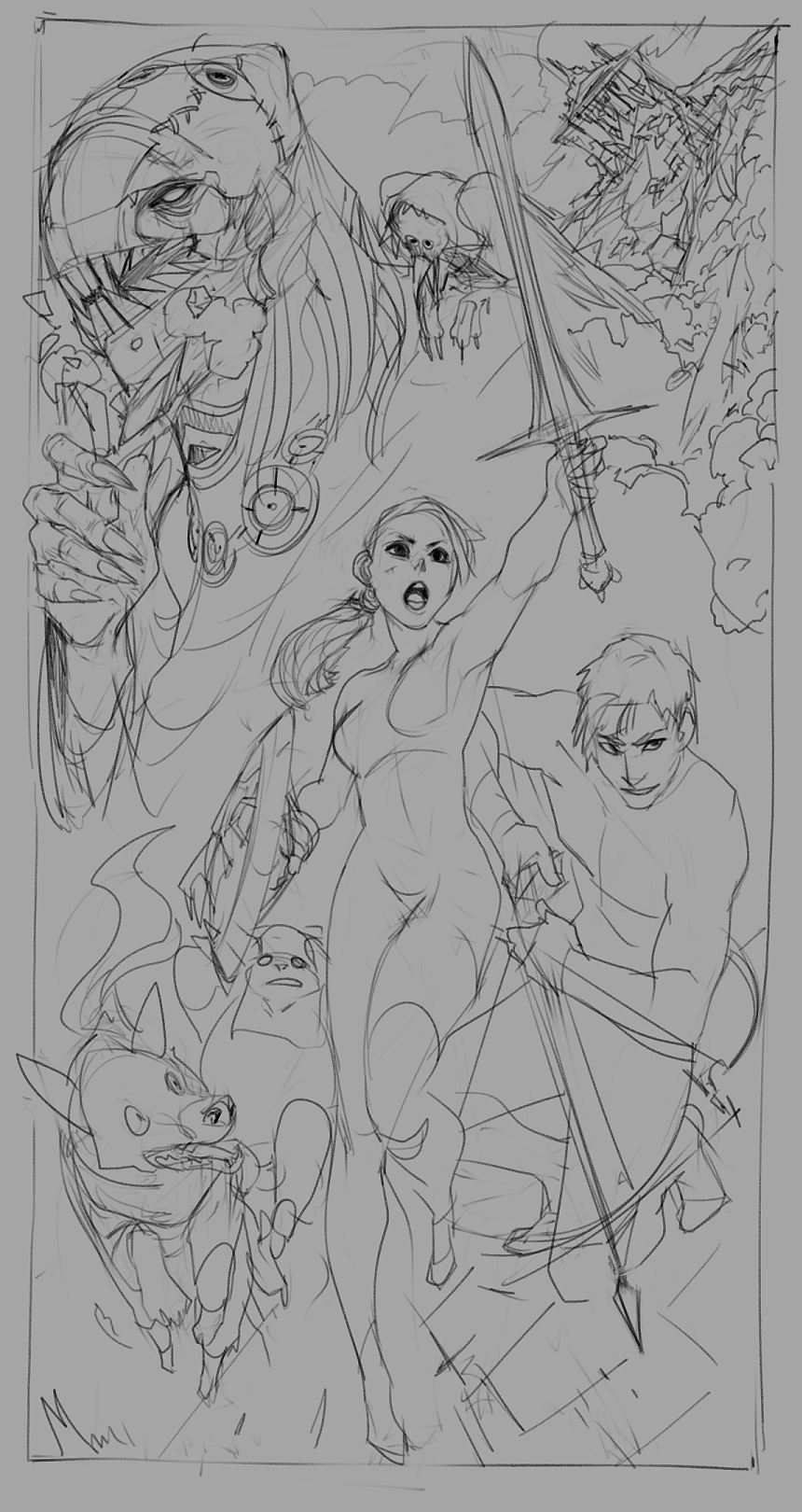
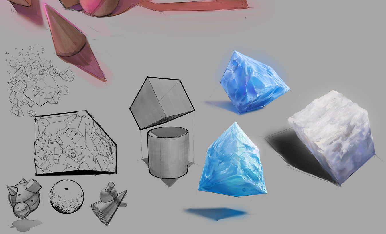
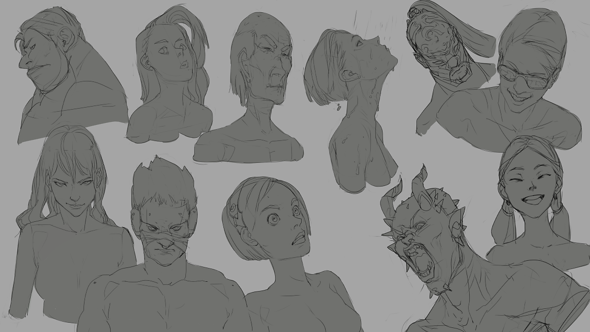
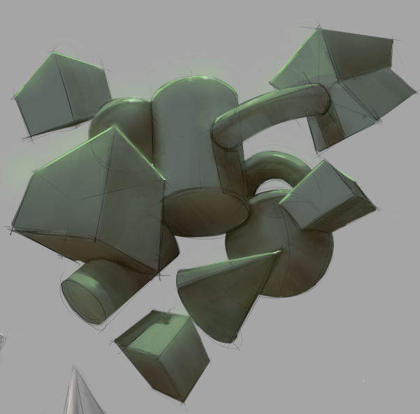
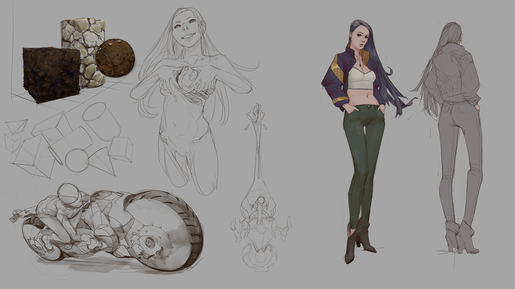
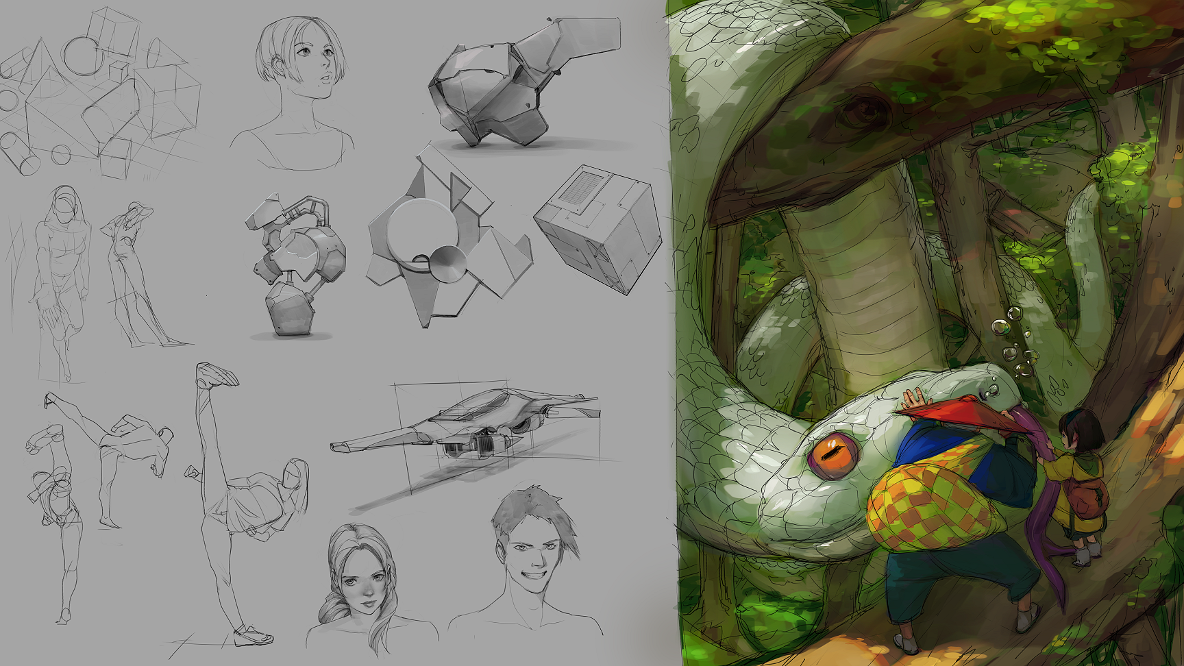
I'll be leaving some things I've done for the past year, from about October 2018 to current month, October 2019.
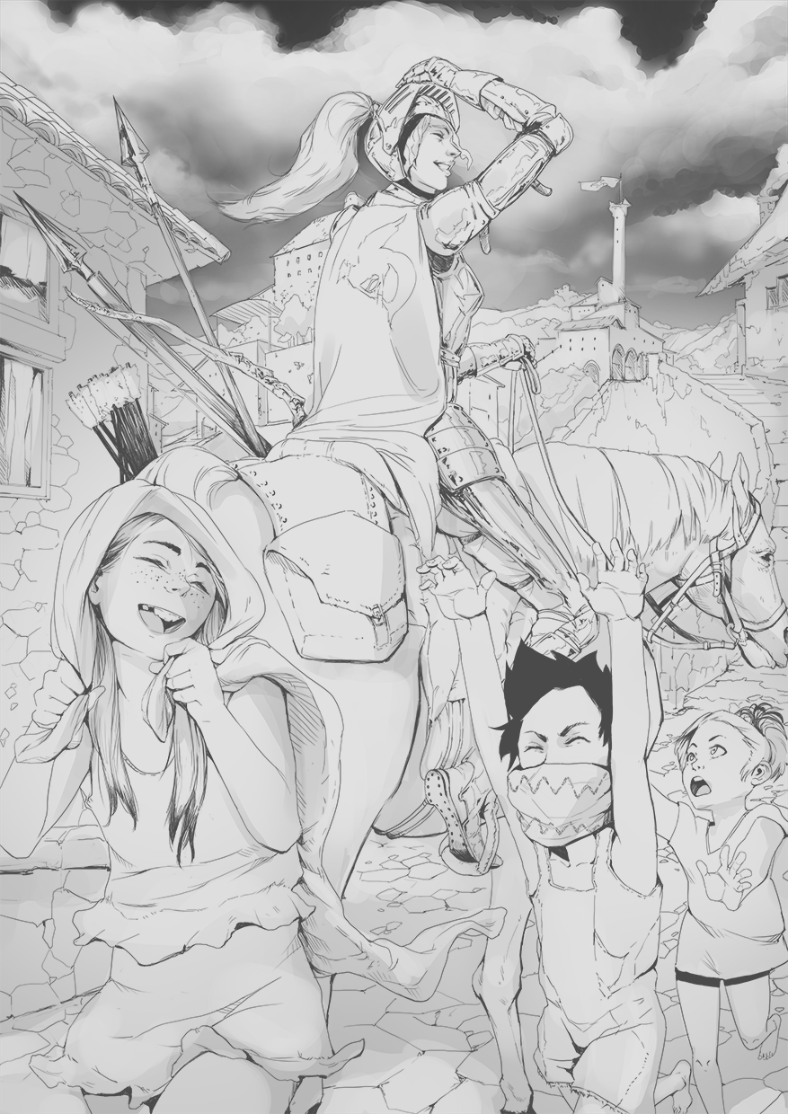
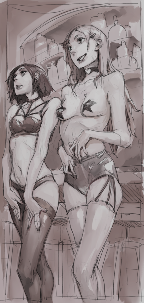
This is one of the first ones I did to get back into drawing.
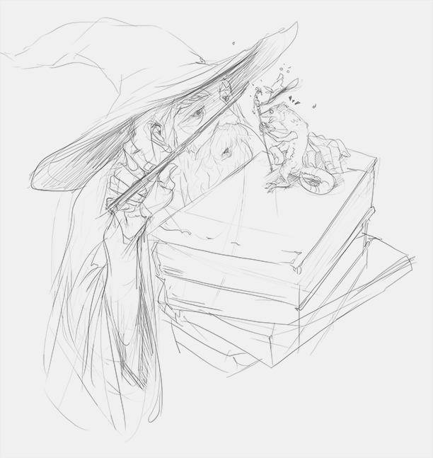
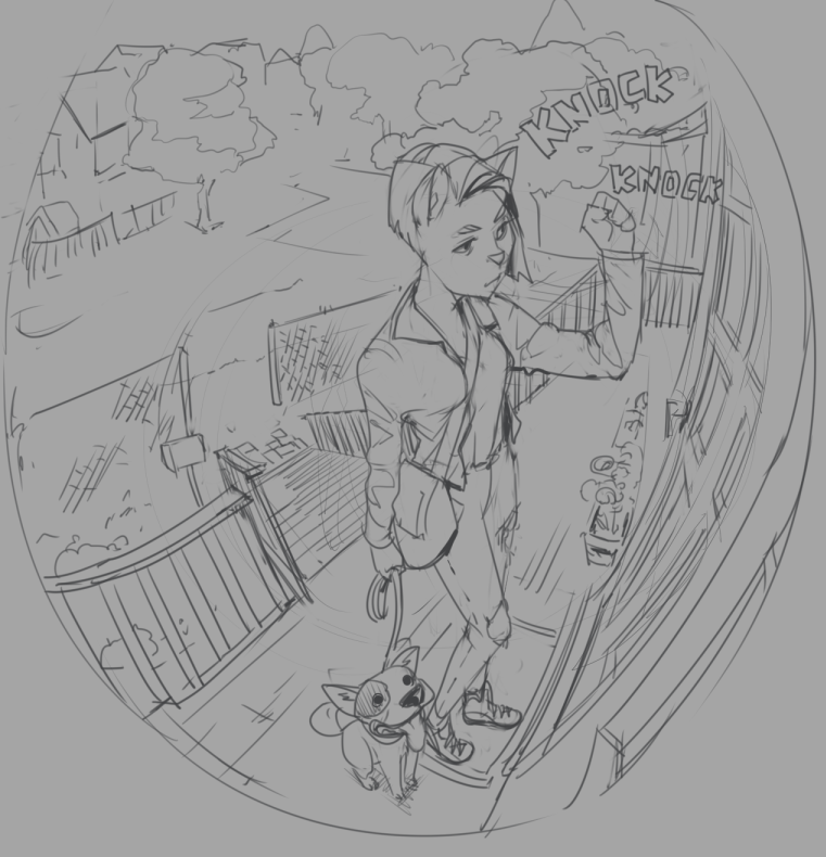
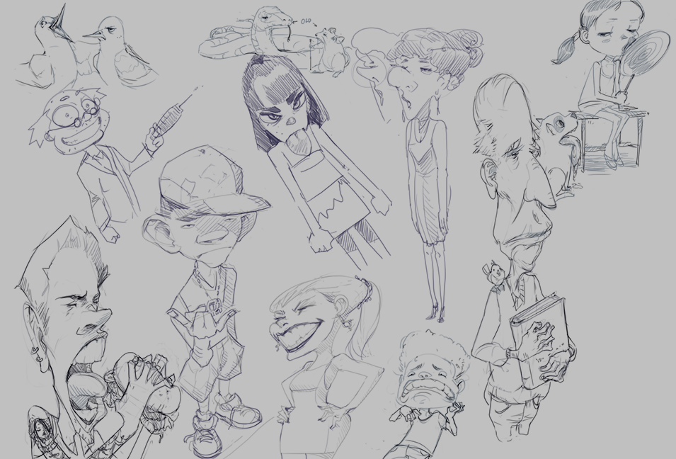
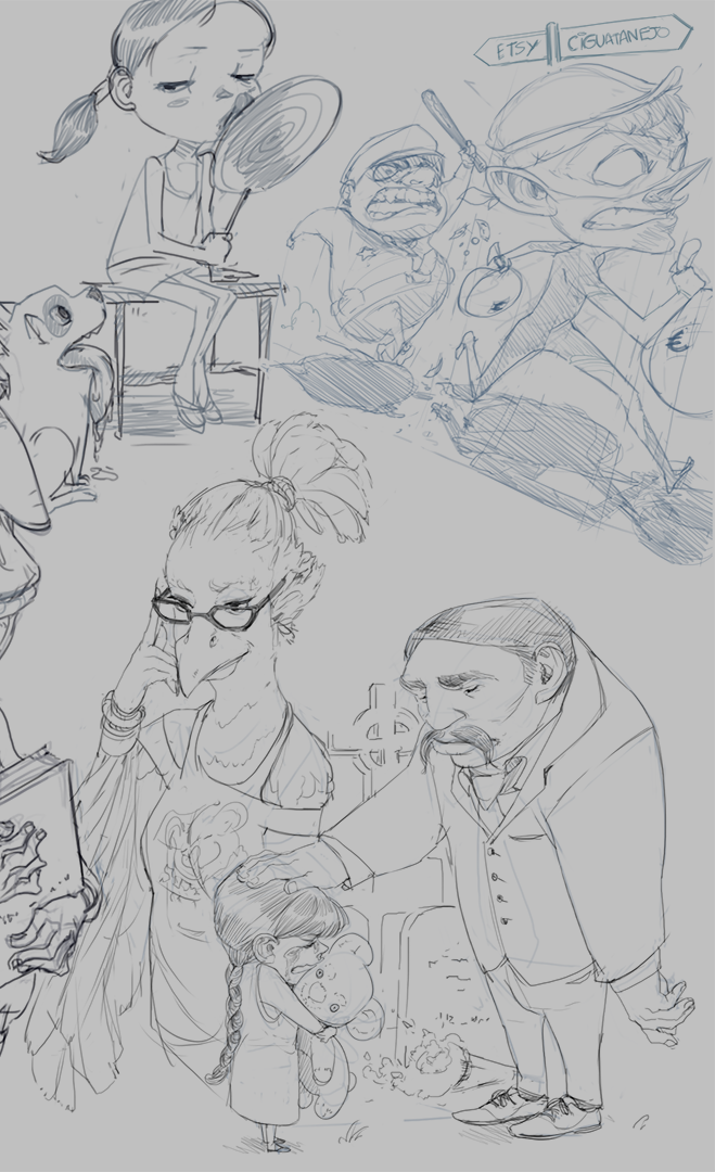
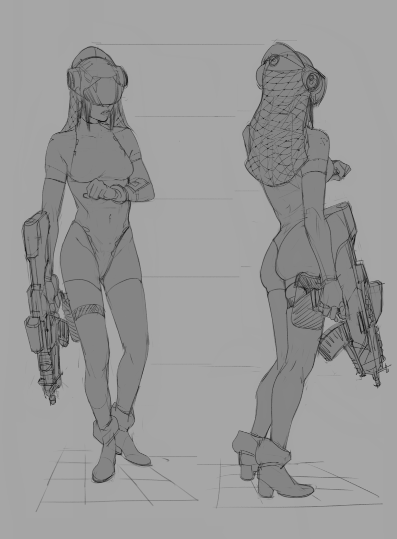
 A bunch of sketches and other things from imagination from the starting out couple of months.


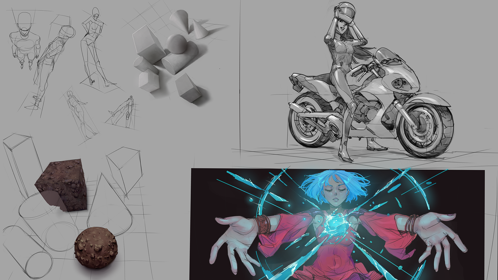
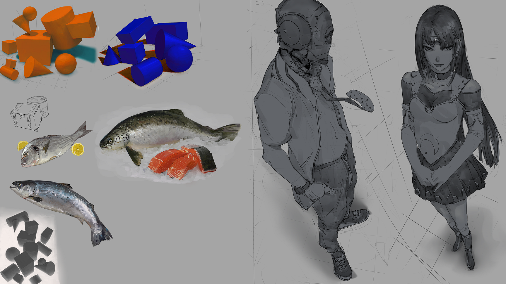
 The first more serious one I did before picking back up painting studies, life-drawing and other exercises. I was sort of scared of doing color at the time.
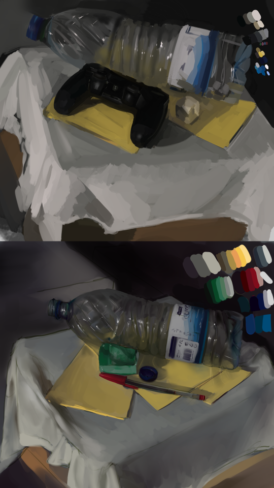
 I started doing studies at that point, sort of really seriously, 10-12h daily, for about 2 months, until my arm started to hurt lol (
I stopped drawing due to wrist pains almost 5 years ago, but I'm doing much better since I got back into bike/trail riding on 2016 ).


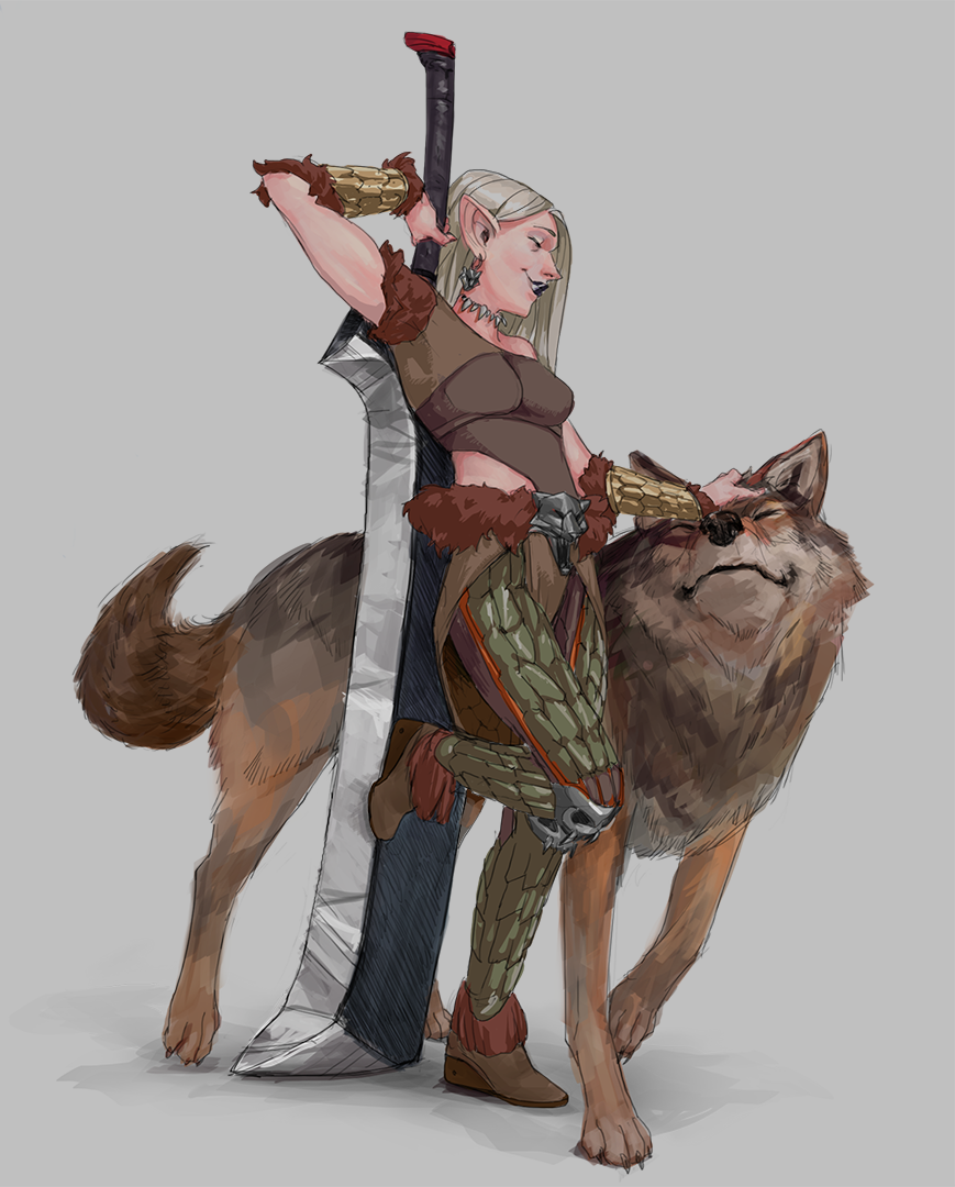
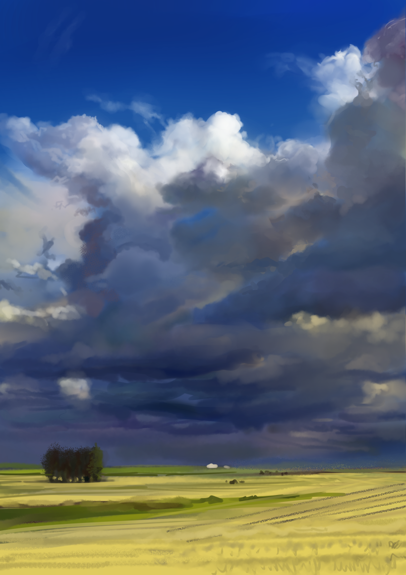
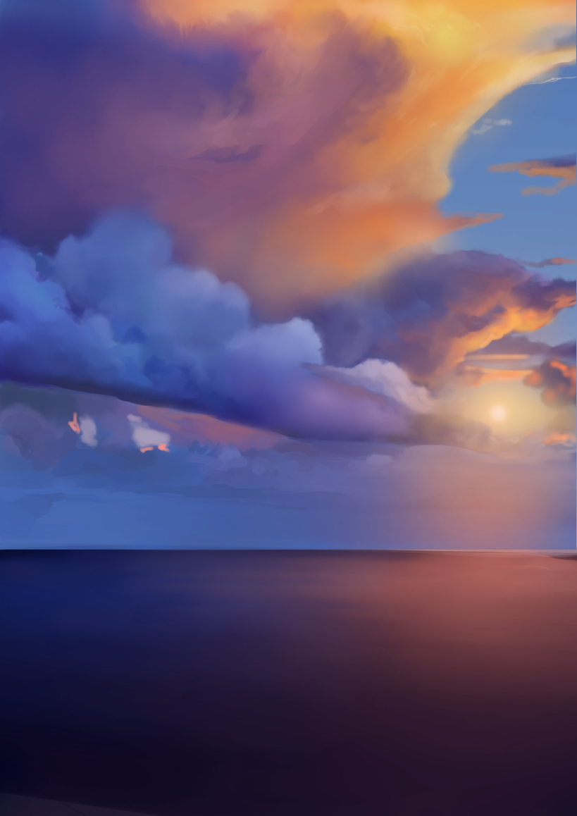
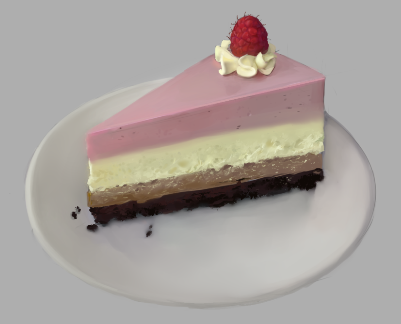
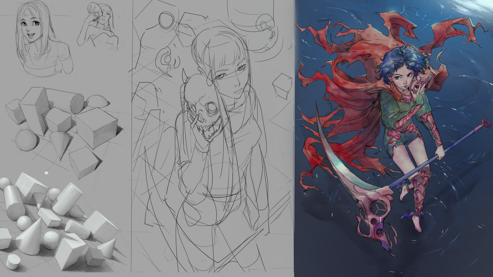
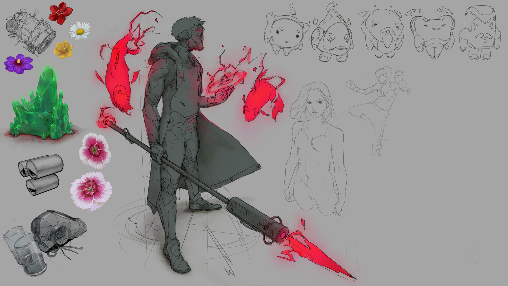
 An attempt at painting from imagination, which is something I always find hard to do, I would love to learn to do so. I don't have troubles drawing but whenever shading or true form rendering is involved I always hit a wall. I'm doing better lately but still I avoid it. I need to work on this.

Continued on next post!
Posts: 151
Threads: 2
Joined: Oct 2019
Reputation:
20
Posts: 151
Threads: 2
Joined: Oct 2019
Reputation:
20
Posts: 151
Threads: 2
Joined: Oct 2019
Reputation:
20
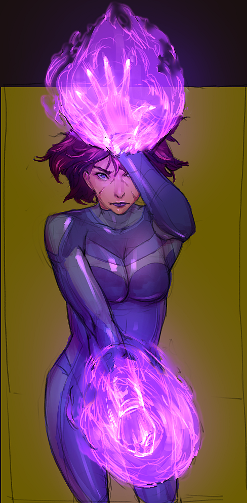
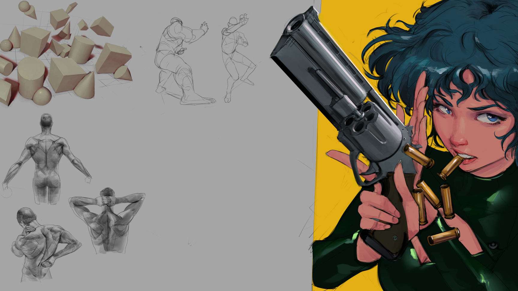
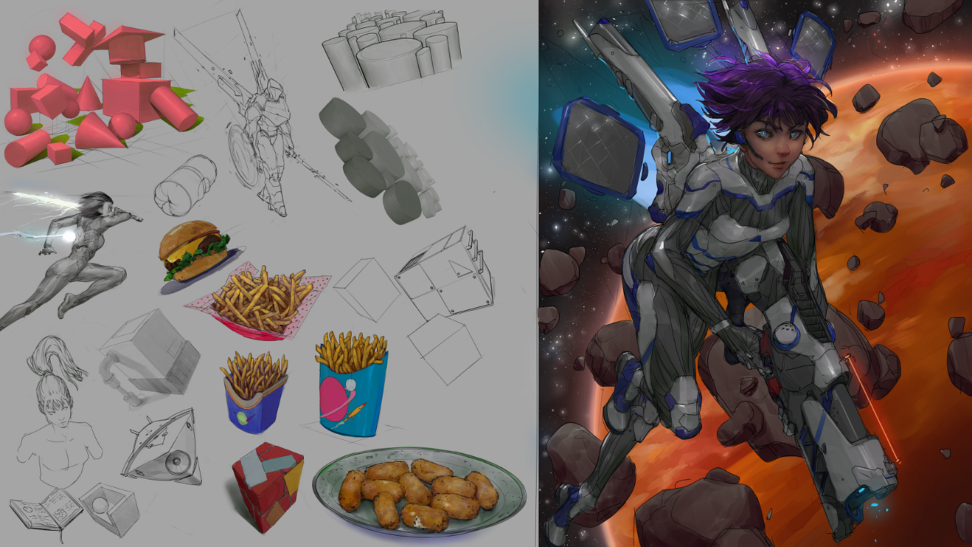
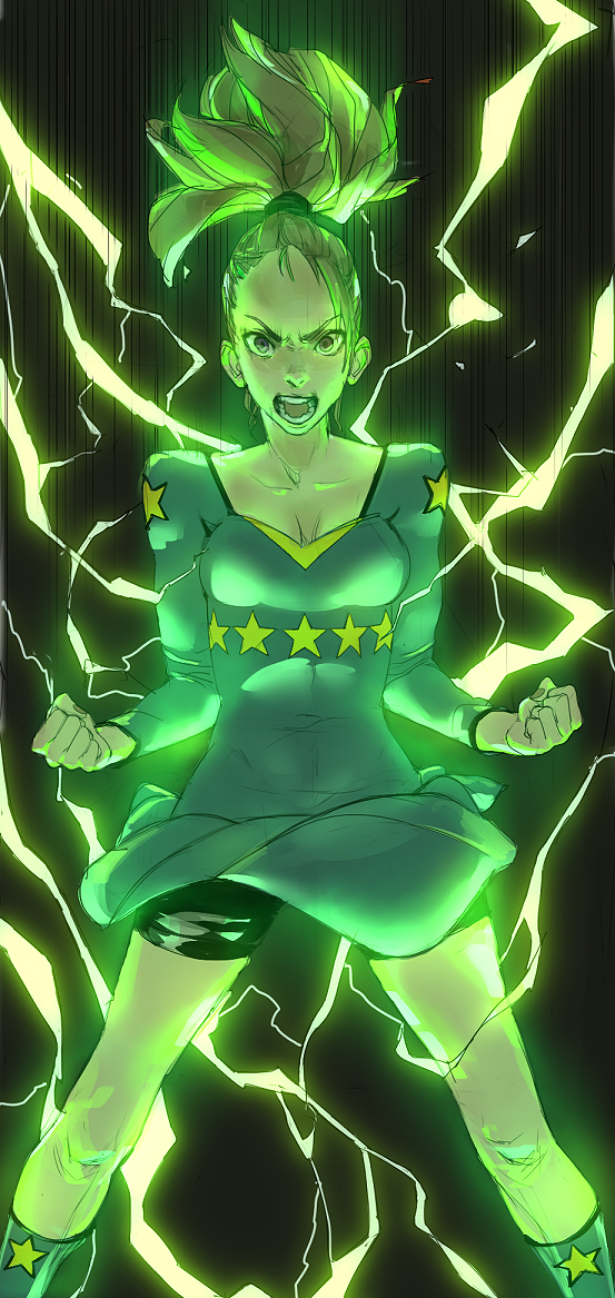
Finally my most current thing I've done, and the reason I decided to go around looking for somewhere to start a sketchbook, get feedback, find a study group or so.

I've noticed that without assistance of peers, I struggle to keep pushing myself at times, meanwhile I've drawn more whenever I got feedback or a back and forth with someone, got invested with them. So I'm really looking to meet people and try help each other out or keep our motivations up, if that is possible. I hope I can find people here around to do so.
Thank you for checking my SB out! I'll try to keep updating this thread weekly.
Posts: 34
Threads: 2
Joined: Jun 2016
Reputation:
1
Posts: 3,357
Threads: 37
Joined: Aug 2013
Reputation:
234
Discipline is the steam that never disappoint that my two cent.Having goal is one thing but valuing them is an other thing.How can an artist value is own work if he work in a vacuum?When people value what we do it as incredible effect on us of course but we have to have discipline to persevere in moment were we doubt of were own value.Even pro artist doubt of there own value it the struggle of any artist self doubt is the juice that keep us going it essential to the growth of an artist.
Posts: 369
Threads: 6
Joined: Sep 2019
Reputation:
23
Welcome! I'll comment with some detail in the days to come but for the time being I suggest that you post your WIPs to get the dialog going.
Posts: 623
Threads: 36
Joined: Jan 2012
Reputation:
50
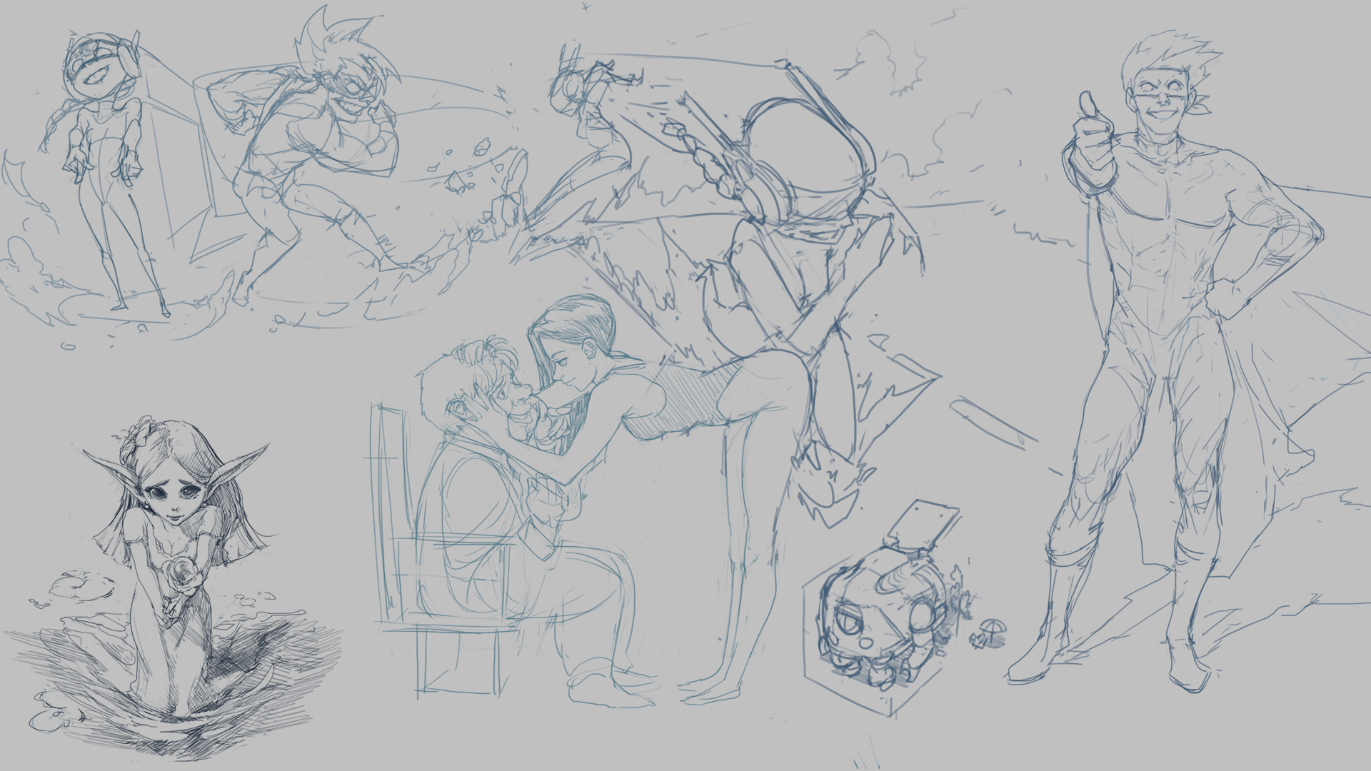
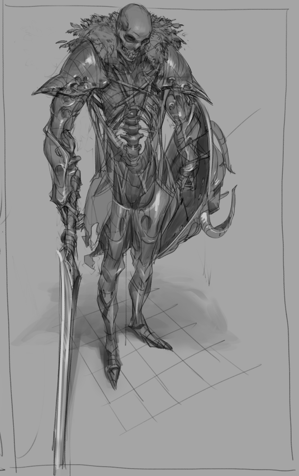
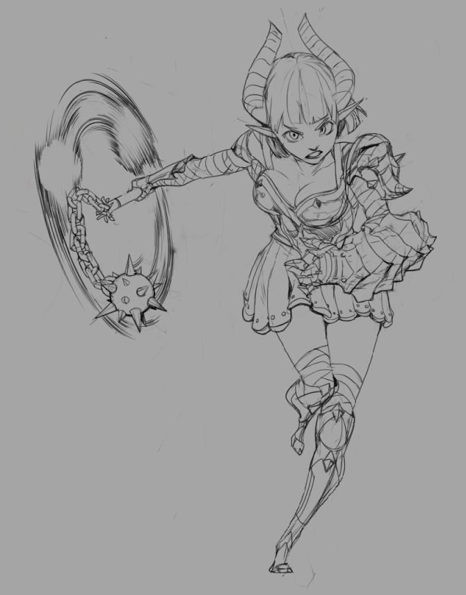
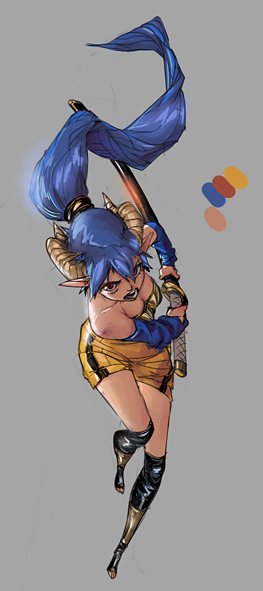
I like what I see. Lots of cool poses, characters, compositions, etc. The girl with the sword, blue hair and horns is one of my favorite character pieces in here, the skeleton knight and the elf archer are quite cool too.
Posts: 151
Threads: 2
Joined: Oct 2019
Reputation:
20
(10-06-2019, 09:26 PM)darktiste Wrote: Discipline is the steam that never disappoint that my two cent.Having goal is one thing but valuing them is an other thing.How can an artist value is own work if he work in a vacuum?When people value what we do it as incredible effect on us of course but we have to have discipline to persevere in moment were we doubt of were own value.Even pro artist doubt of there own value it the struggle of any artist self doubt is the juice that keep us going it essential to the growth of an artist.
So deep! And true. In my case it isn't more value but interaction. Like I don't care much when people say good or bad, I care when someone comes and tells me, "hey, did you think of adding this or that?" or "oh, this made me think about some childhood show or something that makes me really happy (or some other emotion)", that is what I enjoy and seek. Those connections?
But yeah, sometimes also you draw something and it looks good or bad, but you can't be really sure until you ask. Sometimes what you see wrong people don't pay attention, or what you see as great people don't care about, so is best to keep in touch. But I also don't want to be dragged down into nowadays social media focus. Produce, produce, produce. Get digital numbers on your page. People no longer leave feedback, they leave likes. Don't know sometimes if there's an actual person behind that tick or just someone fiddling with the numbers ha ha.
Also thanks for the suggestions over my introduction post. I did narrow down why I was having pains on my arm and as of late everything is good. I do take rest also. Usually do 60-90min drawing sessions with 20min breaks in between.
(10-07-2019, 09:52 AM)Leo Ki Wrote: Welcome! I'll comment with some detail in the days to come but for the time being I suggest that you post your WIPs to get the dialog going. Hey! Thanks! Well most of what I do are technically WIPs, like I should be working more stuff and cleaning, refining, so fire away at anything! ha.
(10-07-2019, 12:04 PM)Dennis Kutsenko Wrote: I like what I see. Lots of cool poses, characters, compositions, etc. The girl with the sword, blue hair and horns is one of my favorite character pieces in here, the skeleton knight and the elf archer are quite cool too.
Hey! Thanks very much! I honestly was really happy with how that demon girl on that charging pose turned out, I should had done the hair better though. I hope I can do better on the future! Also glad you liked those. Did you like them because of the action pose? Or something about the style/appearance? What did you like basically? Those things are what I treasure most to know. So I can narrow down what to focus/work on.
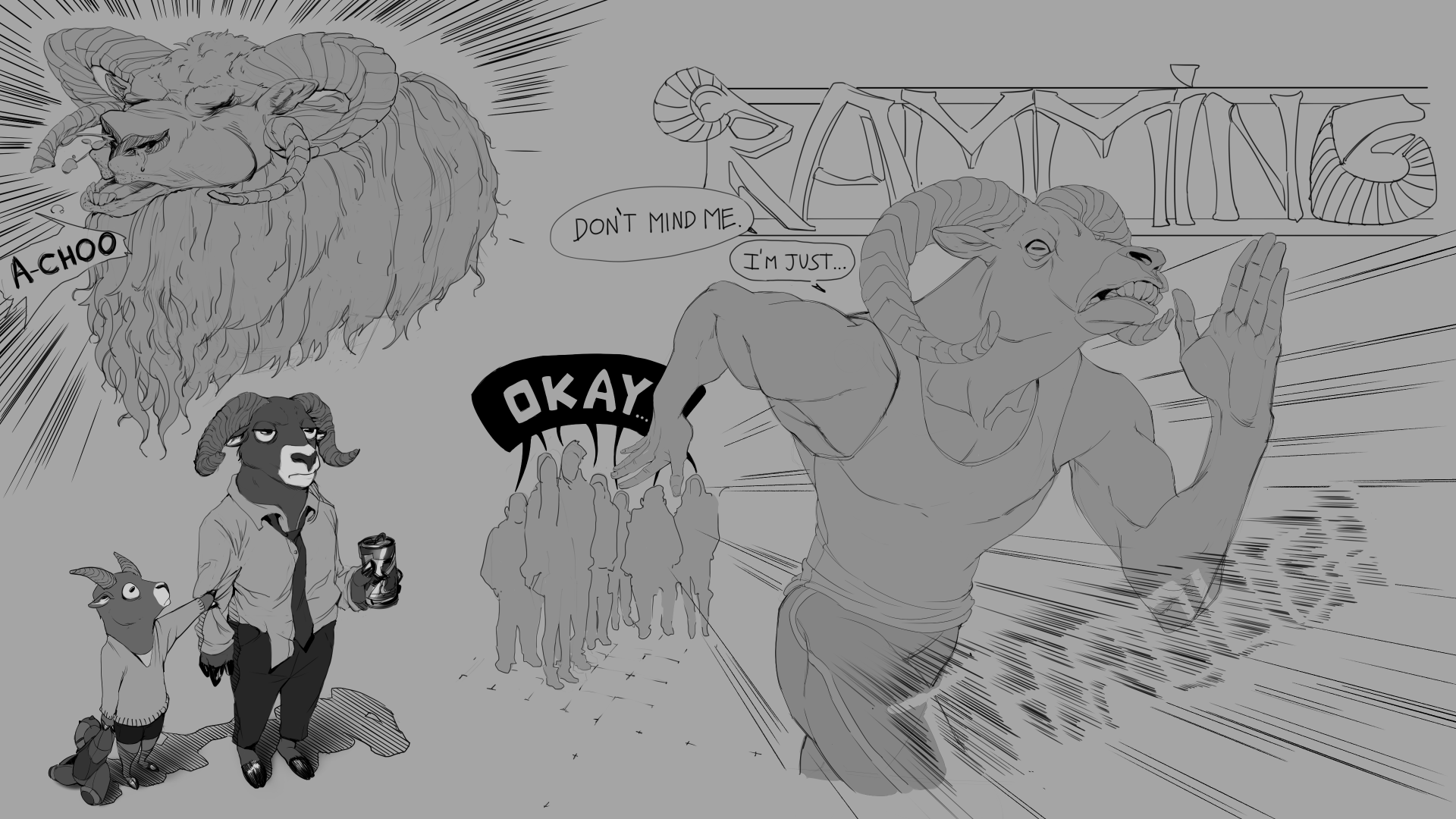
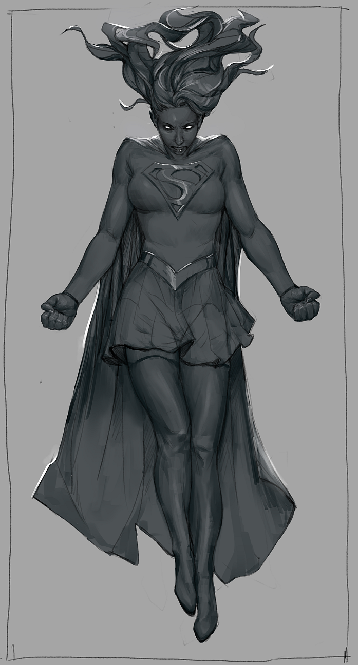
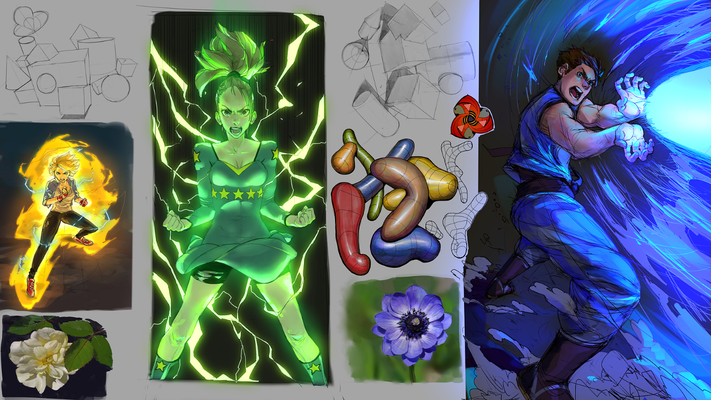
Leaving the page I was working on for last week theme I was going for. I rushed the last one and I should be focusing more on doing better shadow shapes, and not doing random strokes as much. I think the energy turned out alright but very noisy, probably the face could use more exaggeration/expression.

Posts: 623
Threads: 36
Joined: Jan 2012
Reputation:
50
What attracted me to those particular pieces were either the pose, the character design, style, the theme, color theme. For the blue haired girl piece it was all of the above and even though it looks like somewhat of a speed piece/character study, it hits all the right aspects for me. A Horned elf girl with a katana going in for the kill, it has an 80's retro anime type feel about it for me personally and that's kinda what drew me in at first glance.
Posts: 369
Threads: 6
Joined: Sep 2019
Reputation:
23
(10-08-2019, 12:36 AM)Rotohail Wrote: Hey! Thanks! Well most of what I do are technically WIPs, like I should be working more stuff and cleaning, refining, so fire away at anything! ha. Cool then ^^
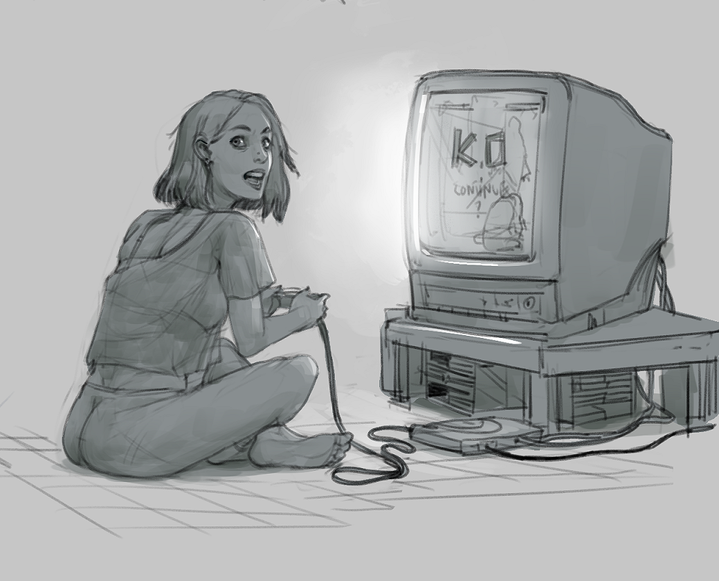
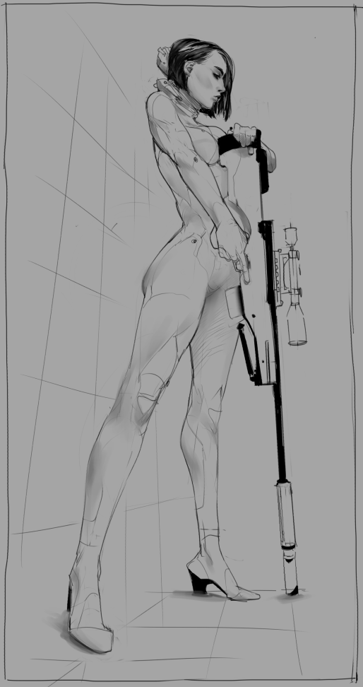
OK, first off I like your few scenes of ordinary life, they reveal a good observation of simple - yet not necessarily obvious to render - postures and attitudes.
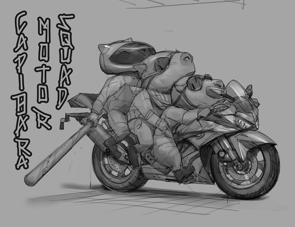
I also like when you go funny and cartoon, good mastery of elastic physics.
I feel that you could go wilder with magical effects - and in some cases more sober, this can be impactful too.
Your scene with the giant white snake in the trees is intriguing but the high angle weakens it and the guy's hat kind of blocks the view.
More comments to come...
Posts: 2,817
Threads: 15
Joined: Jun 2013
Reputation:
109
Im looking at your stuff and i think you have a pretty solid skillset... Your shapes seemed as if youve earned through a lot of blood and sweat and i admire that a lot!
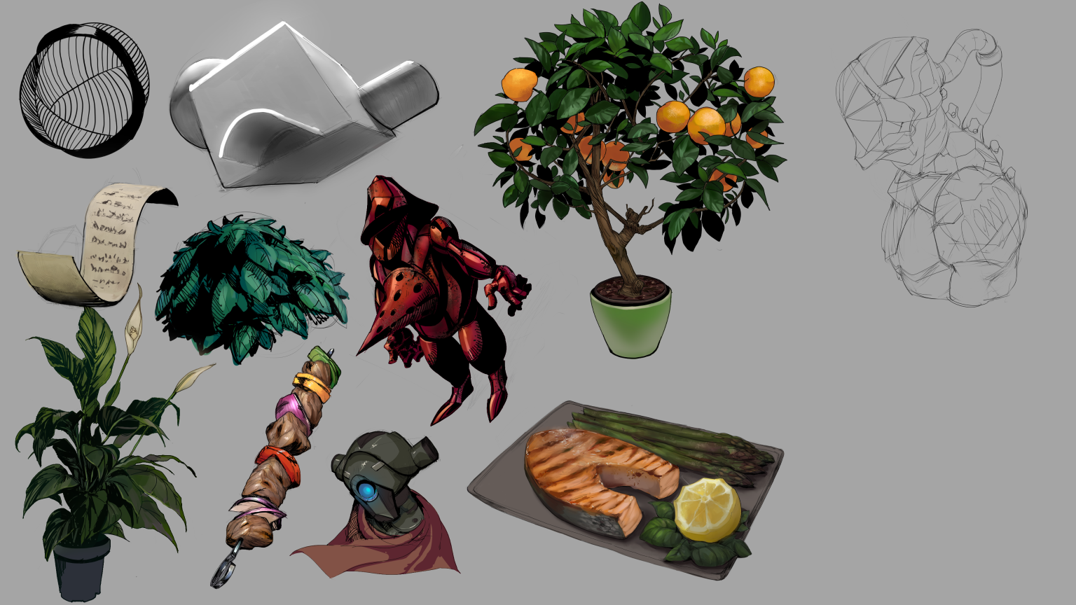
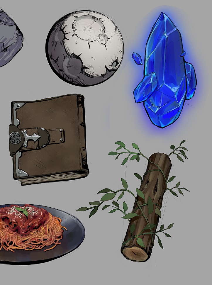
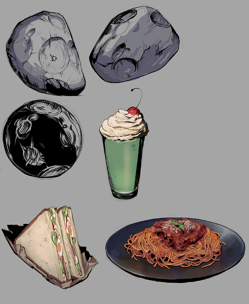
I think your little painted studies are perhaps done in vain because i dont see how they relate to anything else youre posting. for instance, the french fries you drew, like did you just do that for fun? I cant find any picture where you used that knowledge. same for many of your painted studies, it seems like its just random stuff tbh, a cake, a fish, a flower... whats it all mean?
I personally think youd learn a lot more about painting and maybe the things youre wanting by doing long form master studies of old painters like ludwig deutcsh or sargent or someone. within that youd be taking in a lot of things you can later use like edge control, texture, value arrangement, which are very useful. In your paintings of characters, the drawing is strong, which is priceless, great point, but i see very little use of texture and almost no use of chiaroscuro
I can understand if youre going for a cell shaded look, but i feel like its kinda halfway at this point, which is cool.. for instance the blue guy with the kamehameha or blue beam his drawing/expression are on point. But his clothes are rendered in a way that leaves a lot to be desired. Most your rendering (on your imagination pieces) is a flat color and sometimes theres a dab of shadow or a small dot for a highlight.
I dont feel like youre intelligently planning out your compositions, despite some of them being interesting. Its important to think of value structures and how the rythms are laid out on the canvas. my advice is do a master study of an artist you look up to, doesnt have to be an old master, can be a more comic style artist you like, and try to imitate very meticulously their shapes and rendering . and pick one thats challenging and out of the ol comfort zone. Afterwards, do a piece of your own but inject what you learned directly from the study into the piece ;)
doing that will help you discover what you need to work on so you can do those little bitty studies and they will pay off more, instead of it purely being a rendering exercise, you'll patch up a hole simultaneously.
I post here very often and theres a guy who posts a lot named Gliger who can offer you some substantial feedback and he has some very interesting (mad scientist) ways of studying which you could find helpful, so definitely check that out and i hope you'll post more because i love you :)
Posts: 151
Threads: 2
Joined: Oct 2019
Reputation:
20
(10-08-2019, 09:55 AM)Dennis Kutsenko Wrote: What attracted me to those particular pieces were either the pose, the character design, style, the theme, color theme. For the blue haired girl piece it was all of the above and even though it looks like somewhat of a speed piece/character study, it hits all the right aspects for me. A Horned elf girl with a katana going in for the kill, it has an 80's retro anime type feel about it for me personally and that's kinda what drew me in at first glance. Alright many thanks! Well I like all of the above myself so we will get along then ha. I honestly draw too many girls with swords...
(10-08-2019, 11:19 AM)Leo Ki Wrote: Cool then ^^
OK, first off I like your few scenes of ordinary life, they reveal a good observation of simple - yet not necessarily obvious to render - postures and attitudes.
I also like when you go funny and cartoon, good mastery of elastic physics.
I feel that you could go wilder with magical effects - and in some cases more sober, this can be impactful too.
Your scene with the giant white snake in the trees is intriguing but the high angle weakens it and the guy's hat kind of blocks the view.
More comments to come...
A low angle would do wonders to show the size of the snake, but I was thinking of making it as a establishing shot. The hat was kind of doing a draw the attention with the red but hide the action, scene (that's why is also in shadow that area) so as to leave the viewer curious and engaged. To wonder what is going on! Like in horror movies, hint but don't show, let the viewers fill in the gaps. That was my thinking at the time, but as always too green to pull things off I feel ha. Fun nonetheless!
Well effects, I was reading elemental magic a few months ago and they say, like in animation, overdo it, then take a step back. I feel I need to overdo it much more, because so far I haven't yet had the feeling of needing to push it back. I'm pretty new at especial effects though but has always been one of my top interests.
Thanks about the rest! I hope I can do better on the future, and I should probably study more people and gestures because at times I feel I don't have enough variety.
(10-08-2019, 11:07 PM)Fedodika Wrote: Im looking at your stuff and i think you have a pretty solid skillset... Your shapes seemed as if youve earned through a lot of blood and sweat and i admire that a lot!
I think your little painted studies are perhaps done in vain because i dont see how they relate to anything else youre posting. for instance, the french fries you drew, like did you just do that for fun? I cant find any picture where you used that knowledge. same for many of your painted studies, it seems like its just random stuff tbh, a cake, a fish, a flower... whats it all mean?
I personally think youd learn a lot more about painting and maybe the things youre wanting by doing long form master studies of old painters like ludwig deutcsh or sargent or someone. within that youd be taking in a lot of things you can later use like edge control, texture, value arrangement, which are very useful. In your paintings of characters, the drawing is strong, which is priceless, great point, but i see very little use of texture and almost no use of chiaroscuro
I can understand if youre going for a cell shaded look, but i feel like its kinda halfway at this point, which is cool.. for instance the blue guy with the kamehameha or blue beam his drawing/expression are on point. But his clothes are rendered in a way that leaves a lot to be desired. Most your rendering (on your imagination pieces) is a flat color and sometimes theres a dab of shadow or a small dot for a highlight.
I dont feel like youre intelligently planning out your compositions, despite some of them being interesting. Its important to think of value structures and how the rythms are laid out on the canvas. my advice is do a master study of an artist you look up to, doesnt have to be an old master, can be a more comic style artist you like, and try to imitate very meticulously their shapes and rendering . and pick one thats challenging and out of the ol comfort zone. Afterwards, do a piece of your own but inject what you learned directly from the study into the piece ;)
doing that will help you discover what you need to work on so you can do those little bitty studies and they will pay off more, instead of it purely being a rendering exercise, you'll patch up a hole simultaneously.
I post here very often and theres a guy who posts a lot named Gliger who can offer you some substantial feedback and he has some very interesting (mad scientist) ways of studying which you could find helpful, so definitely check that out and i hope you'll post more because i love you :)
Yeah they are pretty random, I do them as warm up or out of curiosity, before moving onto something else. The fries the one with the pink tray was looking at reference but the other two were from imagination, to try that exactly, but yeah flowers and fish I didn't use the anywhere. The flowers were about me trying to learn color schemes? I thought flowers could be useful to practice that but I could just make color charts for it, so they are just random studies indeed.
Oh yeah, I go with my gut all the time for compositions. Like I most of the time have shots in my head planned and a feeling of what I want but I don't really know sometimes how you have to plan them. I do sometimes do a... post-mortem? ha, after drawing something I look at it and try to reason why it works, sometimes I can make sense of it but most of the time I just think it either feels right or not. Is there any book to learn about composition?
Honestly I just try simple shading because I struggle doing complex lighting, from the top of my head. Even then I just mess things up, overwork or move the brush without thinking. As you said, I've been focusing most of my time with line, and put aside color, form and texture. A few months back I started to try use more color and form on the things I do, so I just need to work more on it. Probably do still-lifes again for a while.
I have never tried master studies, I did at times draw some other artist drawing if I really like it, but is rare, I should do it more though! You are right.
I've seen his SB and took at peak but feels so daunting I haven't got around sending him a message yet.
Many thanks for the feedback!
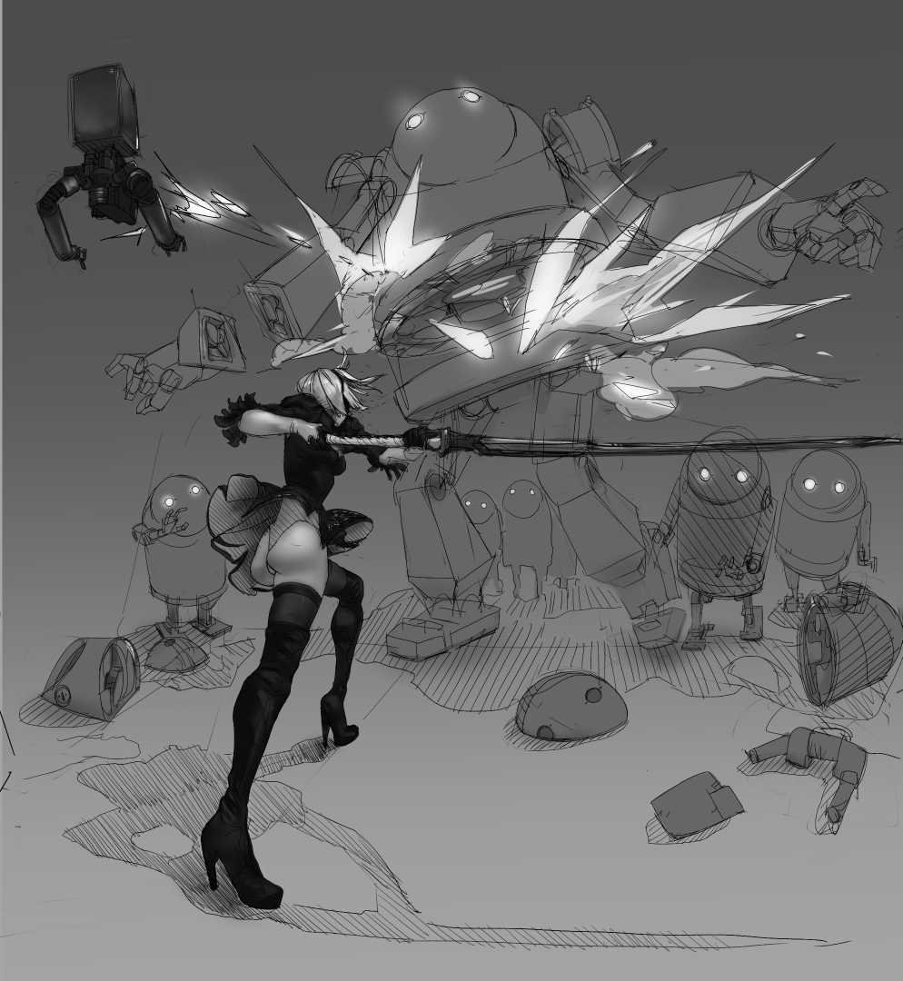
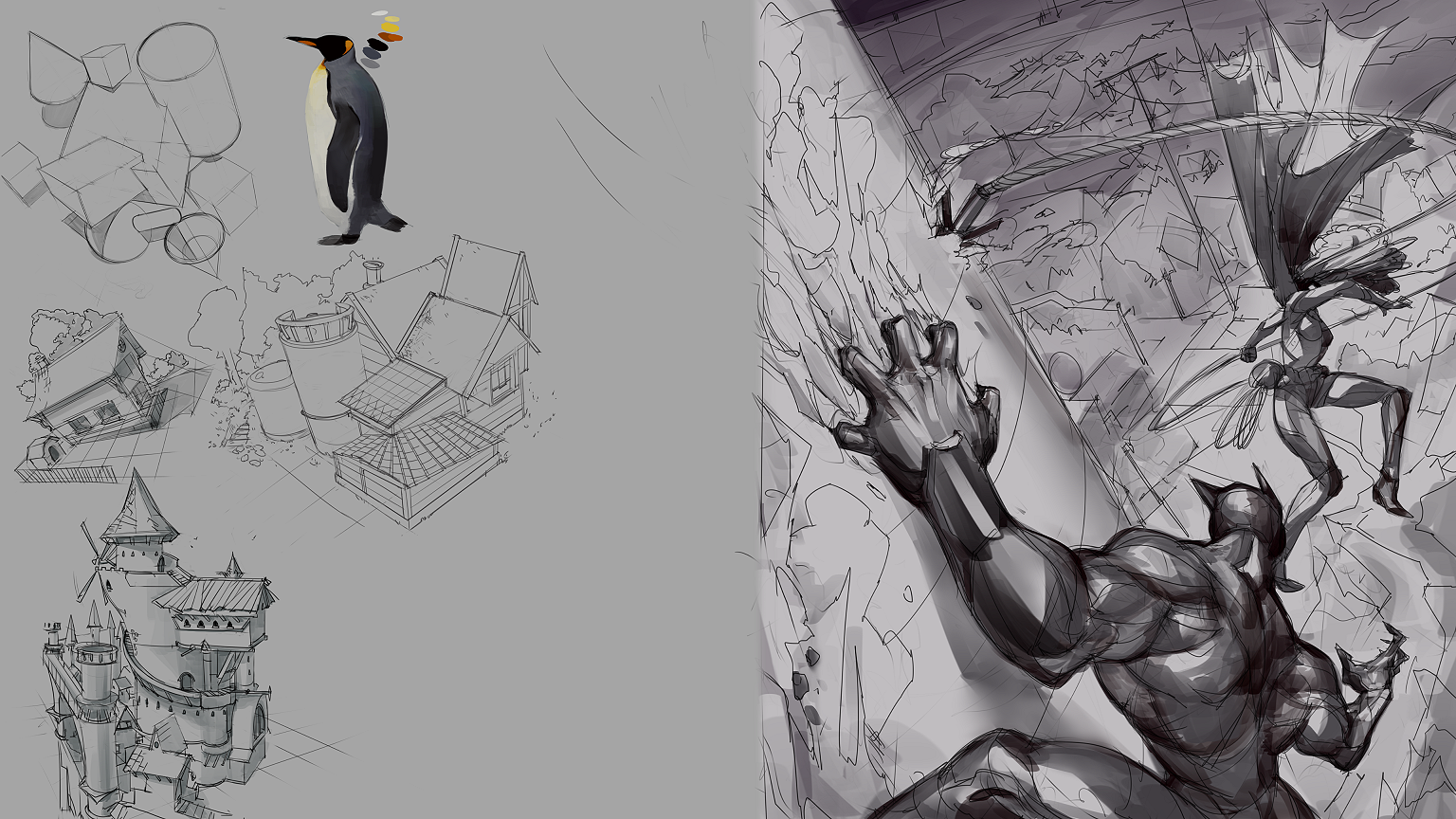
Leaving a WIP of my current page. I need to change the guy, and correct/improve many tones/shadows. I also first want to focus on the background this time. Make sense of it, because not sure about the setting yet.

Posts: 2,817
Threads: 15
Joined: Jun 2013
Reputation:
109
i like your shapes in the latest piece, something about the comp feels static, maybe take the transform and just rotate it to make it slide diagonally across the page could help it!
Some good books on composition are Framed Ink Volume 1, and Creative Illustration by loomis. Also on watts atelier online you can get a 50$ course on composition by robert watts, there is a course by nathan fawkes on schoolism, and bill perkins course on new masters academy are some of my favorites ;)
Posts: 47
Threads: 3
Joined: Feb 2018
Reputation:
2
Hey man, awesome sketches. Good paintings too, great work keep it up!
Posts: 369
Threads: 6
Joined: Sep 2019
Reputation:
23
OK, I understand what you mean by 'establishing shot.' This may work better in a series of illustrations (as in a story book) rather than standalone, in my opinion.
Interesting parallel you make between exaggeration in animation and effects. Looking at the chronological evolution of what you posted I noticed something: Initially you seem to oscillate between two points: Elastic cartoon (caricatures, capibara squad) and a more rigid realism (dangerous ladies), and progressively you have been merging the two, finding a happy midpoint, I like the direction.
About your latest WIP, one thing that I think weakens the action is the fact that the harpoon seems to miss the guy by too far. Also you might want to resize the canvas to show the whole curve of the rope. I look forward to see where you are going to bring this piece to!
Regarding your saying that you sometimes lack motivation and have trouble pushing works from imagination, maybe you need to assess what your goal is: Are you looking at a career in illustration, animation, comics, concept art?
Posts: 151
Threads: 2
Joined: Oct 2019
Reputation:
20
(10-10-2019, 03:34 AM)Fedodika Wrote: i like your shapes in the latest piece, something about the comp feels static, maybe take the transform and just rotate it to make it slide diagonally across the page could help it!
Some good books on composition are Framed Ink Volume 1, and Creative Illustration by loomis. Also on watts atelier online you can get a 50$ course on composition by robert watts, there is a course by nathan fawkes on schoolism, and bill perkins course on new masters academy are some of my favorites ;) Rotate in which way, counter or clockwise? I'm thinking on blurring or doing the background with motion lines, I still have to figure it out before deciding lol.
Gonna have to get my hands on the books, Loomis must be easy to find. I have never tried one of those sites courses but I'll check them out. Thanks again! I need to get around to commenting over your SB but you also have so many stuff, I've been browsing, I'll try to do so soon. Not much that I can say though ha, you seem to be doing well enough.
(10-10-2019, 12:13 PM)Leo Ki Wrote: OK, I understand what you mean by 'establishing shot.' This may work better in a series of illustrations (as in a story book) rather than standalone, in my opinion.
Interesting parallel you make between exaggeration in animation and effects. Looking at the chronological evolution of what you posted I noticed something: Initially you seem to oscillate between two points: Elastic cartoon (caricatures, capibara squad) and a more rigid realism (dangerous ladies), and progressively you have been merging the two, finding a happy midpoint, I like the direction.
About your latest WIP, one thing that I think weakens the action is the fact that the harpoon seems to miss the guy by too far. Also you might want to resize the canvas to show the whole curve of the rope. I look forward to see where you are going to bring this piece to!
Regarding your saying that you sometimes lack motivation and have trouble pushing works from imagination, maybe you need to assess what your goal is: Are you looking at a career in illustration, animation, comics, concept art?
Yes! I do those at times too, I may do a few panels soon for something.
Honestly? I like to not get stuck on one thing, I usually do more cartoon to cheer myself up, have fun, but my goal would be more serious realism if I can achieve it. I struggle with it. I seem to have much more ease with funny, charming, stylized stuff. Grass is greener... ha. But you think so? I hadn't really notice I was achieving a middle point, hmm, gonna have to go over my sketchbook soon then, and see where I'm heading!
I see what you mean, it did cross my mind to make it go over him but my initial idea was like she is grappling and him is chasing her and it's a messy situation because everything is falling into rubble so is like a race for footing? I wanted just to make an action scene where I could interact with the background, work things out because I always leave that empty, and I'm still putting that off right now lol, I need to get around to do it!
The rope I thought it might be interesting to break that rule? Like I keep seeing people say don't make lines go out of the frame, but I attempted to make re-entry points close enough as if to create flow back in? Maybe is all in my head lol, and it doesn't work.
That's what's tricky for me, I don't have a clue! I just want to draw better, improve overall so I can figure it out. I dabble with almost anything. So far illustration, comics is what I've been focusing but I tried hand drawn animation and had a ton of fun! And concept art/ design is also really appealing. So yeah, not a clue.
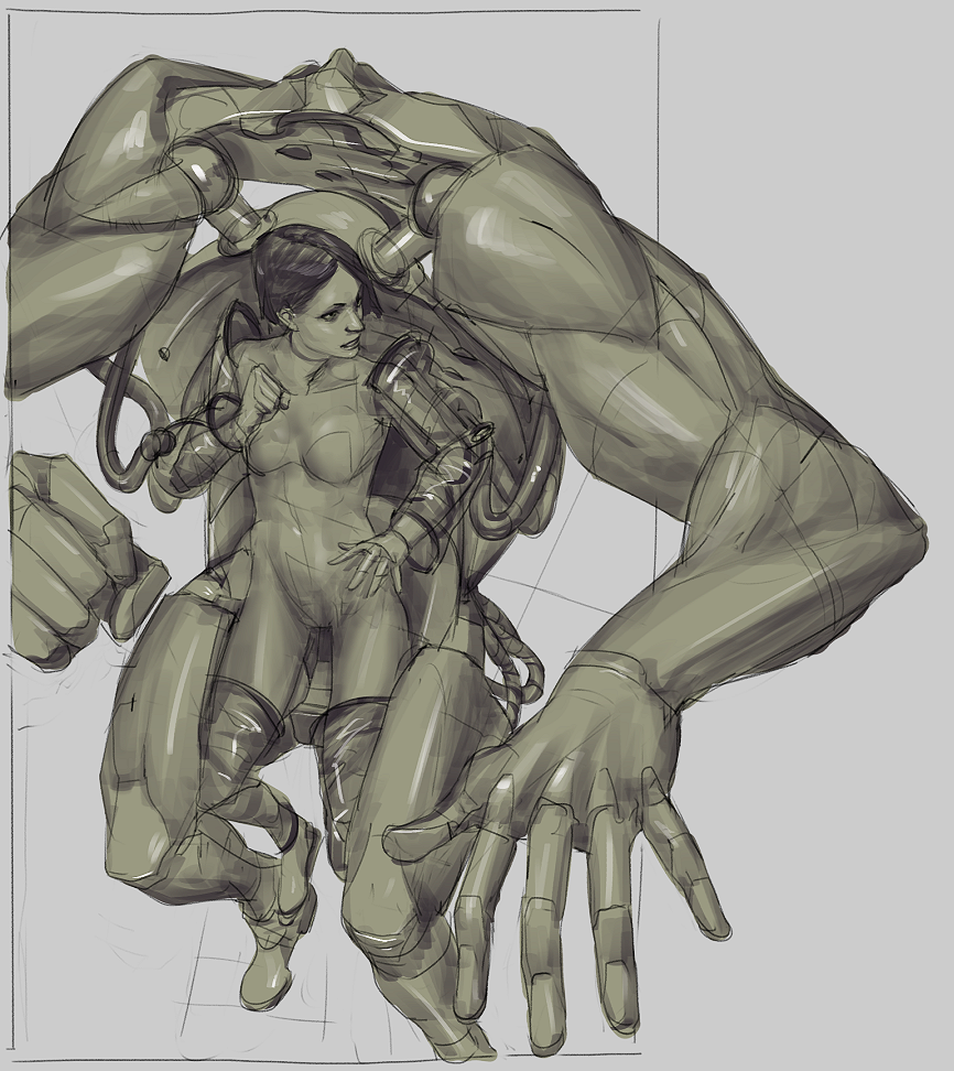
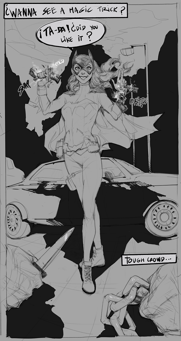
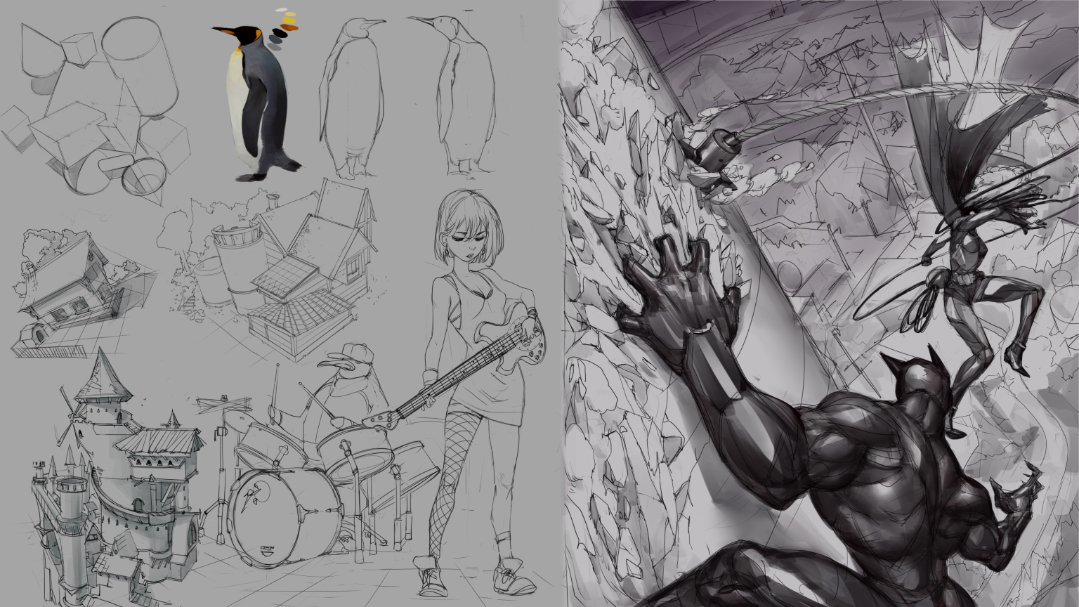
Leaving an update, tomorrow is color day! And the background. I need to work it out. Other possible fixes. So far I'm not so happy anymore with the closest guy hand, too big, and her legs feel too long, I guess for comic is alright but I feel he becomes less menacing that way. I had fun with the girl and the guitar! Always wanted to try something like this.

Posts: 2,817
Threads: 15
Joined: Jun 2013
Reputation:
109
id say counter clockwise, think of the wall he's hanging on as a line, a nice diagonal line, starting at 10'oclock would make it really dynamic i thinks. play around with that rotate tool, see how it feels
Posts: 369
Threads: 6
Joined: Sep 2019
Reputation:
23
Right, in the first version I hadn't realized the woman was in free fall - the background was too rough and I thought she was stumbling on 'something' while attacking and the grapple and rope were focal elements. Now it all makes sense, and I agree that cropping the rope is not a problem. The man's hand is not necessarily too big but the space between the knuckles might be a bit too much, unless you want to go really non-human.
So you like to try every visual art trade but you tend to lose motivation. You need to dig deep and find out why, if you want to persist. In my case, the stories I wanted to tell were the motivation, they pushed me to study everything I could. When I abandoned the projects realizing it was too much of a time investment for no return - non-mainstream-minded comic artists don't make a living - I lost the motivation for drawing.
My impression that you are increasingly merging realism and cartoon may be wrong and just due to the samples that you posted. I find this a good direction but if you aim for more realism I know you can do it, your have such pieces in this thread. And I think that making cartoon can actually be more difficult than making realism. The comic author Zep says that he can somehow rest when he makes realistic comics, as compared to his main cartoon series.
Posts: 151
Threads: 2
Joined: Oct 2019
Reputation:
20
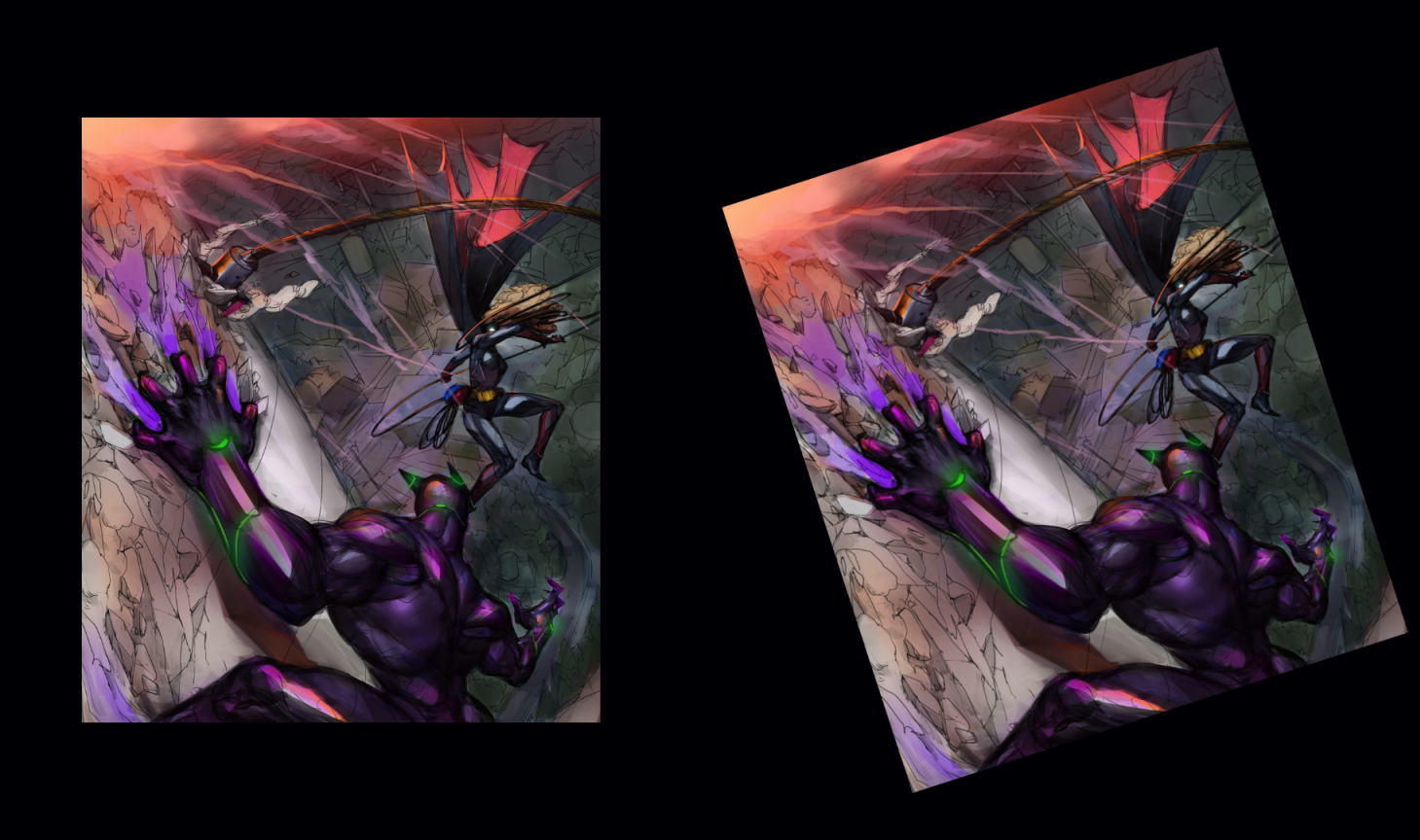
(10-11-2019, 08:54 AM)Fedodika Wrote: id say counter clockwise, think of the wall he's hanging on as a line, a nice diagonal line, starting at 10'oclock would make it really dynamic i thinks. play around with that rotate tool, see how it feels I did a test after a quick color pass (testing the color also) to see how it could feel. What do you think?

So having the horizon tilted does give an extra punch to the sense of off-balance, that can be powerful, but also makes me a bit dizzy. The problem is that the vertical foreshortening looks messed up now ha, I would have to stretch the image.
(10-11-2019, 01:05 PM)Leo Ki Wrote: Right, in the first version I hadn't realized the woman was in free fall - the background was too rough and I thought she was stumbling on 'something' while attacking and the grapple and rope were focal elements. Now it all makes sense, and I agree that cropping the rope is not a problem. The man's hand is not necessarily too big but the space between the knuckles might be a bit too much, unless you want to go really non-human.
So you like to try every visual art trade but you tend to lose motivation. You need to dig deep and find out why, if you want to persist. In my case, the stories I wanted to tell were the motivation, they pushed me to study everything I could. When I abandoned the projects realizing it was too much of a time investment for no return - non-mainstream-minded comic artists don't make a living - I lost the motivation for drawing.
My impression that you are increasingly merging realism and cartoon may be wrong and just due to the samples that you posted. I find this a good direction but if you aim for more realism I know you can do it, your have such pieces in this thread. And I think that making cartoon can actually be more difficult than making realism. The comic author Zep says that he can somehow rest when he makes realistic comics, as compared to his main cartoon series.
I understand, I'm also quite terrible at making scenes so I can see they can be difficult to understand. I need to do better at this. Aha! Yeah I see it now, the space is a tad too much, I though maybe I could make the fingers thicker but to me is the palm the problem, shouldn't be as big, my mistake. I'll take note of that.
I lose motivation because I feel sometimes like I don't know if what I'm doing makes sense to others, that eats away at me. Drawing and practicing I do alone, and I felt I had to find peers to talk to and get feedback from, to see where I'm heading. As content goes, action, mostly, or epic, woot! shots is what really gets me pumping. But I would like to be able to draw anything, like create any mood I want, and setting.
I think it's amazing you want to tell stories, I'm pretty terrible at it, the only way I think I can tell stories is by suggestion or hints, not really in a direct way, but that is fun also so maybe I can build on it.
Well I tend to go towards realism to learn things, and because everyone recommends it, but again, being able to just tackle anything would probably be what I want. I see cartoons and stylized as design/abstraction which is subjective, meanwhile realism is more technical knowledge of light, form and value, which is objective. Realism you can always train, it's there, you just need to look. But anything subjective, abstract, oh boy. Is a maze, you don't know if you are heading right, left, up or down, that's why probably is a lot harder. But I feel comfortable in there, don't know why. Ha.
|
