
+- Crimson Daggers — Art forum (//crimsondaggers.com/forum)
+-- Forum: PERSONAL ARTWORK (//crimsondaggers.com/forum/forum-9.html)
+--- Forum: SKETCHBOOKS (//crimsondaggers.com/forum/forum-10.html)
+--- Thread: Lyraina's sketchbook (/thread-2412.html)
RE: Lyraina's sketchbook - smrr - 07-12-2015
The pencil thumbs are gorgeous Lyra! Would have to agree with meat on the others - however I reckon that's because you're going for gold and trying new things, keep doing 'em and you'll abolustely smash 'em!
That greeting card is dope, I wish I got a card like that for a bday/seasonal, etc D:
Keep being a boss lady!
RE: Lyraina's sketchbook - ramalooke - 07-15-2015
Heeeeyyy. Been a while since I've visited this place. You did so much of great work. It's awesome to see that you improved a ton since I last saw your work. Good job ;3 Me Like! =D
RE: Lyraina's sketchbook - Lyraina - 07-16-2015
Cyprinus: Aww, thanks so much for all the kind words <3 And as for what you aid about fear - so true. Can’t let fear hold us back, can we?
meat: Thank you! You’re right… should try simplifying more next time. This is hard! 0_0
aks: Thank you! :)
VoodooMama: Thanks :)
crackedskull: Uhh… I really don’t know, especially since with some of them, I worked over pre-existing ideas (so for example I already had some very bad, scribbly thumbnails or ink-blots that I used as a base to do the b/w version on top. But they take rather long (for the fact that they are only black and white blocks) since I keep changing things, adjusting, fine-tuning, etc.
smrr: Thank you! Glad you like the card and yeah, I gotta keep doing those thumbs D:
ramalooke: Thank you very much!
—
So, after much self-bashing and sweating blood I forced myself to do some quicker photobashes, to break away from this „taking 2 weeks for one piece“ thing and perfectionism. It’s good for getting ideas out quick and dirty (literally), but it’s kind of a pity that the results aren’t really worth posting on portfolio pages etc. I don’t really like half-assing things, but I can definitely see value in them. Need to experiment some more.
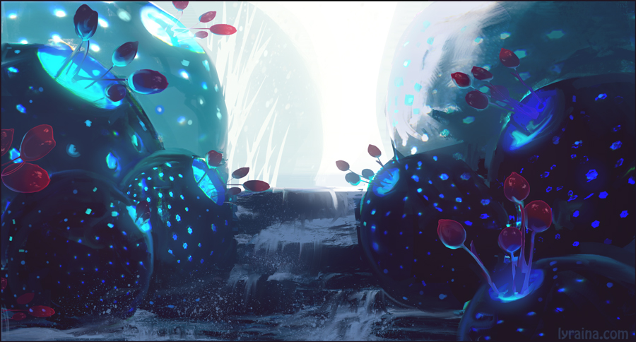
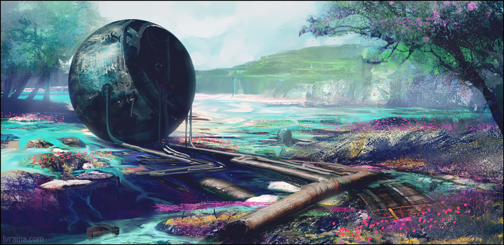
some more compositions

RE: Lyraina's sketchbook - AngeliquevdMee - 07-16-2015
oooooooo great job on the colors!!!! love that mix of blue with pink :)
RE: Lyraina's sketchbook - Lyraina - 07-19-2015
Angelique, thank you! :)
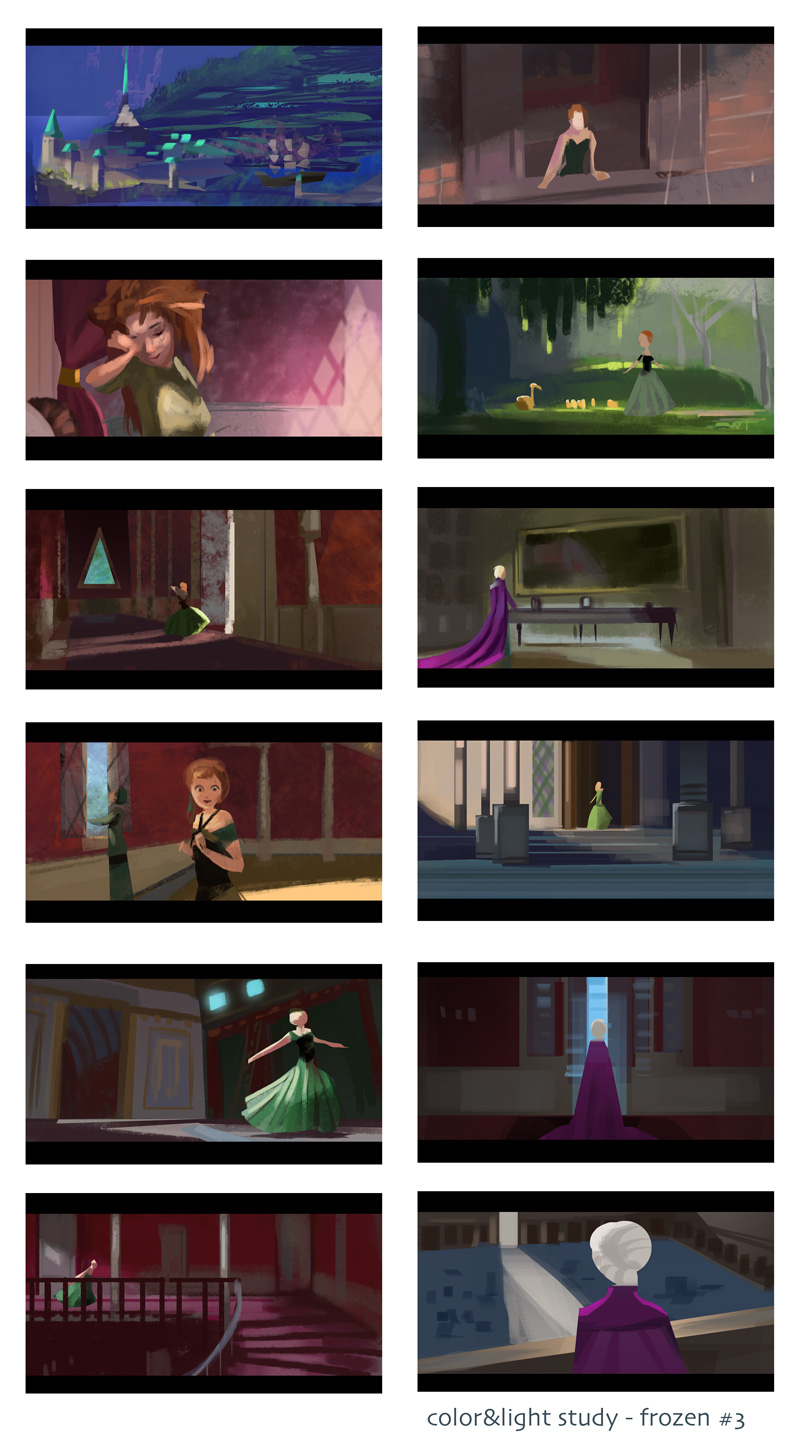
frozen color studies

RE: Lyraina's sketchbook - crackedskull - 07-19-2015
That enviro on the top of the page looks magical, reminds me of that area in WoW.
Good balance of shapes, rendering and speed on the frozen studies.
RE: Lyraina's sketchbook - ramalooke - 07-20-2015
love your color studies. quick bashes are also cool but remember that while beeing quick it's important your not beeing sloppy. Side of that really solid stuff. Love it O.O
![[Image: NUyttbn.gif?noredirect]](http://i.imgur.com/NUyttbn.gif?noredirect)
RE: Lyraina's sketchbook - Jonesoda - 07-20-2015
Oh man looking good lyraina!
RE: Lyraina's sketchbook - Fedodika - 07-20-2015
Hahaha lyrona i think of it this way like; the piece you can do in a few hours now look twice as good as the stuff you had to take a week on a year ago; we just gotta into the unkown area of what all the hotshots are doing... this will be some of the hardest days ahead...
RE: Lyraina's sketchbook - Archreux - 07-23-2015
Hey, really good looking updates in these last few pages! The colors, strokes and mood of those environments have gotten a lot better.
The B&W comps are really solid, really loving the use of those shapes in all of those, and the same goes for the traditional comp studies/sketches. Makes me want to get more into that. Also, nice job on the portraits!
No critique at the moment, just keep doing whatever it is you're doing. :D
RE: Lyraina's sketchbook - Ursula Dorada - 07-23-2015
(just to say I LOVE those recent enviros! and omg studies and omggg let me hug youuu)
:hug:
RE: Lyraina's sketchbook - Lyraina - 07-25-2015
crackedskull: Thank you :)
ramalooke: Thanks! Yep, that’s such a hard balance to strike! Don’t wanna be sloppy…
Jonesoda: Thank you!
Fedodika: Yeah.. that’s a good way of thinking. I’m just alway soooo impatient, wanna be better quicker!
Archreux: Thanks so much for all the kindness :)
Sula: Awwww thank you *huuuug* :D
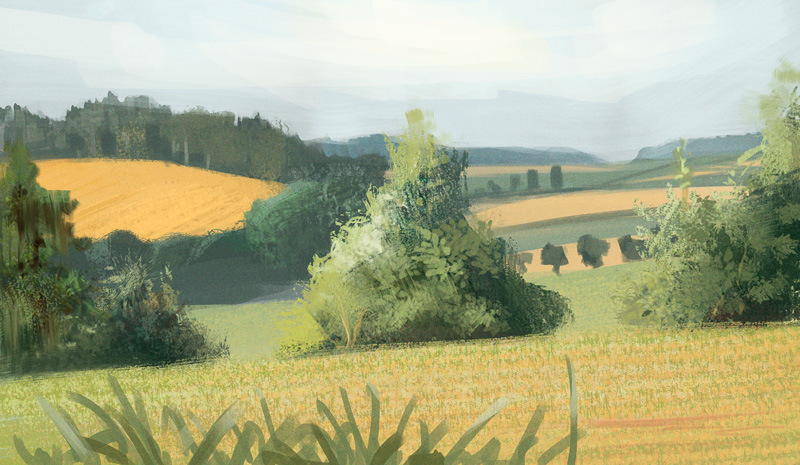
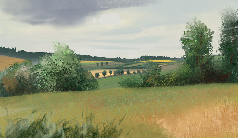
Colors from life - I didn't look at the previous day's painting when doing the 2nd one, so now you can see how embarrassingly little attention I pay to where all these trees and fields are actually placed... or maybe there was an earthquake at night, shifting everything around a bit! I don't know why painting foliage and green (the hue) is so freaking hard...
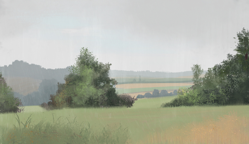
very very humid, 10 am

normal summer day, 9 am
more frozen!

week 2 homework for color&light selftaught class. a bit rushed, but I didn't want to waste time rendering these. (3d base is not mine, but taken from the class)

week 3 homework, more color variations. not exactly an environment but I guess the same principles apply. Maybe I will do more later, since doing color/mood/value/light thumbnails is something I've started doing anyway recently - just love playing with color and light!
RE: Lyraina's sketchbook - Lyraina - 07-26-2015
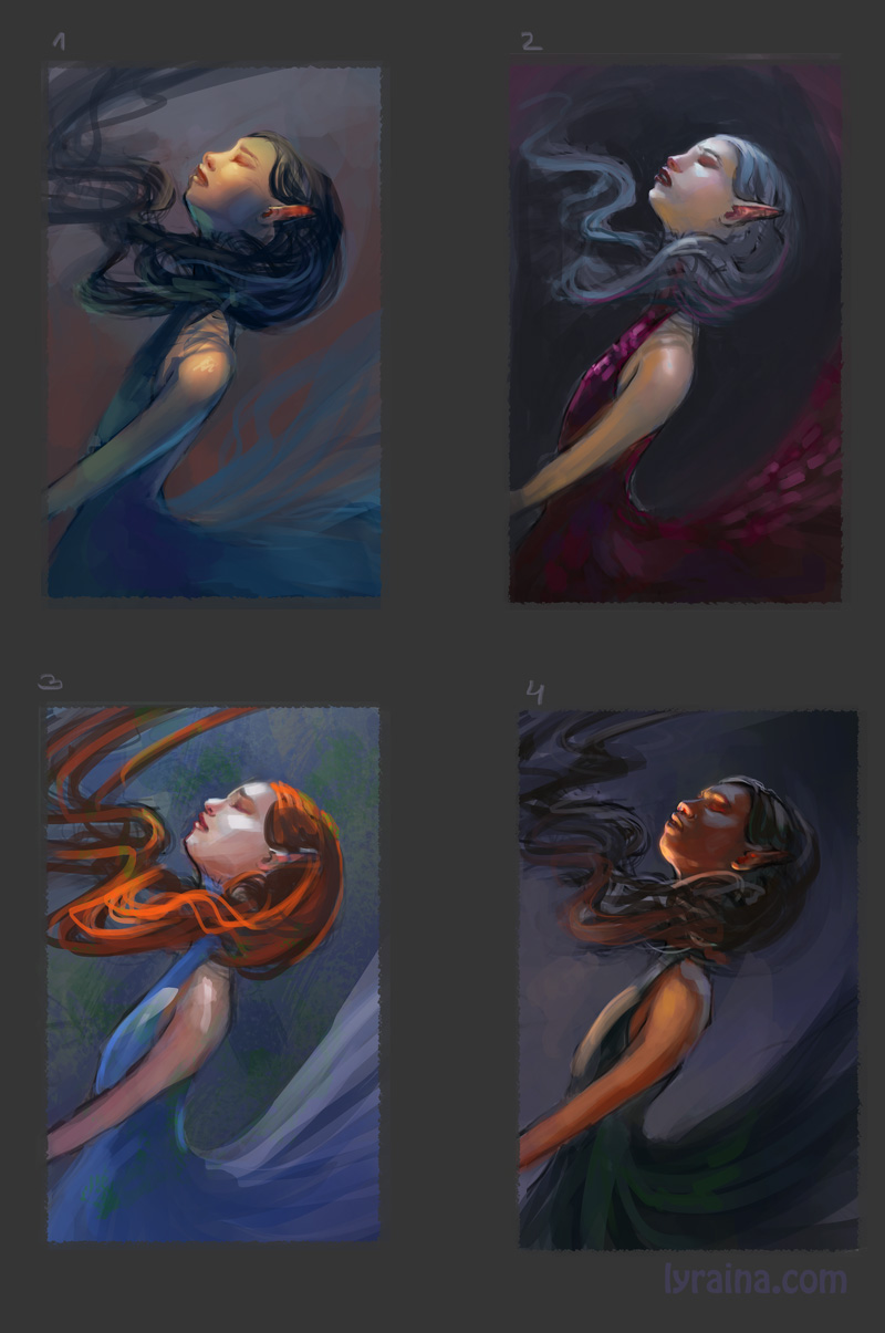
my favourites were 2 and 4, so I went with 4 for more theatrical, less vampire teenage book cover feel.
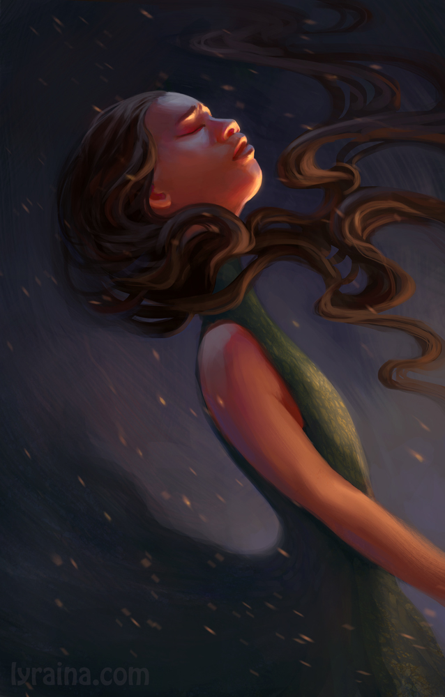
If you like classical music, listen to this, which was my inspiration for the piece. It makes me want to weep, and dance, and die, and live, and love all at the same time.
https://youtu.be/EcsM4HUEwVw
morning, warm and partly cloudy day. Cloudy sky makes for interesting things happening on the ground - which part of the landscape gets lit up (bright green, bright yellow) can change within 10 seconds. Sometimes you can even see the shadow line move. It also means you have to look, decide which "state" to paint, and remember it, or you'll be doomed in eternal repainting of the scene.
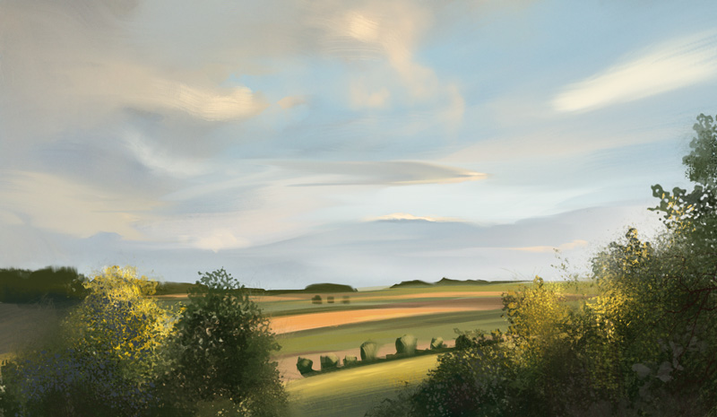
warm and windy day, 8 pm. Not as golden-hour-yellow-cheesy as I would have expected. The midground/foreground shrubs still give me lots of trouble, as does the color green.
RE: Lyraina's sketchbook - Nowio - 07-27-2015
Those environments.... those environment are beautiful! Expecially the more colourful highr up, the blues flowers! :D
To the girl: I really like ho you lighted her face!
A point that I don't find as successful is that my eye keeps following down her arm... But that's mostly it. Keep up the good work ! ;)
RE: Lyraina's sketchbook - Vornag - 07-27-2015
That blue is so incredibly striking, I love it
RE: Lyraina's sketchbook - meat - 07-27-2015
Green is a tricky color to get down looking good - we were warned about it back in landscape painting class. One of the trick is to mix some earthy yellow (Yellow Ochre) in, and the green will instantly look more natural. That said, your landscapes are beautiful, and it's very interesting to see the haze on that very humid morning as well as the slight golden tint to that dusk scene. Even though it's not cheesy golden, one can still see it is dusk and not dawn from that golden tint - evidence that you were looking at real life when painting it.
That girl portrait is also beautiful, no matter how many times I look at it. Your love for color and light certainly shine (pun!) through with no reservation :) That is a nice re-arrangement of Summer, although my personal favorite remains Winter in the same series :D
RE: Lyraina's sketchbook - VoodooMama - 07-28-2015
hey! beautiful landscapes!
The colors and light are really nice :0
Nice lighting on the girl! the face turned out very well. I think her torso and arm are a bit rushed in comparison to the face. Other than that great stuff!
Keep it up :D
RE: Lyraina's sketchbook - Lyraina - 07-29-2015
Nowio: Thank you… especially for the crit! I’ve toned down the arm a little bit, I can see where that’s a problem…
Vornag: Thank you!
meat: Yep, green is hard… and the entire landscape is full of it! I am trying to get in some warms where ever I can, but I don’t want to mix in yellow when I honestly can’t see any. Either I need to learn seeing better, or I need to get the relationship between colors, value and saturation more correct to make it look better/more real. One day I’ll learn it!
In other Vivaldi recordings, Winter is my favourite too. I just happend to stumble over Summer or this version first, and didn’t find the entire recording right away…
VoodooMama: Thank you! :)
27/07/2015
7.30 am, light rain - later on heavier rain
- very noticeable value/contrast different between rain and heavy rain (especially in the distant trees)
- later on, sun came out - distant forest is VERY blue compared to closer one - everything a LOT more colorful (yellow fields) and WAY more detail visible
- rain stopped before I finished so that is kind of done from memory
more frozen. I think I didn't post my notes last time:
- They get the „light subject before dark background“ in almost every scene - if not possible by nature of the scene, just drop a diagonal shadow from some object in the BG
- Many shadow diagonals for nice composition
- Corners and unimportant areas often in shadow, almost spot light on characters.
- Ways to create interesting light:
*Open window or door from the side
*Hallway with several open windows
*Big off-screen object casting (diagonal) shadow over parts of image
*Windowlight can make light patterns
- Framing of characters with architectural elements (windows)
- Light does not always have to make perfect sense - as long as it looks believable
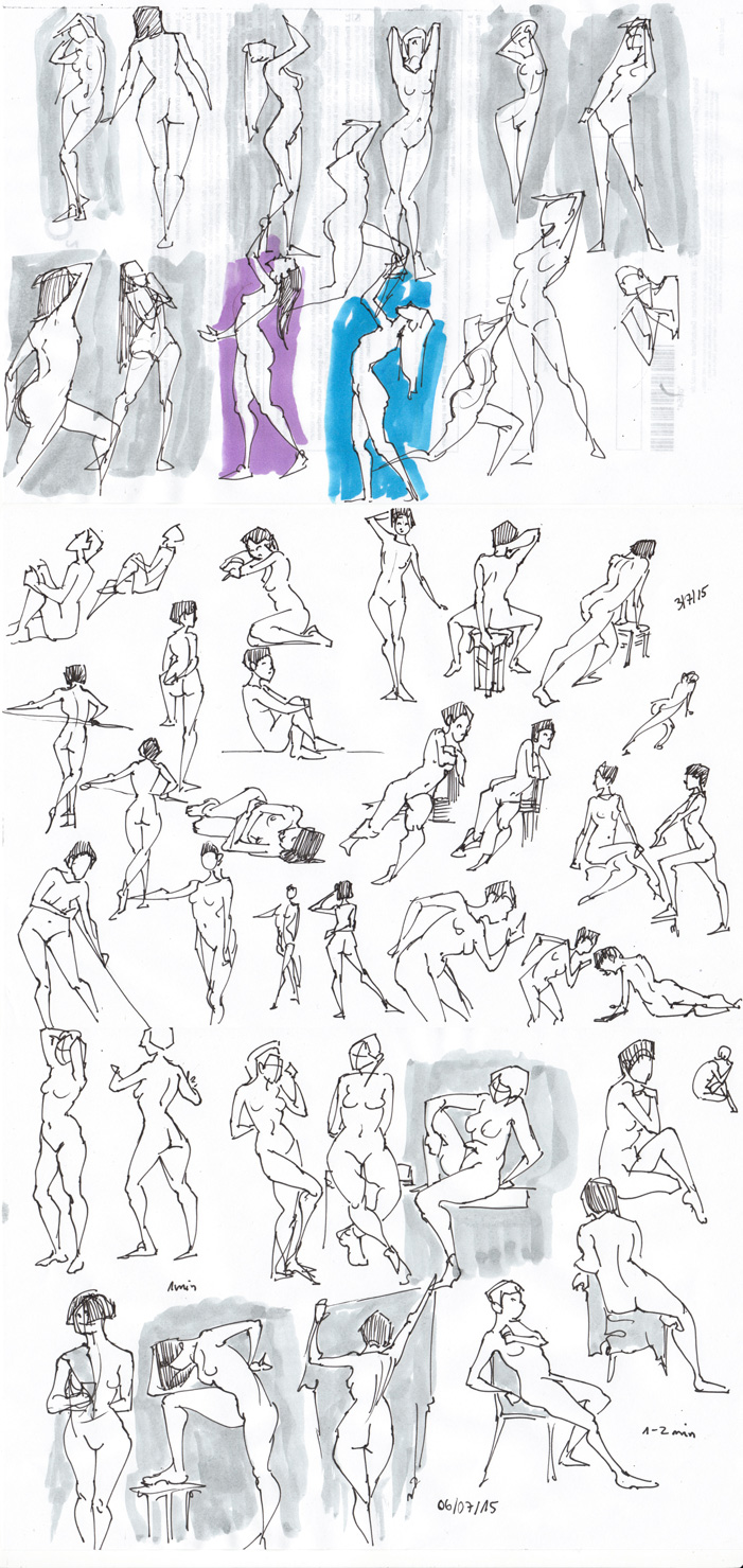
Didn't post gestures for a while... did I?
RE: Lyraina's sketchbook - Lyraina - 07-30-2015
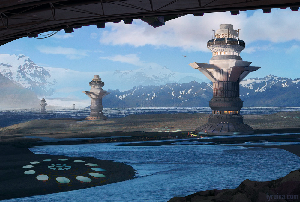
Experiment, started out with photo plate background
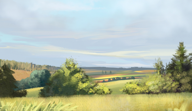
29/07/2015
7.00 am, morning sun.
With sun and clouds, everything changes more quickly than I can paint it, which leads to inconsistent
results and more stylization than I would like to, because I have to rely on memory and not just
observation. It also makes it harder to get the sunny glow just right, because sun always hits
different areas. Morning scene has interesting value patterns because trees on the left are still half in shadow.
Big big trouble areas are foreground grass (it’s strangely light and green, mixed with equally light yellow), medium distant forests (hard to indicate, hard to hit eve changing values), and mid/foreground scrubs.
RE: Lyraina's sketchbook - Cricketts - 07-30-2015
You have some amazing work in here. I love the thumbs you do.