
+- Crimson Daggers — Art forum (//crimsondaggers.com/forum)
+-- Forum: PERSONAL ARTWORK (//crimsondaggers.com/forum/forum-9.html)
+--- Forum: SKETCHBOOKS (//crimsondaggers.com/forum/forum-10.html)
+--- Thread: echo´s sketchbook (/thread-5940.html)
RE: echo´s sketchbook - darktiste - 09-04-2018
I am kinda piss at how you choose to represent the ship.It just seem unatural.Specially since i can clearly see that you copy paste the ship.One other detail is how strange it look that you don't show the underside of the ship my artistic eye was like perspective is broken!!!Even if possible.I think that it was just a matter of reference and sticking to much with the reference instead of trying to interpret and invent.
RE: echo´s sketchbook - -echo- - 09-04-2018
@Naroq, yeah definitely, I already see a bunch of things I wanna change and further push with the piece. Thank you for the comment! :)
@Darktiste, I agree, The ships is one of the things I’m not happy with and that I want to change. But ”pissed”(?) - It´s just a drawing man, be happy ;) Thanks for stopping by!
RE: echo´s sketchbook - -echo- - 09-07-2018
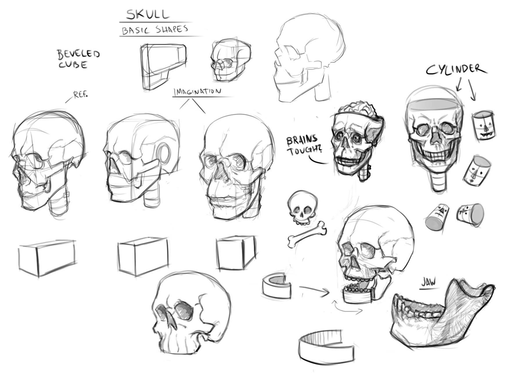
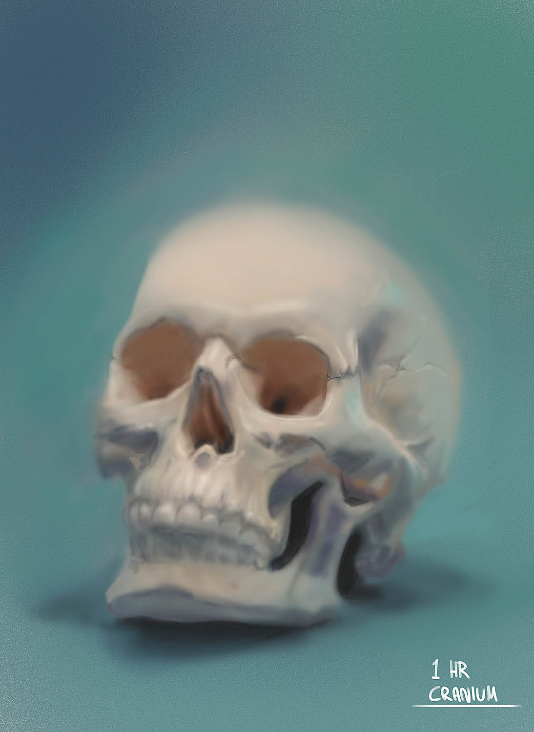
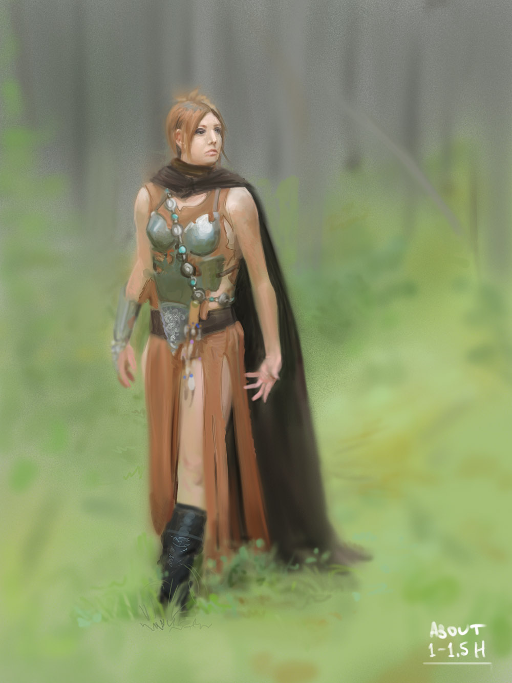
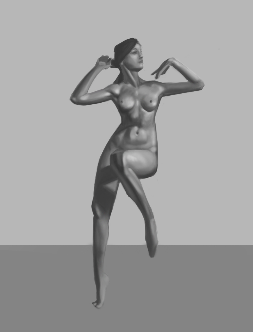
Form of the skull scribbles, quick paintings with limited time and value study.
RE: echo´s sketchbook - darktiste - 09-07-2018
What going on with that skull edge?Did you use a ref with alot of lense effect i would suggest you post the reference.
RE: echo´s sketchbook - -echo- - 09-07-2018
The exercise was not to get it accurate from the reference, so I will not post it. The point of the speedpaint is to paint in a limit of time, brush economy for faster painting and loosing up my overall painting process. With other word to practice working quickly and more efficiently. Going from big shapes to small, only used soft brush for that particular one.
RE: echo´s sketchbook - chubby_cat - 09-08-2018
Nice studies, Echo :)
I know your ladies are painted within a time limit, but be careful to not overlook/rush through key fundamentals.
The forest lady has a few anatomy issues - a super long torso, left eye too high, and a shoe dislocating from her leg. The belt should form more to her hips and not be so straight.
Also, with the boot, it doesn't follow the same perspective as everything else. The top curves upwards, while every other defining curve you have (neck of the scarf, belt, arm band, etc.) points downwards.
Small things, but they immediately stood out when first viewing the image. It's worth spending an extra 10-20 minutes making sure everything is in place rather than rushing.
Anyways, keep up the great work :)
RE: echo´s sketchbook - -echo- - 09-08-2018
Thank you very much chubby_cat! No worries, im aware of those things, there is also a few problems with the skull and value study. I will try to fix it in the upcoming ones. Thanks for stopping by and commenting! :-)
RE: echo´s sketchbook - RickRichards - 09-08-2018
Hey man, yout other piece is coming along very well.
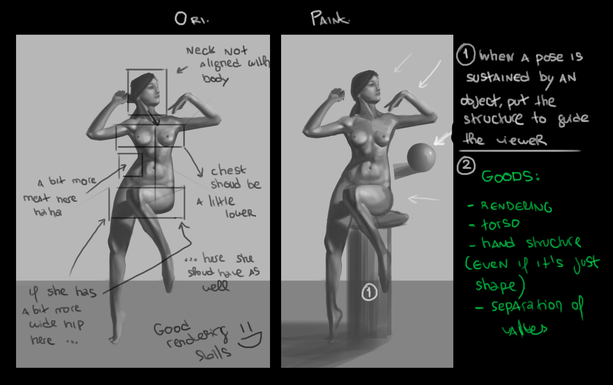
Regarding the studies, it´s good to see you pushing with studies. Since the figure painting is the more foundational one, i´ve tackled it. Hope you don´t mind my paintover man.
RE: echo´s sketchbook - -echo- - 09-09-2018
Thanks for the paintover and the notes RickRichards, it is always helpful and very much appreciated!
You made me see a few more mistakes than I first did see myself.
Also now when I look at it I see even more mistakes like that the upper shadow of the leg is too small and in the wrong angle from her thigh.
Thanks again! :-)
RE: echo´s sketchbook - Fedodika - 09-09-2018
You can learn a ton from one image, If you want a quick boost to your skill, but it could be tedious, take that figure study and start over, correcting for all the things youre aware of now, then keep pushing it until you cant get it any closer. If you see a muscle you dont understand? Look up that area of that body and find out each little muscle. All so much good information in just one image, never underestimate a sustained study
RE: echo´s sketchbook - -echo- - 09-09-2018
Yeah I totally agree with you Fedodika, that is a really good way to study! But honestly i didn't go 100% for accuracy for any of the studies in that last post, just quick and kinda messy studies. Also the reference for the value study is quite bad/low res. So in that case I would probably use another, better reference. Thanks for the comment man <3
RE: echo´s sketchbook - Abnormal - 09-10-2018
Just keep doing that kind of exercises, more and more questions will appear and you will have to solve those problems in the end is what this is all about. keep going. ^^
RE: echo´s sketchbook - -echo- - 09-11-2018
Hey Abnormal, yes that is very true, in the end we are all problem solvers here, thanks for stopping by! :-)
I haven't painted much in the past few days and i will not have time for it in the upcoming 2-3 days either. Anyways a quick update:
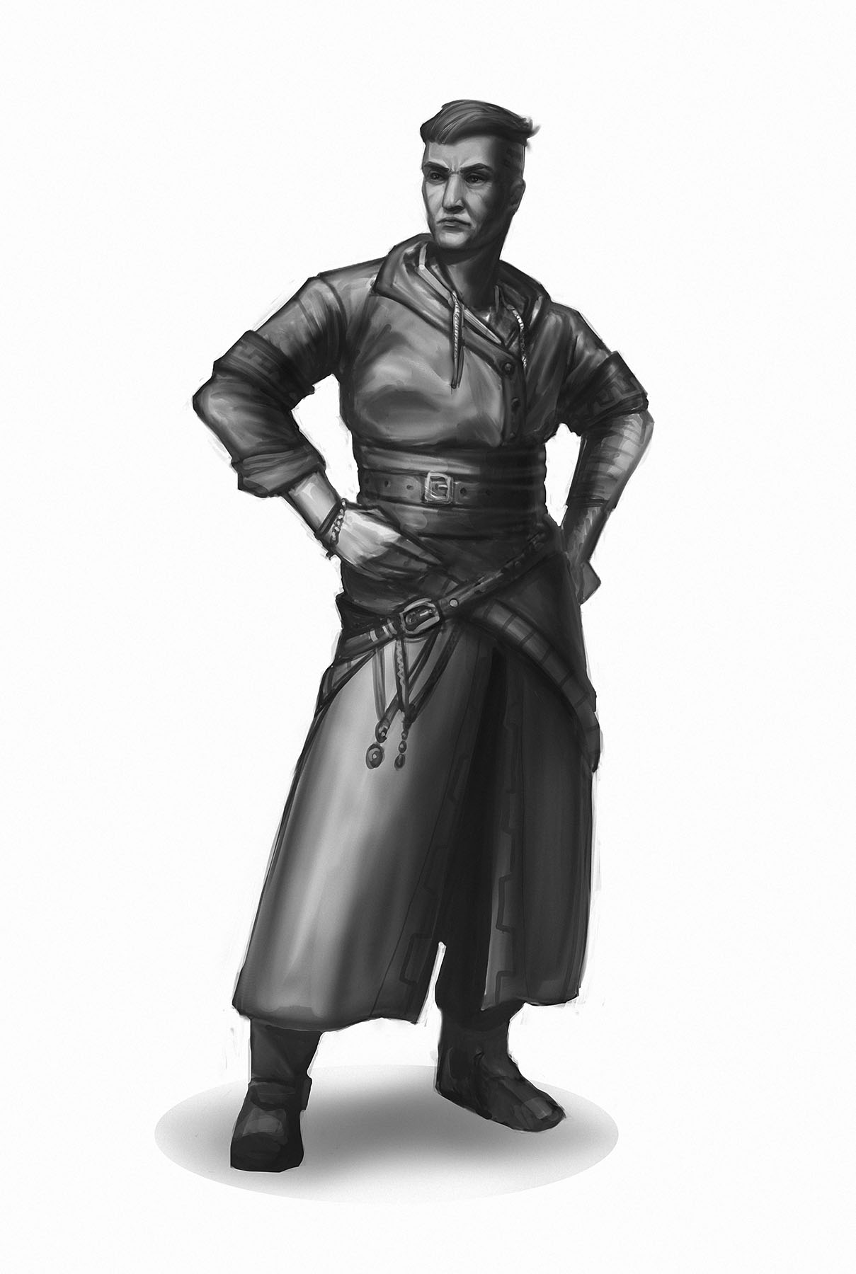
Medieval-tunic-man... I kinda wanna repaint his face though, looks really flat. Also his left arm looks broken.
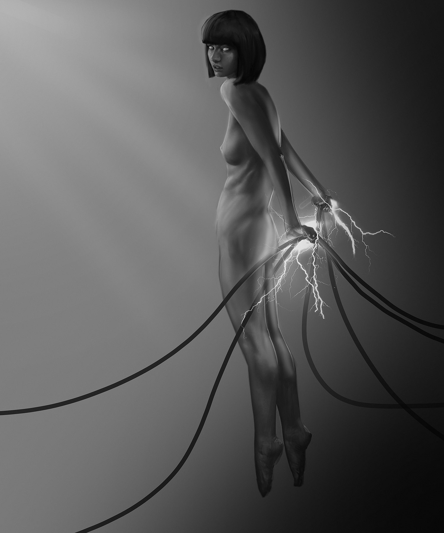
Quick photobash/paintover/concept thingy.. I kinda like the concept with contrast and all, but not the execution. It is not dynamic enough, I'll maybe revisit it with different pose and more thoroughly thought behind it.
RE: echo´s sketchbook - Fedodika - 09-11-2018
if you drew him without clothes, you can probably see where you went wrong with the arm, among other things ;)
The electric girl is hot, but doesnt feel like anything special. I mean, you can make a naked person a concept with lightning hands, but youll need a very stylized approach to make it feel fresh. Kinda just feels like one of those corny deviantart stock photos with "my friend who totally can photoshop" adding some "cool effects"
RE: echo´s sketchbook - -echo- - 09-11-2018
Yeah, that's pretty much what I said :-)
I don't really know what you mean by very stylized because I don't really think a general piece have to be heavily stylized to feel fresh.. just better rendered and more thought behind it, thumbnails, pose, anatomy, composition etc. etc.
Obviously this one is pretty lame, I pretty much took three different photos of three different girls and bashed them together to see where it would get me, then I painted over it. Conceptual art and sketches doesn't need to be perfect in my opinion, it's just for quick ideas and happy accidents. Don't you agree? :-)
RE: echo´s sketchbook - -echo- - 09-19-2018
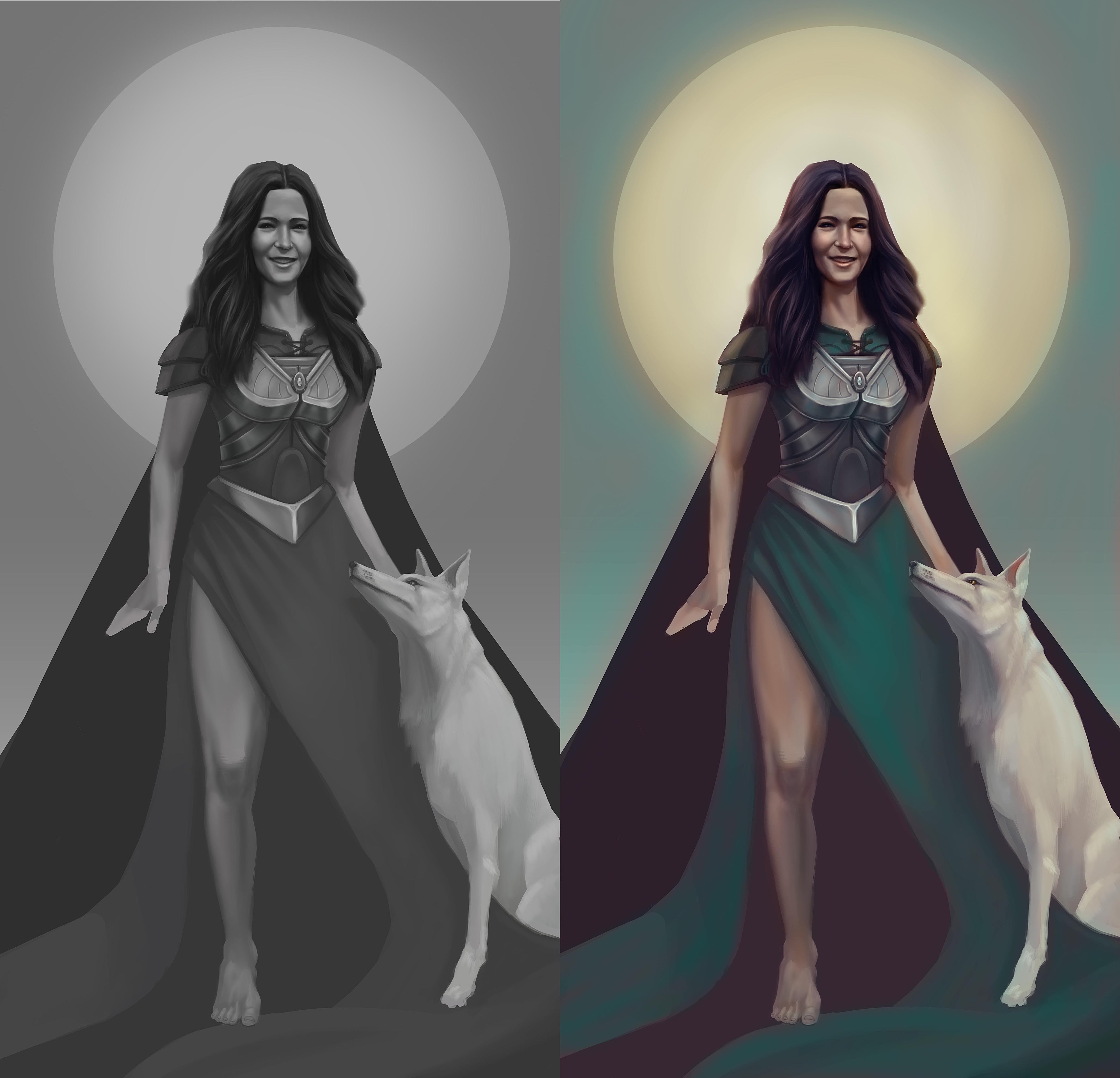
WIP - kinda reworked that one sketch I painted during skillshare classes (from page 7 in the sketchbook).
RE: echo´s sketchbook - -echo- - 09-22-2018
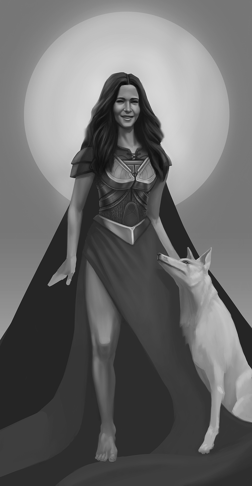
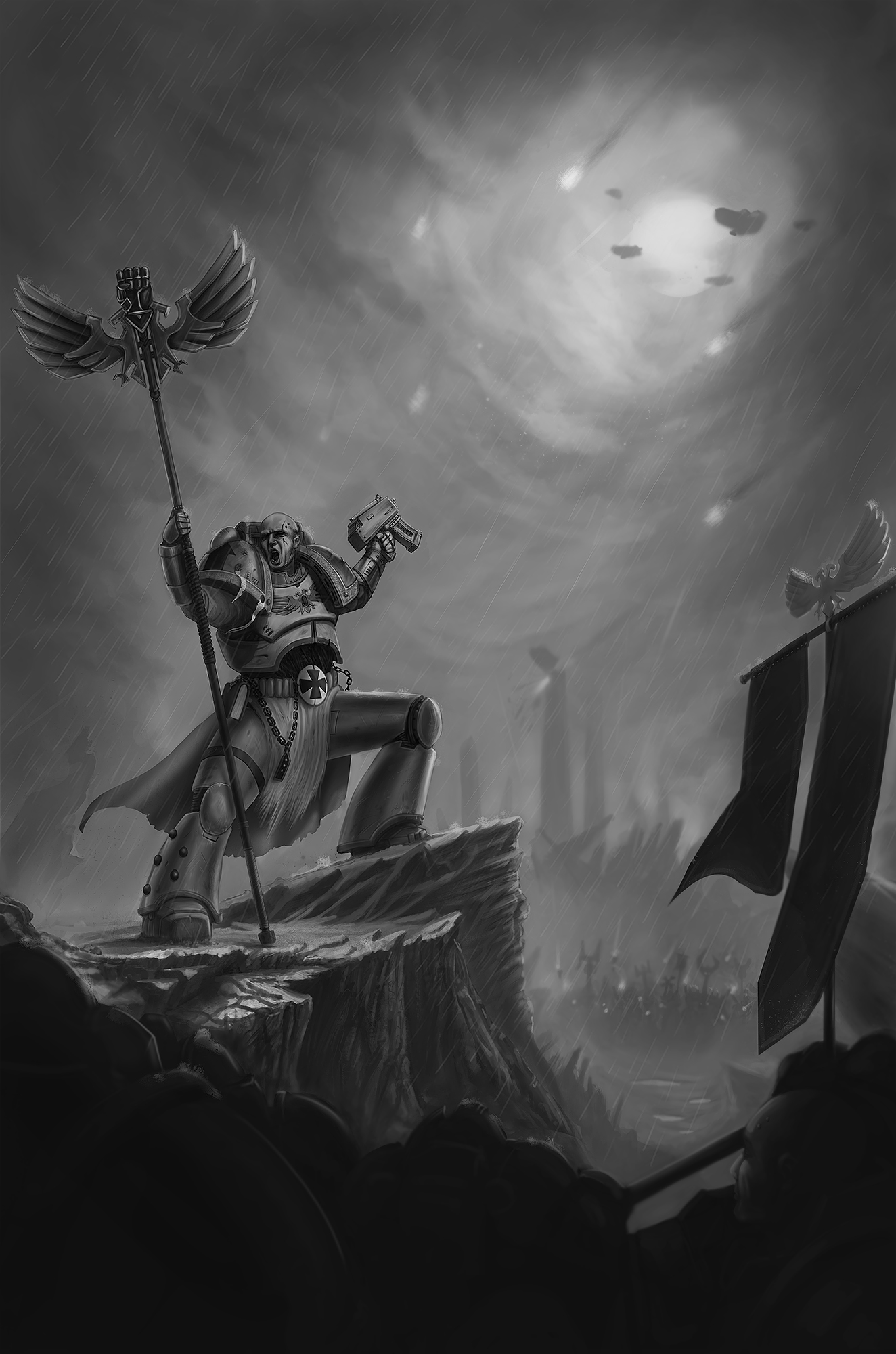
RE: echo´s sketchbook - Fedodika - 09-22-2018
one is dynamic and lacks structure,
one has structure but lacks dynamicism
RE: echo´s sketchbook - RickRichards - 09-27-2018
Hey Echo! Your warhammer piece is going in the right direction, needing some love and refinement but nice.
Regarding the lady concept, i can´t put the finger on what does make me really really like the concept but i really do.
I would suggest a few tweaks with her, so i did a paintover, hope you don´t mind
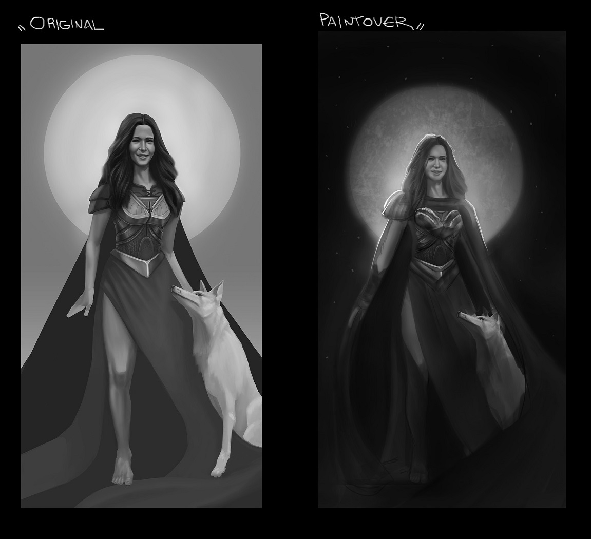
A) Anatomy. Her face is lovely, her torso is nice but the arms are a bit off anatomywise. Same with her leg, her leg suits better a spartan haha. Just kiddin. Just a few tweaks and it´s ready to go.
B) Balance. The uniformity and the visual weight equilibrium is there but the cape/triangle shape is quite disconnected from the lady. Perharps trying to change it a little bit. It´s too strict haha.
C) Composition. The composition works really well. Just a few tweaks to enhance it, prehaprs breaking the strict shap and bring a few organic shapes instead.
D) Drama. There is a connection between the lady and the wolf but i´m not feeling it. Perharps closing the cape on the wolf could create a sense of care, protection, leader of the pack type of feeling. By breaking the strictness it may provide the message that the wolf cares for the lady and the lady for the wolf.
By toning down value, brining contrast to enhance their bond the drama aspect could be better introduced into the picture.
I´m not really a big fan of over the top 1-10 value ranges black to almost white but i think it may really work quite well in this piece.
- The night sky enriches the foreground and enhances silhouette.
- The bright light hitting the wolf and her face and torso.
- By toning down/ creating lost edges on the bottom part, guides the viewer to the upper frame.
- Rim light helps hightinght the silhouette.
Just my two cents, hope it helps haha!
RE: echo´s sketchbook - darktiste - 09-27-2018
Took the liberty to draw over the paint over to add to the critic i think the backlit nature of the piece should be took more into consideration a viewer probably doesn't care as much from where the light come from as an artist would.But i choose to make it more back lit to add to the idea that there a unit by unifying there value into a darker one overall unit.
I choose to brighten the moon a bit also for extra contast to bring the focus on the face.
Overall i don't think following realism like i did is really the best idea but the point is to make sure that the light source as some basis in reality we could have made for example and indication that a fire was nearby so that it could have been front light i think it important to let the viewer know where light source are coming from .
Good job to everybody for the collab.