
+- Crimson Daggers — Art forum (//crimsondaggers.com/forum)
+-- Forum: PERSONAL ARTWORK (//crimsondaggers.com/forum/forum-9.html)
+--- Forum: SKETCHBOOKS (//crimsondaggers.com/forum/forum-10.html)
+--- Thread: Rshin's Sketchbook (/thread-5866.html)
Rshin's Sketchbook - Rshin - 11-23-2014
This is my first time posting an artwork here.
To be honest, I'm not really good but hey, I'm willing to learn.
From time to time, I'll be posting here. And hopefully in each post, there'd be a few improvements.
Whether it may be traditional art or digital art.
So here's my first entry for my sketchbook. It's not that grand but I really had to force my hand
to actually make something - and that's a pretty big deal for me :)
I'm just trying out some character designs here for an art trade I am doing with someone.
C&C are welcome , of course.

RE: Rshin's Sketchbook - Rshin - 11-24-2014
So this is my sketch entry for today.
I decided to go for pencil for this one cause it's a medium I find myself comfortable with.
It's for my book illustration thesis which I'll end up 'crafting' later on.
I'll also post my craft example, if that's okay :) I plan on making my book illustration thesis sketches
in digital as well once I'm done with all the crafting. So for now, this pencil sketch will do.
C&C are always welcome.
RE: Rshin's Sketchbook - Caisne - 11-24-2014
Hey man, Welcome to a CD Forums! You get to the right place, to get better. Its really good to see you're doing a personal stuff, but you should consider doing some studies as well. But don't dive to deep into learning depths, balance it with personal work you have fun with. Get yourself Andrew Loomis's book its free, and Scott Robertson's "How To Draw" and "How to Render" if you can, it on Amazon. Go through them to get some fundamentals, and get better.
Thx for posting man, if you'll need an help, drop me a note, I'll get to it. And keep up the good work.
RE: Rshin's Sketchbook - Rshin - 11-27-2014
Waaaa haven't posted for 2? days. Too busy. School. Yeah :/
But, I made some time now so I feel good about it.
Here are some skull sketches! Yeah, the first one is derp but then as I went on
I started feeling comfortable or warmed up. Not the best thing in the world but hehe
more practice to do then :D
RE: Rshin's Sketchbook - Rshin - 11-28-2014
These are my sketches for today.
Since I did some skull sketches, I tried drawing more heads :D
The skulls did help me understand which parts are more.. uhm pushed back and which ones are not.
of course I'll practice drawing more heads. once I got enough understanding for it, I'll move on to the features and study them one by one, starting with the eyes.
RE: Rshin's Sketchbook - Rshin - 11-29-2014
Today I'll be posting a sketch that is not a study..
so yeah.. I'll get back to those, but for today, this is my entry.
Since I'm working on learning some anatomy, I guess I'll do gestures after I've learned
a bunch of stuff. One at a time Shin. One at a time.
Here's a robot fairy.
RE: Rshin's Sketchbook - Rshin - 03-07-2015
Oh man~~ It's been a while since I've posted something here.
Cause.. well, school happened. I still have it now, but the time I
have now is more lax compared to before.
Here are some studies I did with my little, but still productive, free time (for this week).
RE: Rshin's Sketchbook - JyonnyNovice - 03-07-2015
go Shin! Hands are looking awesome, you seem to have really levelled up but you said you haven't been drawing since your last post? O.O
RE: Rshin's Sketchbook - Rshin - 03-10-2015
@jyonny Thank you for your kind words ^^ In a way, that's true. I stopped the studies but I still drew a bit.. for my crafting project. But It's all sketchy, so I'm glad I'm back to studying again. :)
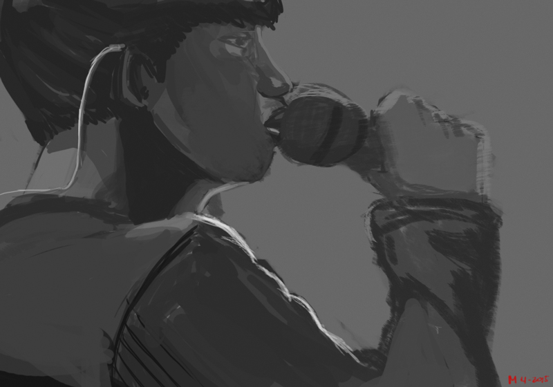
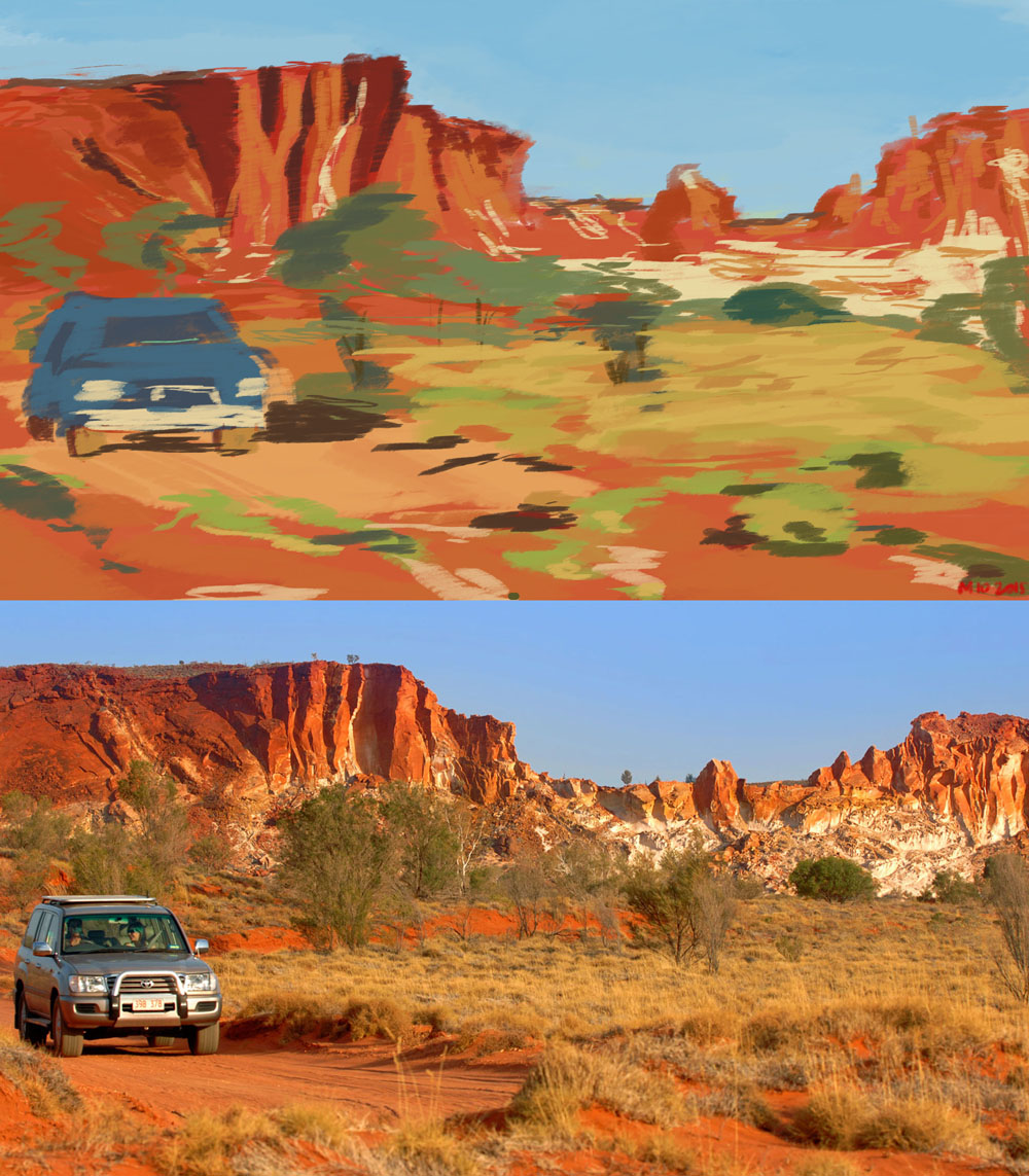
I did a value study and color study. It was also my first time to paint without using guidelines or line art.
Just went straight to painting random shapes then filling them in with different values and color cause I've always wanted to try that. And well, it was pretty fun. I'll do that again.
I learned a lot from these paintings and I'll appreciate any C&C ^^
Still have a lot of things to improve, too.
I did these before I went to school the other day, and before I leave for school today. 1 hr each.
It was a pretty cool exercise.
The grassy parts for the color study was pretty tricky. looks like I'll do some plant/trees study too
RE: Rshin's Sketchbook - JyonnyNovice - 03-11-2015
Hey Shin, you got the right idea, doing these studies and seeing what you find difficult and doing more study on that area like with the plants and leaves and stuff, that's a really thoughtful approach and will do you really well!
Is that portrait from imagination? Pretty cool pose and stuff. I have a feeling you're kind of guessing with the lighting though - although you have good instincts and show the forms well they will have so much more punch when you get a solid handle on this stuff. I know they are just your before school sketches but if you don't mind I broke some stuff down for you. These are for my own studies too but figured I'd write them out and share them with you (helps me to learn them better too).
I broke it down into 4 pieces:
1) light direction,
2) the planes (of any object but in this case a face),
3) values
4) background
It really helps (I discovered by doing this breakdown!) to figure out what values you are going to use before you start painting anything. You can get them by analysing a photo like I did below, or a painting or reading about the theory behind it. The more careful breakdown and intelligent study you do, the more and more it becomes instinctive.
Hope this helps! (There is a big version, so you can read the notes, here: http://i.imgur.com/y1WRc04.jpg )
![[Image: p1gqpBr.jpg]](http://i.imgur.com/p1gqpBr.jpg)
Summary:
- What direction is the light coming from? Above + in front + far side
- What about the planes? Light is a little above, so planes angled upwards towards the light will receive the most light, planes angled down or away from the light will receive the darkest values. (pretty much) everything else receives some kind of mid value.
- Choose only 3 starting values - light, mid and dark - those kind of set your maximum / minimum limits, you can blend and colour pick anything between those after you got them laid down.
- Background will pop your image out and make it look darker or lighter (depending how you want it). A gradient background is more interesting than a flat background.
I hope that was useful! Any questions please ask anytime ^^ (I'm still learning this stuff too)
RE: Rshin's Sketchbook - Rshin - 03-16-2015
@jyonny thank you again for your advice, I'll check them often as reference for my future paintings. :)
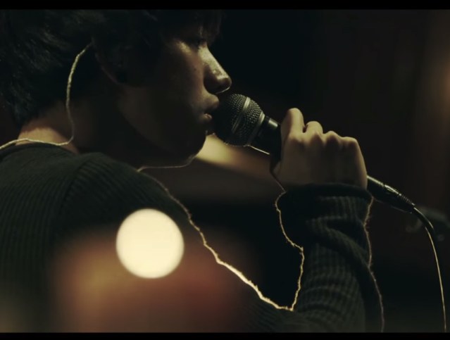
btw this was the reference of the value study. In this picture, I'd like to point out that there is a strong light at the far left of his face, behind him and there are candles around him as well (which you could see in the foreground but completely our of focus)
I didn't do much recently because I've been busy with school. But I think I'll have more time to draw
for this new week.
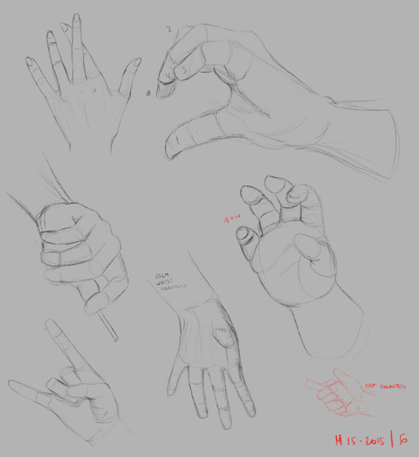
Like before, I did hand studies. This is actually part of the 1000 drawings me and my friend have decided to
do - mine are hands, and his are head studies.
I also tried drawing this gas mask (with ref) cause I just wanted to, then since it would seem slightly pointless to stop after drawing it, I tried to capture its color in the reference. But I stopped halfway because
I wanted to draw this in a different way next time and add something to it like reflections so it wouldnt be too plain.
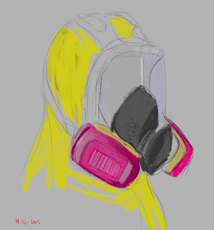
In this picture though, I was able to see and understand a bit more jyonny's advice when it comes to lighting because of the separation of planes on the gas mask's oxygen can.
RE: Rshin's Sketchbook - Rshin - 03-17-2015
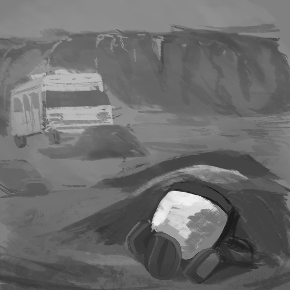
I'm making this new piece, I want to see if I even learned anything from some of the
studies i did from the previous days.
C&C is welcome ^^ I'd like to know how I could improve this.
RE: Rshin's Sketchbook - AngeliquevdMee - 03-17-2015
Good job so far, and good luck with the 1000 hands! One tip for the last image... try to seperate the values of the foreground, middleground and background. ( dark foreground, halftone middleground and light background or vice versa. ) Keep it up like this, you'll get there :)
RE: Rshin's Sketchbook - JyonnyNovice - 03-17-2015
good job pulling the eye to that gas mask in the front with the strong contrast. This is a video about what Angelique said, from ctrlpaint, explains it really well: http://www.ctrlpaint.com/videos/film-studies-foreground-middleground-background
RE: Rshin's Sketchbook - Rshin - 03-19-2015
@jyonny and angelique - thank you for the advice and the link ^^ I got back to it again and was able to separate their values now :)
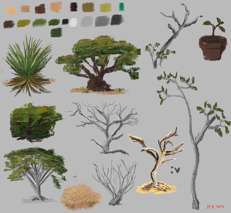
For today, I did studies of trees and plants. Just to get a feel of how I'm gonna draw them
on the painting I'm working on. Just did this loosely and just tried to have fun with it :D
RE: Rshin's Sketchbook - Rshin - 03-20-2015
Ok so I worked some more on that piece I was doing.
I colored it now after I was happy with how I separated the foreground, mid and background.
Though, I know I still have a lot of mistakes.
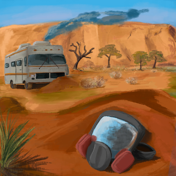
I'm not quite happy with the foreground and background yet, and the mid ground could still do more tweaking.
That's what I'm gonna fix later/tomorrow
To be honest though, this is a big jump from how I used to color or even draw. That itself makes me
really happy that at least I've seen that slight level up. This makes me fired up for my future studies.
As always, C&C are welcome ^^
RE: Rshin's Sketchbook - Rshin - 04-05-2015
It's been a while a gain since I posted something.
I barely studied but I want to put some stuff up I did during the free times I had.
I started with anatomy and learned how to place the 3 masses (head, ribs, pelvis) and how the spine works.
These are a few of the exercises I did.
[I re-drew digitally the ones that aren't quite clear in pencil]
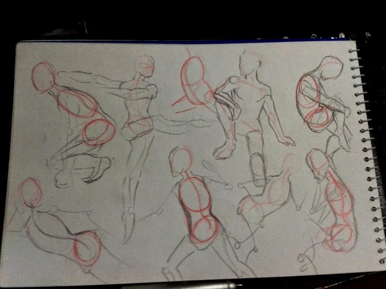
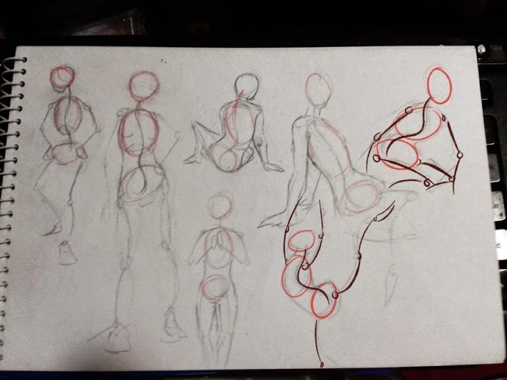
It was a really fun exercise and I thank Jyonny once again for giving me an idea on how to
start learning more about anatomy.
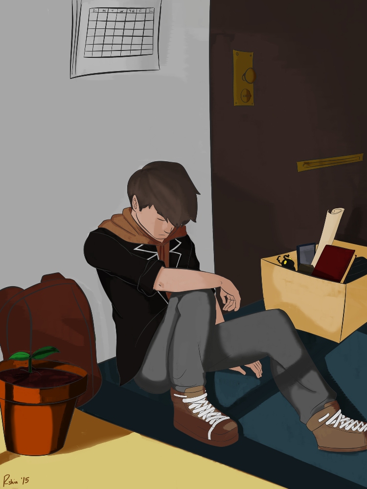
For the previous days, I've been working on something which I'll give as a gift to a friend.
Went back to doing linearts, and I did so many mistakes in this one. I'll get back to this and fix it when
I have more time. C&C are always welcome. ^^
RE: Rshin's Sketchbook - Rshin - 04-09-2015
Today was a really slow day.
So with time to kill, I did some drawing exercises for an hour.
I honestly didn't know what I wanted to draw so I just picked random subjects.
Here's another gesture exercise I did. Getting the hang of these things. Also added some wrapping lines now to make it more 3d and to know where the body is facing.
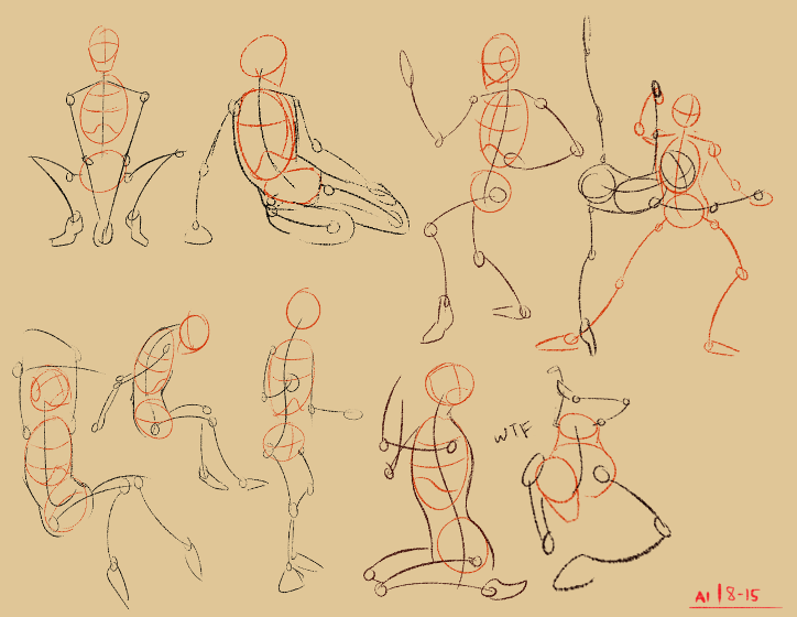
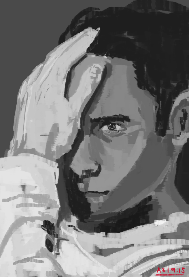
For this one, I did a portrait study or.. maybe more of a value study, either one works.
I made it pretty quick and kept in mind that i shouldn't make too many brush strokes, and that every brush stroke serves its purpose. Though I dunno I did that right haha but I know I made lesser strokes than
how I used to do these things. So I guess that's a good change.
RE: Rshin's Sketchbook - Rshin - 04-11-2015
Oh man I didn't know gesture drawing was so addicting.
Another gesture exercise. I tried something new after watching Proko's videos.
My only problem though is that, let's say I'm drawing a girl, I couldn't make the pose
more feminine even though that's my intention.
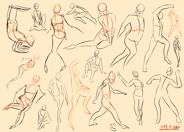
guess I'll have to explore more on that and draw more curves curves curves
RE: Rshin's Sketchbook - JyonnyNovice - 04-11-2015
Looking good Shin, keep going! gesture drawing is really fun!
To get the male / female difference, one thing to use is the shoulder / hip width relationship. On a man the shoulders are generally wider apart than the hip bones (by hip bones I mean the knobbly greater trochanter that sticks out of the pelvis and goes down into the leg bones). On a woman, the shoulders are much narrower and the hip bones wider. Another one is that females have wider but shorter pelvis, male have thinner but taller pelvis. There are few other ones as well but those are the most obvious ones.
So for a man, widest point = shoulders
for a woman, widest point = hips
You can also think men = blocky / straight lines, women = soft / curved lines, like you did with the two in the bottom right, the difference in gender is clear on those.