Posts: 101
Threads: 6
Joined: May 2016
Reputation:
10
Hi guys,
This is my current WIP:

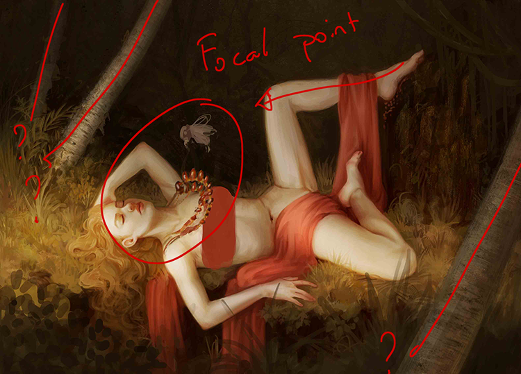
I need some help to tell the story, but any kind of crits or paintovers would be appreciated! The story comes from Norse mythology. The goddess Freyja is asleep, wearing her necklace called Brisingr Men. The god Loki changes into the form of a fly to sneak into the place where she sleeps and steals the necklace.
I've got loads of rendering to do on the fly and necklace, both of which will require some studying...but I'm wondering if I can make the story clearer somehow. The fly will be hovering above the necklace, where I've sketched it in, and the necklace will be pulled up towards it, as if moved by a kind of gravitational pull, with the loose ends trailing on Freyja's skin. I thought about also adding some sort of magicky effects between the fly and necklace, but it looked horrible.
Any thoughts? Either about telling the story or just generally about making this look good?
Posts: 1,970
Threads: 22
Joined: Apr 2012
Reputation:
243
I like the rendering, it's heading in a nice painterly direction. Almost has a Klimt vibe.
I have an issue with her pose, it is pretty odd. If she is really sleeping, why is she posed like a kind of contorted sex doll? There is a lot of overly sexualised content out there...it gets a bit boring after a while to see this used for little reason, unless it is handled in new or a classy way. I know Freja is the goddess of love, sex, fertility etc so the context is there for sure to sexualise stuff, but it doesn't make this particular pose any less odd.
To continue the sex doll analogy, her lower half does actually seem like it is a mannequin's rather than a real person, probably because of the hard lines and the way you have handled the ankle and hip / thigh joint areas. The feet could do with more anatomy love.
I think the elements are all in place to get the narrative out relatively clearly, but for me personally it's just that pose man.
Posts: 101
Threads: 6
Joined: May 2016
Reputation:
10
(05-27-2016, 03:13 PM)Amit Dutta Wrote: I like the rendering, it's heading in a nice painterly direction. Almost has a Klimt vibe.
I have an issue with her pose, it is pretty odd. If she is really sleeping, why is she posed like a kind of contorted sex doll? There is a lot of overly sexualised content out there...it gets a bit boring after a while to see this used for little reason, unless it is handled in new or a classy way. I know Freja is the goddess of love, sex, fertility etc so the context is there for sure to sexualise stuff, but it doesn't make this particular pose any less odd.
To continue the sex doll analogy, her lower half does actually seem like it is a mannequin's rather than a real person, probably because of the hard lines and the way you have handled the ankle and hip / thigh joint areas. The feet could do with more anatomy love.
I think the elements are all in place to get the narrative out relatively clearly, but for me personally it's just that pose man. Thanks for the crit! Definitely the idea was to play on the sexual side of Freyja (she supposedly paid for the necklace with sex, after all!) but I'll see how I can rework the legs, and maybe do some leg and foot studies before settling on new posing for the bottom half. To be honest, I'm not totally enamoured with the arm posing either...but I'm not sure I can bring myself to totally repaint the figure.
Posts: 1,970
Threads: 22
Joined: Apr 2012
Reputation:
243
I get what you mean about the arm posing, I didn't really say anything because it is definitely passable, not at all as odd as the legs. Yeah I feel you man. The piece is already quite some way developed in terms of rendering..always a bugger to change that when so much time has been sunk in! I suppose with a predominantly figure focused piece, the pose will really do a lot of the work. I would say look for or shoot some ref...or if you can, get a willing victim to pose for you just to trial out stuff. having a real live person enter poses also gives you realtime feedback on what feels more natural as the poser as well :P
Another reason why you gotta really exhaust comps and get feedback and address all the big problems up front before you get hours into rendering if you can. Good luck whatever you do man! :)
Posts: 97
Threads: 5
Joined: Sep 2012
Reputation:
1
First of all, I really like the colour palette and the rendering of the vegetation!
I think the bug and the necklace aren't emphasized enough in your composition.
Apart from her leg, there is nothing that points towards the focal point of your painting.
Your trees are in diagonals which is interesting but they don't lead the eye towards the focal point, so what is interesting in the first place actually becomes useless or counter productive as the eye end up "leaving" the image instead of coming back towards the character. (maybe ignore the one in the foreground as the eye probably follow up with the vegetation and comes back in ?)

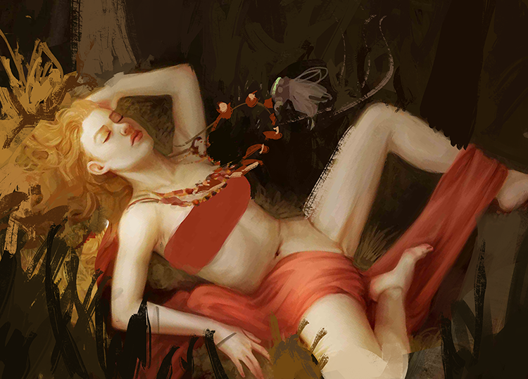
It could also be interesting to have her lay in diagonal and zooming in a bit if yo want the spectator to really feel what is happening in the image. With your current composition, I feel like it's more of a contemplative painting and that the bug is just passing by, not really being of any significance in the story.
My example isn't very well composed but I guess you can still understand what I want to tell.

Long time since I've done a crit' on a painting so my senses may totally be rusty. Don't take them into account if you fee like it doesn't make sense :).
Posts: 101
Threads: 6
Joined: May 2016
Reputation:
10
(06-01-2016, 01:28 PM)Fincks Wrote: First of all, I really like the colour palette and the rendering of the vegetation!
I think the bug and the necklace aren't emphasized enough in your composition.
Apart from her leg, there is nothing that points towards the focal point of your painting.
Your trees are in diagonals which is interesting but they don't lead the eye towards the focal point, so what is interesting in the first place actually becomes useless or counter productive as the eye end up "leaving" the image instead of coming back towards the character. (maybe ignore the one in the foreground as the eye probably follow up with the vegetation and comes back in ?)
It could also be interesting to have her lay in diagonal and zooming in a bit if yo want the spectator to really feel what is happening in the image. With your current composition, I feel like it's more of a contemplative painting and that the bug is just passing by, not really being of any significance in the story.
My example isn't very well composed but I guess you can still understand what I want to tell.
Long time since I've done a crit' on a painting so my senses may totally be rusty. Don't take them into account if you fee like it doesn't make sense :).
I love the paintover man! I hadn't even thought about that, the idea of tilting and cropping the image closer to bring in the focus. Reminds me actually of what someone was saying on twitch today (perhaps Titus Lunter...?) about experimenting with cropping close to the centre of attention and getting rid of all the extra trash that isn't essential.
I agree that the composition isn't 100% doing its job to guide the viewer's eye. I have a more recent version in which the legs have been re-posed (it's at the bottom of my sketchbook), which I think helped a little bit because it took out a few distracting areas like the foot that was close to her crotch. It created problems of its own, but...I don't know. Win some, lose some, and at the moment I'm chalking this painting up as a loss because I didn't spend enough time in the planning stages. Should've thumbnailed it out!
You've given me things to think about, thank you :) Great crit.
Posts: 18
Threads: 3
Joined: Jul 2016
Reputation:
1
Hello! I also found the legs a little unnecessary, I think it is not clear that she is sleeping, that seems kind of uncomfortable stay with the legs as well.
Maybe you could make the fly half grotesque, human and fly between, you know? who has hands to show that he is stealing the necklace himself.
Its yield is beautiful, the body is perfect!
Sorry about the superficial help, but that this painting took me too .. How to make a fly stealing a necklace without sounding lame. But that's it :)
|


