Posts: 1,109
Threads: 18
Joined: Apr 2014
Reputation:
68
Was so happy to see this challenge! I'm gonna give it my all!
A page of ideas, 90% are really cringing and cliche but you need to clear out the crappy ideas first I suppose : )
Posted too tiny for anyone to read (I'm not censoring though, if it's helpful to read my thought process the big version is here: http://imgur.com/m3ceBDK )
![[Image: KmNwyZ4.jpg]](http://i.imgur.com/KmNwyZ4.jpg)
Some more brainstorming of a potential idea, ended up liking this one a lot. It ended up pretty dark, which is a habit of mine I'm not always so happy with. It's quite weird since I am a very positive / cheerful person irl, but I just suck at pop culture humour and can only really write jokes involving characters that are already developed, so I opted for something tragic and (hopefully) emotional. (big version is here: http://imgur.com/P9sNHhE )
![[Image: 2m2k290.jpg]](http://i.imgur.com/2m2k290.jpg)
This is the rough idea panel, fleshed out a bit so it hopefully makes sense.
![[Image: 39WHAAY.jpg]](http://i.imgur.com/39WHAAY.jpg)
Written up a plan for this, all the things I need to do and which dates I'll do them on. This is a challenge of project management too since there are quite a few different elements.
![[Image: Uz7yJCj.jpg]](http://i.imgur.com/Uz7yJCj.jpg)
Next step is churning out a load of different panel layout options, drawing angles, trying different drawing ideas and text.
Any comments or feedback greatly appreciated!
Posts: 671
Threads: 8
Joined: Feb 2016
Reputation:
113
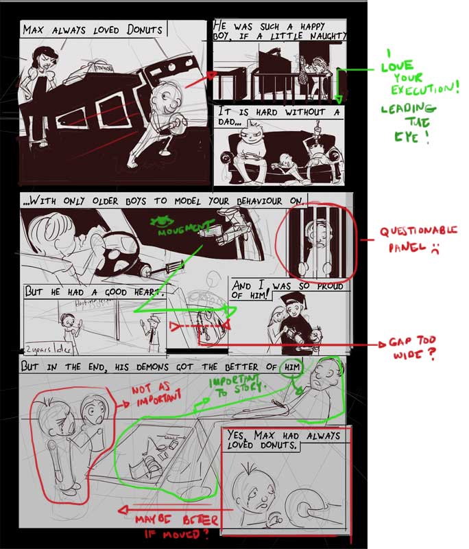
Hey Jonny! Great push off. Quick critique. I hope it's legible enough..

Just to add. The bigger space you give a panel, the more 'time' the moment has... In your 4th to 6th panels (or 7th, if the person in jail counts as a separate panel), given the real estate you provided for each, the guy getting carjacked has more weight to the story than the rest because it feels like you've given the scene more page time.. Not sure if this is your intention. But as a reader, that's what I see.
It's shaping up real good!
EDIT: These are just suggestions! They are probably bad advice!
EDIT 2: 10in (267mm) x 7.5in (178mm) are the new dimensions for the comic!
If you are reading this, I most likely just gave you a crappy crit! What I'm basically trying to say is, don't give up!
----
IG: @thatpuddinhead
Posts: 1,109
Threads: 18
Joined: Apr 2014
Reputation:
68
Thanks dude! Great points you brought up, will keep that all in mind while I work up some more!
Posts: 742
Threads: 28
Joined: Jan 2012
Reputation:
44
To be honest I have no idea what's going on, but maybe it's because I'm a bit drunk at the moment...
Posts: 1,109
Threads: 18
Joined: Apr 2014
Reputation:
68
I guess a successful comic should be understandable by a drunk person :) But probably depends how drunk... either way mine needs work, but 3 out of 4 people who've seen it so far have made sense of it, so that's promising ^^
Posts: 1,970
Threads: 22
Joined: Apr 2012
Reputation:
243
It's never a bad thing to go with something dark if is personal to you in some way, otherwise it is just dark for the sake of it. Though, yes, humour is a beautiful balm to spread into the world :)
Gotta say you've done some great work with the brainstorming. I think John made some really good points with the layout. About the story...I read your notes before I read the page...so not sure how much that influenced my first read of the story. I didn't have too much issue understanding it. I think how you draw Max so he is very recognizable through the various ages will help with any confusion.
Now because this is a comic I want to say upfront, please don't take ANY of this below as somehow something that is wrong or needing changing. I don't want to influence people's stories and development process too much, unlike how I would with painting crits.
About the impact of the final panel, I almost feel like there needs to be one more time-step between the degree panel and the final panel so we get a sense of temptation going his way? Might not be the contrast you want though, so feel free to ignore this!
I might suggest making the final scene more horrifying in some way and tie it to the rest of the panels for more impact. Perhaps his Mum finds him, with the children lying crying on him..his framed degree on the table, being used as a cutting surface...or on the wall. Maybe he is dreaming his final dream of him as a kid playing in a mound of donuts while OD'ing. It's a hard thing to make someone emotionally attached to a character in one page so keep pushing that aspect too!!!
Seeing this has also made me realise I intend to cram a LOT into my page...bit nervous about that now haha
Posts: 530
Threads: 14
Joined: Dec 2015
Reputation:
51
So sleepy that I don't seem to understand what's going on, too, but I see you've put much work into it already! Keep it up, looking forward to see your final later! :)
Posts: 559
Threads: 6
Joined: Jul 2015
Reputation:
68
Came by to suss everything out and was kind of intimidated by the amount of planning you seem to be doing, makes my process seem a bit inadequate. But, I see that a few people are struggling to make out your narrative.
Maybe don't be so concerned with design for now, and concentrate on making the story shine through.
Posts: 1,109
Threads: 18
Joined: Apr 2014
Reputation:
68
Amit Thanks for the great feedback! I agree there needs to be another step before the overdose panel. Trying to work something in!
Neo No probs neo! I was pretty surprised anyone got it at this stage.
Pocket Don't be intimidated! Comics are my goal and my dream so I'm using this challenge to really push myself to do a page thoroughly. Plus I always writes lots of little notes for stuff, it's just the way I do things.
So, tried out few alternate layouts, I won't bother to post them individually since they probably only make sense to me (although you can see the big page here if you want: http://i.imgur.com/OFkj7dl.jpg )
![[Image: MZGLIgp.jpg]](http://i.imgur.com/MZGLIgp.jpg)
Decided on this layout below (layout F) then trying a few things out on it below that.
![[Image: BC2NdV1.jpg]](http://i.imgur.com/BC2NdV1.jpg)
![[Image: mpgM7LY.jpg]](http://i.imgur.com/mpgM7LY.jpg)
![[Image: Cym7jV7.jpg]](http://i.imgur.com/Cym7jV7.jpg)
This is still just planning, the whole thing will be redrawn once I design the characters, so stuff like perspective and all that kind of stuff is no concern right now.
I'm quite happy with the top portion images - still playing with the text.
I'm happy with the bottom portion too.
The middle section, those 5 - 6 panels need some work still, both for text and images.
As always any feedback greatly appreciated!
EDIT Realised the latest one is possibly even more confusing than the first one.
Posts: 1,109
Threads: 18
Joined: Apr 2014
Reputation:
68
I think this one is better, I put more narration in it, and a few labels to explain the unclear drawings.
![[Image: 6u96kca.jpg]](http://i.imgur.com/6u96kca.jpg)
Posts: 530
Threads: 14
Joined: Dec 2015
Reputation:
51
I like the version with the dogs much more! The faces are funnier and more expressive. Great that you changed the last frame, the story makes sence now for me! I haven`t read the notes, but donut is a very effective symbol of circularity, children suffering the same fate as their parents.
Posts: 1,109
Threads: 18
Joined: Apr 2014
Reputation:
68
Ah! That's awesome! I'm so glad it's becoming clearer - I was worrying a bit that I'd chosen a story beyond my abilities. I never thought about the donut like that, it really fits ^^
Did a bit more, trying to amp up the drama in the last panel with a realistic human hand and some forced & fisheye perspective, I think it has potential.
![[Image: lFZkchg.jpg]](http://i.imgur.com/lFZkchg.jpg)
Need to stop for today, it's making me so sad working on this >.<;
Posts: 39
Threads: 1
Joined: Aug 2015
Reputation:
6
well... That's dark. I was having a hard time understanding it at first but this new setup is definitely helping a lot! The only thing that is REALLY throwing things off right now is the 'Life can be painful without a dad' part. It might work a bit better at the bottom of that frame, but I don't know if they would mess up the way the eye flows through the panes.
Posts: 1,109
Threads: 18
Joined: Apr 2014
Reputation:
68
Thanks Twilight, I agree, that part bugs me too. Will probably put the text at the bottom since I like the triangular frame - also the adjective 'painful' doesn't work so will I think.
Posts: 39
Threads: 1
Joined: Aug 2015
Reputation:
6
Hmmm.... Maybe 'tough' or 'difficult' instead? Really depends what you're going for.
Posts: 1,970
Threads: 22
Joined: Apr 2012
Reputation:
243
gogogo Jonny! Made many improvements in this iteration!
Posts: 1,109
Threads: 18
Joined: Apr 2014
Reputation:
68
Twilight Thanks for the suggestions! I'll use something like that.
Amit Cheers dude!
I found it useful to break down my page into shapes to see what was working and what was weak:
![[Image: N4P4fxv.jpg]](http://i.imgur.com/N4P4fxv.jpg)
Pushed some things around a bit and ended up with this (last panel still needs work but I need a break from the layout for now, will go back to it in a few days)
![[Image: XvyHpDQ.jpg]](http://i.imgur.com/XvyHpDQ.jpg)
Next exploring some design for the main character, heavily based on Preston Blair's animal's:
![[Image: GFtKV0p.jpg]](http://i.imgur.com/GFtKV0p.jpg)
![[Image: hS2Uc7x.jpg]](http://i.imgur.com/hS2Uc7x.jpg)
![[Image: eSIc7Km.jpg]](http://i.imgur.com/eSIc7Km.jpg)
Posts: 1,109
Threads: 18
Joined: Apr 2014
Reputation:
68
Posts: 1,109
Threads: 18
Joined: Apr 2014
Reputation:
68
Posts: 1,109
Threads: 18
Joined: Apr 2014
Reputation:
68
|
![[Image: KmNwyZ4.jpg]](http://i.imgur.com/KmNwyZ4.jpg)
![[Image: 2m2k290.jpg]](http://i.imgur.com/2m2k290.jpg)
![[Image: 39WHAAY.jpg]](http://i.imgur.com/39WHAAY.jpg)
![[Image: Uz7yJCj.jpg]](http://i.imgur.com/Uz7yJCj.jpg)
![[Image: KmNwyZ4.jpg]](http://i.imgur.com/KmNwyZ4.jpg)
![[Image: 2m2k290.jpg]](http://i.imgur.com/2m2k290.jpg)
![[Image: 39WHAAY.jpg]](http://i.imgur.com/39WHAAY.jpg)
![[Image: Uz7yJCj.jpg]](http://i.imgur.com/Uz7yJCj.jpg)


![[Image: MZGLIgp.jpg]](http://i.imgur.com/MZGLIgp.jpg)
![[Image: BC2NdV1.jpg]](http://i.imgur.com/BC2NdV1.jpg)
![[Image: mpgM7LY.jpg]](http://i.imgur.com/mpgM7LY.jpg)
![[Image: Cym7jV7.jpg]](http://i.imgur.com/Cym7jV7.jpg)
![[Image: 6u96kca.jpg]](http://i.imgur.com/6u96kca.jpg)
![[Image: lFZkchg.jpg]](http://i.imgur.com/lFZkchg.jpg)
![[Image: N4P4fxv.jpg]](http://i.imgur.com/N4P4fxv.jpg)
![[Image: XvyHpDQ.jpg]](http://i.imgur.com/XvyHpDQ.jpg)
![[Image: GFtKV0p.jpg]](http://i.imgur.com/GFtKV0p.jpg)
![[Image: hS2Uc7x.jpg]](http://i.imgur.com/hS2Uc7x.jpg)
![[Image: eSIc7Km.jpg]](http://i.imgur.com/eSIc7Km.jpg)
![[Image: YlmpqeL.jpg]](http://i.imgur.com/YlmpqeL.jpg)
![[Image: Yv9ZpMR.jpg]](http://i.imgur.com/Yv9ZpMR.jpg)
![[Image: OTJqNo2.jpg]](http://i.imgur.com/OTJqNo2.jpg)
![[Image: 2bOEhQ6.jpg]](http://i.imgur.com/2bOEhQ6.jpg)
![[Image: rUK03Xo.jpg]](http://i.imgur.com/rUK03Xo.jpg)
![[Image: pupXuyX.jpg]](http://i.imgur.com/pupXuyX.jpg)
![[Image: Uj7z6Eu.jpg]](http://i.imgur.com/Uj7z6Eu.jpg)
![[Image: nibzFP9.jpg]](http://i.imgur.com/nibzFP9.jpg)
![[Image: J8rv5P0.jpg]](http://i.imgur.com/J8rv5P0.jpg)
![[Image: ljTKI7b.jpg]](http://i.imgur.com/ljTKI7b.jpg)
![[Image: Za2qviJ.jpg]](http://i.imgur.com/Za2qviJ.jpg)
![[Image: qO9usQc.jpg]](http://i.imgur.com/qO9usQc.jpg)
![[Image: XPZXQin.jpg]](http://i.imgur.com/XPZXQin.jpg)