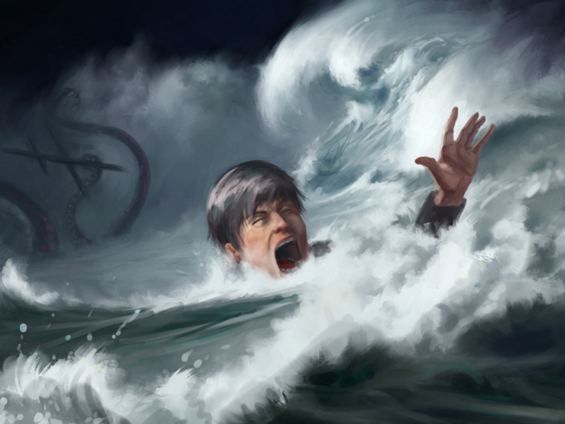
I'd say that you're right in that there is something to be understood about this that doesn't just boil down to "get gud".
A lot of time, this lack of "push" has a very real reason why it creeps in. It's not really due to photoshop or anything like that, although photoshop blending can grey out an image. The reason this happens is because approaching anything at a 1:1 contrast from the start is very difficult when working from your imagination because you are in the process of finding your key and contrast level. Because you are exploring your image, making clear and strong statements of contrast becomes difficult and it can be argued that this is a good thing.
In traditional drawing, many classical artists would work on their image in a high key, basically meaning that the light mid-tones and some of the medium mid-tones would be keyed out and replaced on the value scale by the dark mid-tones and darks. So they would be working with an image that is substantially lighter in value than the final image, almost like an overexposed photograph. They'd do this to simplify their working process and allow them to more easily edit their dark tones until they're in place, before introducing mid and light tones (while simultaneously keying the drawing down) that would substantially complicate things and make it more difficult to work with.
The same thing can be done in work made form your imagination. By working in an image that has less contrast, you have fewer levels of value to work with and you can more easily solve problems in that stage, before complicating things further by having more contrast and more "pop".
I should mention that contrast is not only contrast in value but also contrast in color.
When working from life, a painting can more easily be designated a key and a level of contrast by it's relation to the subject but because this is imaginary, we have to find other ways around it. You could do what you already are doing and use things like overlay as a "wash" to push the existing information further into the direction you want it to be. Another way would be to use a contrast key reference image that you want to emulate. This would be an image that has a similar contrast level that you'd like to have and you can reference your values accordingly.
One way to work around this in the start of your image that I do a lot is to add a warm underpainting. What this does is that it gives me a context for the information I put down and I am not comparing my values and colors to a white background, rather I am comparing them to a warm value scale, so that the contrast in value and saturation is more favourable to push my colors further. You can see this in one of my posts here where I show how I use this warm value scale to allow myself to use more "juicy" colors that would have been more difficult to pick if I had used a white background when choosing them.
http://crimsondaggers.com/forum/attachme...?aid=89727
Another thing that's a bit less "meta" that you might want to consider is the integrity of local color. I think the best example for this is looking at a red apple. Have a strong light on it and look at it. You will notice that (excluding the specular highlight) the lightest area is still very red in saturation. In a lot of paintings by beginners, you see people paint something red under strong lights as pink because there is a tendency to desaturate something when pushing around it's colors. In reality the color has more of an integrity and it's saturation changes less than what most people think.
I believe this can be applied to your image as well. This person's face is fairly desaturated and I think this is because you're painting something that occupies a lighter area in your value sale, so to push this as bright as you want it to be, you've ended up desaturating the color. If you were to introduce colors to it, you'll be making it darker in value. So you're in a bit of a catch 22 where if you add colors you move it out of the value area you wanted to have it in and if you do nothing, there's a very distorted face there. The solution, I believe, would be to key down the image. Move the image, step by step into a lower value key so that when you introduce these colors that darken the face, it is still in a proper value relation to the rest of the image.
I discuss value keys in my SB but here's a short image I added with that post that might explain it a little if you don't feel like reading what I had written there
http://crimsondaggers.com/forum/attachme...?aid=89866
Anyway, hope this clears a few things up.


