10-19-2016, 10:16 PM
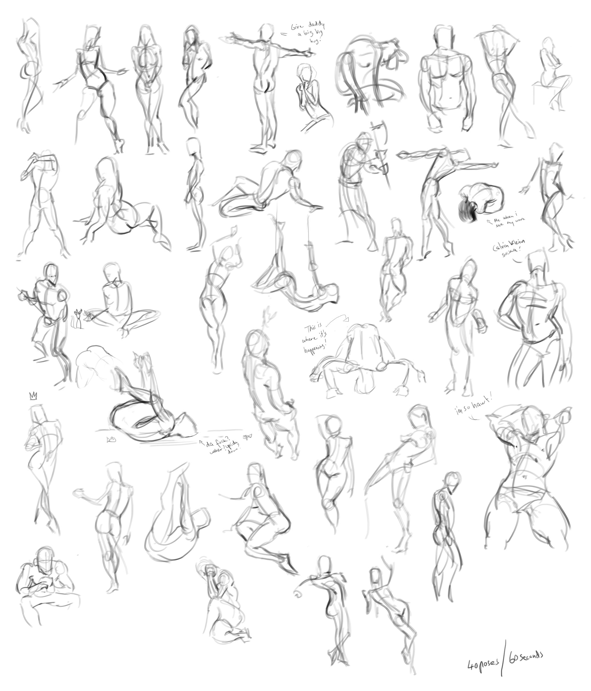
Yesterday's and today's quick poses!


|
Lale's Traditional and Digital sketches!
|
|
10-19-2016, 10:16 PM
Yesterday's and today's quick poses!
 
10-19-2016, 10:46 PM
hey Lale! great news about your mentor, that's really a great opportunity, awesome! Good to see what you're working on too, I love the face on the pretty lady above.
I know you said you will be reworking those designs of the boy and his croc, but figured I'd throw this up there anyway since I had time. I just adjusted the spacing between his left / right eye and his nose, since it was getting this 'bowling ball' effect where they are all evenly spaced. The middle one I moved the eyes and nose a bit but really it's just good to think about that bowling ball thing (you know the three holes where you put your fingers that are on the ball), and have that in mind when designing cartoon faces. Looking forward to seeing it progress! BTW I like the red croc best, reminds me of madame Mim from 'the sword in the stone' 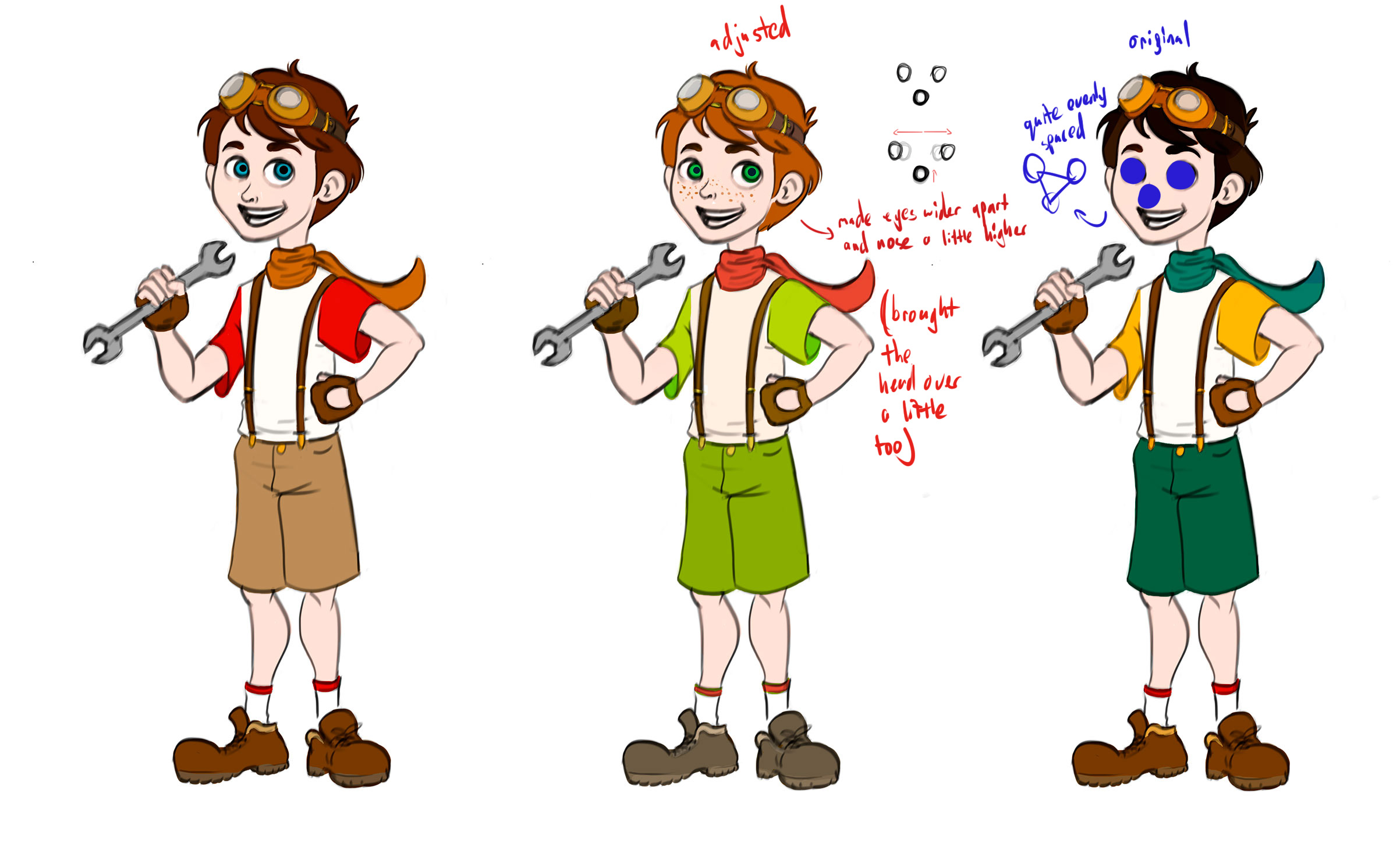 EDIT Figured I'd add this stuff to properly explain what I mean, it's all stuff I got from Stephen Silver's character design course: 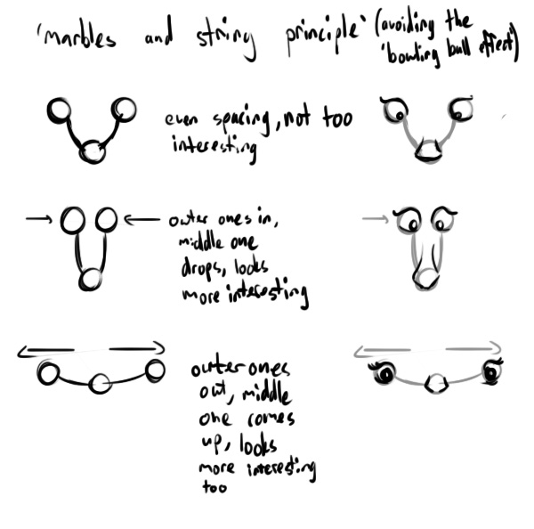
10-20-2016, 12:56 AM
Hey, welcome back. Figures are looking nice. If you need any help or insoiration, check out Walent's sketchbook on this forum.
Sketchbook | Gallery | Twitch
10-20-2016, 11:04 PM
Thanks Jyonny! Not sure why the bowling ball thing wouldn't work? The changes you gave make him look kinda creepy I think xD It's more a proportion thing maybe. Makin eyes bigger etc.. I've been looking through a loooot of animation character design stuff and the bowling ball thing seems okay as long as the eyes and nose don't have the same size..
Thanks Piotr!
11-01-2016, 05:41 AM
More of these.. Blergh :P
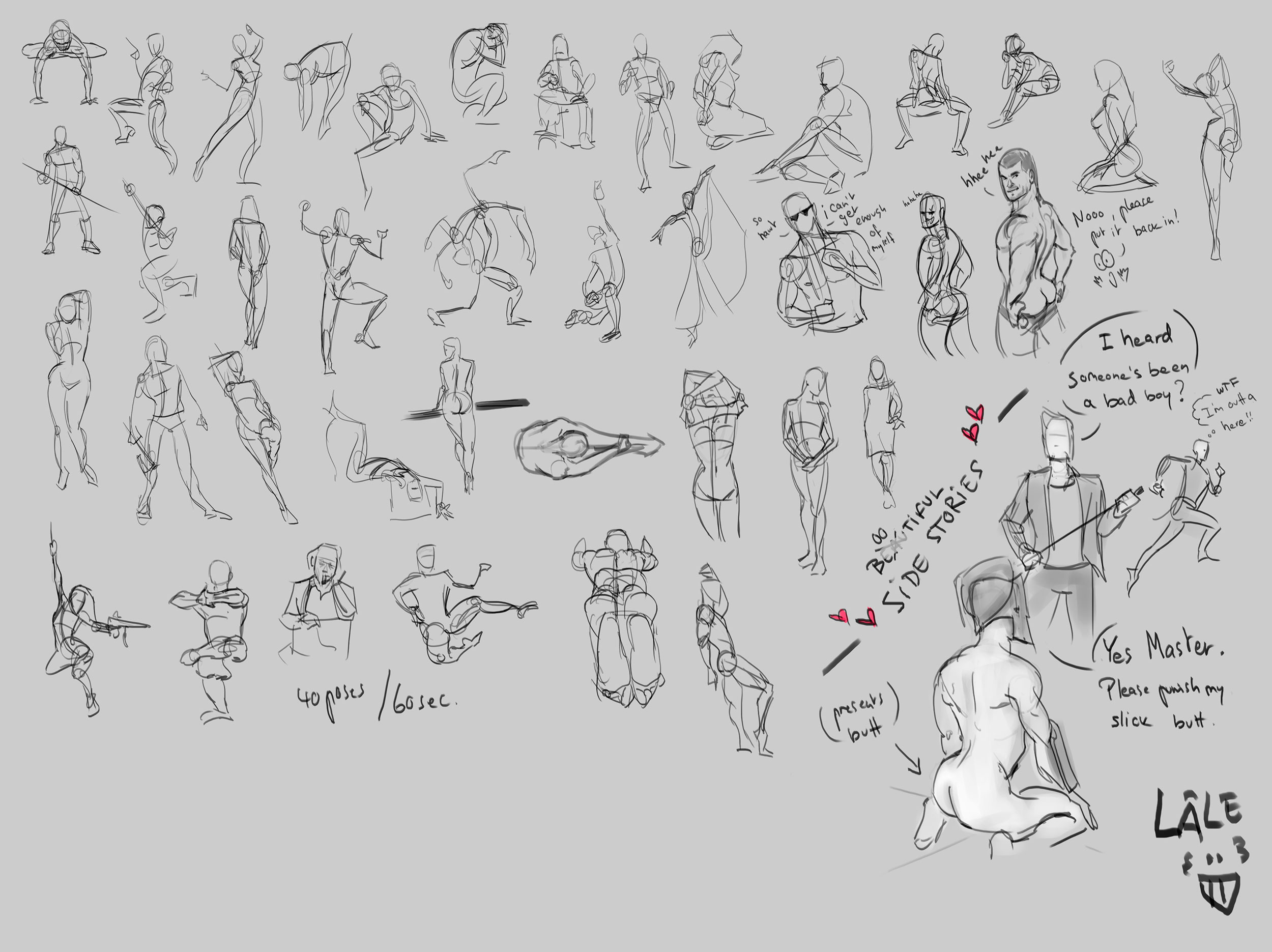 and some 40min David Finch'in 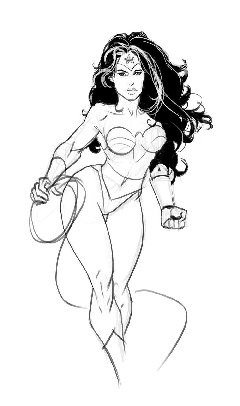
11-02-2016, 09:50 AM
Some work on expressions and Ivan Rei and Finch anatomy studies..
  
11-02-2016, 10:29 PM
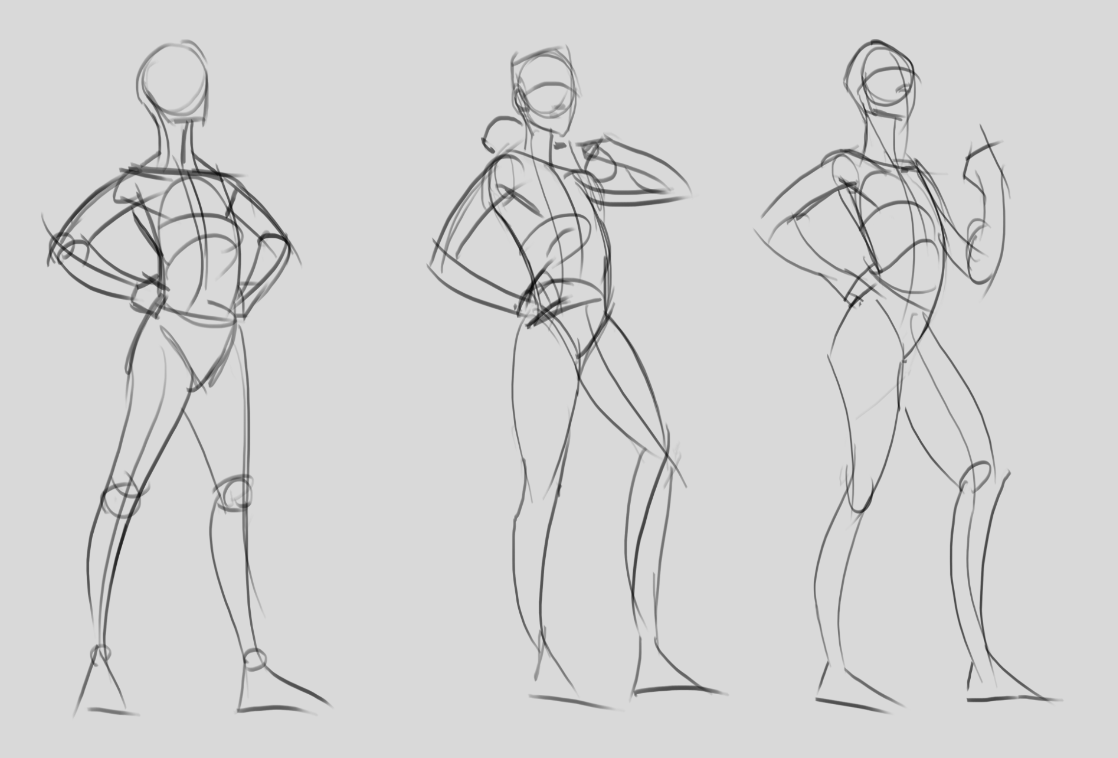
Trying to be more thoughtful in the process with my 1min poses.. Thinking about the motion, head/shoulder/hips angles, rythm of the torso etc.. I can see I'm getting a bit more comfortable again. Time to do some characters today!

11-03-2016, 02:41 AM
Took a bunch of photo references and I'm going to draw all of them and pick the best ones to turn them into final characters! *_* A quick sneak peak before I go out.
11-05-2016, 11:55 PM
Look at you! putting the forking work in
 I love your gesture drawings. those last three are tasty af haha!
11-07-2016, 03:13 AM
Hahaha, nice notes and side stories on some sketches. I think you should practice figures in perspective. And draw legs/feet to catch them up to your level in torsoes.
11-08-2016, 12:30 AM
Thanks guys! Yeah crackedskull! i will, I will! <3
11-22-2016, 04:09 AM
Yeay! Finally done with the main character of my ongoing Character Design project. :)
Reshaped an old project called "Oniria" and gave it to this one instead.. Might reveal a bit more of the story later on if that interests anybody. I learned a lot on the road to design this fella. Lots of Disney animators' tutorials and sketches.. Time to post now! :) Moving on to the next characters.. Thanks for stopping by!
11-22-2016, 07:04 AM
Oh man your lines in gestures and sketching have gotten so nice!! You're improving a lottt! How is atelier life for you? : D
11-22-2016, 08:43 AM
(11-22-2016, 07:04 AM)Kristina Wrote: Oh man your lines in gestures and sketching have gotten so nice!! You're improving a lottt! How is atelier life for you? : D Thank you! Oh I'm not in an atelier! xD I'm actually looking for work in Berlin at the moment and hope to move there in the beginning of next year! :) Fingers crossed :P
11-22-2016, 09:38 PM
Started to do the crappy sketches for Adrian's friend.. and I might see myself in her way to omuch, because I enjoy designing her and drawing her face way more than the boy! Or maybe it's just because I got more comfortable doing these..
Anyway! Here are some crappy crappy sketches, so I can get all the bad ideas out of the way and get closer to the girl.. And I think I got her now! So excited!! :) First page is the worst. I don't care if it looks good at this stage, I really just dive in and sketch.. until I get a little closer to what I have in mind. 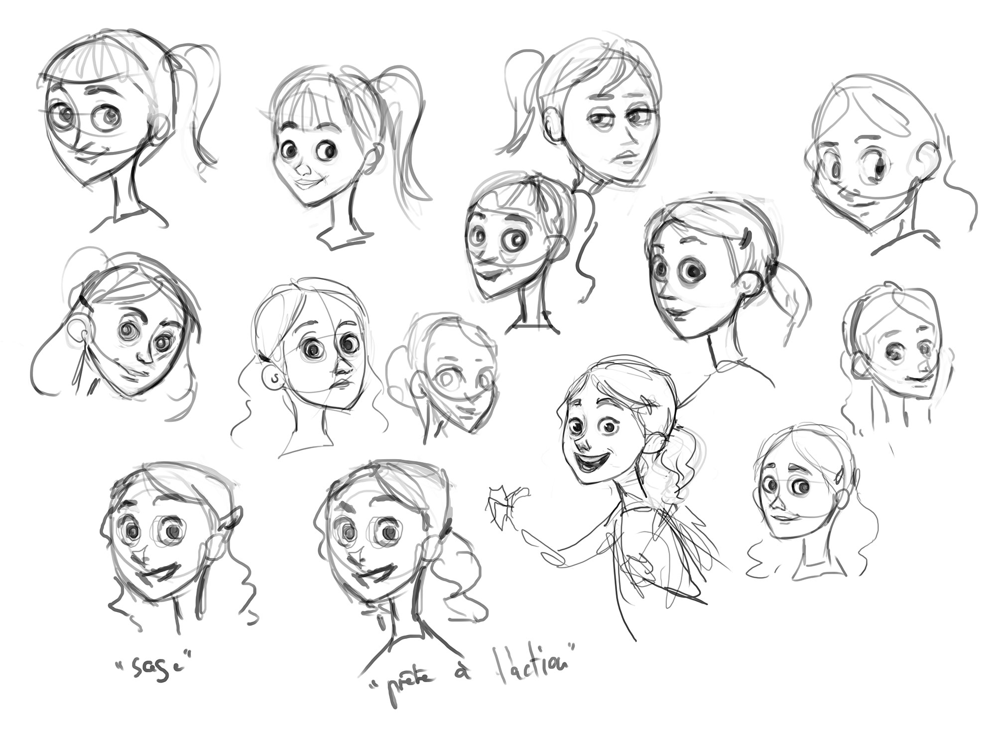 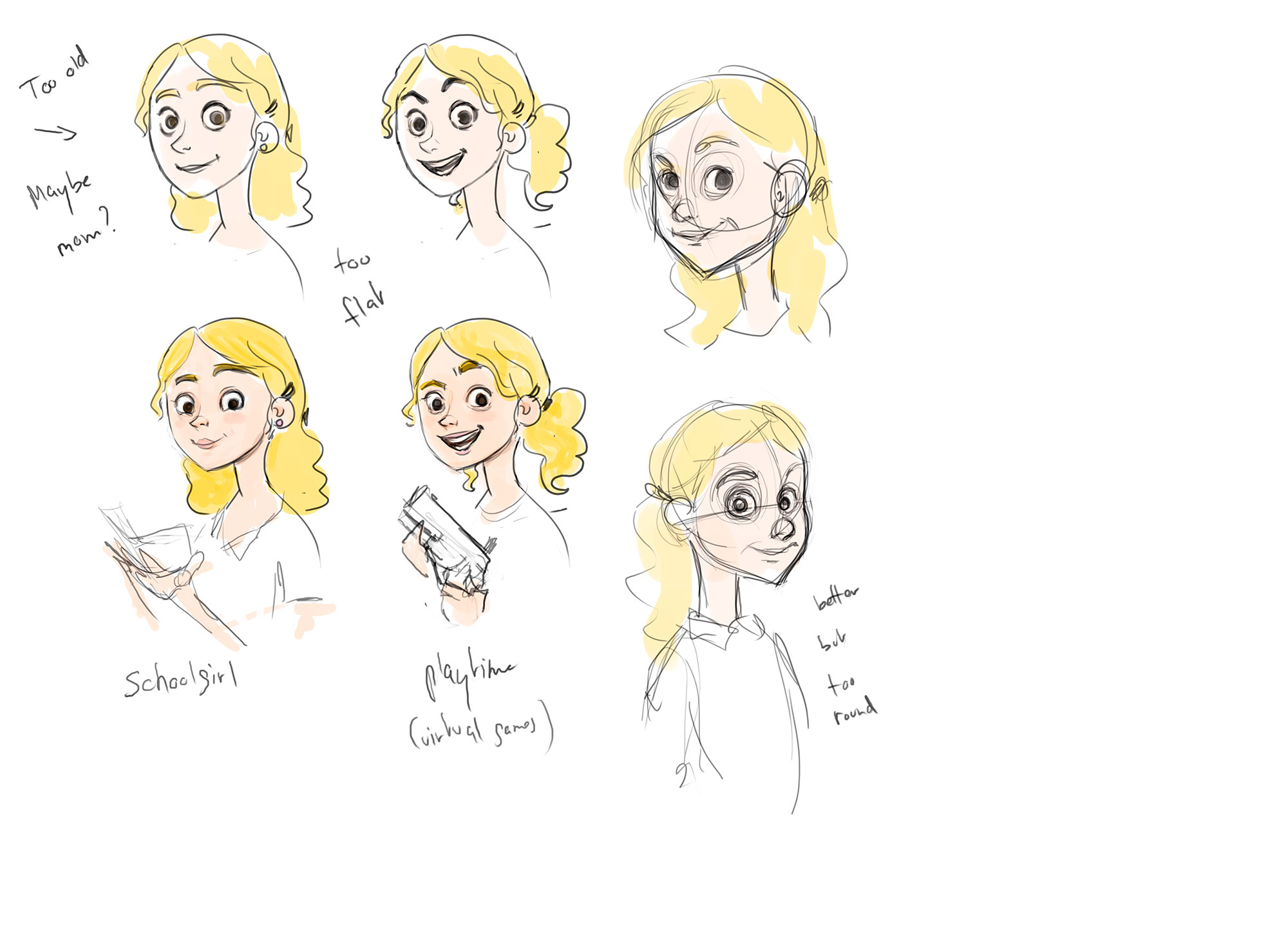  There she is!
11-23-2016, 02:21 AM
Hey LaleAnn. Nice stuff here!!
I like the character design, specially the face, i would just throw my two cents and provide some feedback i´ve listened both from animator friends and professional artists; 1) i would reccomend you to simplify the shapes and push the fluidness of the gesture. 2) I would try to push further the colour scheme. The main colour scheme has several very saturated and high contrasting colours such as; vibrant green, blue, red, pure white and yellow, all competing for attention. If you like here are two good links for reference for animation characters :), the second specially for female characters; http://livlily.blogspot.pt/ http://blackwingsketch.blogspot.pt/ Keep the good work LaleAnn! Hope it helps!
11-23-2016, 04:30 AM
@RickRichards Thanks a lot! It's a learning process, will try to make it more fluid next time! :)
11-30-2016, 07:43 AM
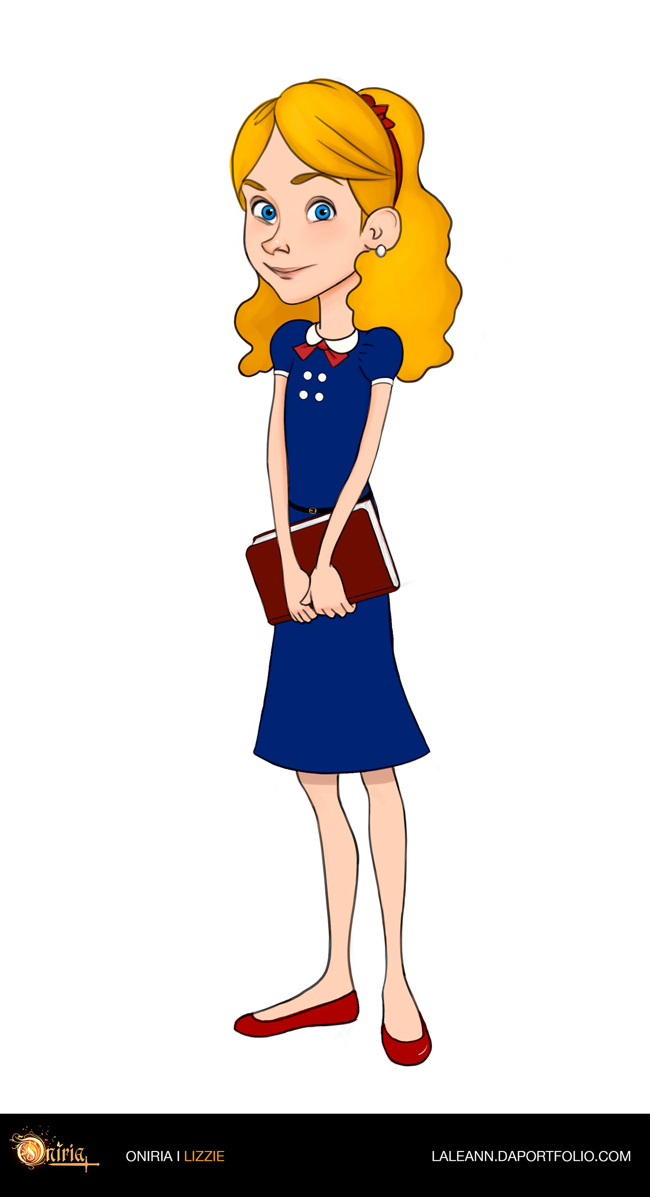
After many, many many sketches and trials and errors, here is Lizzie in her final version! :) I had lots of fun and learn a few more things designing her. I think I'm gonna stop now for a while and go back to hardcore anatomy studies and come back to it later on..
12-09-2016, 05:51 AM
A few other little things..
Quick poses and a 3hours portrait study! :) 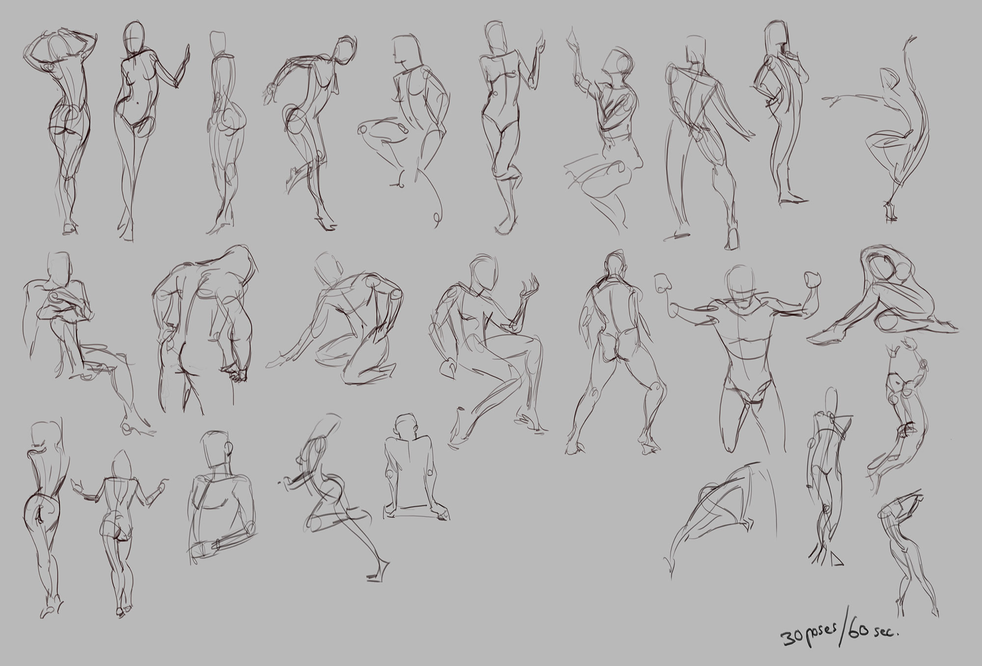 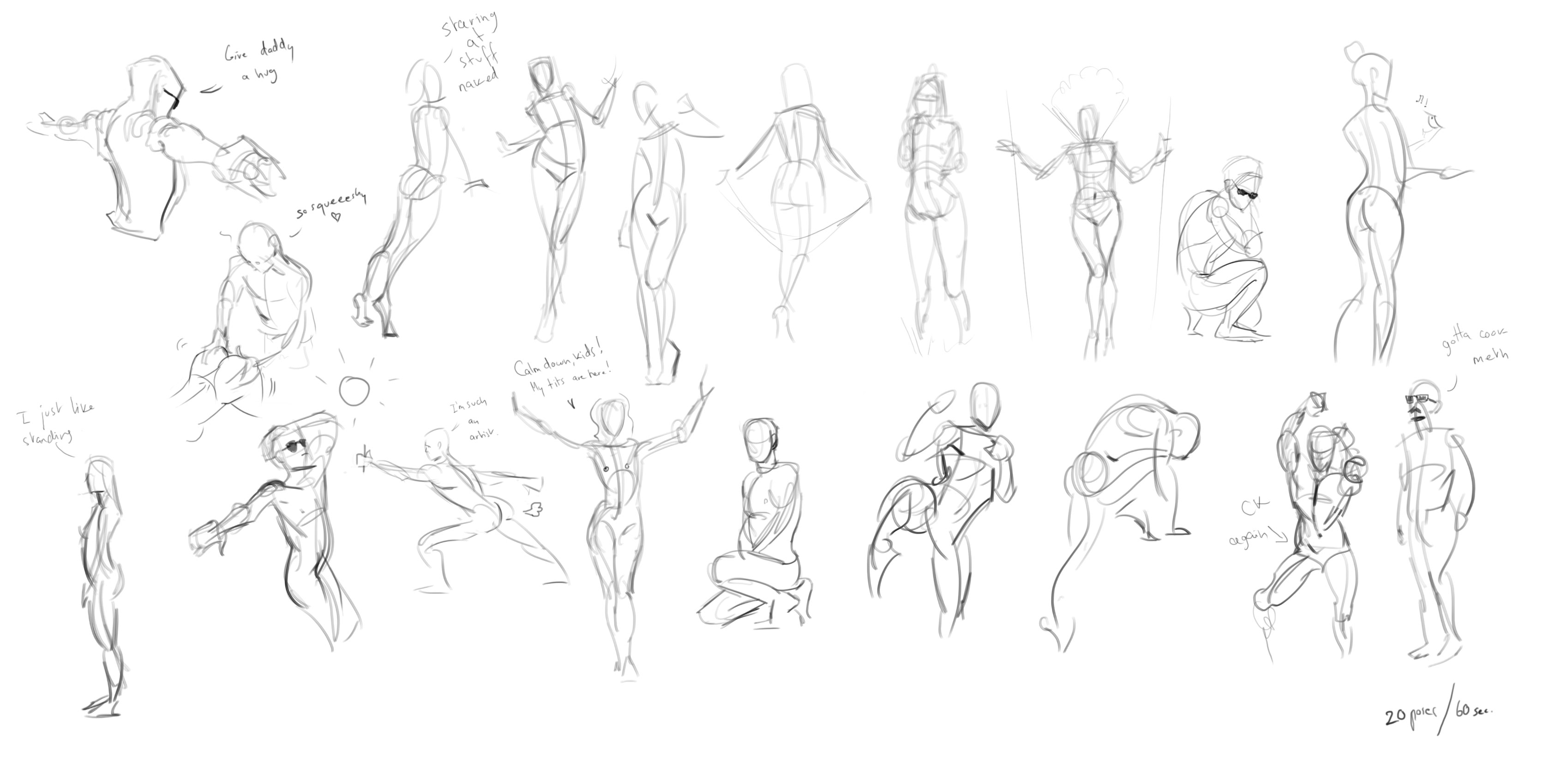 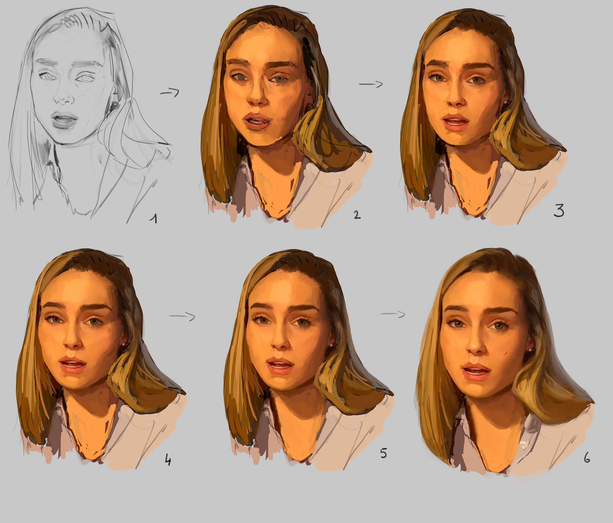 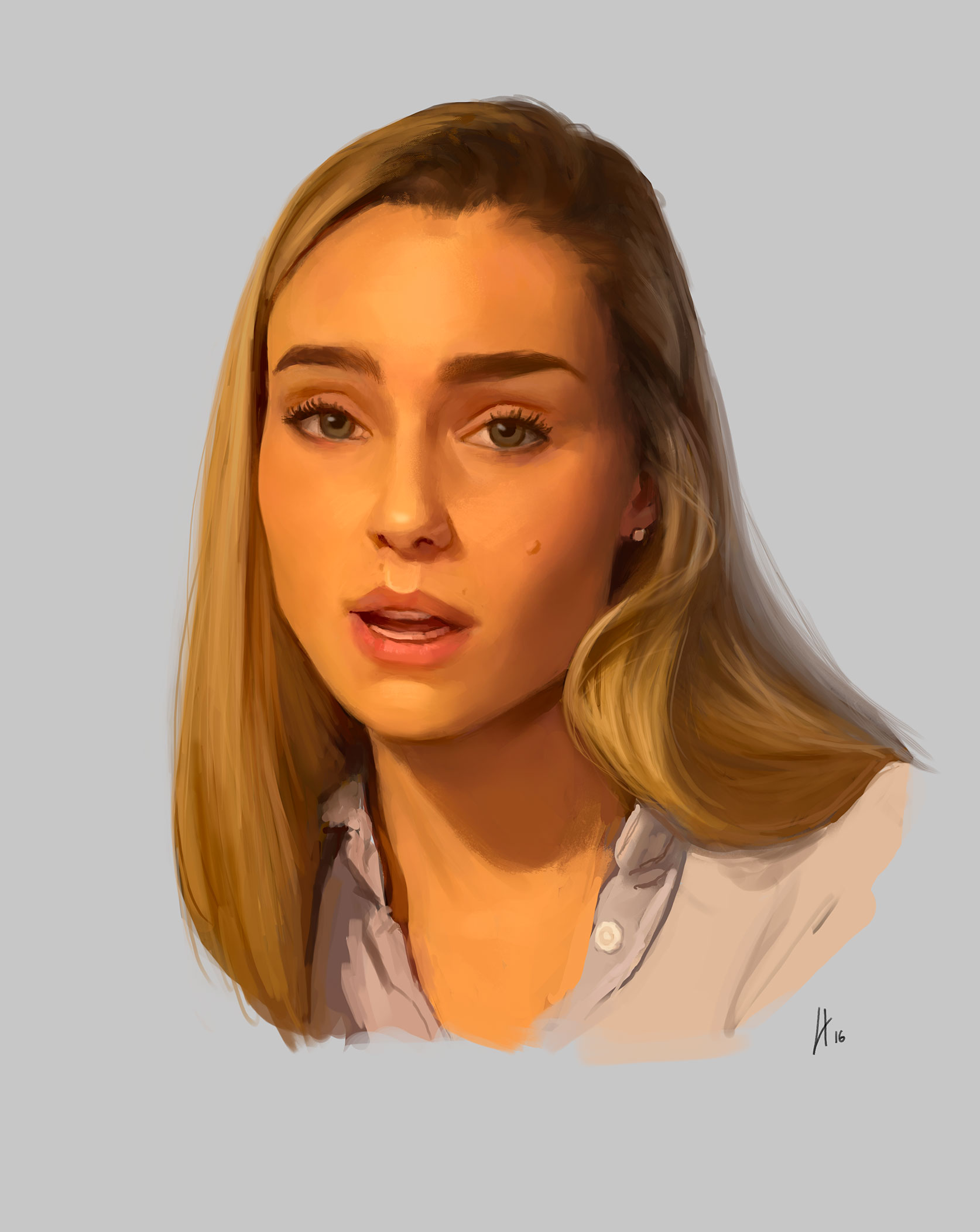 |
|
« Next Oldest | Next Newest »
|