SufferDriver Sketchbook
#1
I posted this in the wrong place yesterday, sorry about that.
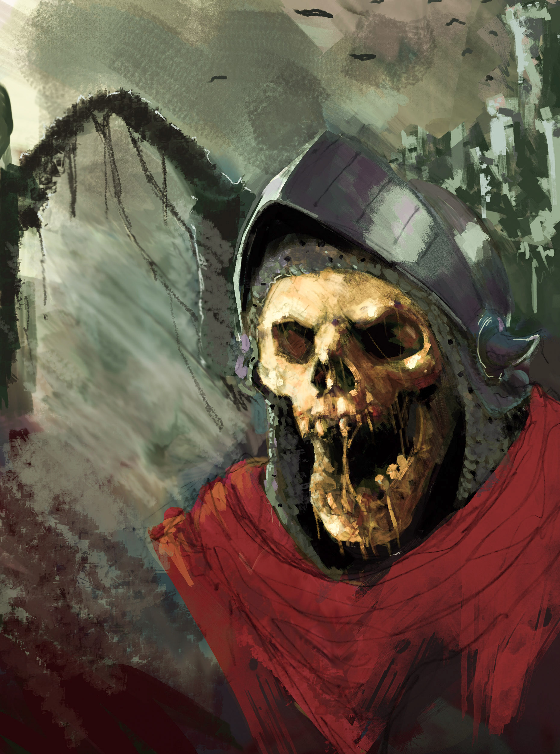
Anyway im trying to get better. I am going to try and push this picture I drew the day before yesterday as far as I can. 
I pretty much need to learn everything. 

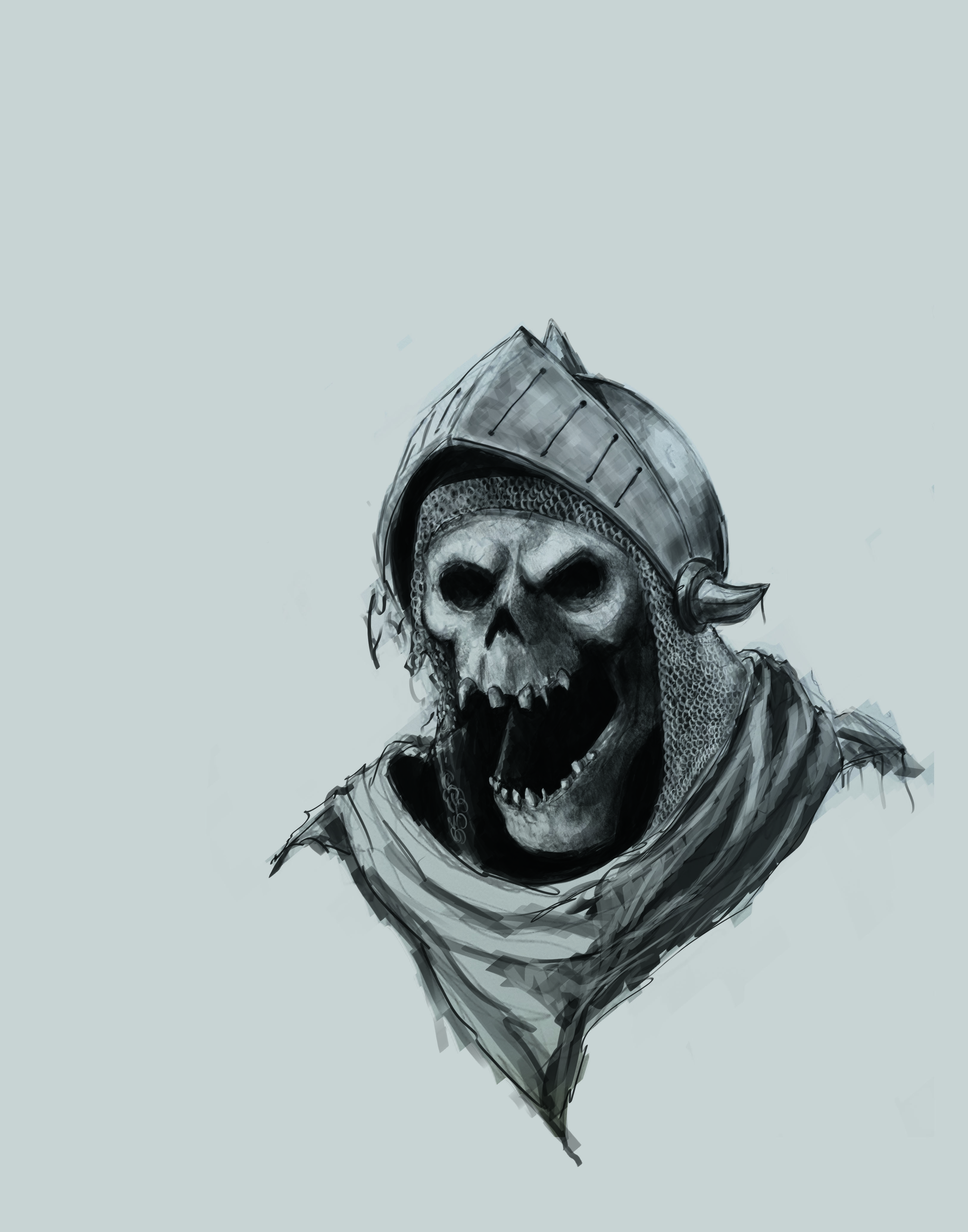
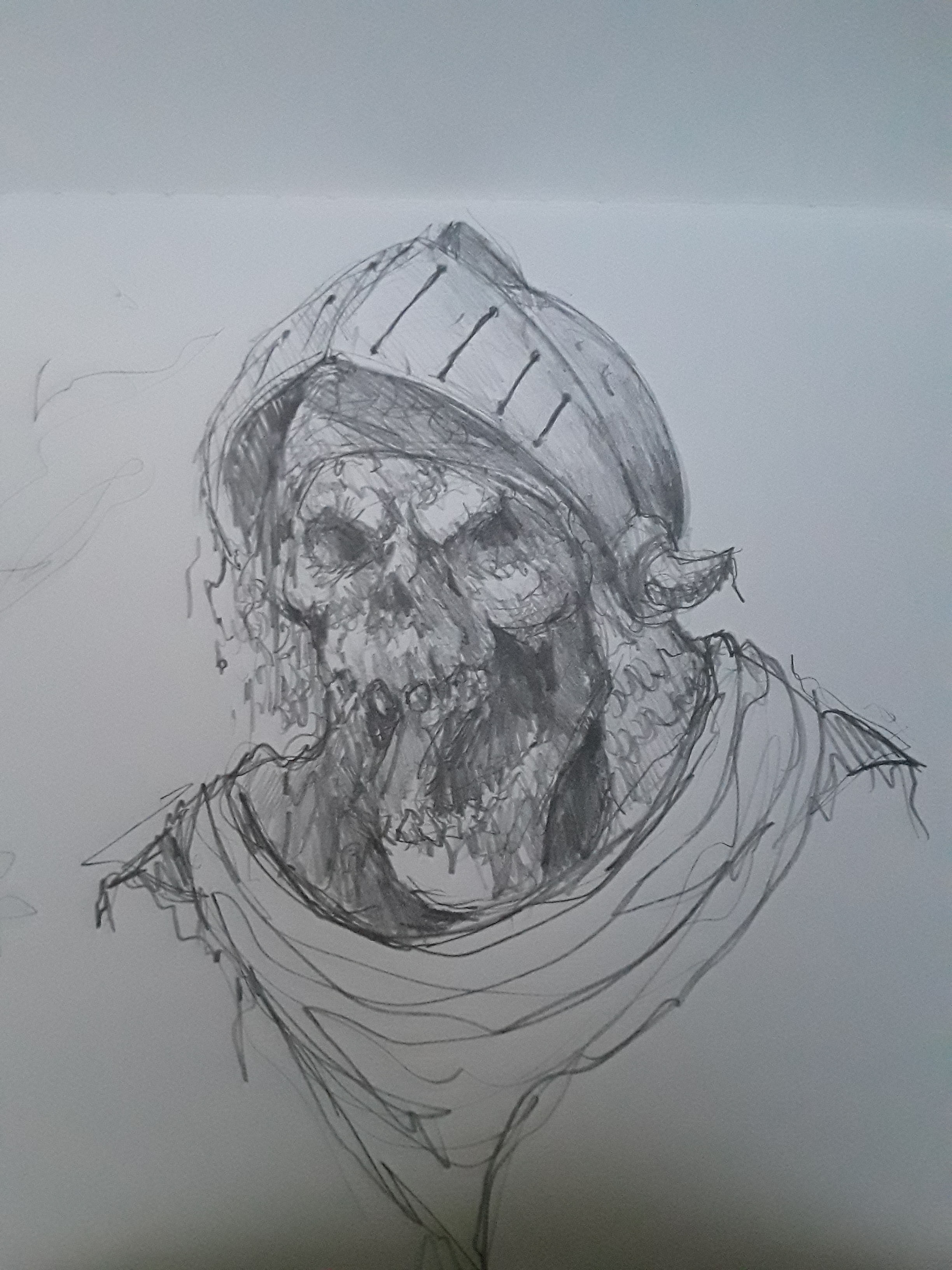
This is the sketch. I always do stuff like this, super rough and sloppy. I never could do tattoos because of that.


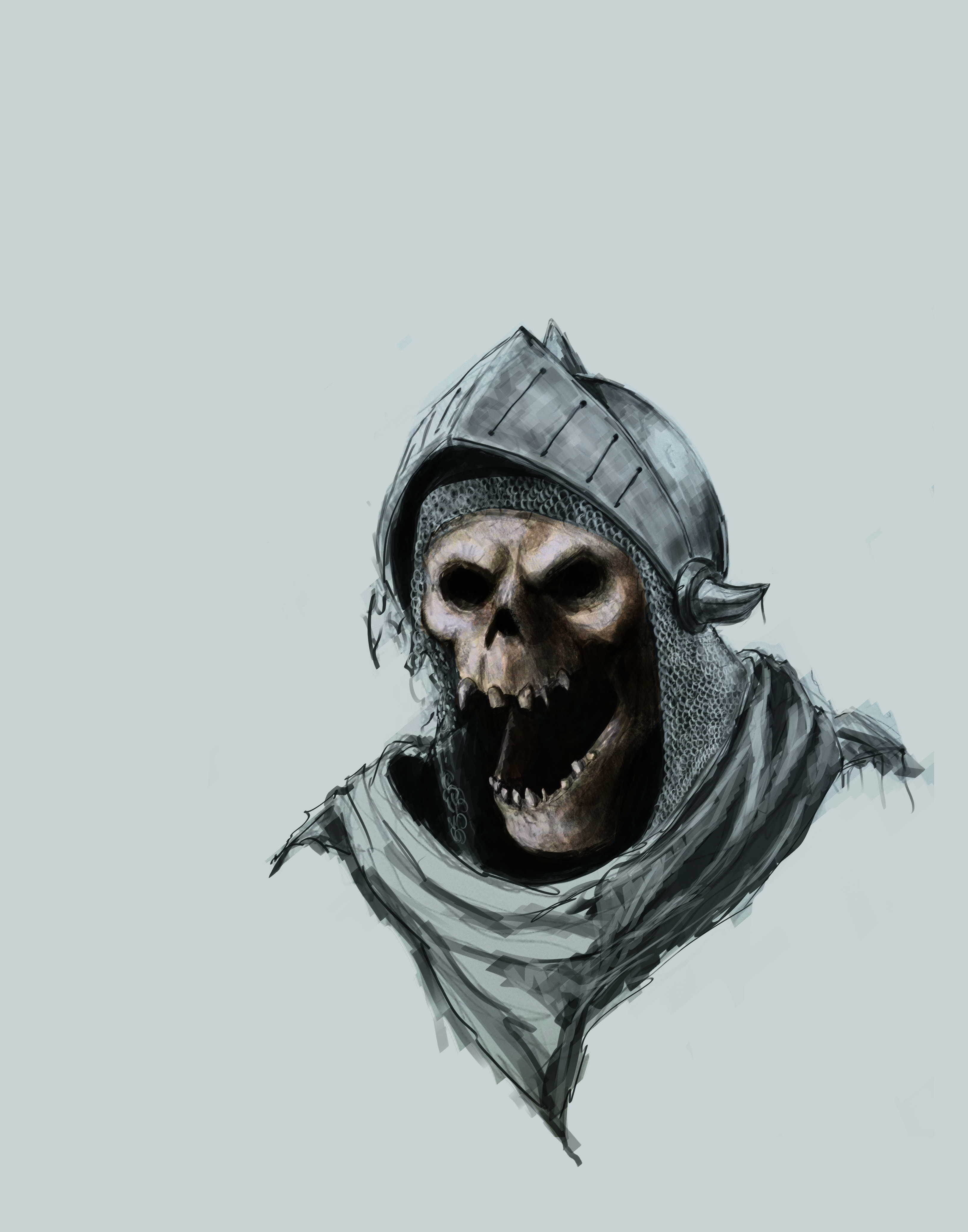
I took a picture of it and put it in photoshop and am trying to clean it up. 


no idea what I am doing

Reply
#2
eyyy sufferdriver! i read your profile description and i wanna assure you its never too late to follow your dreams :)!

This may sound weird but i think your pencil drawing is much better than the cleaned up photoshop version. your rough pencil strokes add a lot of energy and all those strokes disappear in photoshop as well as the teeth going from cool to kinda plastic toy looking. the anatomy just looks better in the pencil version too, so if you do paint in photoshop, try to maintain your pencil style, which is already cool, make a rough custom brush and shade just how you would irl and leave those rough strokes.

You seem to already have some idea of fundamentals with cast shadows and form turning over the skull. Id recommend just doing more stuff in pencil and studying anatomy and try to maintain that energy you have, its inspiring! set yourself some short term goals and follow them up with more and more, what can i achieve today kinda goals, and youll be on the right track,

keep postin!

70+Page Koala Sketchbook: http://crimsondaggers.com/forum/thread-3465.html SB

Paintover thread, submit for crits! http://crimsondaggers.com/forum/thread-7879.html
[color=rgba(255, 255, 255, 0.882)]e owl sat on an oak. The more he saw, the less he spoke.[/color]
Reply
#3
Really cool drawing! You've done really well with your lighting and the chainmail is really nice! One thing that I'm noticing is that in your finished drawing the lower jaw is at a different angle than the rest of the skull. If you hold a straight edge up to the angle of the front of the top teeth and compare that to the front of the bottom teeth, you'll see that they are in different directions. Keep up the good work, I look forward to seeing more :)
Reply
#4
(04-15-2019, 08:52 AM)Nikelart Wrote: Really cool drawing! You've done really well with your lighting and the chainmail is really nice! One thing that I'm noticing is that in your finished drawing the lower jaw is at a different angle than the rest of the skull. If you hold a straight edge up to the angle of the front of the top teeth and compare that to the front of the bottom teeth, you'll see that they are in different directions. Keep up the good work, I look forward to seeing more :)

hey thanks for the kind words, I know where im at though im not delusional. I just got to keep at it and hope it starts to click.
I tried moving the jaw bone but since im not sure where to move it it ended up looking more broken so :(
Reply
#5
yea, it looks alot better just keep tweakin (his) right side of the jaw it looks uneven as if the top plane has disappeared and we arent seeing the molars and teeth

70+Page Koala Sketchbook: http://crimsondaggers.com/forum/thread-3465.html SB

Paintover thread, submit for crits! http://crimsondaggers.com/forum/thread-7879.html
[color=rgba(255, 255, 255, 0.882)]e owl sat on an oak. The more he saw, the less he spoke.[/color]
Reply
#6
It's definitely improving! I think that it could be helpful to look at a skull if you have access, or pictures if not, and really look at the way the teeth wrap around at that angle as well as their planes. Maybe try some separate studies without individual teeth, just to really see how the jaw and teeth should line up.
Reply
#7
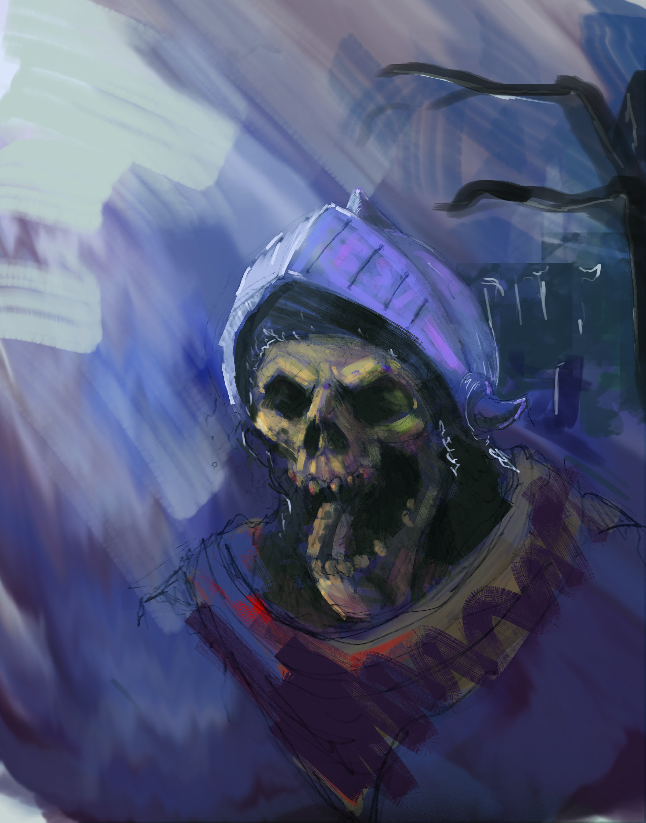
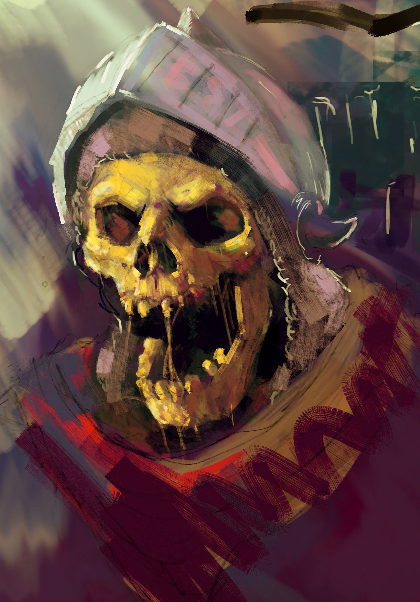
I decided to go in a completely different direction. I just realized that I was going about it in a way that didn't suit me so I figured, fuck it, Ill just let myself be as sloppy as i want and see what happens. I kinda like it. I think I might have found the start of a style that suits me. this is the one im going to push to the finish. Im flying completely blind and have no clue what im doing. just listening to music and playing around. feels good man


Reply
#8
Fedodika: Thanks for the suggestion, you're absolutely right and im gonna try to fix it.

Nikelart: You're right about his teeth for sure,  im just going by feel. I def need to start studying and getting a real understanding of how things are. Now that I know how I want to go about it im a lot more motivated to do some studies.
cant wait for that alarm to ring tomorrow.
Reply
#9
I'm glad to hear you're feeling pumped! :D Also damn, I really like those colors! *.* the purples are gorgeous and that splash of red is a real nice touch.
Reply
#10
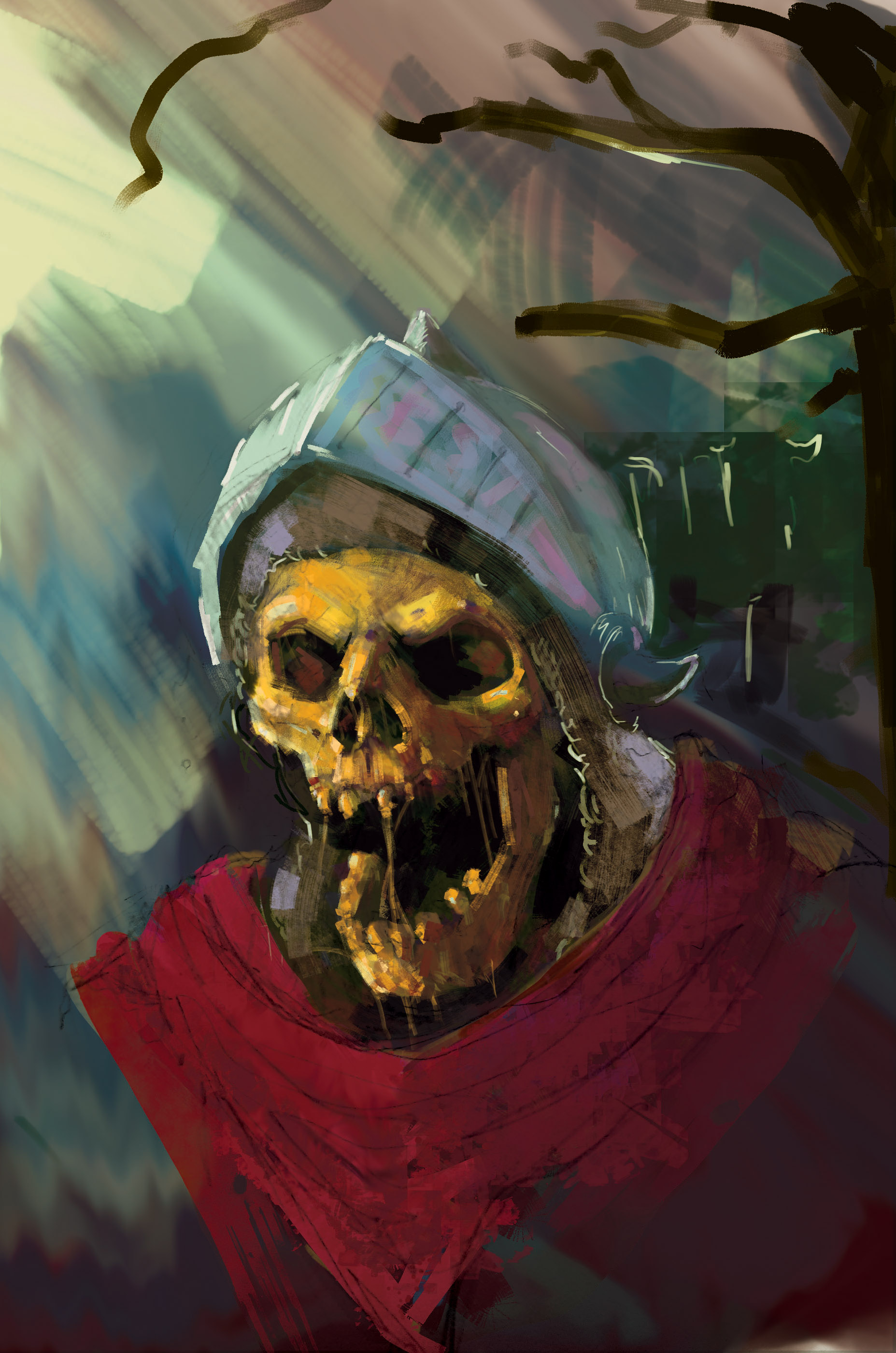
Making some progress, I feel like its starting to take shape. Just kinda learning as I go keeping in mind all the shit I used to look at when I was a little kid. I fiddled with the jaw and tried to make the teeth look better. I know the teeth up top aren't accurate but I like em. I am having a lot of fun with this even though im just sorta learning as I go. theres a lot of "maybe....nah that looks terrible."
anyway I know im not very good but im just gonna be over here doing my thing. 

also I notice when I look at the post that the picture looks all washed out, anyone know how to calibrate a monitor? it looks a lot better on my tablet.


Reply
#11
I tried to edit it on my phone to what it looks like on my tablet, let's see if it works 


Reply
#12
Got about 10 minutes in this morning before my 1 year old woke up trippin because hes teething. 
So I messed with the color balance to try and compensate for how warm my tablet apparently is.
Worked on the cloth around the neck a bit. Kinda lame update huh?
Also I'm trying to decide if the chainmail should even be rendered at all I want all the focus on the skull, might be too much detail


Reply
#13
In regards to these recent images, they have some issues and I think the primary cause of them can be traced back to the images being more concerned with minor differences rather than large ones. This is a very common problem and something every artists should be very aware of because it is a tendency that can creep into the works of even the most experienced artists.


Our brain and eyes are very adept at discerning minor differences in things, communicating to our brain what the object in question would feel like to touch. The relationship between sight and touch is something very important to the way we see and interpret the world but it does give us a significant bias when we try to draw or paint something. We tend to overemphasize what touch-like information we want to represent, this is usually the material feel we’d pick up with our fingers, and neglect the larger visual impression and subsequently the larger form.

Historically, the artist’s education has significantly focused on counteracting our innate bias and training our abilities to see, conceptualise and represent the big impression of our subject matter. You’ve probably heard stories about how artists like Sargent and Mancini would look at their subject next to their paintings far away from the other side of the room, closing one eye and squinting to blur their vision to only be able to see the the big impression of their subject and painting, comparing the two on a very basic and abstract level. That would be one example of a historical practice aimed at counteracting our bias. There are other examples of this like three point value comparisons that were emphasised by Scandinavian artists like Krøyer.

Getting to details and texture is something you can generally figure out on your own. If you were to look at the painting manuals published in the 19th and very early part of the 20th century, they clearly omit any discussion on details in any drawing or painting. This is because details come very naturally to people and the big issues artists have to deal with is what is beneath all the textures. John Collier even going so far as to saying it’s the easiest thing an artist can do and therefore he won’t bother discussing it.

In general my point is that the historical focus in art has been on the big impression rather than the minor details and I would encourage you to continue in that tradition with your own learning. This isn’t to say that texture details are unnecessary, they have a very important place in art but they ought to be supported by an underlying impression.

I borrowed one of these images to illustrate this idea in practice. I compressed a lot of the surface information and instead put the emphasis on where light transitions into dark. I reduced the number of values to limit the amount of information I’d have to manage at the same time and to emphasise what things are similar and what’s different relative to the large impression. I reduced the “drawing” information into simpler straight lines to again reduce the amount of information I’m working with and to then allow me to put pressure on that limited information I do have to accurately express the drawing of the subject.
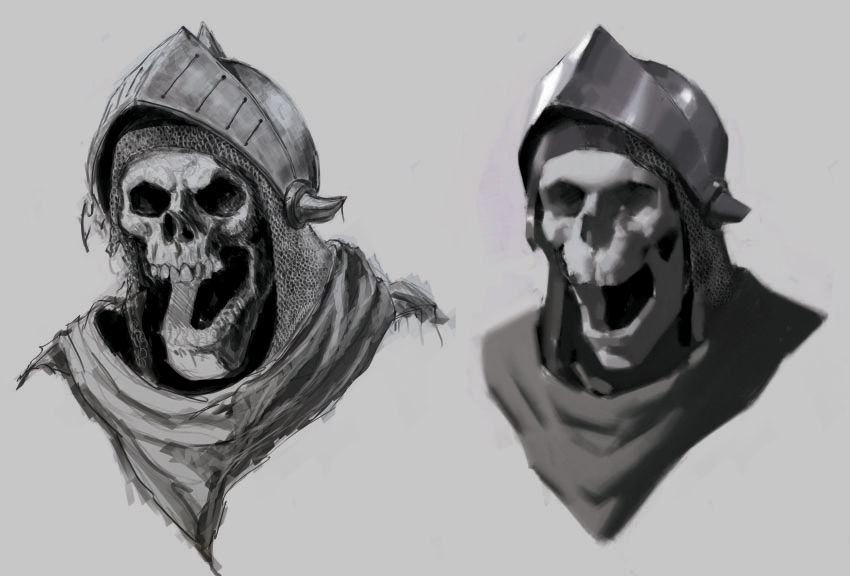


I would recommend doing this in the early stages of any image and something to always keep in mind when working. It happens to everyone that these very fundamental aspects of an drawing or painting may slip away while we’re working. It’s very easy to get tunnel vision and focus on something small that eventually harms the larger impression, and it’s a constant challenge to suck it up and correct yourself when you’ve found that you’ve made these mistakes.

There are certainly examples of artists throughout history front loading some of their paintings with texture and noise however these techniques are somewhat advanced and require a very abstract way of working (see Mancini as an example). It should certainly be studied by any ambitious student but probably after you’ve gotten a hang of things using more conventional methods.

I don’t mean to imply that you have to approach drawing and painting like a robot. I find that a kind of dialectic approach to art is very useful where you may switch between contradictory ideas/approaches to arrive and something satisfies both. Traditionally in art this has been switching between trying to express form and trying to express the light impression but we can also switch between a very restrained approach to painting and a more free one, to on one hand reason through our painting and on the other hand to knock the work forward whenever this approach gets “stiff”. Most people need to focus on the former rather than the latter. 

Also, the color issue probably has something to do with the color profile of the image + how the web browser interprets the information. Look at what color profile you’re saving in. Set it to sRGB or something in photoshop and you’ll probably avoid any issues.

Anyway, if you need any help with art stuff, let me know.
Discord - JetJaguar#8954
Reply
#14
Tristan Berndt:
I cannot thank you enough for such an in depth and thoughtful comment.
I feel like you've unlocked a door in my mind with your insightful words.
Also the sketch you included demonstrates your point clearly, I cannot wait till morning when I have another chance to try and implement your suggestion.

I actually feel like doing some studies! I still plan to try and finish this piece ( I made a promise to myself) but after that I'm going to begin studying light, shadow, tone and form. 
Again many many many thanks!

Joining this forum has been very valuable for me.

PS thanks for the tip on the sRGB
Reply
#15
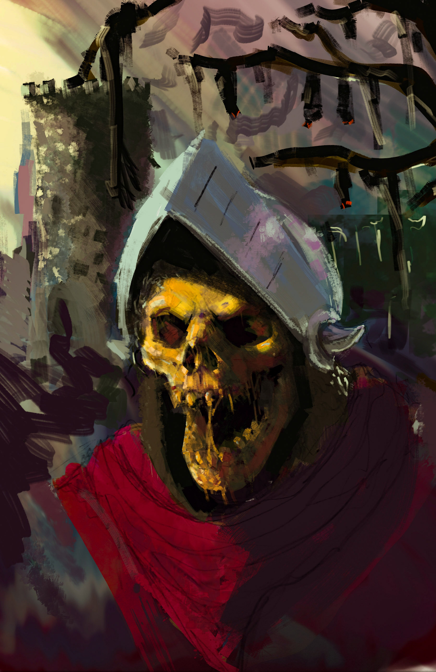
I ended up having a little time after work and tried to fix the jaw some more and I noticed the helmet didn't seem right. 
I got frustrated trying to improve the tone and shadow on the skull so I starting messing around trying to find something to put in the backround. 
Welp! time to go pretend I like my in-laws.


Reply
#16
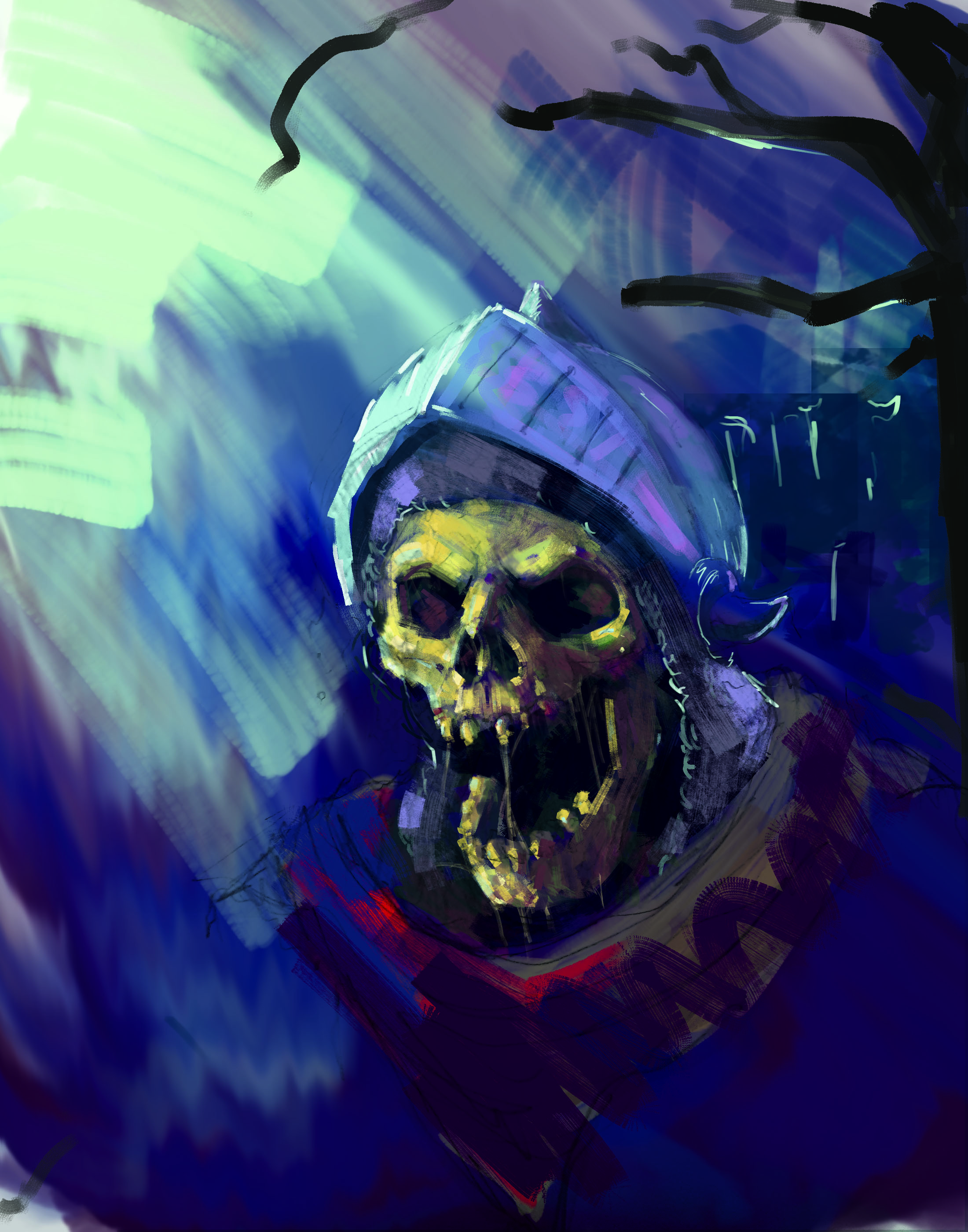
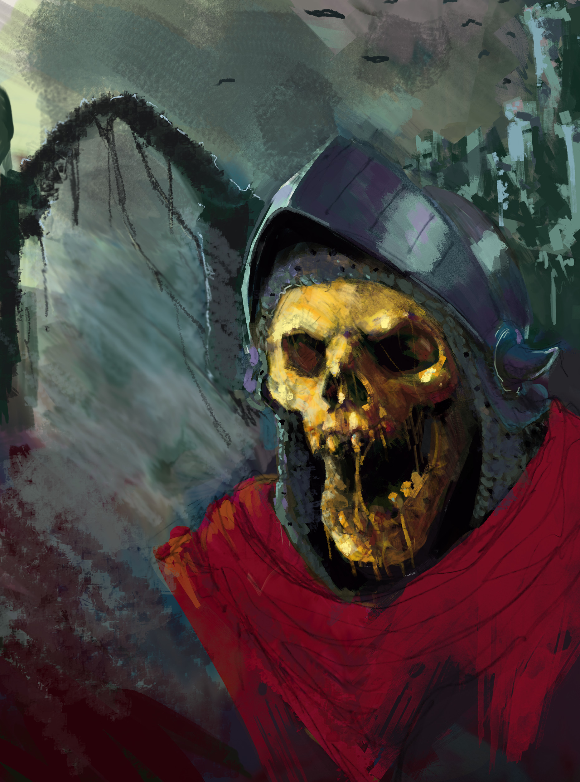
Today is my day off so when everyone was napping I got some good work I think. I really hated that last update after I saw it again, I had starting overthinking and also thinking about what others might say, so with this one I nust didn't think and just listened to the first 5 sabbath records.
I am alot happier with this and honestly I feel like it's about 75% there. The backround I like alot more.
I'd love to hear what anyone thinks, I guess I suck that bad you guys like I'm hopeless huh?


Reply
#17
I wouldn't stress out so much, just keep pushing each piece as far as you can and take what you've learned on to the next one. Take your time to study the aspects you may have uncertainties on. Consistency in your work ethic is what's vital here.
Reply
#18
(04-19-2019, 07:55 AM)Dennis Kutsenko Wrote: I wouldn't stress out so much, just keep pushing each piece as far as you can and take what you've learned on to the next one. Take your time to study the aspects you may have uncertainties on. Consistency in your work ethic is what's vital here.

That's good advice man and I think you're right. Thanks for taking the time to look at my stuff and post.
Reply
#19
Just a minor update, I got up this morning and just hated the picture. I thought about it and when I was on my lunch break today I realized the reason I was hating it was because the skull doesn't look like its existing in the environment that is there so I tried to do some color correction in the photoshop app. I think it looks a bit better but its clear that i need to start trying to learn a more about color theory.


Reply
#20
Hey SufferDriver!
You shouldn´t be so harsh on yourself regarding the piece, it´s on the right track. I sense a crispness on the skull that reminds me of Dave Rapoza, there is volume on the skull.
I think this piece of Dave Rapoza ( Skeletor ) might be a great reference; https://www.deviantart.com/daverapoza/ar...-266241371

Cheers!!


Reply


Forum Jump:


Users browsing this thread: 24 Guest(s)