Posts: 852
Threads: 6
Joined: May 2018
Reputation:
116
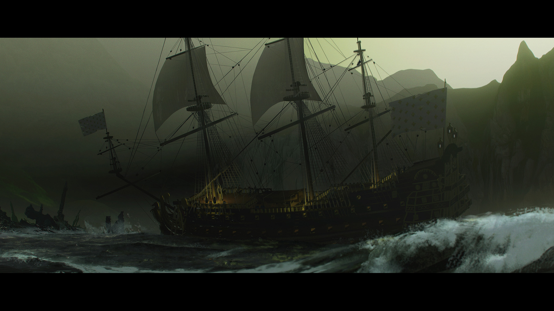
Honestly looks really cool. I don't really know much about it, but it feels very cinematic, dark and foreboding. The rolling wave in the corner looks really cool.
One thing I will say is that there are certain things which give it a very 3D model kind of vibe. The shape and edge of the mountains in the background for one. It's nice that there's a little bit of softness and chromatic variation in the edge of those mountains, so that they aren't completely cut out. But the contour is very uniform and also quite smooth. So it doesn't feel like real mountains in the distance.
The ship as well has wonderful detail in the rigging and sails, however If you were to see this scene in real life, or even in a movie, I highly doubt you'd be able to pick out every single strand of rope, or for that matter care to. So that combined with the mountains make it feel a little like a model ship close to us, rather than a real ship that is far away. Maybe that's nitpicky, but I feel like there's not much point in having the eye drawn to details on the ship that don't really have anything to do with the mood of the piece. Might as well paint over them!
But for what you were going for, I think this works really well. I don't know that much about this stuff, so feel free to ignore. But if this helps, great!
Posts: 181
Threads: 0
Joined: Oct 2017
Reputation:
41
Hey gerbenpasjes! It's a great looking piece! And I also agree with what Joseph has said about it.
What really stuck out to me is just how uniform the two masts in the center of the image feel. Everything around them has this really nice sense of organic movement to it, but then you have these two masts center image that are so close in shape size that they feel too uniform/identical for the rest of the image (imo anyway). Maybe playing around with size difference and sail shape would help combat this? I don't claim to know anything about ships lmao, but I know a lot of ye oldy ships had the middle mast as the biggest.
Also in terms of sizes you could think about the flags in relation to the sails. The right flag is giant (you could probably say it's as big as the top deck). So maybe playing around with size relationships would help??
Idk if that was helpful but regardless, you've definitely captured the feeling of it being in the moment of a story. It's a great image
Posts: 57
Threads: 3
Joined: Jan 2021
Reputation:
9
Hmm thanks everyone! I think you brought up some very valid points and I'll take a stab at doing those! Will update in this thread once I tried it.
"No man is more unhappy than he who never faces adversity. For he is not permitted to prove himself." - Seneca


