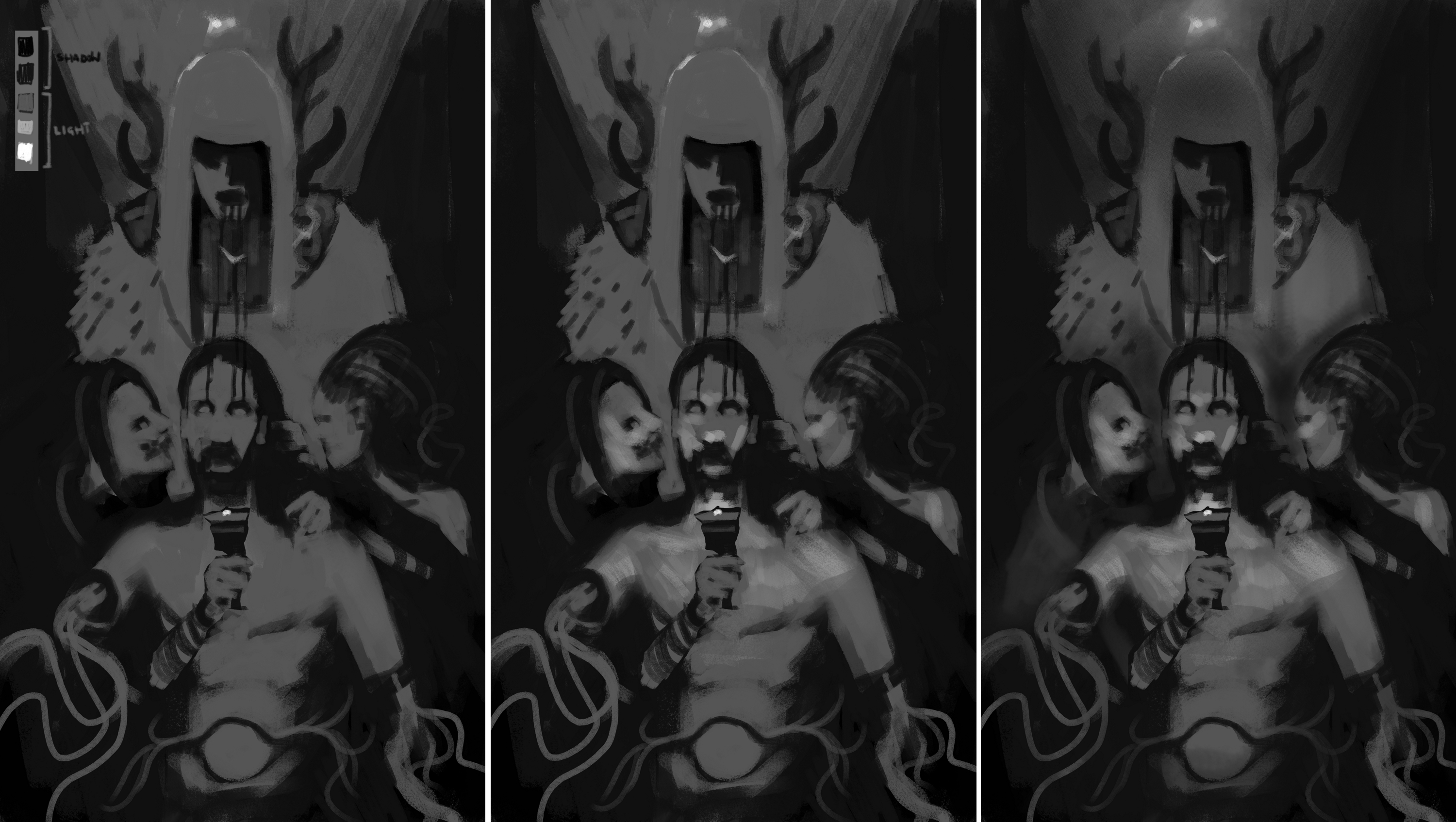
Hey Max, I like the shamen dream image a lot, it is interesting, but what I suspect is letting you down is your general process when it comes to understanding how to arrange the value hierarchy in the composition. I can tell you get focused on the details too soon before you have determined the overall effect you want of the image. I assume a lot of noodling happens in your process as you try to resolve lighting and value? I hope this gives you something to be more mindful of for future paintings that will reduce noodling. I did a demo to give you an idea of a way to do so, which was started before your latest update so it's not a strict paintover but a process/workflow suggestion.
This video is brilliant and covers what I'm going to suggest more thoroughly. especially the demo section on two approaches on how to mass and group light and dark values.

For any composition, the general read or 'effect' of the image is most important. One way to achieve this is to group our values into distinct shadow and light 'families'. the values belonging to the two families are always kept separate. In other words, the lightest value in the shadow family must not be lighter than the darkest value in the light family, and vice versa. This rule is to keep forms reading as forms and help us organise.
Generally we can start with one value for light and one for dark. The focus at this stage is to approach the image as a whole, and pick a general value key (the range of values for the two families ) to work with. working zoomed out can help if you have a tendency to jump into detail too fast.
In the first stage you can get a very clear sense of the composition the main proportions rhythms and balance of your image. at this stage it is easy to see where your image may be unbalanced or not make sense and fix quickly. It can help you make decisions about what local value to 'choose' in areas that work better for your composition. An example here is I made the shoulder collar thing of the shamen darker because that shape worked better dark than light when looking at the general effect of the composition instead of arbitrarily deciding it should be light or dark.
This first stage is the most important stage by far. Everything rests on this value hierarchy. This does require deciding where your light is coming from first. I notice you tend to paint objects separately and then try creep up on the light later and because of your detail focus it appears to remain inconsistent. This is because you are lighting individual objects which diverges from the general light effect of the scene which you haven't resolved that enough yet, and so it all starts to look a bit 'wrong' and patchy. This tends to happen if we aren't extremely conscious of our overall value hierarchy at every stage.
The next step is to look at the light family and introduce another halftone (or value) into the light family. This allows you to model your forms in the light. Your light halftones in your figures for example are uniformly light overall, and the shadows aren't well separated using values from the shadow family, which then flattens out the feeling of 3d forms.
I added one more direct light value. As an aid to narrative and the magic feeling, it made sense to me to have this light emit from the cup. It also has the effect of drawing more focus to the expressions of the main characters and the underlighting also happily helps spook factor. Notice how quickly it brings out a more 3d form too by just adding that single lighter halftone.
There is nothing wrong with using unidentified invisible light sources on screen(or off) and I noticed some of the artists you mentioned use this a lot to draw focus to a main focal area of their character and I guess you are attempting the same. It may not make sense but if it makes the image better that's fine. The main idea is that with a more structured process these are all the kind of choices you can make and try quickly without having spent hours on changing rendering.
You can then basically keep adding discrete values in the light and shadow families as desired. In the last image I began to add more values in the light and shadows and begin to show a more realistic light drop off with value gradients or transitions. Also can control atmospheric perspective and accentuate depth, easily seen in his headdress.
It is very easy to see how quickly you can achieve an overall lit and scene that feels more unified without really going into any detail. Finishing or polishing is often misunderstood as adding more 'detail' through outlining objects, adding tons of little bright hot spots and hard edges everywhere and making everything more outlined or another 'mistake' is adding and using a gazillion more values unnecessarily to render. I can see you did the former in the last raven image.
Instead I have found it is more useful to think of it as refining and helping the value hierarchy from the first stage really sing, adding just enough halftones in the light family and values in the shadow family and focusing on the increasingly smaller shapes to provide the level of detail you need
where they are most effective at showing your vision. If the detail bling gets added everywhere without thought, it can easily become gaudy. This can be seen in how badly the scar on that woman's face sticks out because of the extreme hard edge and extremely dark value that doesn't take into account the general form lighting of her face. It sticks out terribly and breaks depth. the artists you mentioned are heavily 'painterly' in their aesthetic, and they are extremely controlling of where the hardest edges and darkest values are. I think you would benefit from this approach.
Also in general, I think you need to use more reference for your figures, and potentially spend more time working on your anatomy knowledge with your study time. There are many issues I won't go into there, but it will help to take photo ref of yourself or a friend lit as similar to your scene if possible for more accurate lighting and shadow effect, but even for the foreshortening and anatomical information.
And another thing I feel is important to work on for you through studies and focus of your attention, is your understanding of how to control edges in your paintings. The balance of hard, firm, soft and lost edges goes a HUGE way towards making realistic forms read and they become a very aesthetic and important aspect. I suggest study how your fav artists approach their edges, then try yourself. The best way to 'see' and identify edges is to squint your eyes down at something irl. the more you squint the more the hardest edges only remain as well as the more the values get simplified. This is why doing at least some study from life is such a huge boon. Cameras don't produce the same
effect as our eyes.
Anyway, hope that helps. It's. a cool image, I feel you should push it as best you can.


