02-18-2013, 05:17 PM
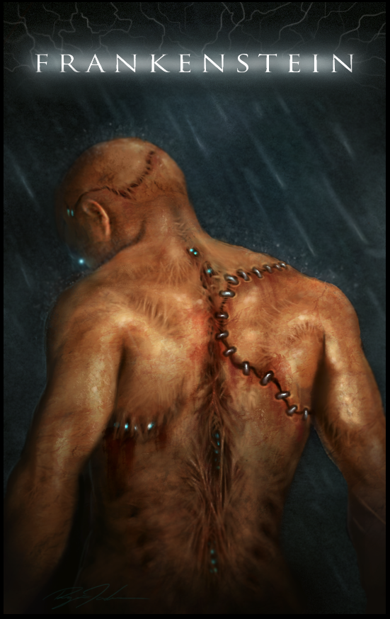
would love some feedback on this poster=]


|
Frankenstein
|
|
02-18-2013, 05:17 PM
would love some feedback on this poster=]

02-20-2013, 07:48 AM
I really, really like this! A few things that come to mind when I look at it:
- Why are the heavy metal stitches only on the right side of his body? I dig these and I also dig the rips where you can see bits of his glowing interior, but it seems imbalanced the way they're spread out right now. - I'm assuming that the glowing orb to the left just above his shoulder is supposed to be his eye, but I don't think that's clear enough. Maybe try less of a fuzzy glow and more of a viscous sheen like a real eye. - The lightening behind the title is too faded for it to be clear that it's emanating from the letters. I actually didn't notice it until the third or fourth glance. You'll have to increase the brilliance if you want this to be more obvious. - Are all the little blurry dots around his head and shoulders supposed to be rain splatters? I think for this kind of thing to actually be visible, you would have to increase the back-lighting. Like he standing in front of a car's headlights or something, but then you'll have to think about how that lighting would interact with the light source that's falling on his back. I hope you get more feedback (and from someone with more experience than me) because I would really like to see this piece pushed to its full potential!
02-21-2013, 05:02 AM
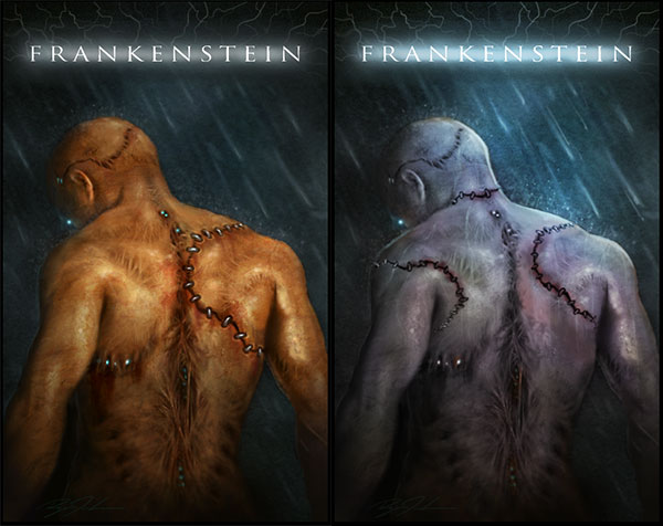
SWEEETTTT painting! The one thing I would mess with is the coloring, frankenstein is dead, his skin color would reflect that (Greens, blues, purples). The rain would be flowing down his back and like Camilleon mentioned you could use some back light (lightening?) to clarify the rain. I also shrunk the stitches and added a few more to make it look like he was put together. I did a quick paintover to get my thoughts across.
Hope this is of value to you. 
Eric
Elmstreetart.com
02-25-2013, 02:11 PM
(02-18-2013, 05:17 PM)RyanScott Wrote: would love some feedback on this poster=] nice work on that frankenstein
02-27-2013, 07:29 AM
(02-20-2013, 07:48 AM)Camilleon Wrote: I really, really like this! A few things that come to mind when I look at it: Thanks for taking the time to give me a good solid critique. I agree with everything you said. It always helps to have a pair of fresh eyes on a piece you've been staring at for awhile.
02-27-2013, 06:44 PM
I'm kind of wishing for more contrast. Looks like he's standing in a night scenario and lit from behind by some sort of spot light, maybe car headlights ;) so I think the background should be darker. also i think the hard light from a spot light would create harsher shawods on his body, right now you got this very soft light falling on him. try changing the light situation and see how it works, maybe it's better, maybe not =)
|
|
« Next Oldest | Next Newest »
|