Can you find mistakes or something wrong? Please, be harsh and truthful .
. ![[Image: PSANBVv5RBg.jpg]](http://cs421017.vk.me/v421017675/3e07/PSANBVv5RBg.jpg)
 .
. ![[Image: PSANBVv5RBg.jpg]](http://cs421017.vk.me/v421017675/3e07/PSANBVv5RBg.jpg)
|
Can you critique it or do paintover?
|
|
Can you find mistakes or something wrong? Please, be harsh and truthful
 . . ![[Image: PSANBVv5RBg.jpg]](http://cs421017.vk.me/v421017675/3e07/PSANBVv5RBg.jpg)
05-03-2013, 09:42 PM
Hey Defre, first of all, very nice piece. I really like the colours and the composition... It all looks just a little bit vague to me, for example the background, there's barely some structure or architecture visible, the rocks could use some more work too, try to push the texture more and maybe change the form a little bit, because right now the rock on the left looks a bit odd. I like how it frames the composition though, so maybe try to keep that effect but with a more realistic form (use refs if necessary).
It's also not quite clear what the guy in the middleground is doing, is he casting the spell in the background? Overall, try to work more on storytelling elements. What are those spikes next to the guy, for example? And the last tip, every pro would give you (I'm not a pro though) is: Do NOT use a grass brush, try to paint the grass by hand, it just looks way too artificial with a stamp-like grass brush. Hope I was helpful :)
05-04-2013, 01:26 AM
Thank you very much for your critique! I will remember your advice.
And,yes , you are right I used a grass brush there  . .
05-04-2013, 06:43 AM
I'm agree with MichaelWitmann. The color and the comp are both good, but there are some stuff to adjust to make it "really good". Like Michael already said, there is no much relationship between the BG and the main character, is no so clear about what happen in the bk and if that is realted with the guy holding a rise harm. If you want to give the sensation that the the gut castinga spell or making a evocation you should enfatise his position, maybe using both of the harm rised and a blow of wind flapping his cape. To add more In the BG you can also add a lightning impact in the glowing point, to add a sensation that something happen in the moment we are looking. For add more fiction you can drawn a little boat near to the river, maybe the mage escape from the town or he is waiting for something (You can add a creppy little mage slave on the boat, wich is waitning for order).
About the Comp. I sudgest you to re-paint the strange roks beind the mage, It've a too strange shape. You can use some ref image of (just google Sharp Roks, you find thousand interesting shape for your paint) there are really strange but still possible. I also sudgest you to delete the strange pilar in the water, is too distractive, sems like a knife blade wich cut the attenction in that point, instead drive the eyesight in the BG. This are just few idea are coming in my mind looking your artwork, wich is good but you can add more particular for give to it a nice kick. I hope I was helpful in some way. Cheers
05-04-2013, 03:42 PM
You are absolutely right in your advice. Thank you for them . And, you know , I really had an idea to draw a boat near the wizard but I rejected it.

05-04-2013, 07:04 PM
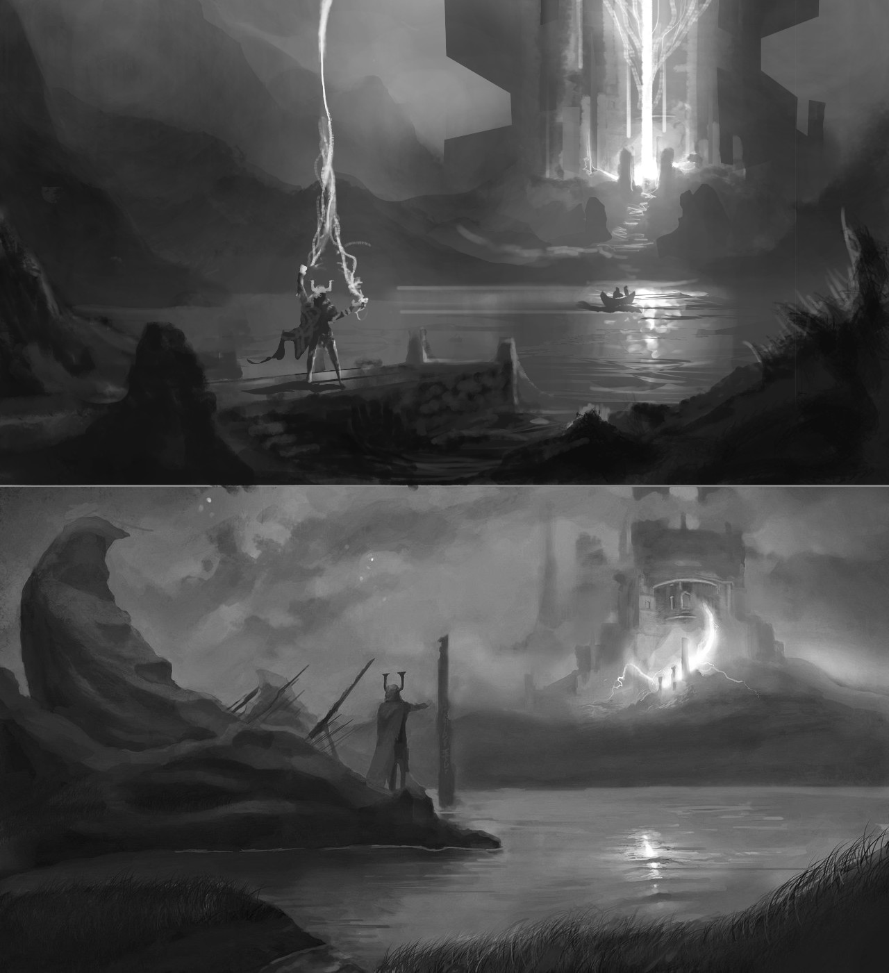
I did a value re-sketch because I think as the others said the colours are nice enough (though perhaps a little bit too saturated overall) but I thought the perspective, values, composition and narrative could do with some work.
I rearranged the perspective a bit and used rule of thirds to arrange the focal points so they were a little stronger in the piece. I emphasized the silhouette and size of the castle thing. I made it clear that the dude was doing something to open gates with the power of burrito farts or whatever. I used your ideas of a little boat and a jetty to add some narrative to the piece. I also readjusted values to bring more foreground in and generally add more layers into the piece. While you should think in terms of fore-mid-background you will get better results if you have transitions from one to the other rather than keeping them very distinct from each other as it is more realistic this way. I also used overlap to add depth between layers. Also added more detail in the focal points for the eye to go to. If you nail your fundamentals first you can easily take it on to colour and refining after that without worrying too much. Value sketches are a great way of doing that. Hope it helps. 
05-05-2013, 07:11 AM
WOAH! Thank you so much for overpaint ! I will keep your advic
 e in my mind! e in my mind!
|
|
« Next Oldest | Next Newest »
|