quest for light
#1
Smile 
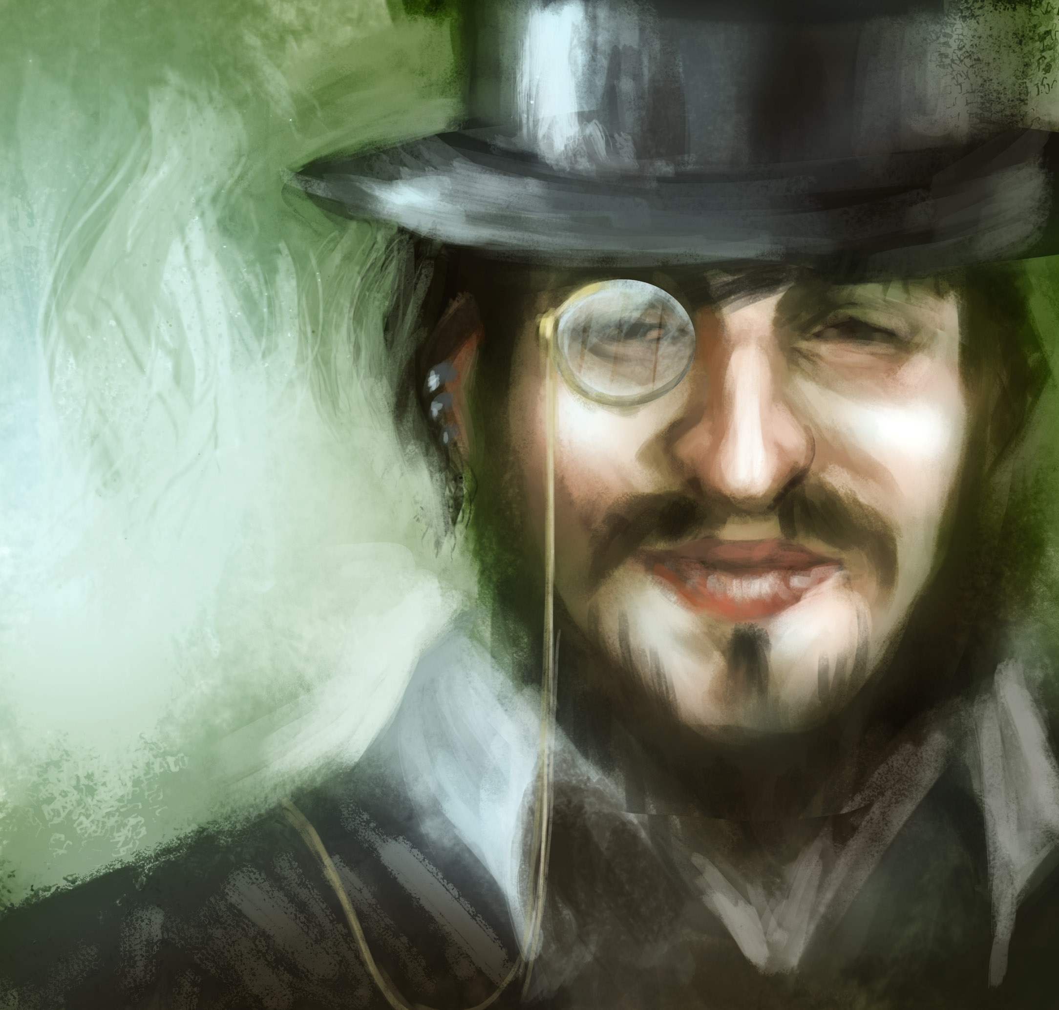
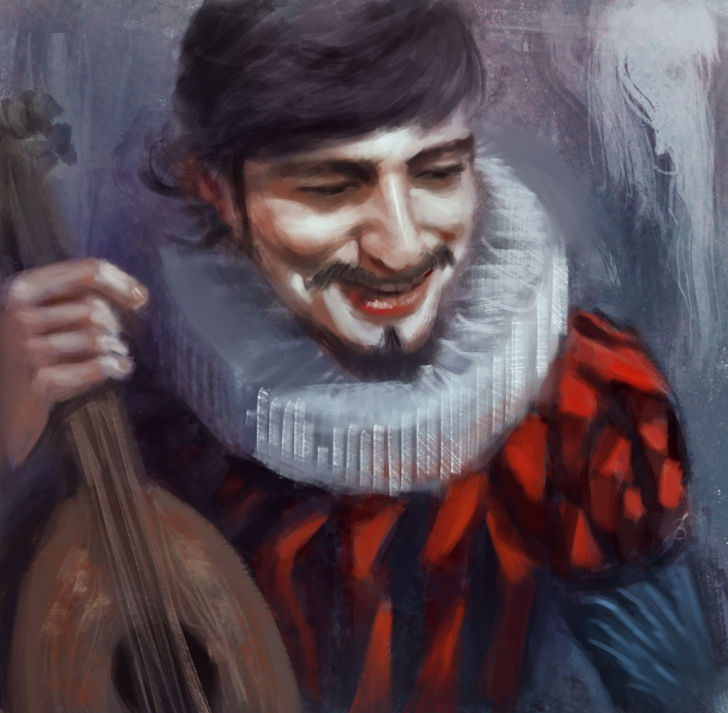
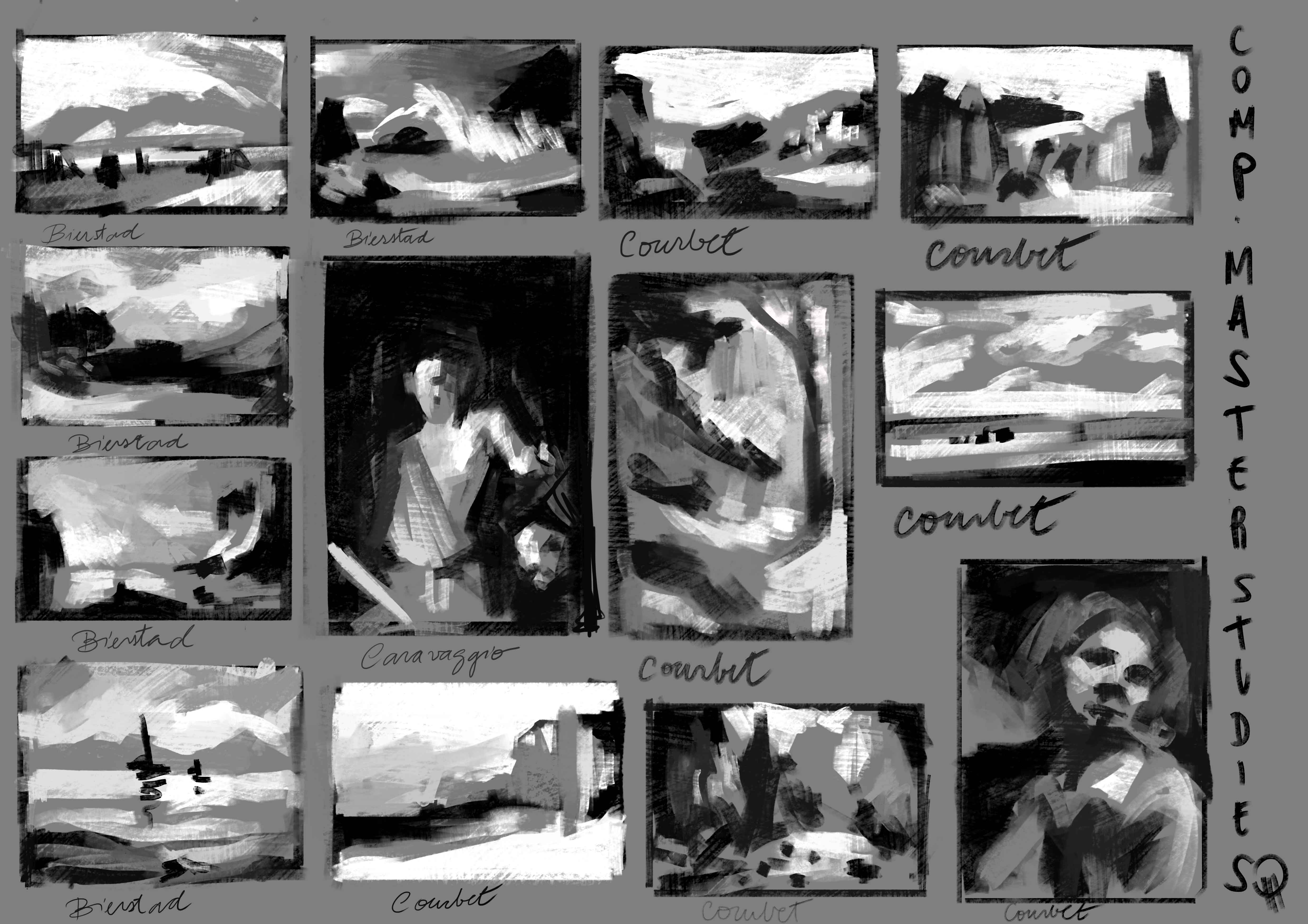
So, this is my first post in this sketchbook, and I think it would be nice to kind to establish a landmark of where I am with my art :)
finished stuff:


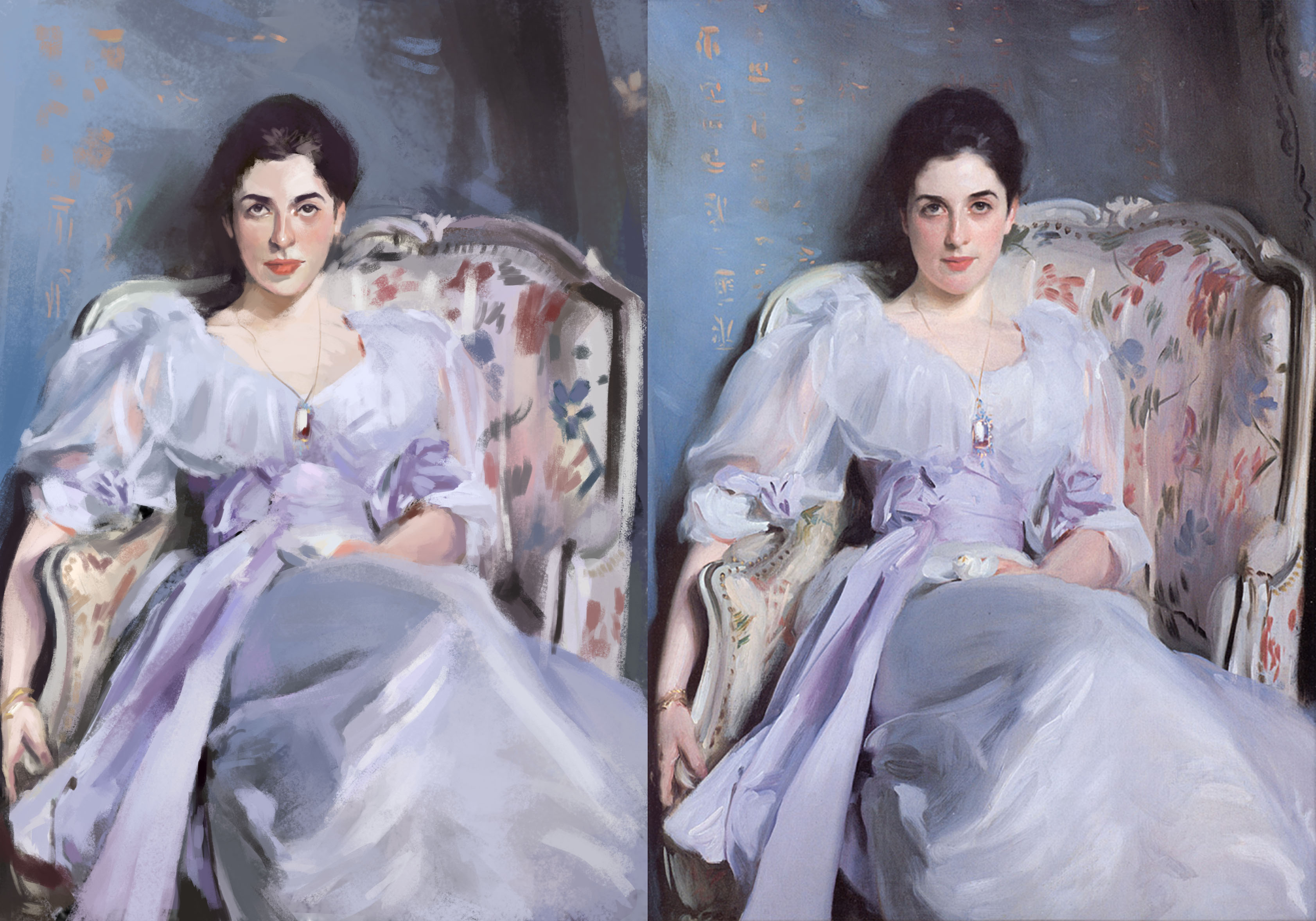
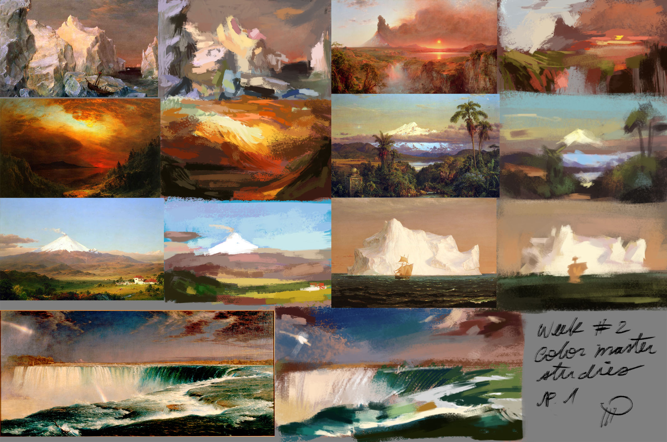
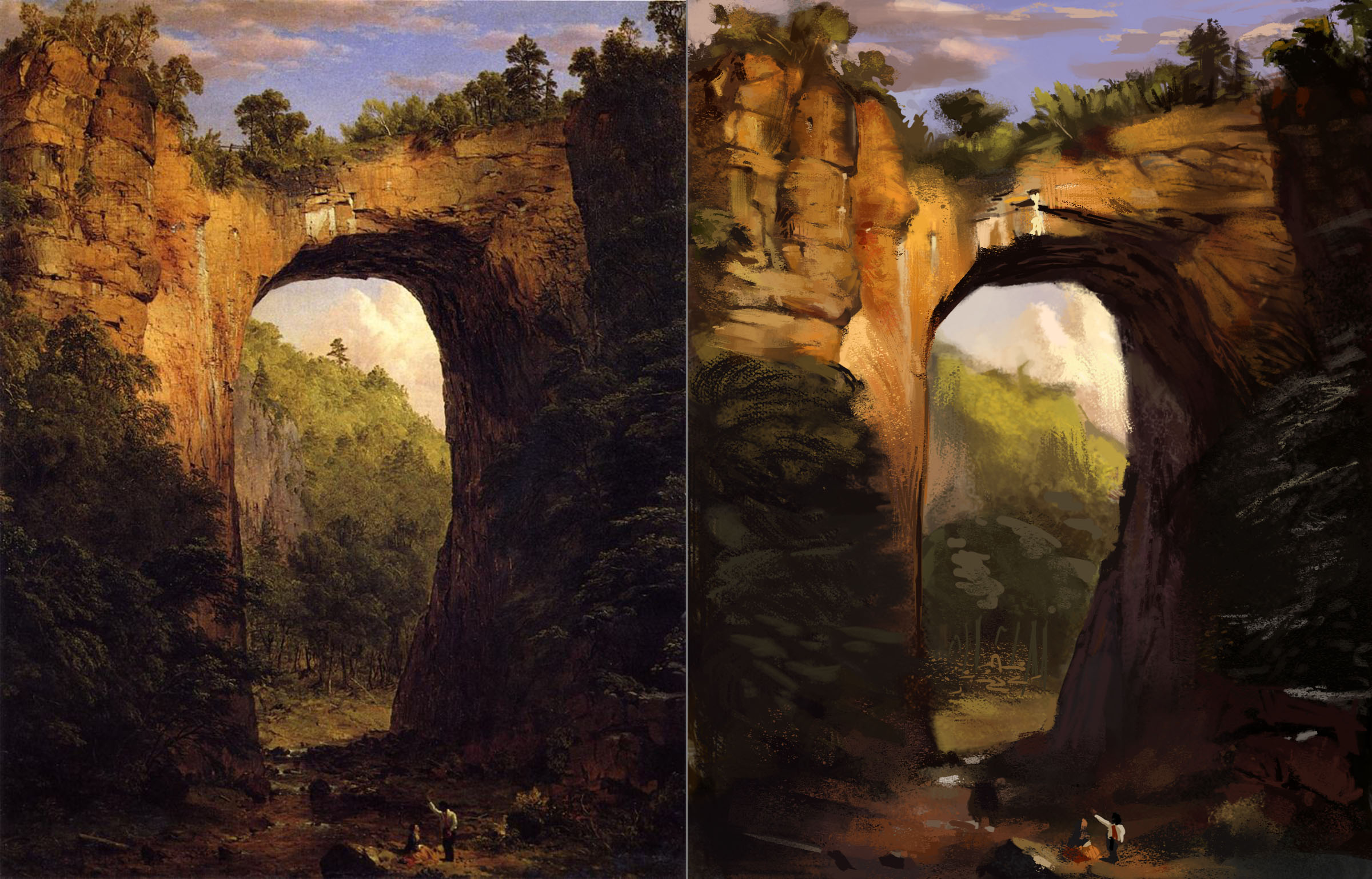
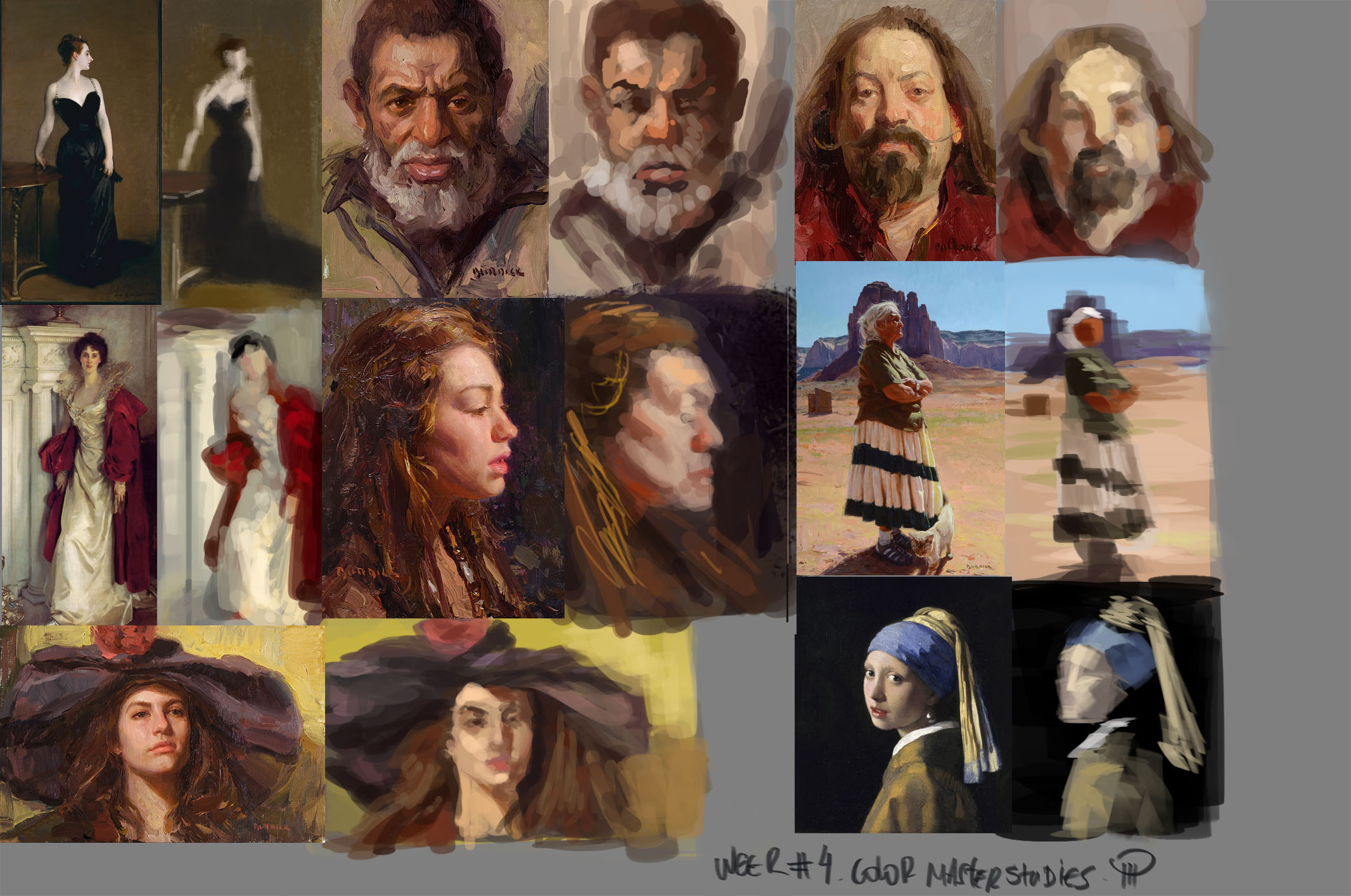
master studies:


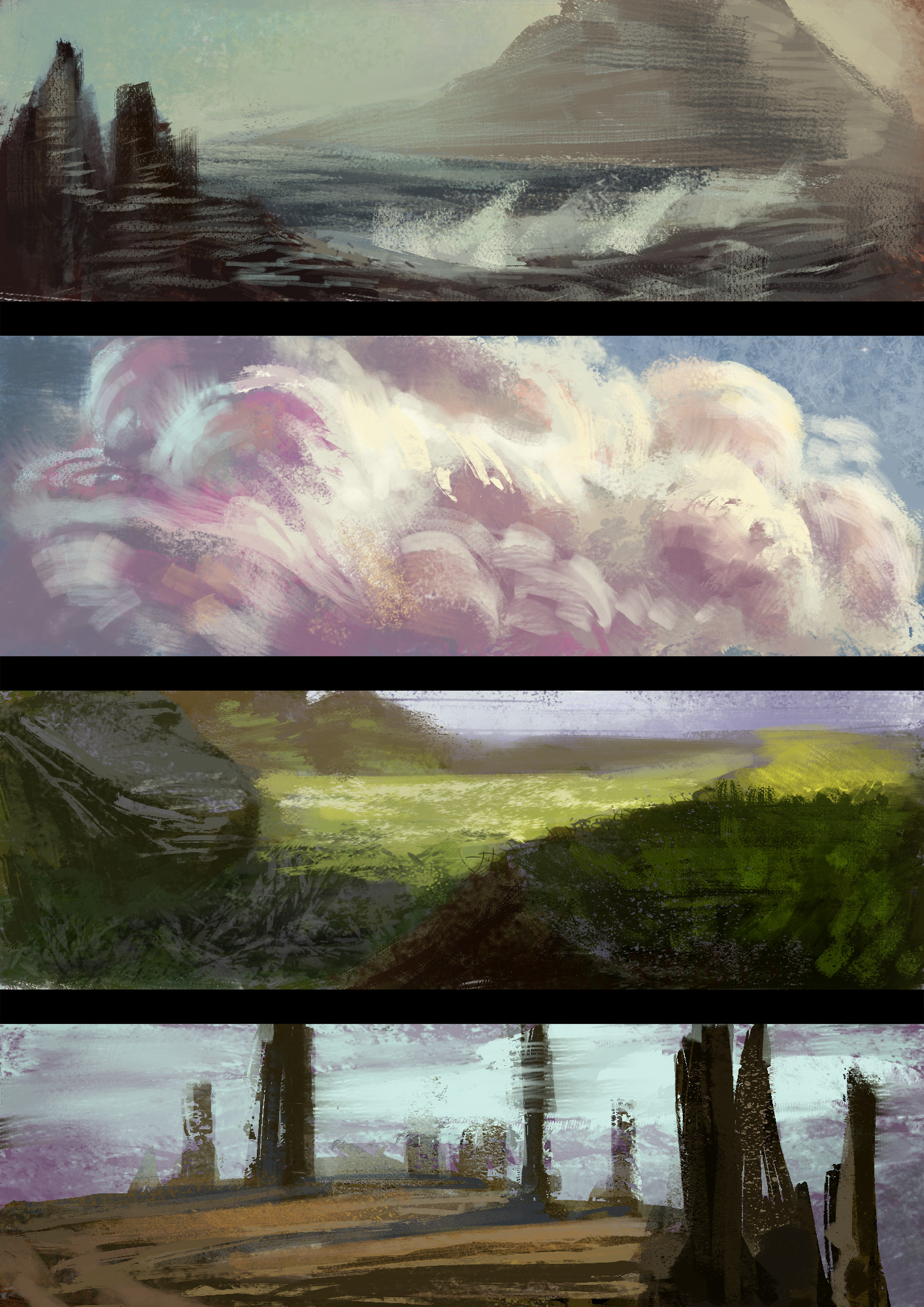
speed paintings:

Reply
#2
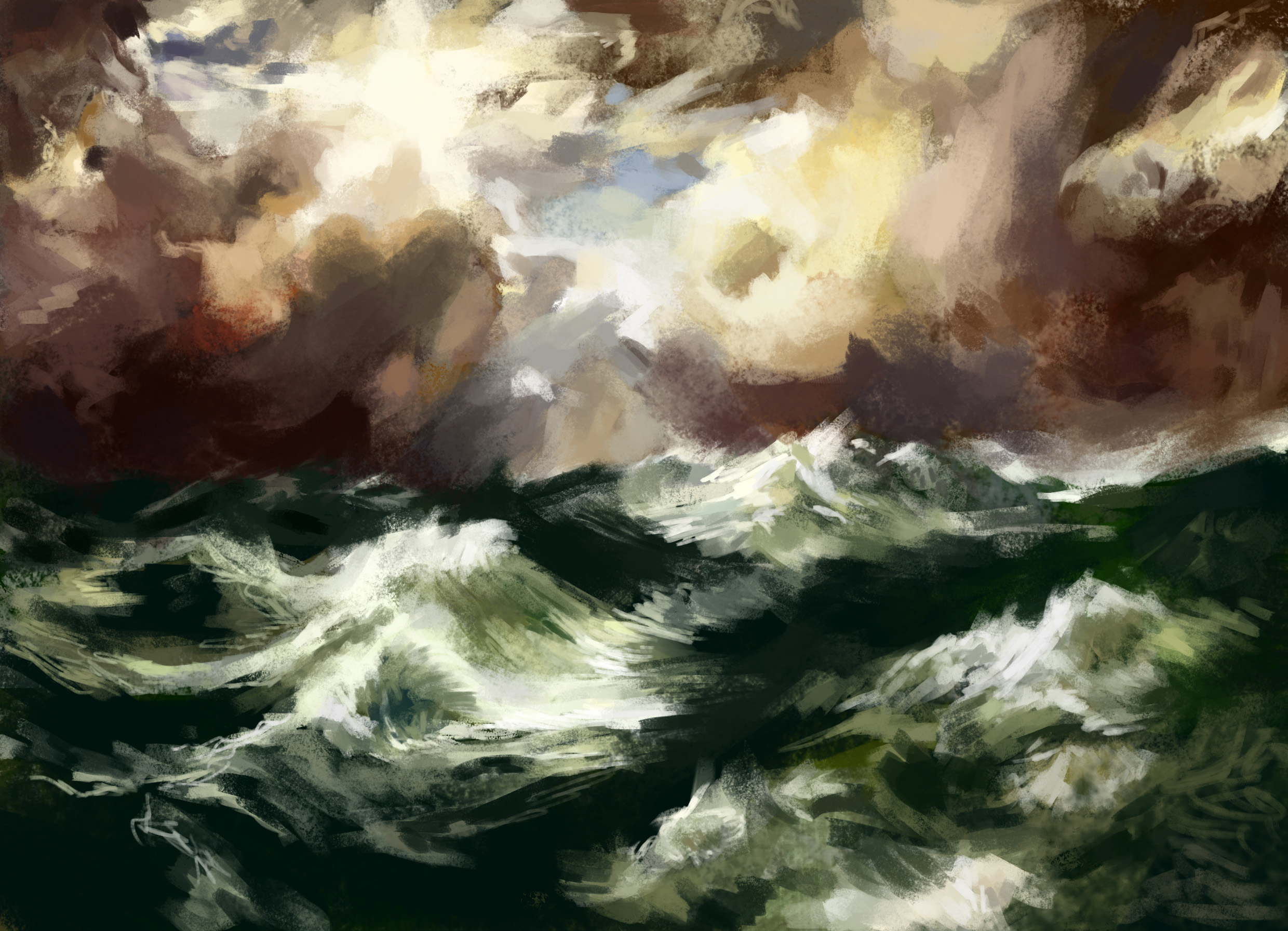
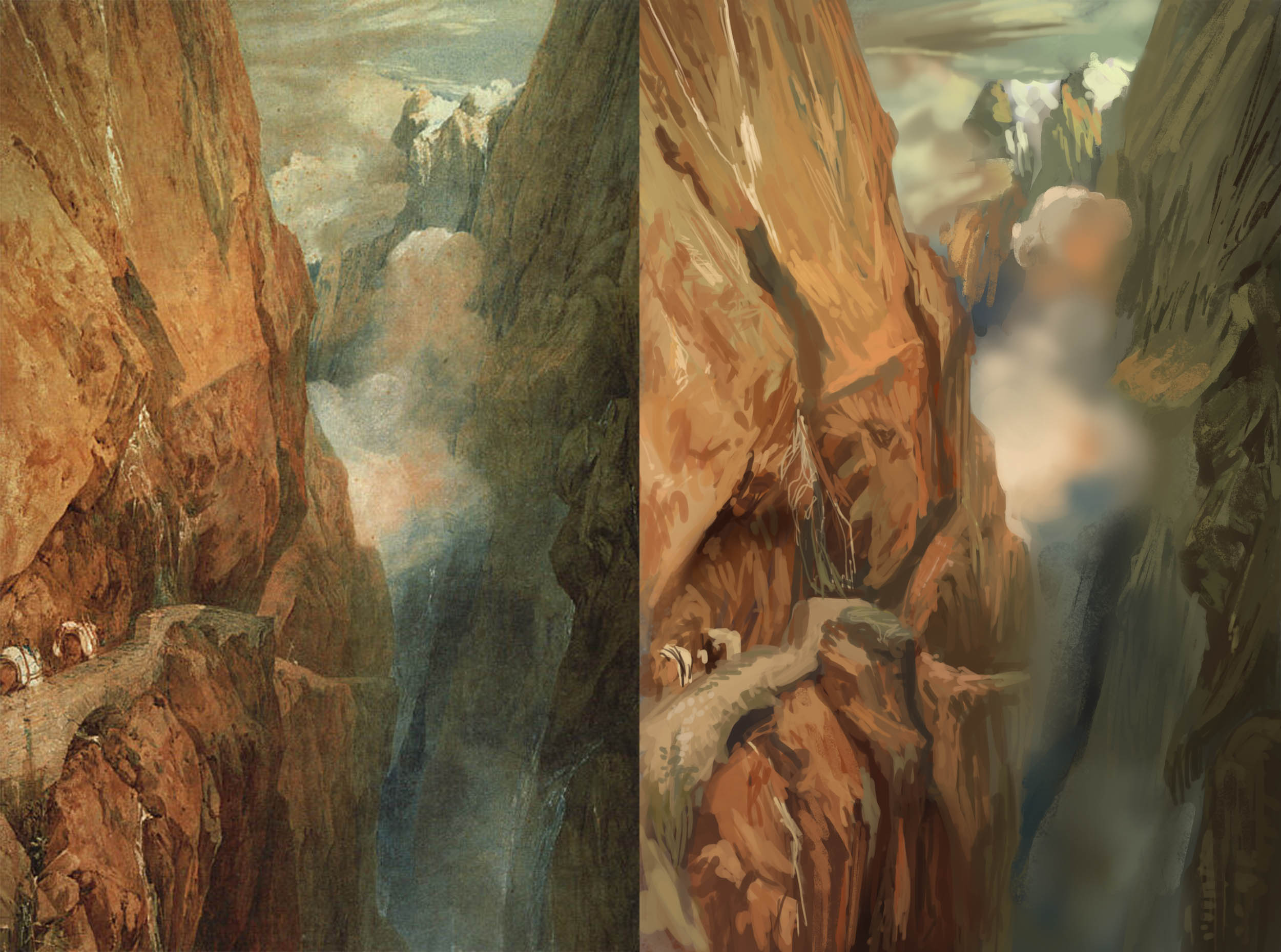
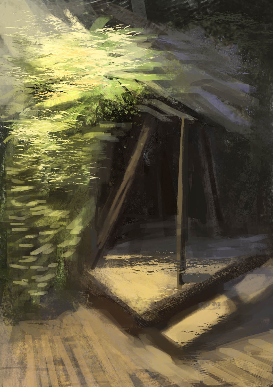
started my morning with some Turner :):

Reply
#3
Wow that's a nice start! I love how you work with all these textured brushes! You get a real nice rough look :)

Keep up the great work!

Reply
#4
Hello there, welcome to Crimson Daggers.

This is a really good start and you already have some beautiful studies here. You choose your refs wisely and build up colors more and more. Just keep up with this good job and have a lot of fun :)

CD dA FM  MaL
Reply
#5
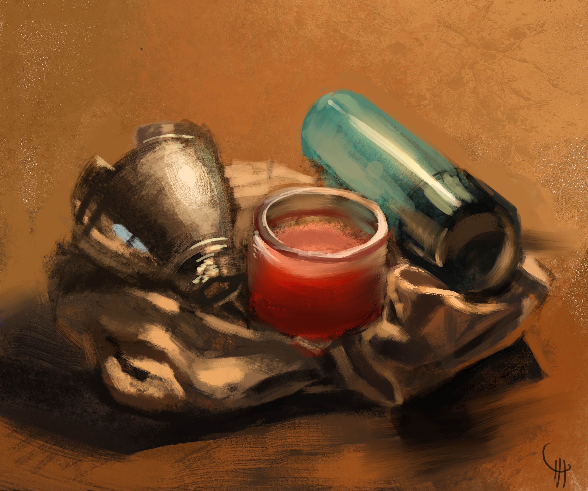
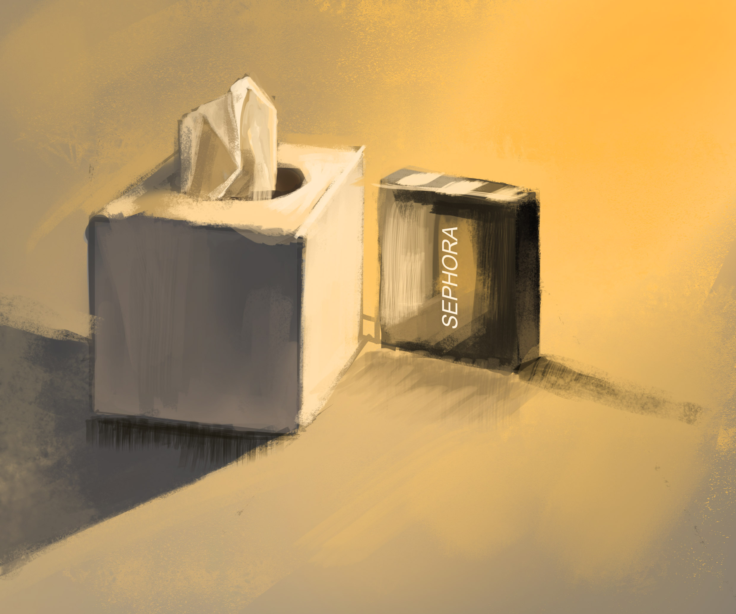
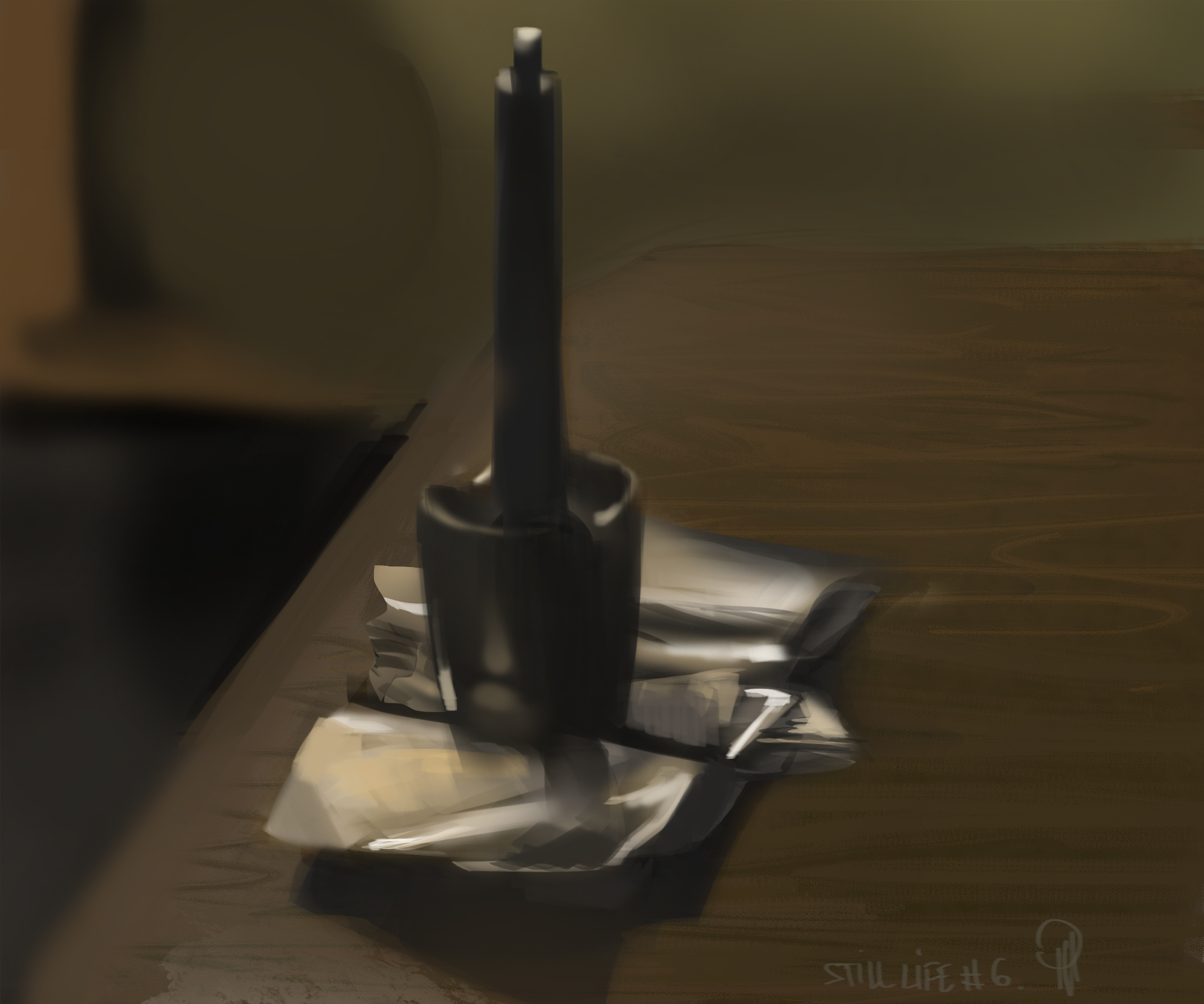
Thank you Lulolana and Toxicpanda, for stoping by and replying! I definitely want to add more colors into my pieces and that`s one of my goals with the master studies. Right now, a wonky still life I did today. Probably shouldn`t post this, but just to be clear, I didn`t draw anything for like centuries:

Reply
#6
struggling with still lives :/

Reply
#7
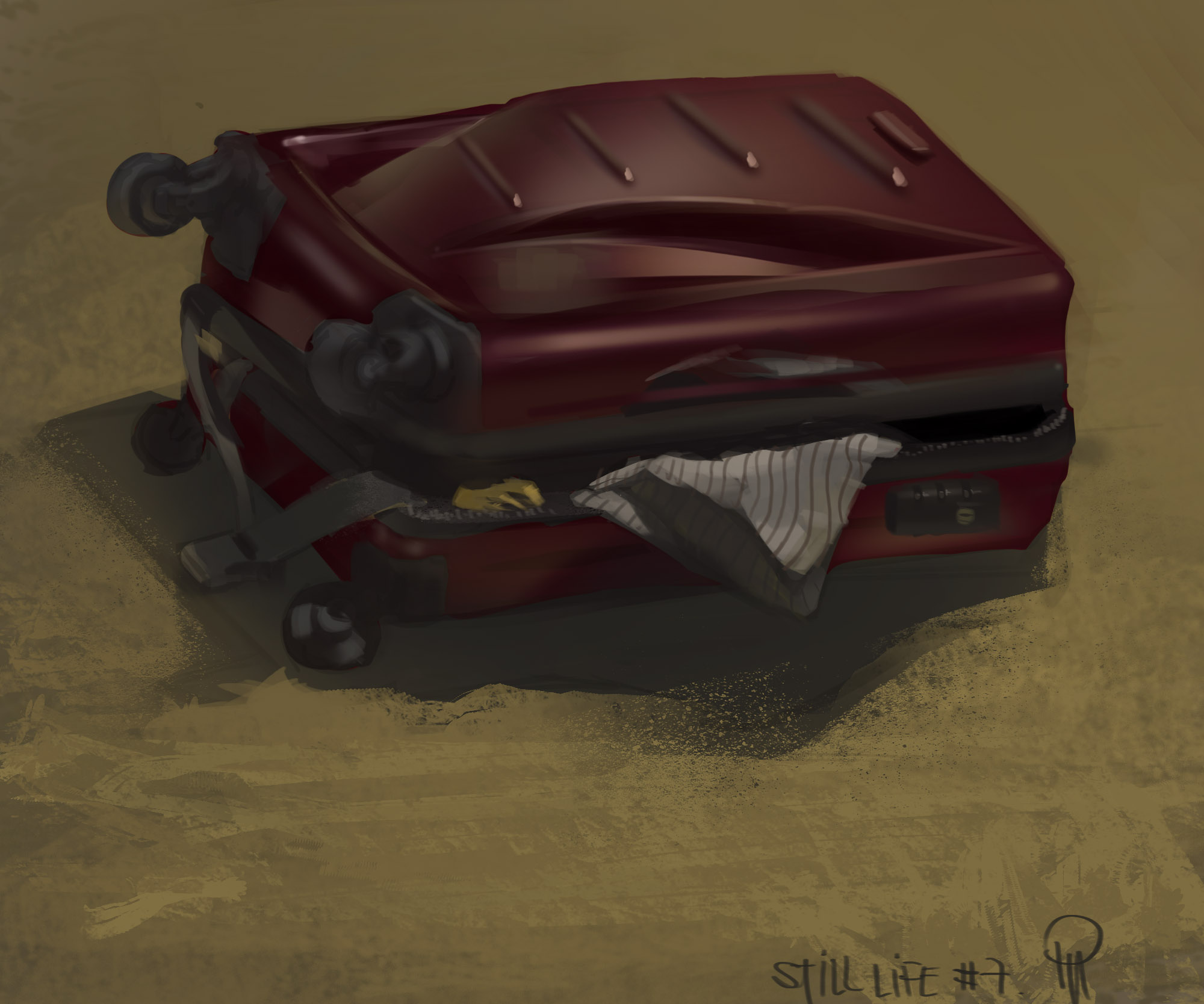
perspective sucks :/

Reply
#8
still from today:

Reply
#9
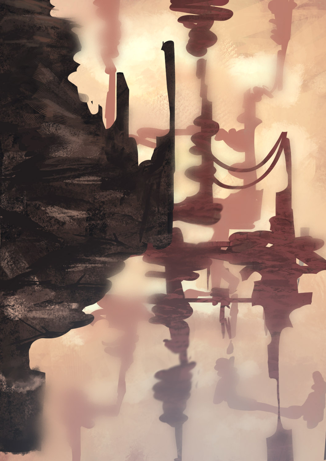
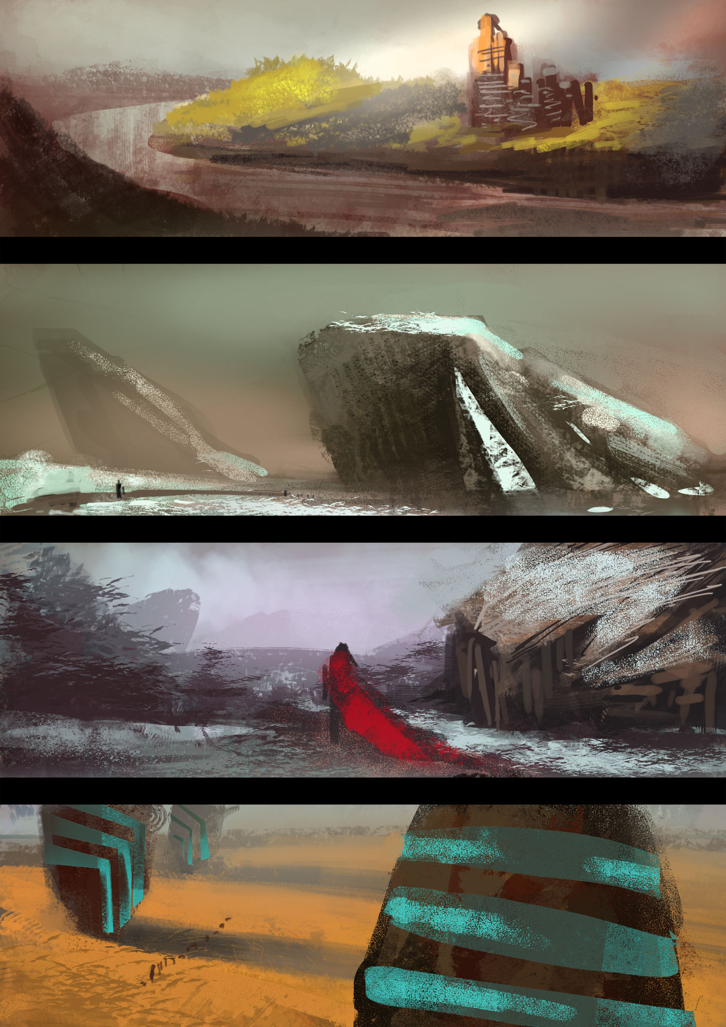
some speedpaintings after an artist block:

Reply
#10

Reply
#11
sketches

Reply
#12
Keep up the good work! These landscape paintings have some real energy in them, just be mindful of atmospheric perspective. Keep doing the master studies they can only help guide you in the right direction. Good luck!

Reply
#13
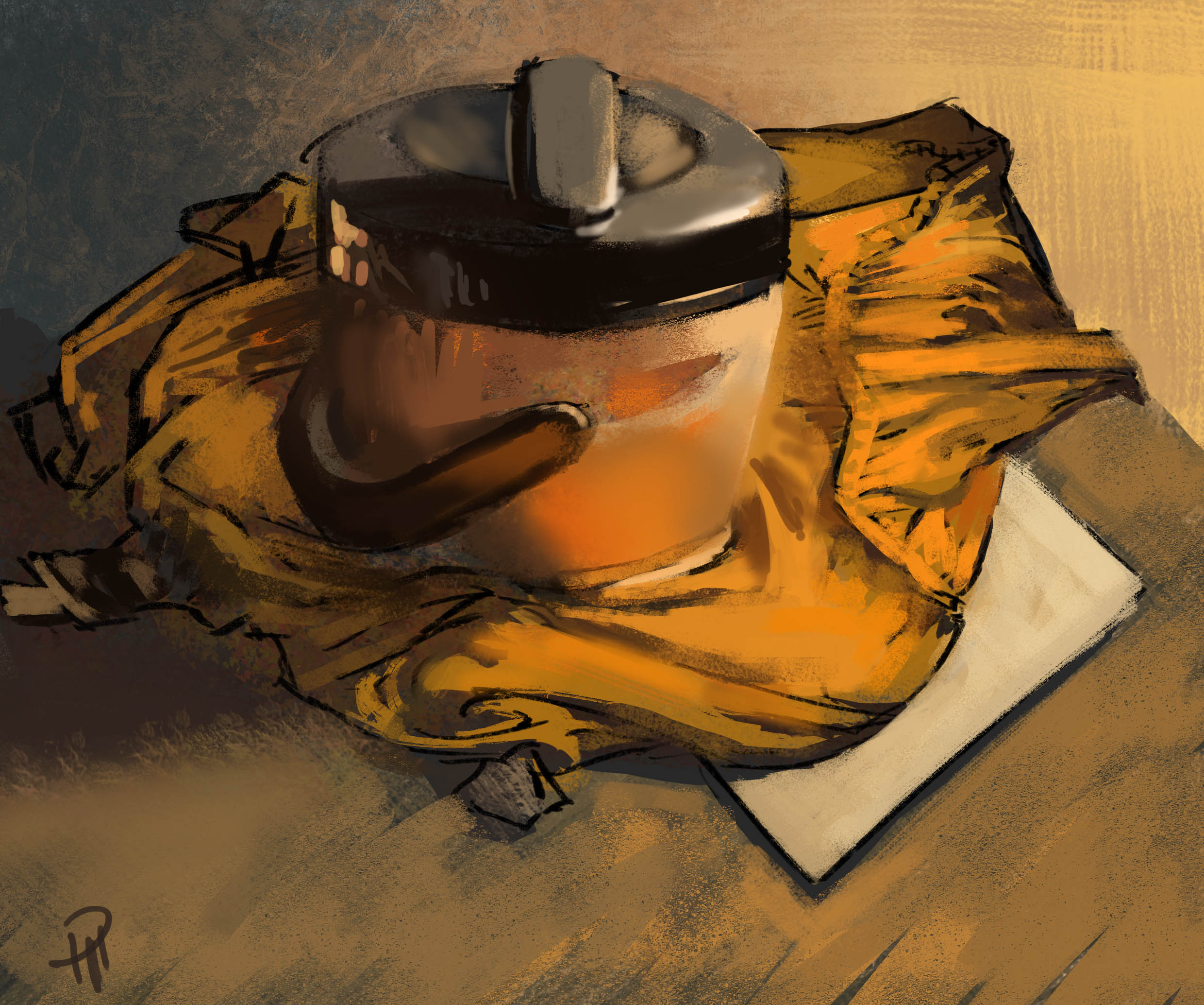
batch of "mini" still lives :)

Reply
#14
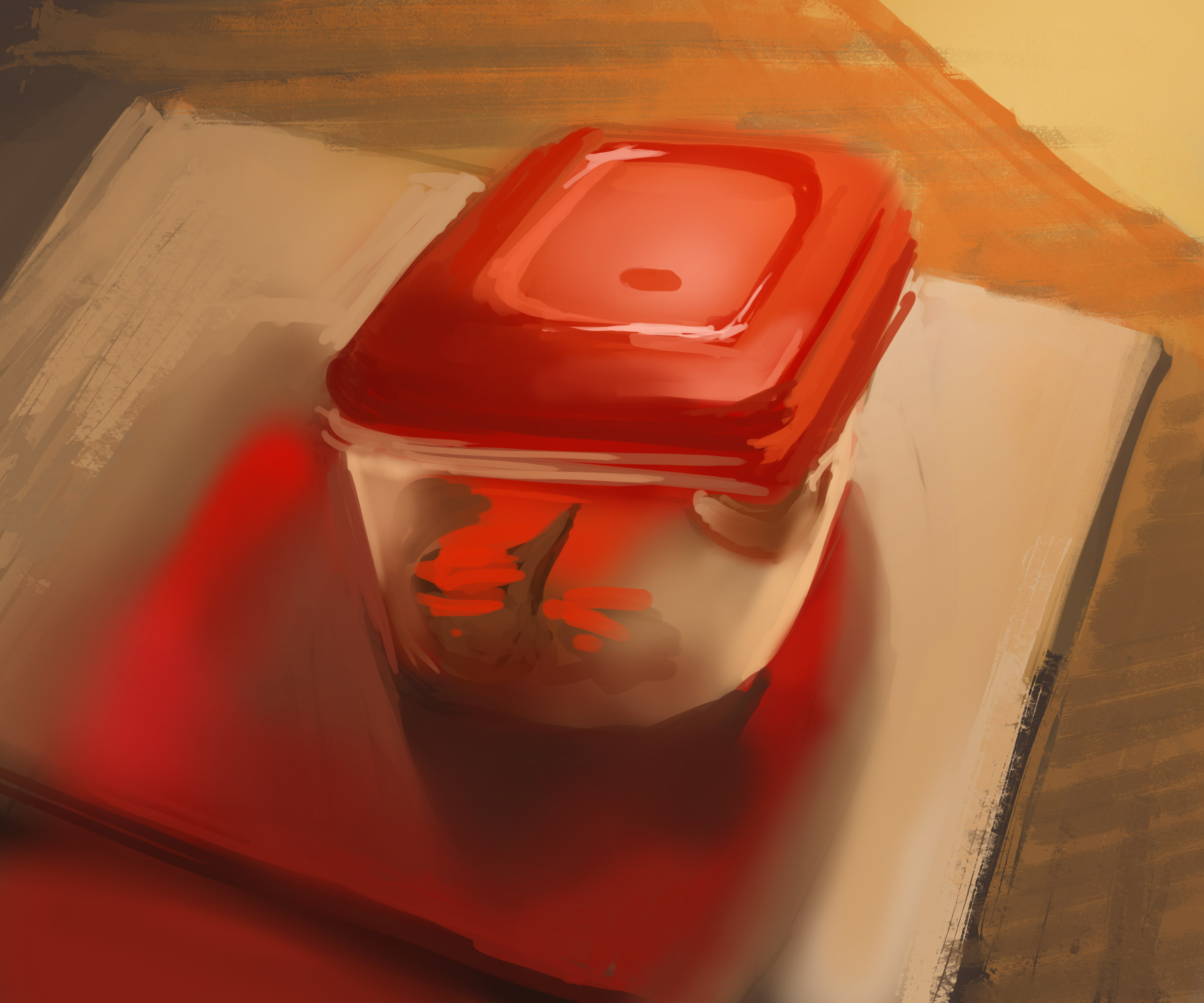
still lives from today

Reply
#15
From today:

Reply
#16
color studies:

Reply
#17

Reply
#18
more still lives

Reply
#19
Nice work :)
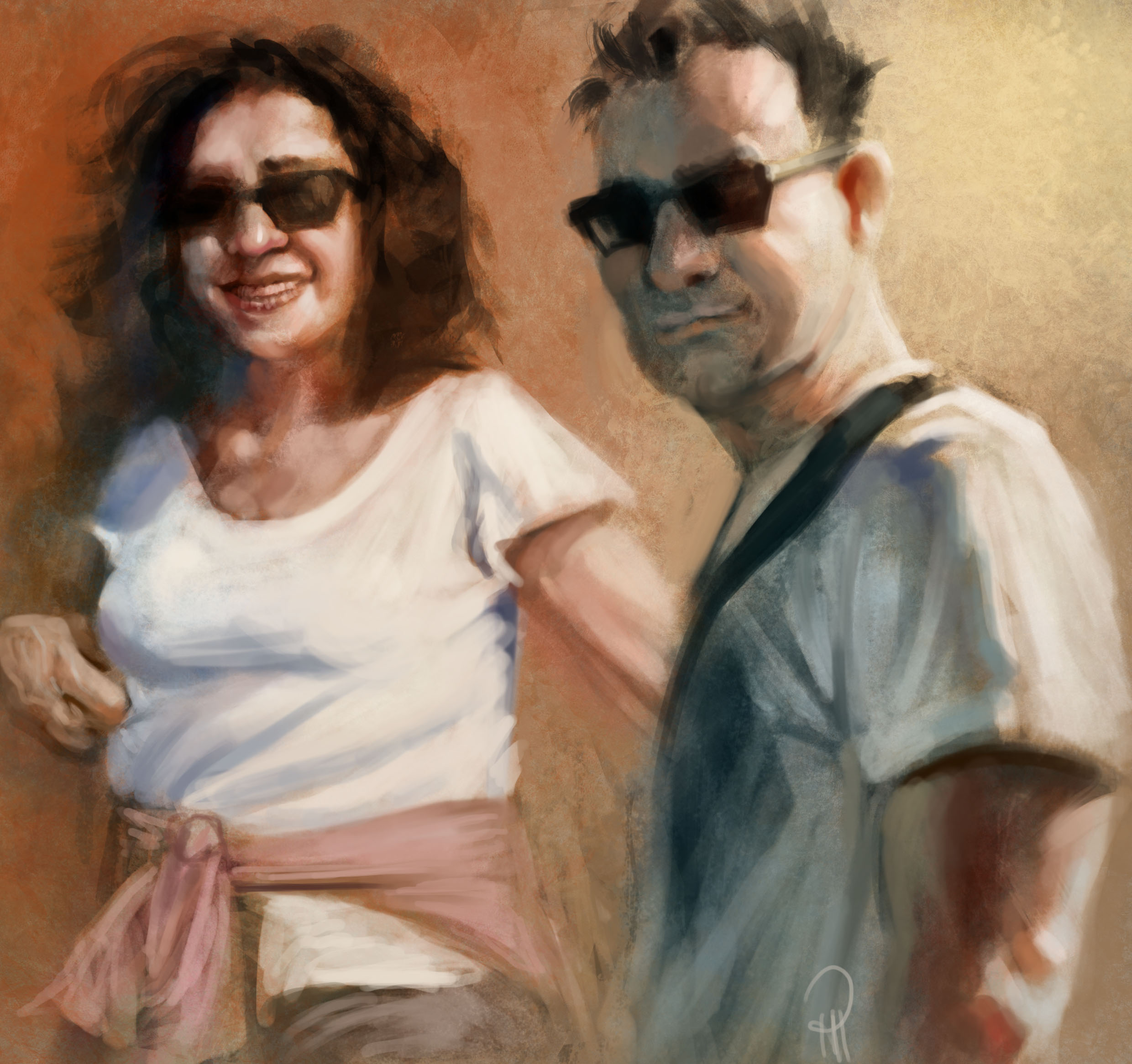
I like your brushwork, keep strong with your style. Your fast and loose studies are cool, but i think you might be skipping on a few subtleties of color, especially with faces? Maybe it should be best to spend a few more strokes on the studies, so you can do "more with less" later, what do you think?
Reply
#20
(06-10-2013, 03:48 PM)Gabriel-Dias Wrote: Nice work :)
I like your brushwork, keep strong with your style. Your fast and loose studies are cool, but i think you might be skipping on a few subtleties of color, especially with faces? Maybe it should be best to spend a few more strokes on the studies, so you can do "more with less" later, what do you think?

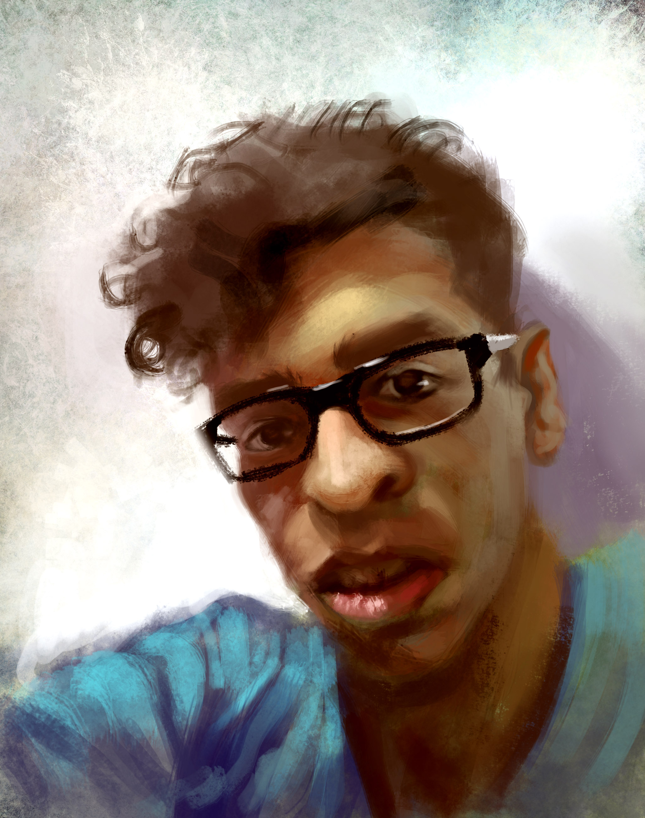
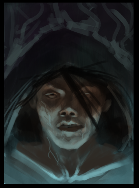
Thank you! Yeah, I agree with you. I think it`s probably because I did the portraits in black and white and then added color to it. However, right now I`m really trying to grasp the "painterly" feel you have using fewer brush strokes. Any tips regarding that? :)
Reply


Forum Jump:


Users browsing this thread: 10 Guest(s)