Typhon prerblerms
#1
Hello.
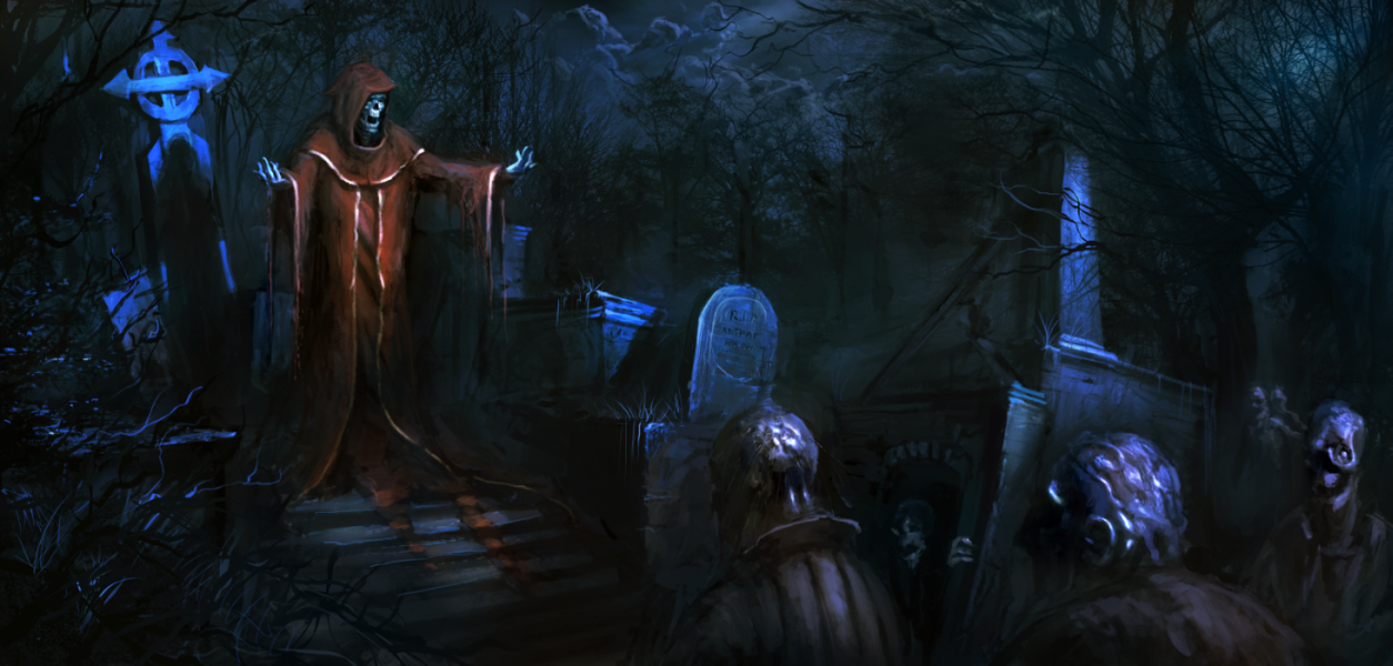
I have started doing my portfolio, already have 1,5 piece and this is the next one. May you suggest, critique or something what will help improve me this work? It's in early faze, but I want lead this in the best way possible.

The idea is to paint some sort of pirest/undead, higher necromance slave who commands smaller zombie groups :P

[Image: death_speech_by_typhonart-d68ffjm.png]
Reply
#2
Dude! Now you have a bit of story in your work! Awesome! It feel very cinematic with the sharp spotlight (moonlight) on the high priest guy. It feels a lot like an old school horror move and I love all that stuff :)

That tombstone with behind the priest is hitting the top if the canvas. You might want to fix that. Just make it go slightly outside the canvas or make it smaller.

I think you should spend more time designing the big priest dude. I googled those kind of robes and they often have cool gold patterns you can use. Using that on the high priest will make him look more powerful/higher ranked than the others. With that blue light hitting him you can probably make a cool effect with the gold to draw the eye

Here are two references you might want to use
http://www.schooljotter.com/imagefolders...5x1024.jpg

http://www.meijer.com/assets/product_ima..._A_400.jpg

But dude. This is awesome! really impressed! :D

Discord - JetJaguar#8954
Reply
#3
I simply can't describe how helpful it was. And how hard you motivated me to squeeze evertyhing what I can from this work :D I started fixing everything and rendering it a bit more. When I do some big steps I'll post it again.

Hope one day we will do collab that will rule the internet :D
Reply
#4
Hey man, nice work...should be a kick ass piece. I have a little to add about composition. I felt the line of rotting dudes down the bottom created a little bit of a block in the comp, and really it was the guy on the left end that was bothering me..So i substituted dead guy for prickly bush to mirror the other prickly looking trees elsewhere as well as to get some overlap with the main guy and add even more stuff to point at him (not that you needed it, but more can't hurt)

I also added a bit of atmospheric fog behind one of the figures and the tomb just to get a bit more separation between elements going on...oh and added a smaller figure lurking to add to the sense of there being more of these. The previous comment about embellishing the figure was a good idea, so I did a tiny bit just to see what that would be like...you may even want to give him some accessories...smoking lanterns or magical raising spell or something. Hope that helps.


 YouTube free learnin! | DeviantArt | Old Folio | Insta
Reply
#5
(06-10-2013, 10:54 AM)Typhon Wrote: I simply can't describe how helpful it was. And how hard you motivated me to squeeze evertyhing what I can from this work :D I started fixing everything and rendering it a bit more. When I do some big steps I'll post it again.

Hope one day we will do collab that will rule the internet :D

Heh, glad I could help!
Yeah a collab would be cool to do someday :) I kinda got in the mood to do some typical old school horror move stuff. The lighting in those movies is just amazing. Maybe I'll do some Bram Stoker stuff ;)
Oh and one last thing, If you need something to get you into the mood of the painting, here you go http://www.youtube.com/watch?v=URdtnf0RV0s
I feel that it's so similar to your painting you might get inspired or something ^^

Discord - JetJaguar#8954
Reply
#6
I pushed it a little further. I loved the idea with comming zombies from forest. What do you think or what would you change or see in this? Next I'm going to balance colours a little, do more graveyard mood with greys, pale blues and greens. And do something with this zombies, I'm not happy how they look at the moment :/

Reply
#7
Hmmm, not sure what to say. Love that dude coming out of the crypt by the way ;)
What I'd do is to bust out that atmospheric fog and cross graves and do some cool composition stuff with it.

A bit of reference you might want to use to make it look really cool when you mess around with the colors and maybe some fog http://www.youtube.com/watch?v=rrdnwnXxBw4 that video has a lot of cool elements to pull from. Something you se in a lot of in horror movies is a strong silhouette foreground sooo maybe put a big cross somewhere... or don't, maybe it will look to messy... hmm... experiment man, I think you'll work something out and make it really really cool in the end :)

Discord - JetJaguar#8954
Reply
#8
Careful with the tomb pillar on the right. Because you've now brought tree branches in front of it it looks like it is behind that tree , but then its value and base read as if they are are in front of the tree. I'd also say to be mindful about over detailing areas that don't need it, the sky now pulls more attention because it has more information in it. You're pretty much on the edge of going too far I think, so make sure any further detail is kept to the focal points.. The thing that strikes me about this composition now is that everything is happening in the midground and it feels quite cluttered overall. Also that large pillar is making a strong V shape that distinctly splits the composition in a bad way. Maybe you actually should push that large tomb back further or use atmospheric fog to "mend the gap" ...or even remove it and replace it with background shots of more gravestones or the rest of the cemetary...a field of more zombies etc...

Speaking of focal points, the environment and narrative is cool, but I think the thing that will really make this piece sing is how you treat the priest. At the moment, he is kinda just stood there fairly statically, and his arms aren't really indicative of whether he is beckoning or casting a spell or what. He could be holding a large invisible plank of wood in his arms. I'd suggest fixing the comp first, but really focus your efforts on giving the priest a more impressive presence. I recommend acting his role out and taking photos for ref. Oh and ref the hands too.

 YouTube free learnin! | DeviantArt | Old Folio | Insta
Reply
#9
http://fc06.deviantart.net/fs70/f/2013/1...68khd9.png <- Here is final version.

Yeah, I rushed on this one too much. I tried fixing it and include what you said, but lack of skill don't allow me to do overpaint and still make it look "good". I wanted the priest to do some sort of preach, not sure if it works and looks as it should. I'll definetly make series with simillar story, so I'll put there everything I have learned from you. Still thanks a lot with such great help and critique.
It was one of the best lessons I ever had. Next one will be way better!
Reply


Forum Jump:


Users browsing this thread: 12 Guest(s)