Posts: 53
Threads: 3
Joined: Jun 2013
Reputation:
0
Hey fellas!
Before I start, ima quickly introduce myself.
My name's Julius, I'm an illustration student from Germany, 20 years old. I recently decided to go international with my attempts of drawing and painting, since I've only been showing it in a german community before. So here I am.
Let's get started. I will show some stuff of the past weeks to give you guys an impression and then follow up with 'almost' daily updates.
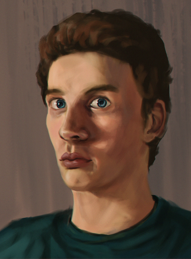
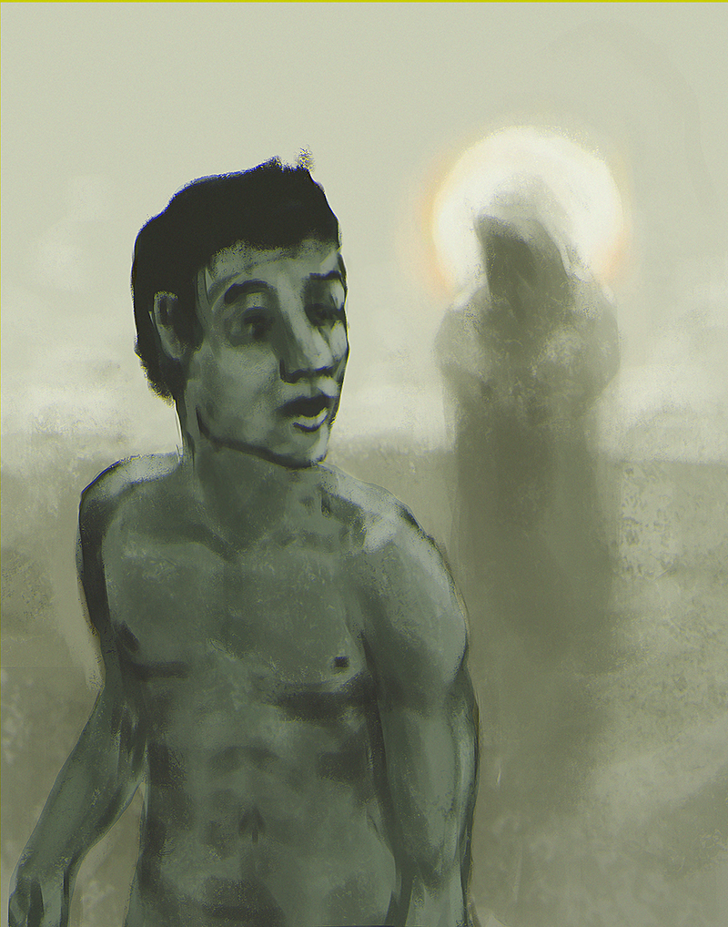
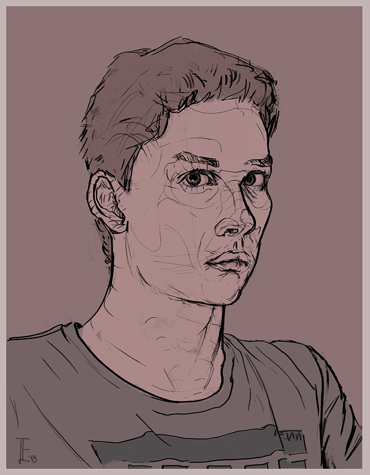
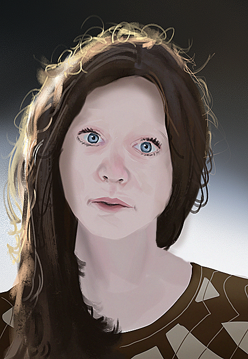
A selfie:

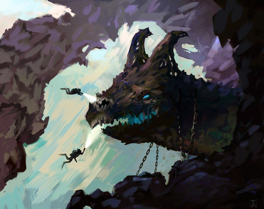
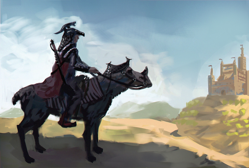
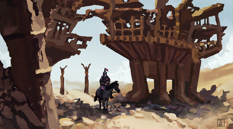
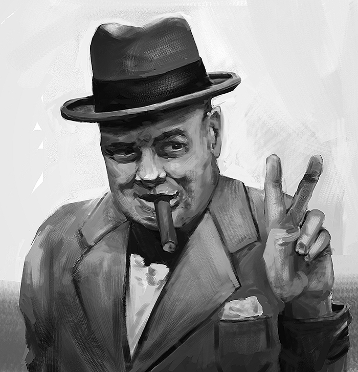
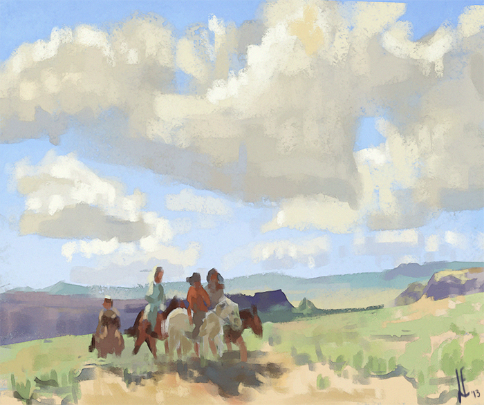
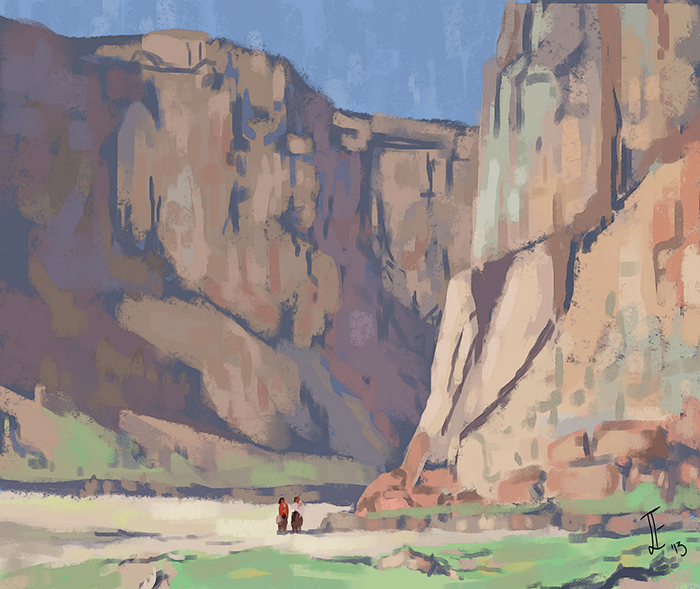
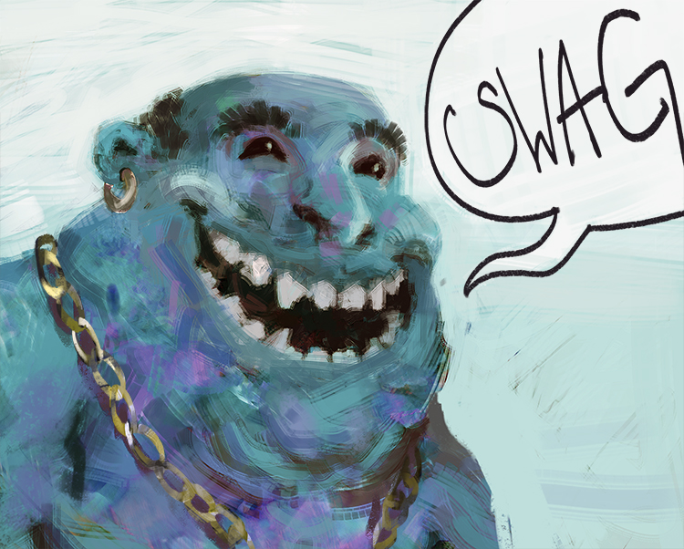
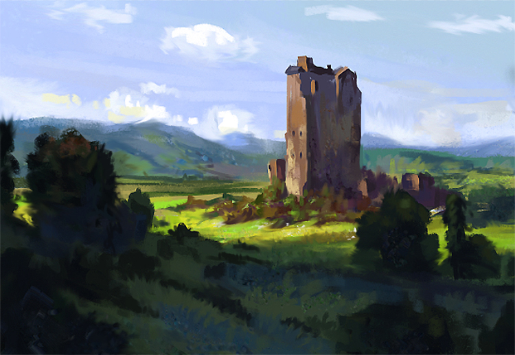
Some speedpaintings (slowly getting better at these)


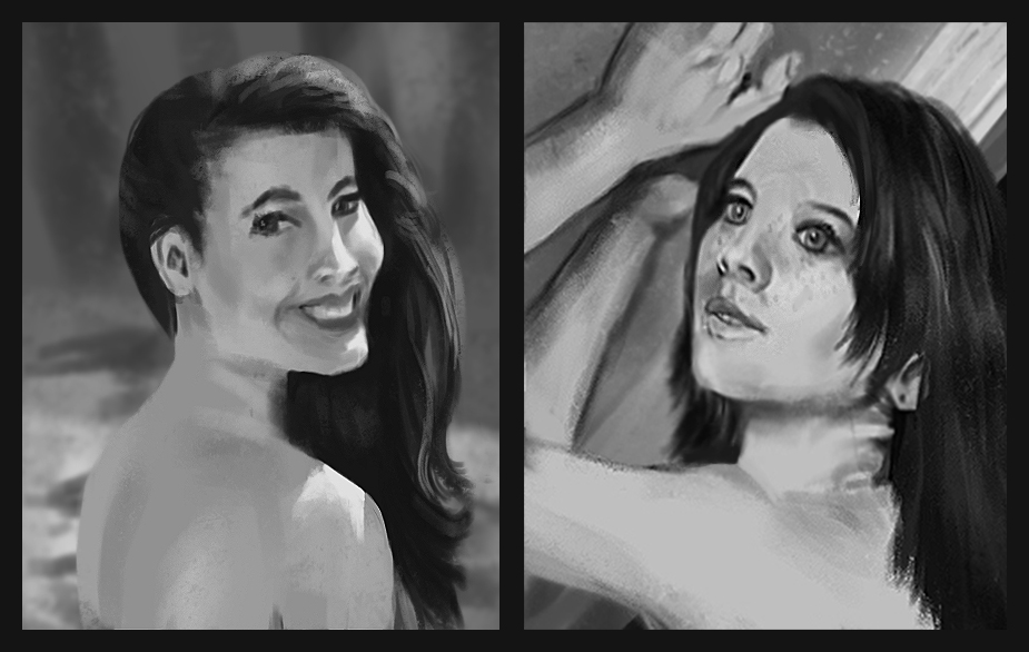
Two quick studies. 30 minutes for one on the left, about 50 for the right one. Studies are definitely my comfort zone...

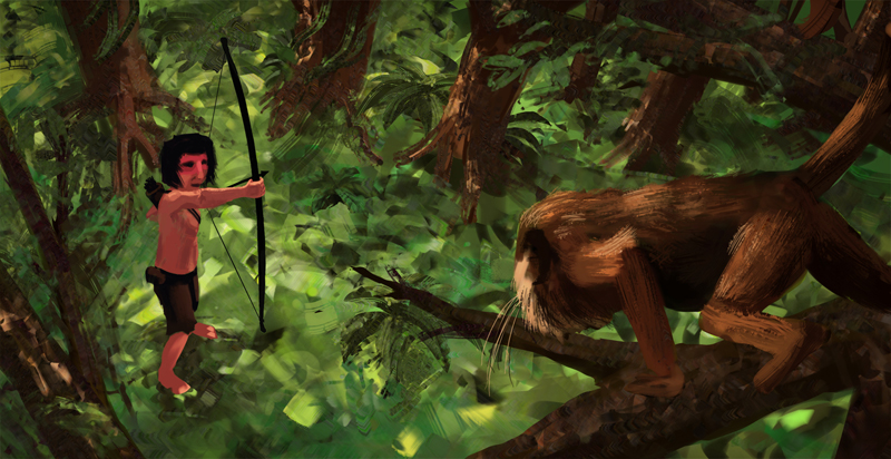
A current WIP for school.

So, that's it for now. Ima post the stuff of today later on. Critics and all kind of comments are more than welcome!
Cheerio!
At the moment I'm very much into figure drawing and anatomy, since my drawing skills are far behind my painting skills (I feel like I have to explain this with another sentence. What I mean is, that I believe that my knowledge of how light works on surface is much better than my knowledge of how forms behave in space following proper perspective. I hope that fixing this issue, by learning how to draw figures, which involves the understanding of perspective will push me to a new level. I don't know if this makes alot of sense, but its just the feeling I have at the moment.)
So untill my Hampton book arrives (shipping from the US :/ ) I do daily figure and gesture drawing and general perspective drawings. Yet I'm a bit lazy at scanning, so you won't see too much of those gestures. But I will get my lazy ass up when beginning with Hampton. Promise!
So, long story short, here comes the stuff of today:
Started this one with a reference, after about 10 minutes I proceeded to render it out from imagination.

This is a crappy speedy I did while listening to the beautiful voices of Miles Johnston und Dan Warren discussing about artzy stuff. Really nice stream you guys! Thanks!

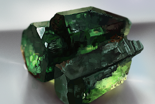
And an emerald study, due to the CHOW, won't be able to finish anything till sunday though. But the topic really baits me into doing something even after the deadline.

Posts: 53
Threads: 3
Joined: Jun 2013
Reputation:
0
Today was a good day!
I finished my sketchbook for gestures and figures two days before my personal Deadline. That's almost 250 Gestures in 12 days. Let's see if I can keep this rate up.
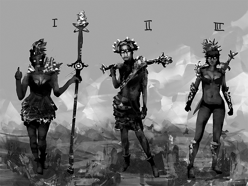
Had some freetime in the evening to do some concepts for CHOW.

I'm not to happy with those. They're too generic. Anyways, I hope you enjoy them atleast a bit. I would love to hear you guys opinions on my stuff. :)
See ya around!
Posts: 53
Threads: 3
Joined: Jun 2013
Reputation:
0
 06-16-2013, 12:38 PM
Heya!
I worked all day and really got some CHOW goin.
Im sure to be able to finish it tomorrow. Since I really put alot of effort into it (literally the WHOLE day :P) I really want to get the most out of it.
Id really like to hear some crits to this one. Would be wonderful :>
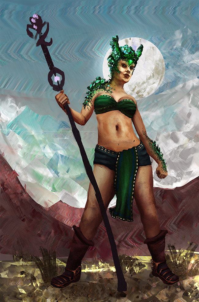
Here it is. The background and her staff are ofcourse still very frowzy.

Cheerio!
Posts: 184
Threads: 4
Joined: May 2013
Reputation:
11
hallo!
cool crazy brush patterns in this last pic. i'll see if i can get some crit on it for you..
first of all great work on the design of the character and the overall comp. the precious-stone rendering really stands out, looks photographic almost. the funky brush is really interesting and it works, and nice start on texturing her skin and clothing. nice work on the hips and shoulder angles in that pose too
some ideas:
-try putting yourself in her pose: it might look better if her staff goes behind her body instead of infront, it felt a little awkward to me when i tried standing like that, not as powerful as it seems you want to convey
-on her torso, at the left of the image, it seems to "stick" to the background, it doesn't look like it goes around in space (it looks flat at the edge). making the edge a little less sharp, and helping show the direction of the form with brushstroke directions and value might help a little
-lightsource isn't totally clear to me
-could help to separate the ground and the mountain a little more, show how they connect etc.
-the clouds are a little hard to read
-hand on right side of picture is in a slightly odd pose
hope i didn't go overboard with the crits. good luck on this!
"If you want liberation in this life, there is no area that you do not watch. Watch the breathing, watch the posture, watch the flow of energy, watch the texture of the mind, watch the response to objects." - Namgyal Rinpoche
Posts: 53
Threads: 3
Joined: Jun 2013
Reputation:
0
Thanks alot for your help!
The brush pattern comes from the amazing Brushset of Alexandre 'Zedig' Diboine.
I tried to put her staff behind her. I wasn't able to make it look 'right'. It always looked like she was about to stumble. I will try it out again, but I guess I will stick to this pose.
With her hand you're totally right. I think it looks 'wrong' because it seems like her thumb is inside the fist, which is just an awkward girl fist. haha.
Thanks again for your helping hand! :)
Posts: 53
Threads: 3
Joined: Jun 2013
Reputation:
0
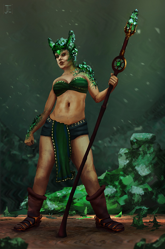
So, here's the finished piece.
I chose a different Background, since it fits the description of the CHoW better. I tried to fix the Hand, but I screwed it over and over. Dunno if this ones a bit better than the old one.
I hope you like anyways. C&C greatly appreciated.

Posts: 53
Threads: 3
Joined: Jun 2013
Reputation:
0
Took a day off today, only two small studies of Edgar Payne.


Posts: 53
Threads: 3
Joined: Jun 2013
Reputation:
0
I did some digital gestures today. Most of them are hideous, but a few are actually getting better, I believe. And thats what I'm doing them for. Improvement. They're 45 to 60 secs :)

Posts: 53
Threads: 3
Joined: Jun 2013
Reputation:
0
Hey folks.
Here's todays stuff after one week vacation.
Some gestures after watching the Proko-videos. I will only post a few, so my evolvement (hopefully) will be visible. I tried to focus more on the gesture itself, rather than the contur.

Some radnom wizzle between the gestures.

And another master study. Tried to catch the great colors of Jaime Jones. He's so good. *-*

See ya!
Posts: 53
Threads: 3
Joined: Jun 2013
Reputation:
0
Hoooya!
Two new ones:
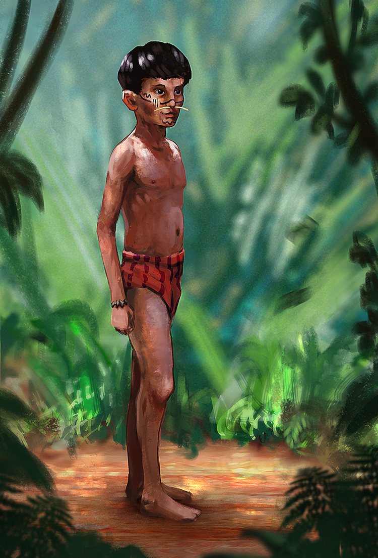
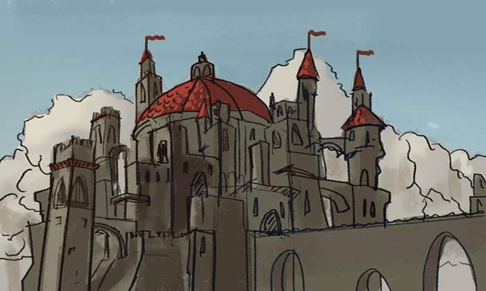
This one's from the same project as the WIP. I posted some time ago. I needed to get myself a bit cleaer about the character, and I needed an establishing shot anyway. If I find some time before the deadline, I will work abit more on it, cause I see several things that annoy the shit out of me already, but for now this has to do it.

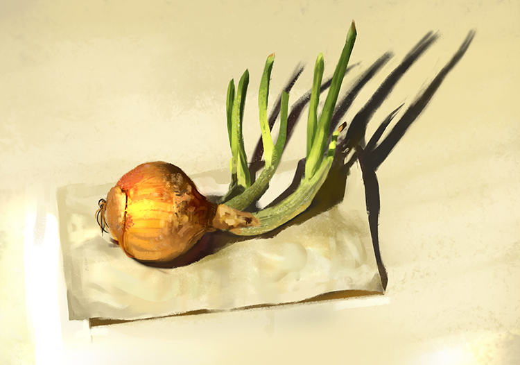
And a still life. I used to do these on regulary base some time ago, then I somehow lost track. Felt good to do one again.

Gimme all those crits& comments! :)
Cheerio!
Posts: 140
Threads: 2
Joined: Apr 2012
Reputation:
2
Cool sketchbook here ! :D You got nice colors !
Be careful on this last character, try to make the structure lines disappear, he must be "unified" more with the background I think not too much like "pasted" on it.
Anyway keep working hard man ! :)
Posts: 53
Threads: 3
Joined: Jun 2013
Reputation:
0
Hey dude,
thanks alot for your reply! I wasn't sure with the outline aswell, but kinda liked it in the end.
I will keep on going for damn sure! :)
Here is something new:
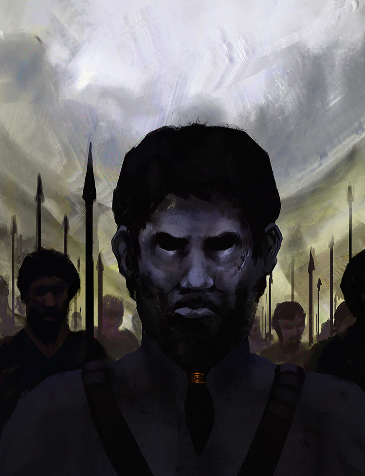
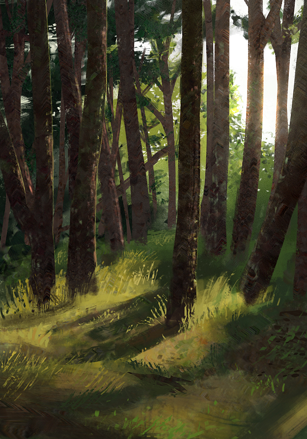
A speedpainting:

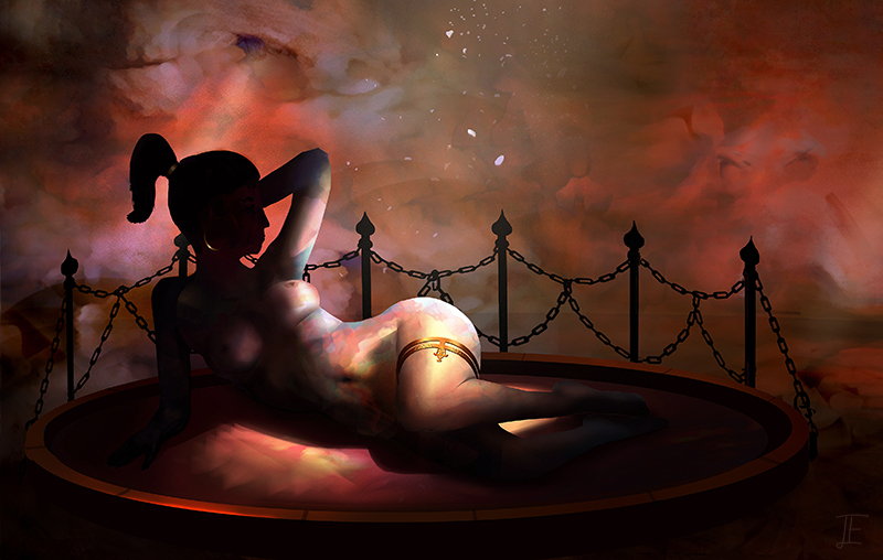
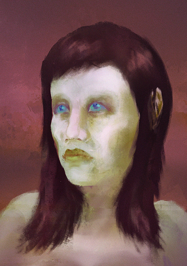
And a longer 4-hourish-painting. I tried to focus on the mood and the atmosphere on this one. Miles Johnston and his lifestreams were higly inspiring for me to do this one. I hope he's getting those up again. I used a reference for the pose of the woman and 1-2 textures for the background. At the moment, I'm quiet happy with the result, but usually, tide turns after some days.

I hope you like it,
I will probably post more illustrations I did for my project at university later. But those highly frustrated me.
See ya around!
Posts: 99
Threads: 1
Joined: Mar 2013
Reputation:
5
Hi Art.ful. Nice sketchbook. I can definitely see Miles influence in that last piece. There are a couple of anatomical points that could do with a little reworking though; the forshortening on her right arm seems off and the hand could do with a little more love. The lower legs and calf muscles appear too short to me aswell.
Keep up the good work.
Posts: 53
Threads: 3
Joined: Jun 2013
Reputation:
0
Heya,
thanks for your comment! You're definetely right with those crits. What I dislike even more, when I look at it now, is the face and it's proportions. Anyways, I will move on. I always feel like doing new stuff helps me more than reworking older pieces. But that doesn't mean that critic is valueless. I still learn alot and figure out what to look out for in the future. So thanks again mate! :)
______________________________________
I'm following ctrlpaint’s video “From Observation to Imagination" at the moment. It’s about applying skills you learned from studying to imaginative painting. Starting off with drawing stuff you understand, not only what you see.

All in all I try to focus on drawing at the moment.

These are two crappy speedies I did while watching some lifestreams.


And another longer 'speedy'. About 2.5 hours, no refs used.

Cheers and g'night!
Posts: 114
Threads: 7
Joined: Feb 2013
Reputation:
1
Nice work here man, really like your color palettes too!
Posts: 2,817
Threads: 15
Joined: Jun 2013
Reputation:
109
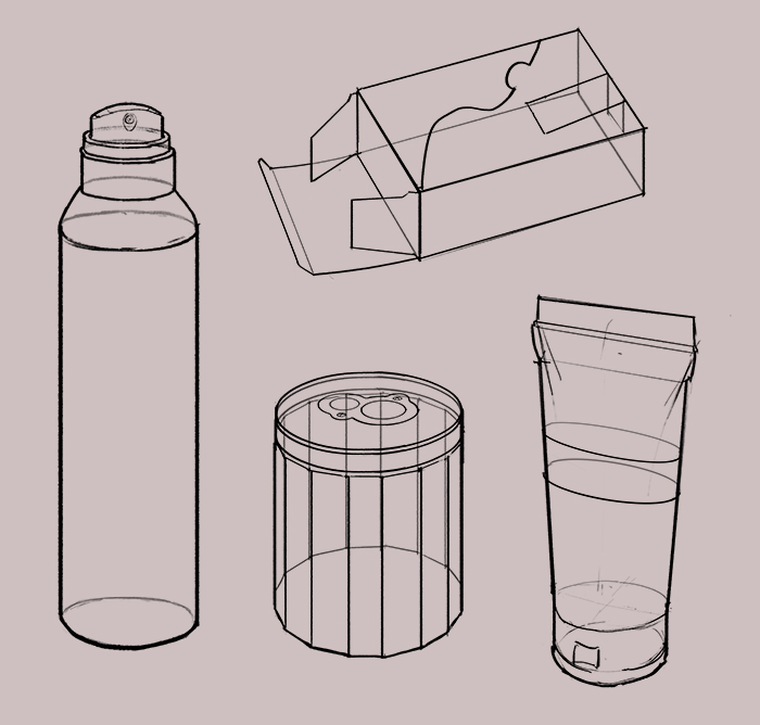
i have that same box that you drew for the line/perspective drawings haha; keep pushing!
I also love miles too he's got a calming voice
Posts: 2
Threads: 0
Joined: Apr 2013
Reputation:
0
I don't know that I'm in any sort of place to give you critique given that you're better than me but it looks like the bellybutton is a bit too high on the druid type chick. I feel like I usually see them around or slightly below the elbow line on women.
I might be wrong though. I only mention it because it'd probably be pretty easy to fix if it were a problem. Cool stuff man, you really nailed that emerald imo. Like if you squint at it it kinda looks like an out of focus photograph
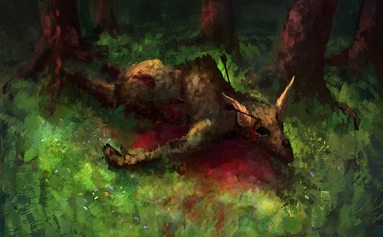
I really like the gestures but most importantly that onion is killing it =D. don't lose heart about the still lifes and keep it up. your colors are really good but the form of your subject tend to suffer (the dead moose painting). hope to see more from ya, cheers!
Posts: 53
Threads: 3
Joined: Jun 2013
Reputation:
0
Thanks alot guys! You're really pushing my motivation with those comments! :)
Beartankmaster
I appreciate every critique! And you're definetely right with the belly button! So yeah, if you got contructive critique, I'm sure no one on this forum or any other art related site would not appreciate it.
natori
I will paint still lifes from time to time, but as you mentioned it, color and light definetely are my comfort zone, especially when it comes to studying. So at the moment I really try to push my drawing and perspective skills.
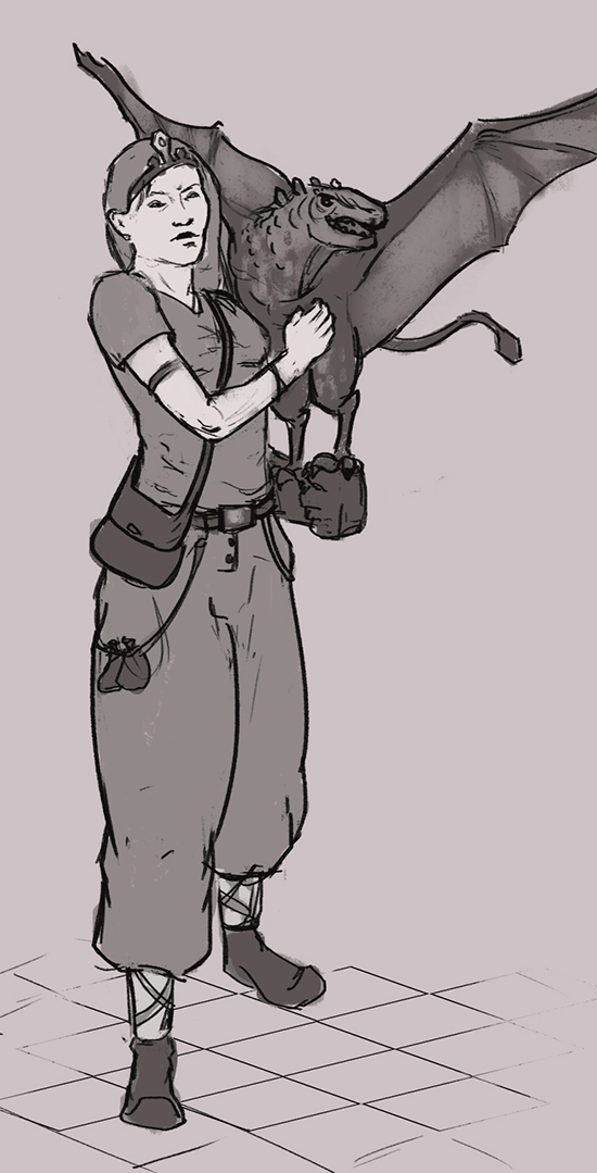
Here is some new stuff. I decided to participate in the current CHoW - The Dragon's Nanny.
I'm still in sketching phase, trying some designs.

And some quick photo study in the evening.

C&C as always more than welcome,
Cheers!
Posts: 53
Threads: 3
Joined: Jun 2013
Reputation:
0
A comment over at ca.org pushed me to another study. But it turned out pretty bad. No concentration .__.

Ima better go to sleep, haha.
Night!
|
