Posts: 84
Threads: 6
Joined: Oct 2012
Reputation:
3
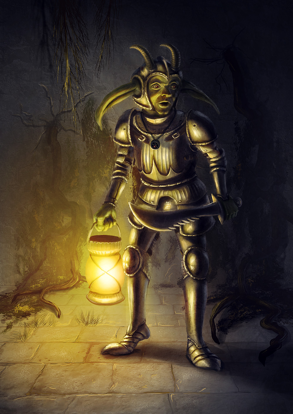
Elderscroller, this piece is off to a good start. I can think of a few things to try to improve it.
The biggest thing I'm seeing is that the lantern's light is hitting everything. It has a top and a bottom on it that look like they would block light. So, really, there should be a shadow on the ground beneath the lantern, and most of the stuff above his thigh or so wouldn't be catching the light, including the hand that holds it.
As far as that goes, the places lit will be areas of focus, and I don't know that you're trying to focus so much on his knee. I would position the lantern so that it can highlight his face. Right now it's also creating a tangent with his knee.
Compositionally, it's kind of static. Everything is very vertical. Try to work in some diagonals, with his limbs, with some sort of architectural elements coming forward from or taken out of the wall, or with cast shadows. You could even try to rotate or crop the image to see if you can find a more dynamic solution.
Also, the shapes of the roots in the background were a little confusing at first, too. I wasn't sure what they were. I would maybe get some reference for roots doing this to a building. Maybe google Angkor Wat or something. I think roots find existing cracks and push through, whereas what you have looks like the root popped a chunk out by itself.
I hope this helps. I think you've nailed the colors and atmosphere for a night scene like this, it's just a matter of making it work.
Posts: 86
Threads: 10
Joined: Jun 2012
Reputation:
2
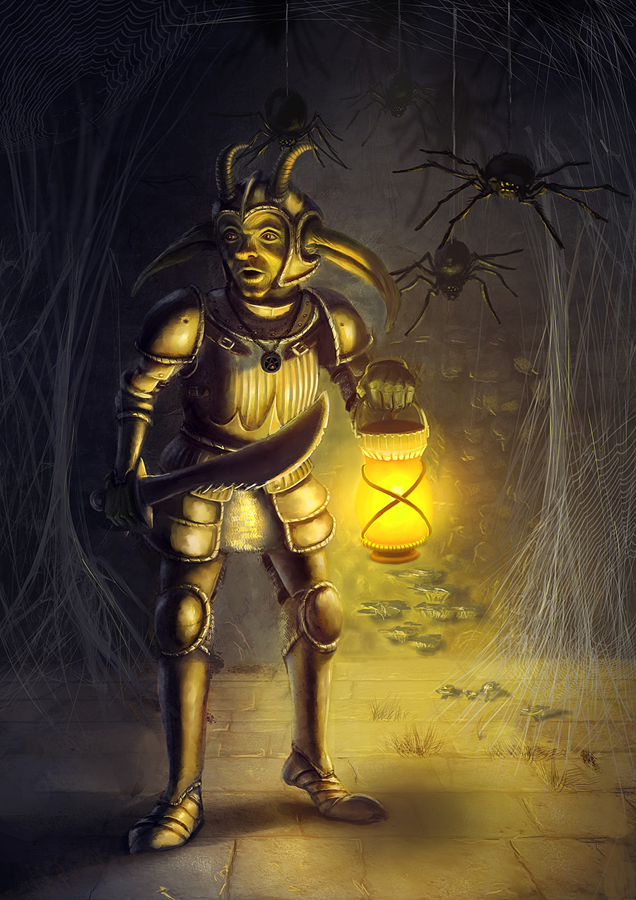
hey there, nice work so far
here's what i notice:
his head is a little deformed.
one of the horns is too large as is one of his ears.
the mushrooms look out of place.
the lighting in his face looks wrong according to the lamp.
the spider in his head is too distracting.
keep up the good work!
Posts: 782
Threads: 5
Joined: Jan 2013
Reputation:
22
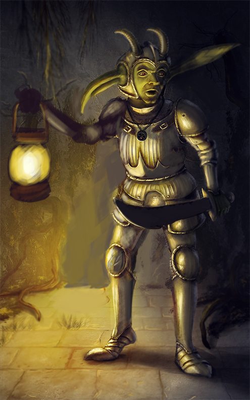
Thanks a lot for all your critiques, especially to Mike086 for the paintover. I found it really helpful for my future work!


