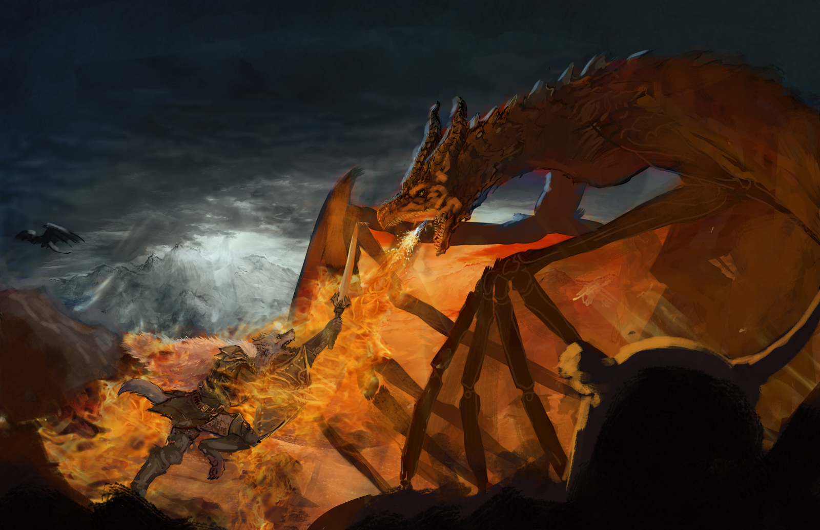
Thanks for your help and the video sorry I missed the stream..
One thing I find ironic is with the composition you suggested at the beginning, I didn't actually chose this composition, the commissioner did, otherwise it would have been the more dynamic angel of the back of the warrior vs the dragon .. I started of with about 6 -8 concepts for the peace and the commissioner just so happened to chose one I didn't like as much hey you win some you lose some I tried to work with it anyways

If the peace was my own and had no commissioner waiting, restating from a base point wouldn't be a bad idea but because its a commission I rather not leave the commissioner waiting to much longer I already made him wait long enough,
not to mentioned I have restarted the peace time and time again to try to make the composition he chose work ... easier said then done it just keeps felling flat and lifeless like you mentioned....
As for your questions in the video
the light is meant to be as sun set, no volcanoes ...part of the confusion is I changed were then sun is setting, from the middle of the image to the side to try to put more empathizes on the charter but I have yet to remove the original light source.
The background characters was idea from the commissioner wanted to be the leader of a pact of werewolf /wolf people, for some reason his request is for them to be savage without Armour and him more heroic/ more human in spirit,
the helmet was meant to be cracked or batten worn to much to wear as was meant to be owned by the charter in combat (though I have changes his Armour designed so drastically since then and it no longer in the same style of Armour as hes wearing) or belonged to another who has fallen fighting the dragon. although It was meant to be in the foreground like you stated at the end so I might change it up like you recommended to make it work better with the image.
another thing I might do is shade with blue shades on the characters maybe to make them stand out more? I dont know if that work well or not ..
another change I was thinking about making is instead of making the picture shorter maybe I could make it longer to try to use the rule of thirds that way ..
I do love the idea of using the green to bring out the peace I never thought of that, I also liked the suggestion for the wing as well as the advice on the character I try to implement some of the changes suggested.
As a side note I don’t think you have it anymore but if you do ...
do you think I could get the copy were you thought it was the sun (it is the sun)
also I like to see the blue line or the portion test you did on the character if possible so I can get his proportions right in the final peace.
Thanks so much for your help and advise!
I be posting more art here in the future.


