Help with fabric and arm.
#1
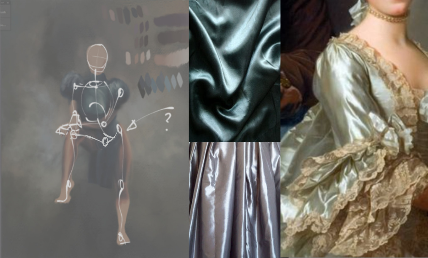
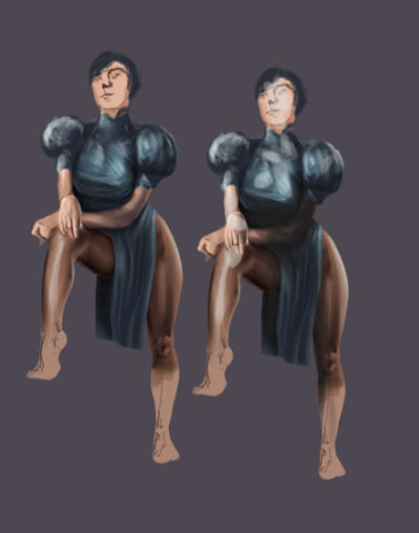
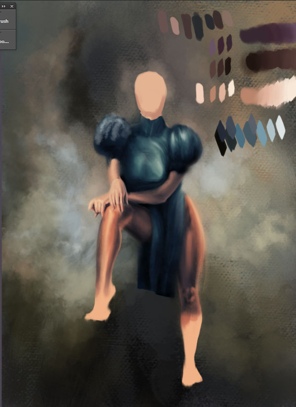
So, I'm having a bit of hard time getting this satin fabric appear satin without making it look too noisy. I'm going for a Rococo thing, so I want to make it look soft and creamy. Also, should I go lighter? I also feel like her exposed arm falls a little flat. I dunno. Lighting has got me all confused.


Reply
#2
First things first, I think your pose is really off at the hips. You will need to fix that first as it is the base for everything else on the figure. Torso is very straight, that curve to the hip is incredibly sharp, and her hip joints and where the trocantors connect are out of plane.

Next. Reference reference reference. Have you gathered any?

Here's some. Satin highlights are relatively sharp with a fair amount of sheen. The fabric folds are very linear and angular. It reflects a fair amount of light even in shadowed areas.


Do you know what your value scheme and lighting sources are going to be before getting this far? Do you have a reference painting you are trying to emulate? If not gather your reference, do value sketches, thumbnails experimenting and honing these down first. Depends how much work you want to do grinding on the actual painting side of things, or sort the issues out first, gather what you need to help you do what you haven't before, and then have fun painting.
Hope that helps.

 YouTube free learnin! | DeviantArt | Old Folio | Insta
Reply
#3
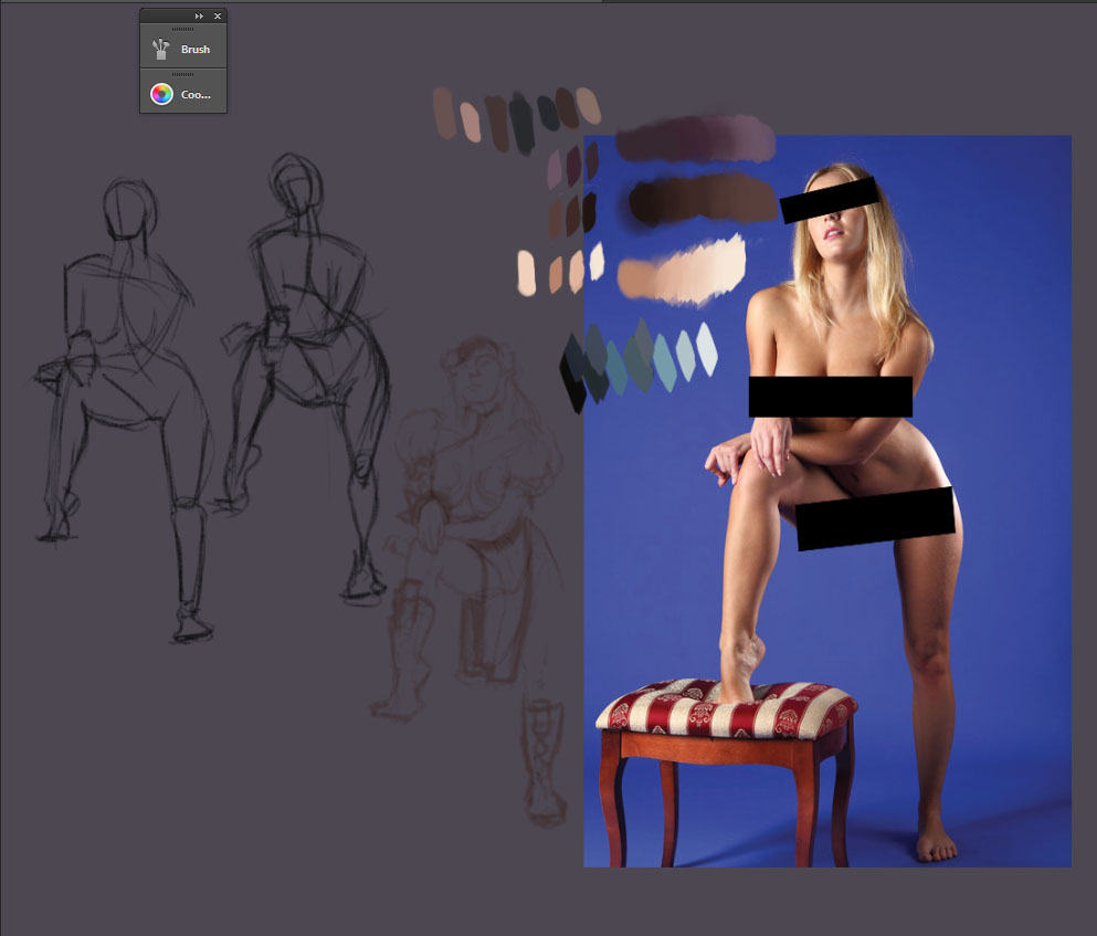
I made some gestures from this reference. then I filled it out with a solid color. I've looked at satin material over the net and noticed they generally only has 3 values. So, I thought this would be easy: sharp folds, sharper, brighter highlights with creases being the darkest. But, I keep screwing up the forms of the folds and those very subtle ones sharp edges but not too bright or dark on the value. I end up making the whole attire look too bright or too dark and saturated. Anyways, thats my palette there and my sketches.


Reply
#4
Ok cool so the pose is quite extreme. In this case it's your foreshortening that is off on the torso and front leg that is creating that uber sharp hip look. The left sketch in that last image, you actually nailed it for the most part, but I think you've lost that original clarity with muddier values in the main painting as well as the drapery off that inner thigh, which brings the leg much closer to the other one than it actually is.. Always refer back to the original thumbs, gestures where you solved the issues as you are painting. It's easy to get off track if you don't keep checking.

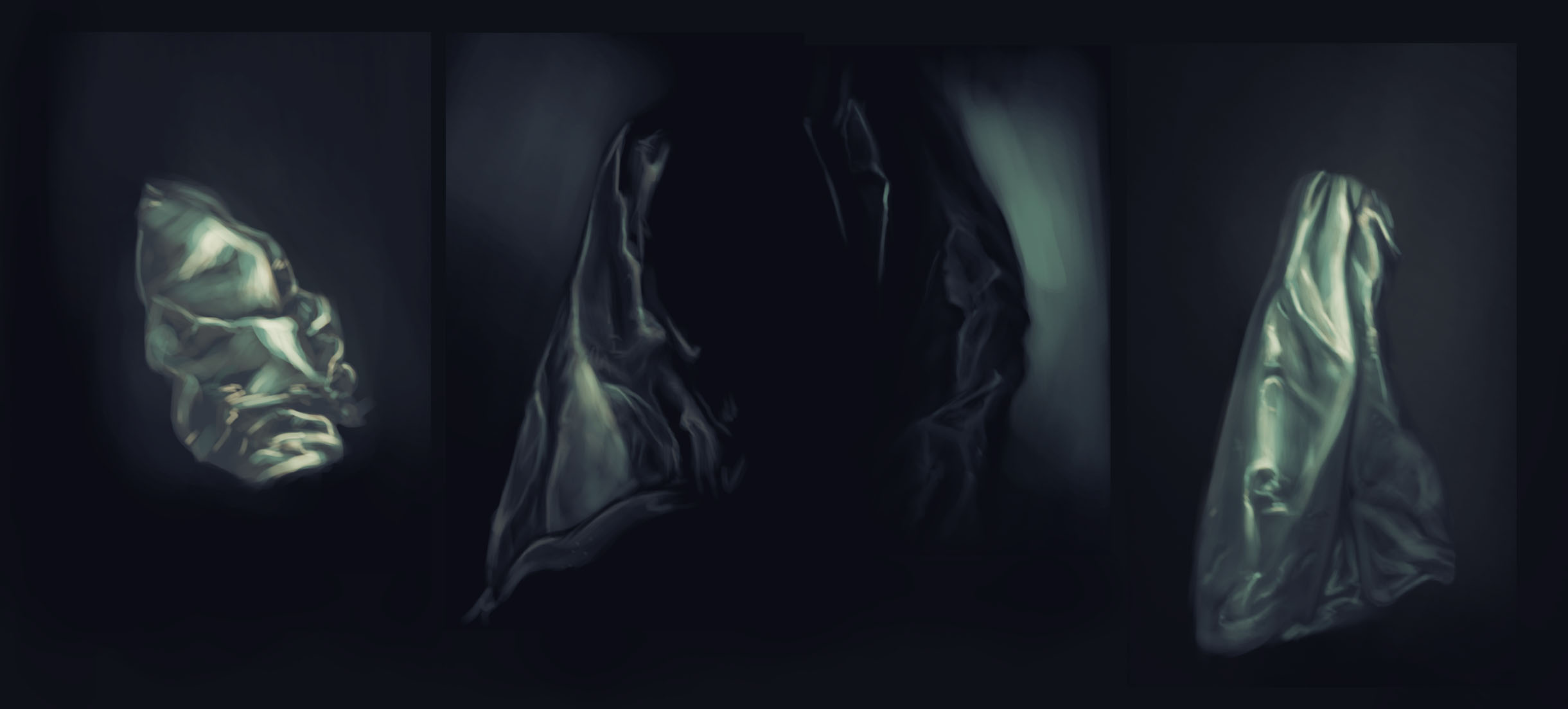
Did you do actual painting studies of the satin? Looking at an image is one thing, but sometimes if you really have to understand something, the best thing to do is do a study. I also think that because it seems like you haven't really resolved your lighting completely (front and side lit?) it will be harder to figure out convincing satin because it really depends on those highlights and the light interactions on it to read!

 YouTube free learnin! | DeviantArt | Old Folio | Insta
Reply
#5
yeah, i thought i'd learn as I go through with this, but it seems like I'll need to do some few studies before i go back on this dress.
Reply
#6
I feel like I'm having trouble on structure


Reply
#7
Those are looking nice. I think the most successful is the one on the right and the middle left in terms of fold structure and material. The one on the left doesn't feel realistic fold wise for some reason. Reference will always help with folds. Nice man, now apply :)
 YouTube free learnin! | DeviantArt | Old Folio | Insta
Reply
#8
(01-15-2014, 07:26 AM)monkeybread Wrote: Those are looking nice. I think the most successful is the one on the right and the middle left in terms of fold structure and material. The one on the left doesn't feel realistic fold wise for some reason. Reference will always help with folds. Nice man, now apply :)

yeah, I definitely feel like I need to improve the structure of the clothing, which makes me hesitant to proceed with this little project. All in all, I'm going to drop this and work on some studies to get a better grasp cause I dont think I can pull this off straight from my head, haha.
Reply


Forum Jump:


Users browsing this thread: 16 Guest(s)