04-16-2014, 12:44 PM
|
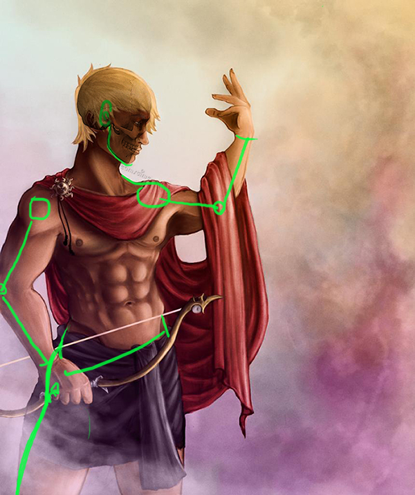
Apollo Illustration in Need Critique and/or Paintover asap
|
|
04-17-2014, 01:41 PM
Nice rendering skills! I like how you organized the light around his head to show he's the sun god. Maybe you can even push that further and have a stronger light/dark contrast to emphasize the point.
Just a couple of detail things - his arm lengths are different, and very noticeably so. His hip is looking a little wide for a male (maybe that's just me though, double check). His jaw is too far back. 
04-18-2014, 04:47 AM
(04-17-2014, 01:41 PM)meat Wrote: Nice rendering skills! I like how you organized the light around his head to show he's the sun god. Maybe you can even push that further and have a stronger light/dark contrast to emphasize the point. Thanks! That helps a lot, I see what you mean about the jaw and the arms
05-09-2014, 04:06 PM
05-27-2014, 11:22 PM
(05-09-2014, 04:06 PM)Dark-fenrir Wrote: The face is looking more natural definitely. You'll need to move that neck muscle forward to meet with the ear and the jaw too. One of the arm still look much shorter than the other, but you might just make that a note for next painting if repainting here is too much work for you atm.
05-28-2014, 01:24 PM
Don't be afraid to erase and re-work complete sections of your painting. I know it is a drag, but the second and some times third time always goes twice as fast.
If you know the anatomy is off you need to fix it, if you don't you rob yourself of a great learning experience. I just got done fixing some anatomy issues in a painting I thought was done:/ Have fun with it.
Eric
Elmstreetart.com |
|
« Next Oldest | Next Newest »
|
Users browsing this thread: 1 Guest(s)


![[Image: Apollo12.jpg]](http://i1269.photobucket.com/albums/jj594/dark-fenrir7/Apollo12.jpg)

![[Image: Apollo16.jpg]](http://i1269.photobucket.com/albums/jj594/dark-fenrir7/Apollo16.jpg)