Posts: 25
Threads: 1
Joined: Nov 2013
Reputation:
1
Posts: 25
Threads: 1
Joined: Nov 2013
Reputation:
1
Posts: 1,527
Threads: 24
Joined: Dec 2012
Reputation:
70
Hey Ashley! Seeing some hard work in here, which I'm loviiiiing!
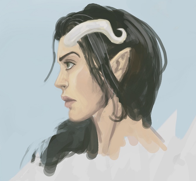
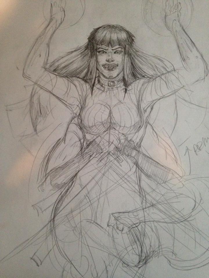
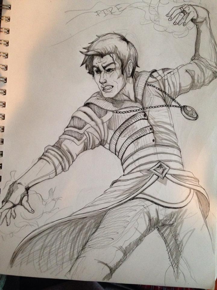
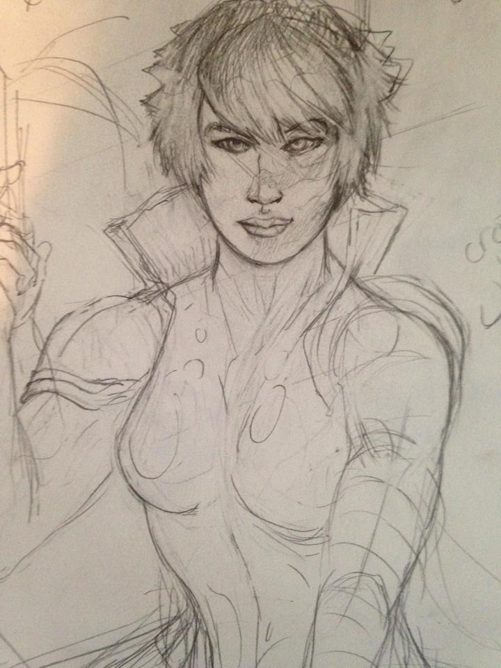
The first pieces look good, you seem to have a good handle on anatomy already, my thoughts are that you should try to focus more on form and value. Form in the body would include observing the planes of the body/wireframes. And for value, I mention this because I noticed you seem to have used solid black in the Herne the Hunter piece... which can in turn break the 3d illusion within a 2d space.
Here are some wonderrrful links (if you already know about them, my bad :3) to some interesting skin tutorials:
http://navate.deviantart.com/art/SKIN-a-...-144294636
http://navate.deviantart.com/art/SKIN-a-...-145159387
http://muddycolors.blogspot.com.au/2013/...today.html
I hope you find these helpful, I know I sure did ~
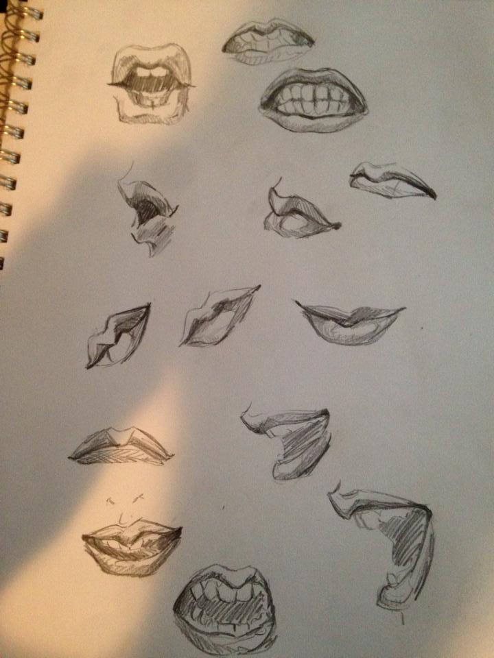
Anyways, keep up the killer work and you'll be smiling -cheekily- in no time!
sketchbook | pg 52
"Not a single thing in this world isn't in the process of becoming something else."
I'll be back - it's an odyssey, after all
Posts: 25
Threads: 1
Joined: Nov 2013
Reputation:
1
Thanks so much for the feedback~! :) Value and texture (especially skin) is something I definitely struggle with, and those links you posted are amazing, thanks so much!
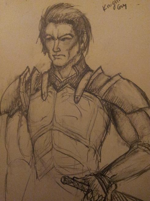
And here's a knight dude doodle before I hit the hay

Posts: 25
Threads: 1
Joined: Nov 2013
Reputation:
1
(01-15-2014, 09:21 AM)smrrfette Wrote: Hey Ashley! Seeing some hard work in here, which I'm loviiiiing!
The first pieces look good, you seem to have a good handle on anatomy already, my thoughts are that you should try to focus more on form and value. Form in the body would include observing the planes of the body/wireframes. And for value, I mention this because I noticed you seem to have used solid black in the Herne the Hunter piece... which can in turn break the 3d illusion within a 2d space.
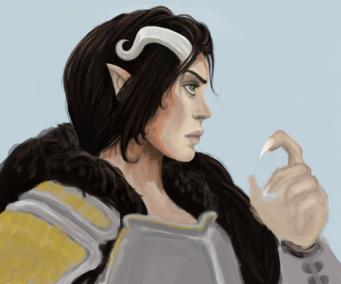
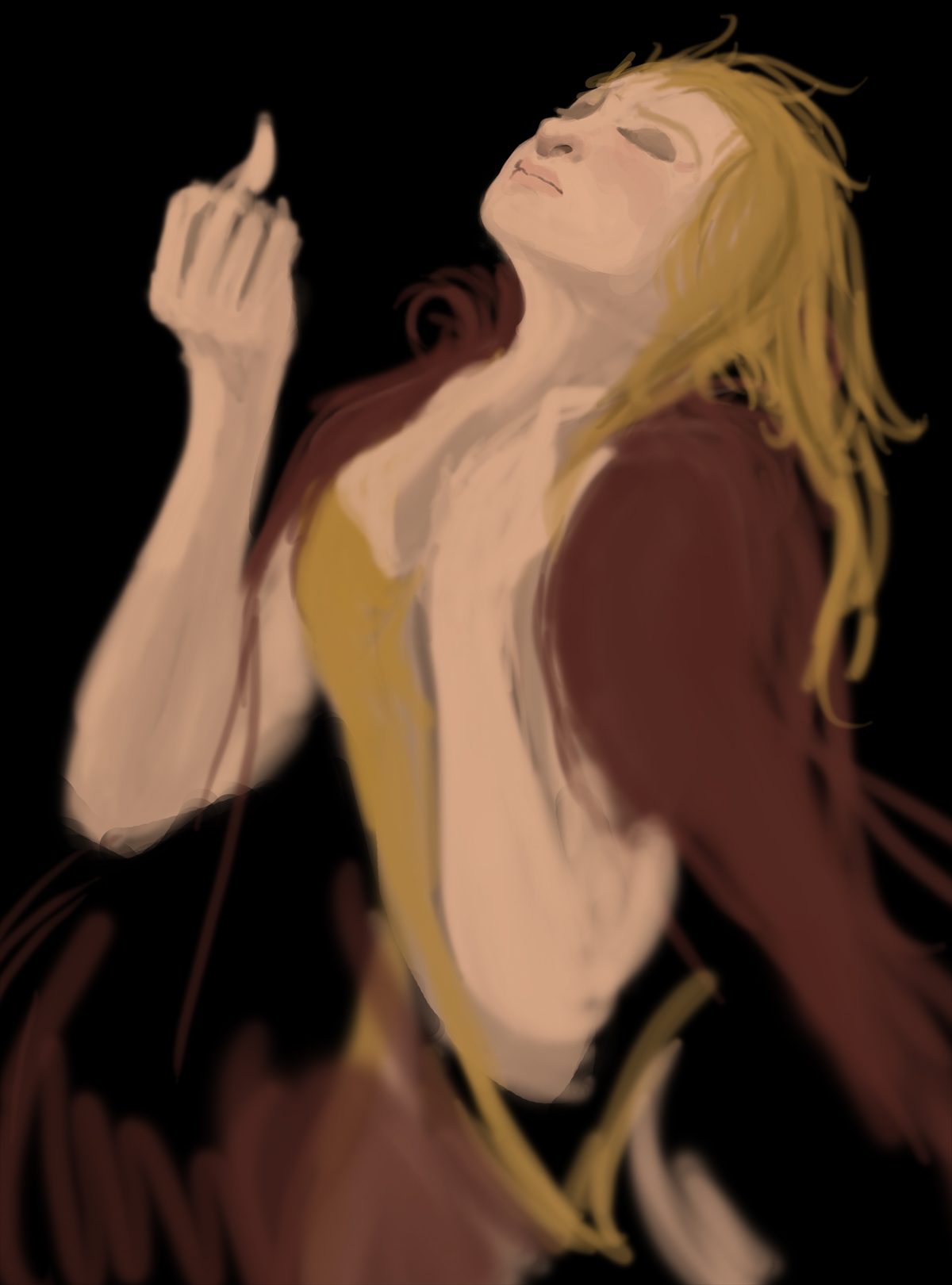
So I took a look at those skin tutorials and fiddled around with trying those for skin; here's a wip from imagination, about 2 hours in:

Probably just gonna paint naked people for a while til I get it right 
Posts: 905
Threads: 39
Joined: Sep 2013
Reputation:
51
When you're drawing your figure, try having the curves overlap each other at one end - not like an X, only one side. Right now a lot of them are like 1 continuous long line with bumps all the way down one side. Having that line broken up into multiple arcs and curves, and have them overlap can help add feel of 3D-ness. Try it!
Posts: 25
Threads: 1
Joined: Nov 2013
Reputation:
1
Quick post; dragon person. Studies tonight!

Posts: 25
Threads: 1
Joined: Nov 2013
Reputation:
1
Posts: 25
Threads: 1
Joined: Nov 2013
Reputation:
1
I suck at keeping up with this. Haha Have to start really making time to post stuff.
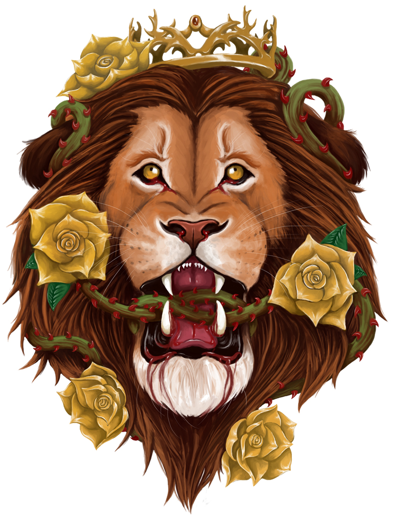
Here's some stuff I've done for my friends' bands!


Posts: 45
Threads: 2
Joined: Mar 2014
Reputation:
0
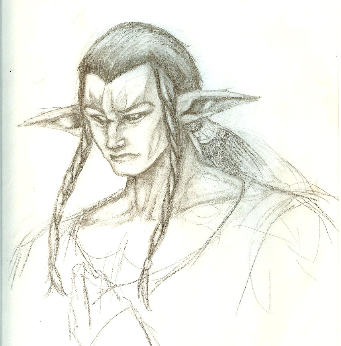
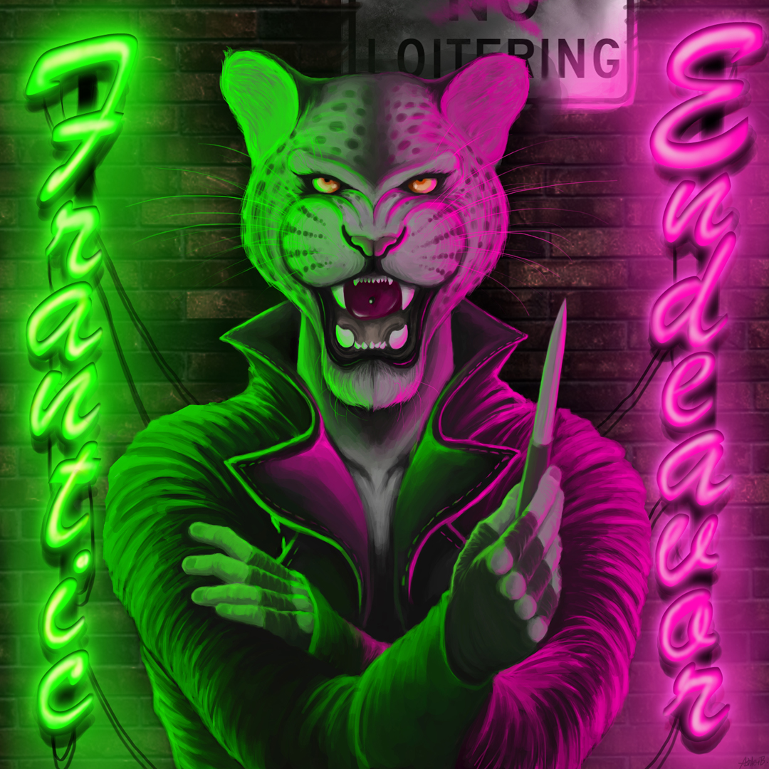
I like the tiger and your very first demon drawing a lot! And that owl... Wow.
Posts: 25
Threads: 1
Joined: Nov 2013
Reputation:
1
(03-28-2014, 05:12 AM)Kaycee Wrote: I like the tiger and your very first demon drawing a lot! And that owl... Wow.
Thanks so much!! :) I took a look at your sketchbook too, keep it up!!!!! <3
Posts: 25
Threads: 1
Joined: Nov 2013
Reputation:
1
 05-16-2014, 12:41 PM
Gotta post more of my studies as I do them, no excuses. So many places to post art on the internets
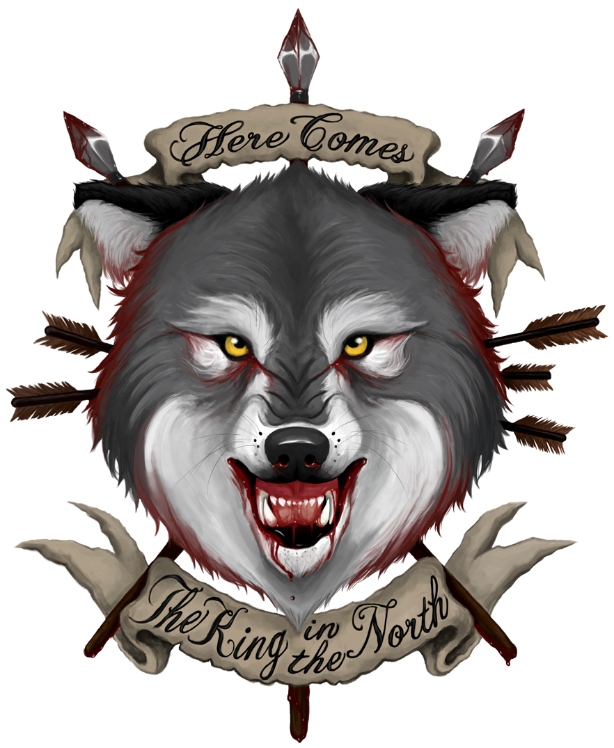
Here's some latest stuff, Game of Thrones fan art. Now back to woooork


Posts: 25
Threads: 1
Joined: Nov 2013
Reputation:
1
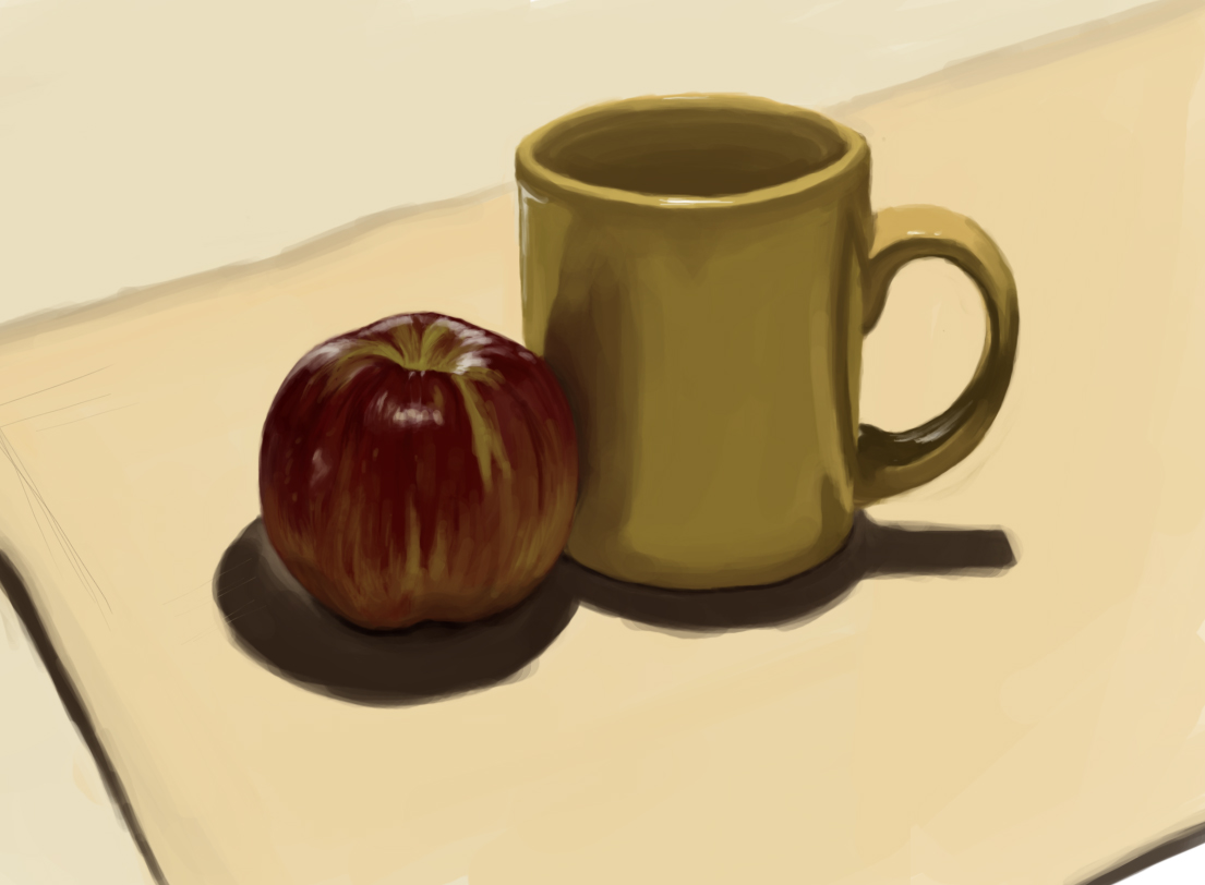
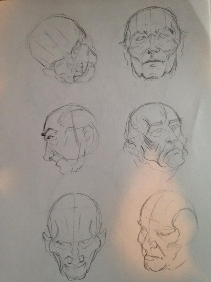
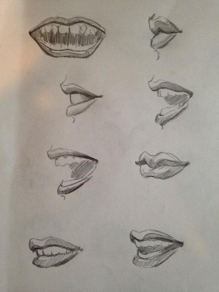
Studyyyyyyyyy trying to do way more of them

Posts: 25
Threads: 1
Joined: Nov 2013
Reputation:
1
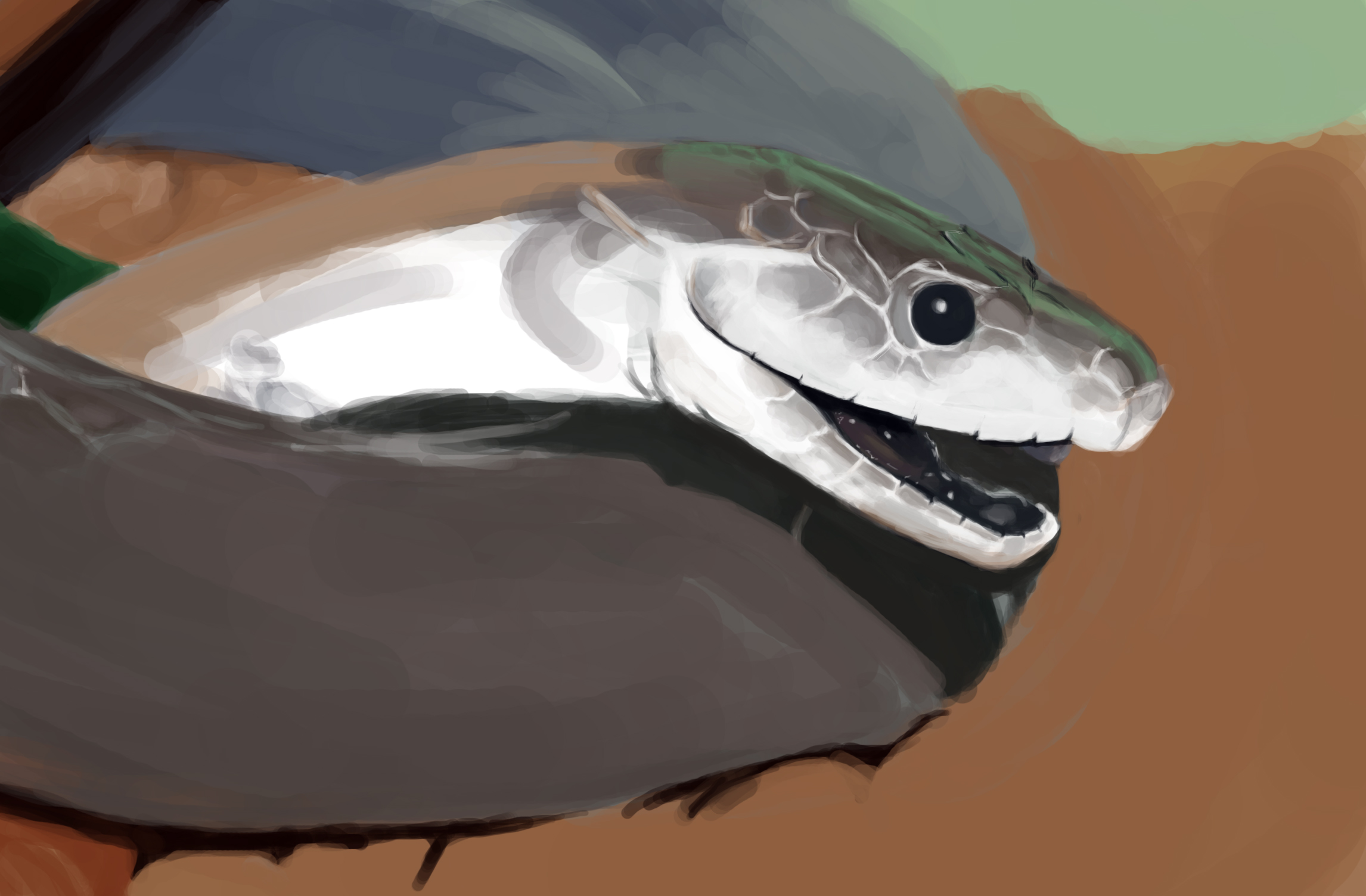
Snake study wip cuz I'm gonna start a painting with a snake haha

Posts: 905
Threads: 39
Joined: Sep 2013
Reputation:
51
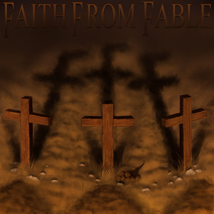
I like your album covers, the green and magenta leopard, the 3 wooden crosses, and the GoT fan arts. I'm not sure if it's related to graphics design or illustration, but you're good at cover-like stuff - storytelling stuff that's not utilizing things like a stage with background and character. Does that make sense?
Posts: 25
Threads: 1
Joined: Nov 2013
Reputation:
1
(05-31-2014, 02:38 PM)meat Wrote: I like your album covers, the green and magenta leopard, the 3 wooden crosses, and the GoT fan arts. I'm not sure if it's related to graphics design or illustration, but you're good at cover-like stuff - storytelling stuff that's not utilizing things like a stage with background and character. Does that make sense? Thanks!!!
Yeah, I know what you're saying. I'd like to push myself out of that comfort zone though and do full blown paintings with narrative and stuff, stuff thats more fluid than what I'm doing. I think the only reason I'm sorta good at cover-stuff is because most of the work I do for people is for local bands haha
Posts: 25
Threads: 1
Joined: Nov 2013
Reputation:
1
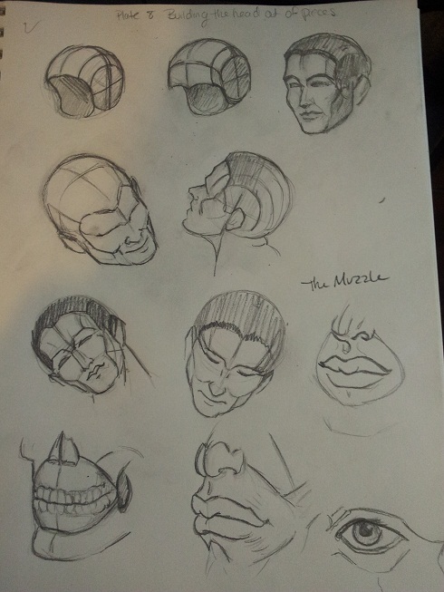
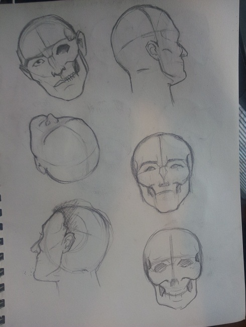
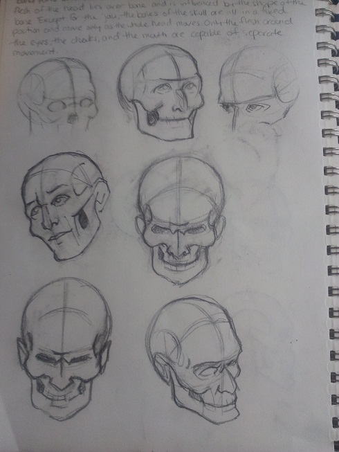
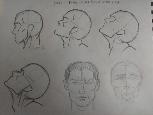
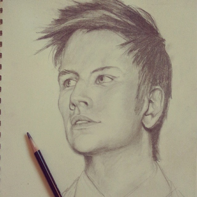
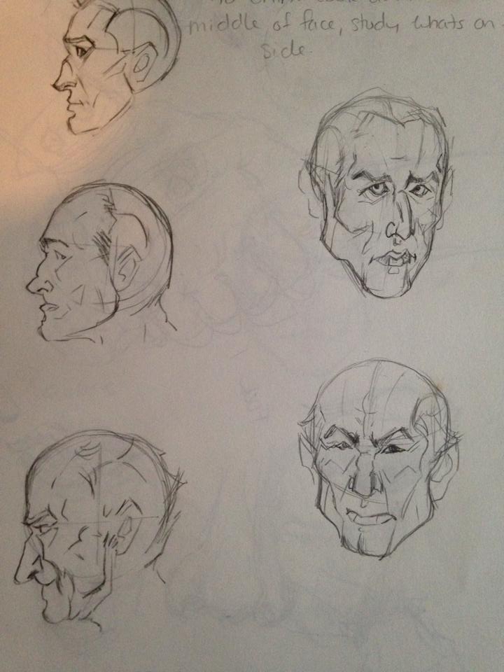
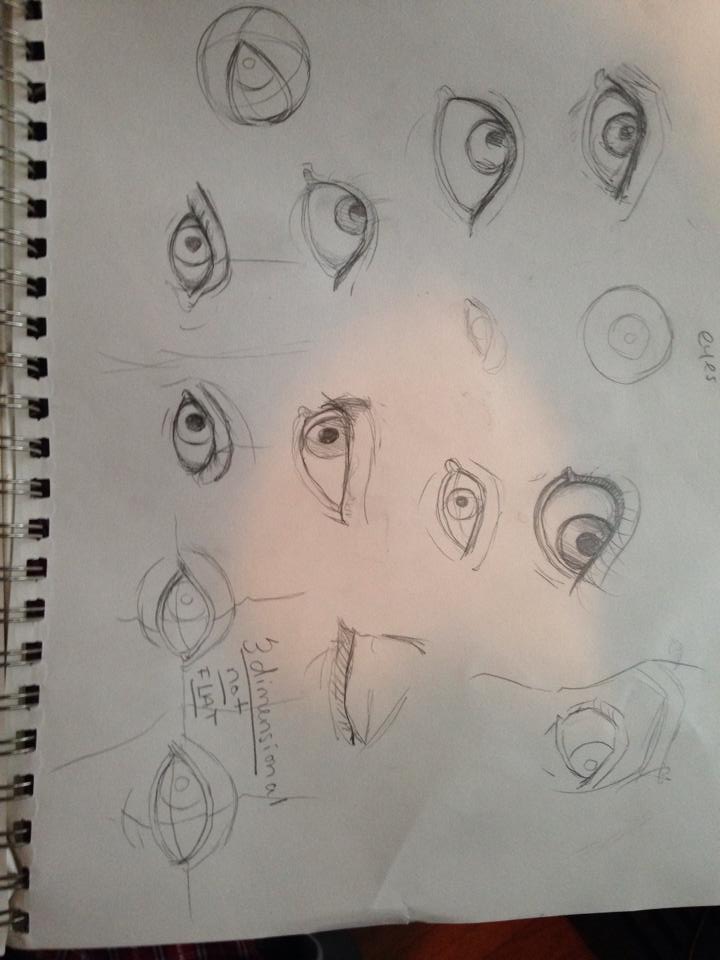
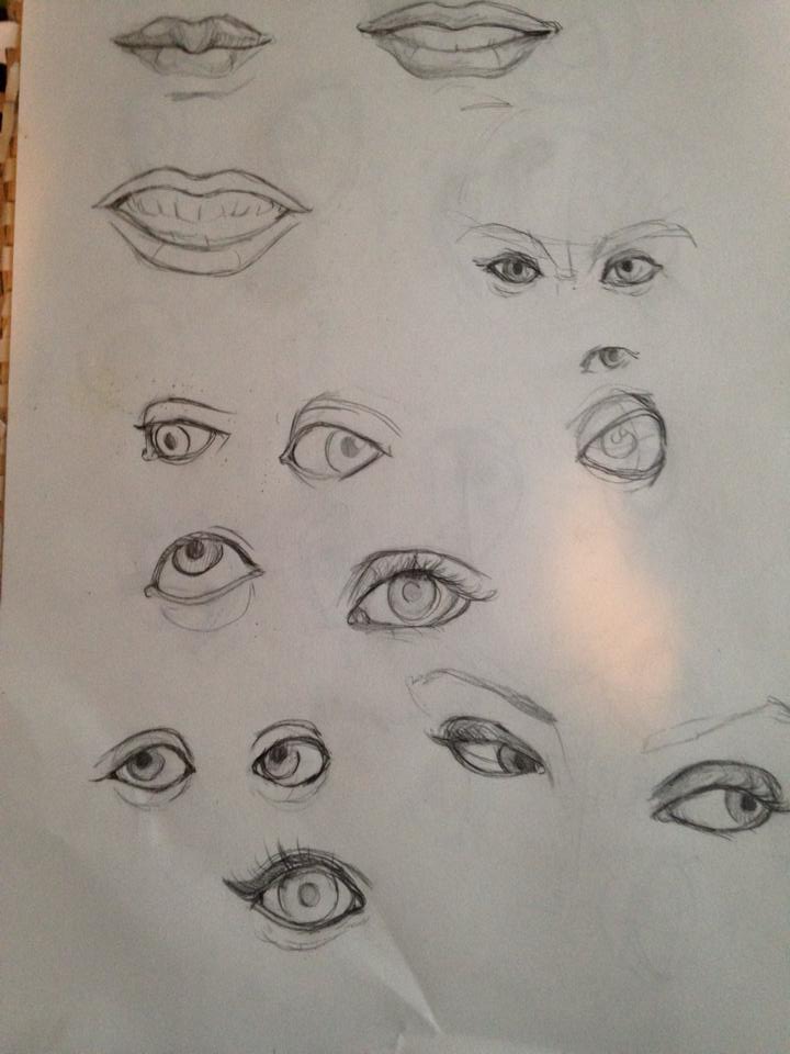
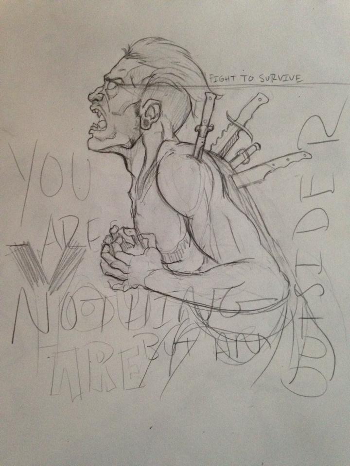
So much for doing something different haha Design for a band wip. More studies soon, need to get my scanner hooked up. Been working out of the Loomis books to improve my faces

Posts: 25
Threads: 1
Joined: Nov 2013
Reputation:
1
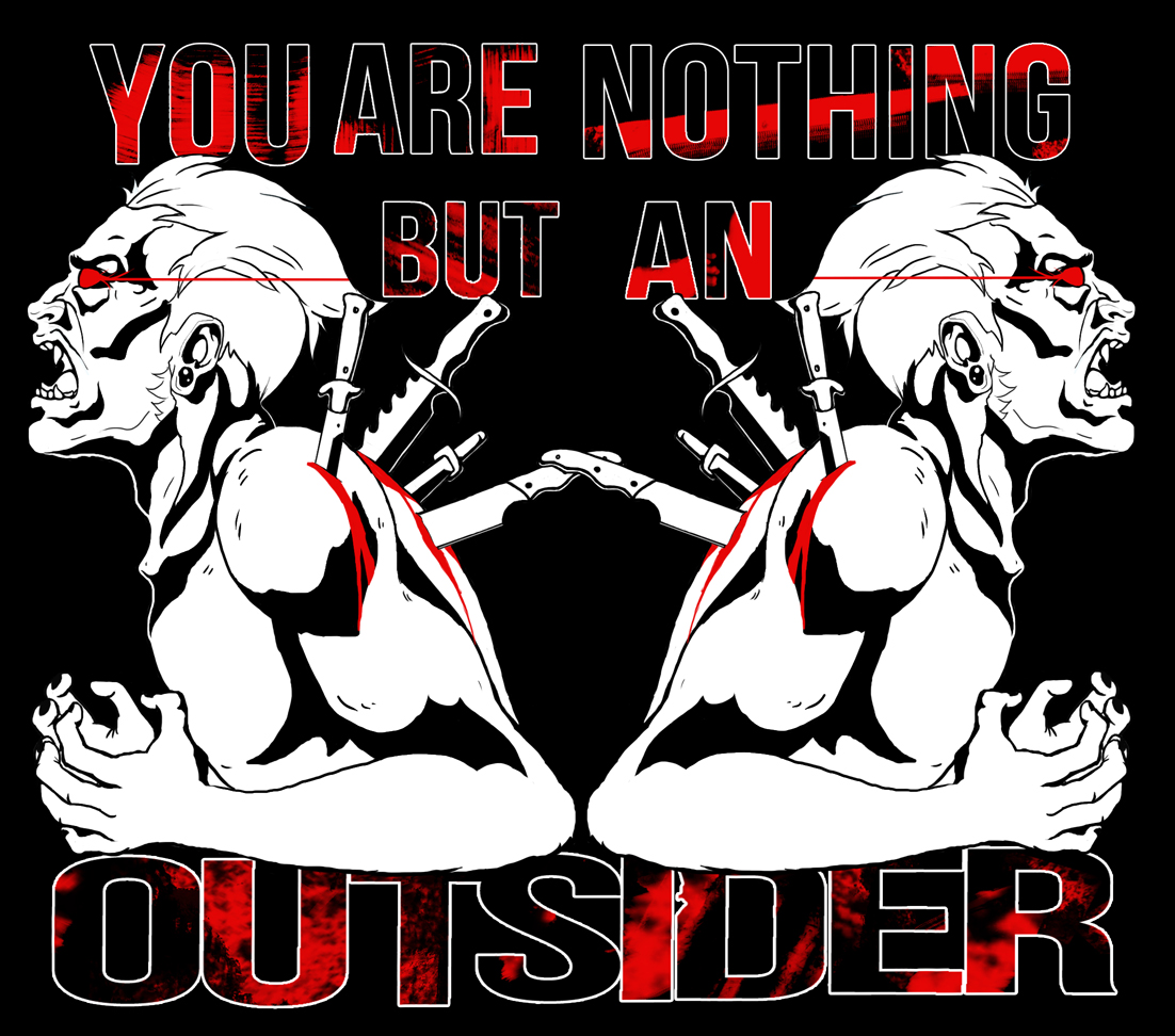
finished shirt design. Going to start having to turn down work like this, Im so sick of it lol

Posts: 25
Threads: 1
Joined: Nov 2013
Reputation:
1
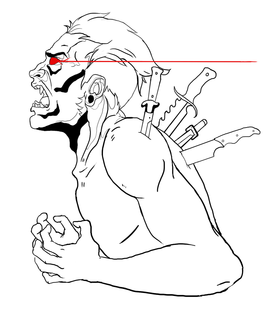
wip thing

Posts: 25
Threads: 1
Joined: Nov 2013
Reputation:
1
|
![[Image: succuboxer_by_ashley_the_dragon-d6zo5ua_zpse727909c.jpg]](http://i1319.photobucket.com/albums/t669/ashley_barrett3/succuboxer_by_ashley_the_dragon-d6zo5ua_zpse727909c.jpg)
![[Image: phoenix_lady_by_ashley_the_dragon-d6zo5d...98b771.jpg]](http://i1319.photobucket.com/albums/t669/ashley_barrett3/phoenix_lady_by_ashley_the_dragon-d6zo5dp_zps9998b771.jpg)
![[Image: alien_girl_by_ashley_the_dragon-d6zo49y_zpsef749a05.jpg]](http://i1319.photobucket.com/albums/t669/ashley_barrett3/alien_girl_by_ashley_the_dragon-d6zo49y_zpsef749a05.jpg)
![[Image: herne_the_hunter_by_ashley_the_dragon-d6...g~original]](http://i1319.photobucket.com/albums/t669/ashley_barrett3/herne_the_hunter_by_ashley_the_dragon-d6zo33r1_zpsc3b8cd96.jpg~original)
![[Image: hernecropsmall_zpsda7ac855.jpg~original]](http://i1319.photobucket.com/albums/t669/ashley_barrett3/hernecropsmall_zpsda7ac855.jpg~original)
![[Image: 0659e5f3-216e-4a1b-b420-8b16c9dcc28c_zps...1389470980]](http://i1319.photobucket.com/albums/t669/ashley_barrett3/0659e5f3-216e-4a1b-b420-8b16c9dcc28c_zpsd1ab47f2.jpg?t=1389470980)
![[Image: 054db81a-1a65-4631-a29a-e56b92d6a77d_zps...1389471059]](http://i1319.photobucket.com/albums/t669/ashley_barrett3/054db81a-1a65-4631-a29a-e56b92d6a77d_zps6a8a5bd5.jpg?t=1389471059)
![[Image: 2803d80d-75a3-41ac-a90b-e5af56049d73_zps...1389471218]](http://i1319.photobucket.com/albums/t669/ashley_barrett3/2803d80d-75a3-41ac-a90b-e5af56049d73_zpse9d5a5d6.jpg?t=1389471218)
![[Image: 534d052f-5612-44ea-8a1a-8eabab8f81c4_zps...1389471295]](http://i1319.photobucket.com/albums/t669/ashley_barrett3/534d052f-5612-44ea-8a1a-8eabab8f81c4_zpsa88430f4.jpg?t=1389471295)
![[Image: 003122ca-c6b8-4bf0-988e-f61c44f7f055_zps...1389471366]](http://i1319.photobucket.com/albums/t669/ashley_barrett3/003122ca-c6b8-4bf0-988e-f61c44f7f055_zpsb7e39302.jpg?t=1389471366)
![[Image: 5af7c962-dbc8-433c-8cda-d6e7f6a12c4d_zps...1389471426]](http://i1319.photobucket.com/albums/t669/ashley_barrett3/5af7c962-dbc8-433c-8cda-d6e7f6a12c4d_zps2c6bc48d.jpg?t=1389471426)
![[Image: e6790787-dc04-4c6f-b8d6-417e23d63c9e_zps...1389471536]](http://i1319.photobucket.com/albums/t669/ashley_barrett3/e6790787-dc04-4c6f-b8d6-417e23d63c9e_zps49039b1f.jpg?t=1389471536)
![[Image: d29b2e7b-9ed1-447f-981e-6ff53d70b089_zps...1389471684]](http://i1319.photobucket.com/albums/t669/ashley_barrett3/d29b2e7b-9ed1-447f-981e-6ff53d70b089_zpsf24a074e.jpg?t=1389471684)
![[Image: 34bc2f54-4cbd-4a25-ab4a-9103c80feb26_zps...1389472005]](http://i1319.photobucket.com/albums/t669/ashley_barrett3/34bc2f54-4cbd-4a25-ab4a-9103c80feb26_zps1ece8eff.jpg?t=1389472005)


