08-14-2014, 11:16 PM

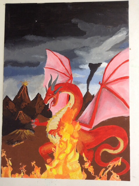
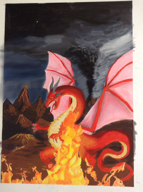
please tell me how can make this picture look more real, and what I need to practice on to get better.
thank you.
|
feedback please
|
|
08-14-2014, 11:16 PM
 please tell me how can make this picture look more real, and what I need to practice on to get better. thank you.
08-15-2014, 04:03 AM
When you say "real" are you talking about Game of Thrones type of real looking dragon in anatomy research, texture, movement, and lighting? You can have simplified designs of terrain and creature with realistic lighting, and that's a type of "real". Or you can have realistic texture on caricature anatomy. What I mean is you need to be more specific about what you're after because "real" and "better" can mean way too many things. It's like building a house from scratch and telling the architect you want it "big" and "nice". So think about what you're after, and help us out here with some more description of your goal. Or even example image of another art work that represents what you're after helps too.
You've done a nice job with the lighting on the dragon and fire so far. So let's look at the stage it's in. For starter, you've set some kind of perspective with the mountains, but the ground leading up to it doesn't share their shading or texture. It's completely flat and detail-less. Secondly, use reference photo of volcanoes and cloudy sky, if you're going to adhere more to real life terrain and not terrain that aims more towards mood-setting and story-telling instead of real-life representation. If you darken the sky behind the dragon more, the dragon will shine more out of the whole picture, and we'll really focus on it.  |
|
« Next Oldest | Next Newest »
|