Critique needed
#1
So I initially started to play around with colors with no real concept behind the overall painting. Along the way, I hit a snag when I was trying to figure out how I could reflect light from the flower petals on to the skin, clothes on the figure and sword. I'll admit I wasnt brave enough to make a drastic change since I'm not very knowledgeable. Are the any other things I should fix besides composition?


Reply
#2
I think the coloring is beautiful! Its really pleasant for the eyes : )

What I would change is maybe where finn and the grave is placed in the picture, I can't really explain why, but it feels off.

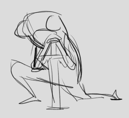
I would also change how he holds that sword, he is supposed to be reclining against it and then it would be better if you could feel that he is putting his weight on it


like so but better obviously ^^

Otherwise it looks great to me : ) like i said love those colors!

My sketchySketchy book

MY tumblerone

Reply
#3
yeah, I like that gesture even more. I'm sure that will bring more emotion.
Reply
#4
yay adventure time! stunning lighting, i love the luminescence of the whole piece.
completely agree with the crit before me, really get that gesture solid and show were the weight is.
not much to add actually, nice work!

Train, gain, or stay the same.
Deviantart
Sketchberk
Reply


Forum Jump:


Users browsing this thread: 10 Guest(s)