Posts: 19
Threads: 2
Joined: Aug 2014
Reputation:
0
Hi!
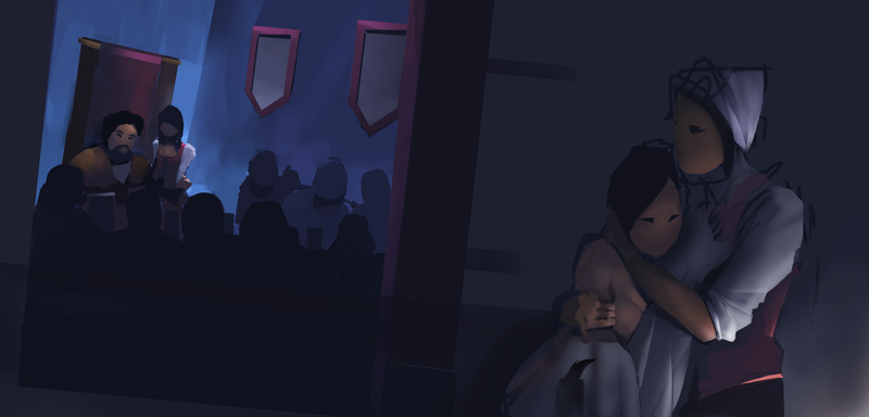
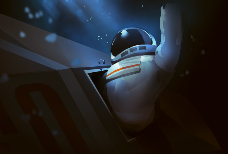
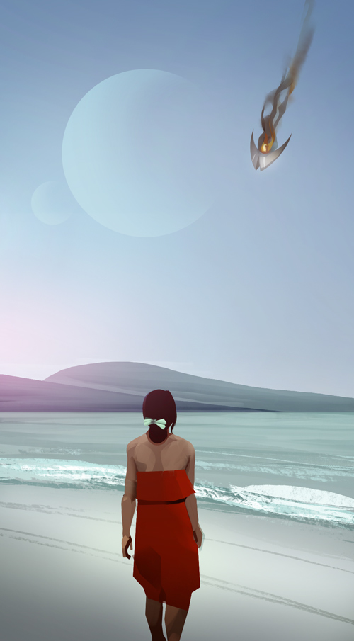
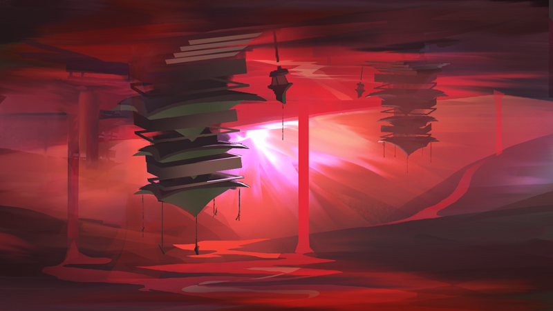
I'm Olof. I'm an artist looking for some feedback while learning new things.
I hope to use the sketchbook section as a way to post sketches, unfinished and works in progress - in contrast to places like tumblr or deviantart where I want to present finished pieces.
Nice to meet you!


Posts: 448
Threads: 1
Joined: Feb 2013
Reputation:
6
Hey, welcome to CD.
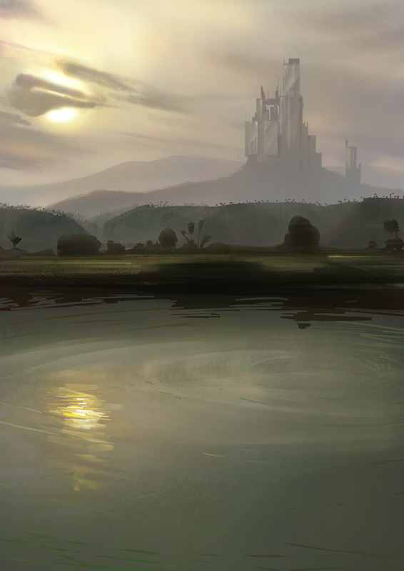
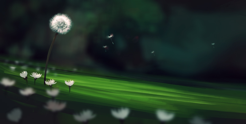
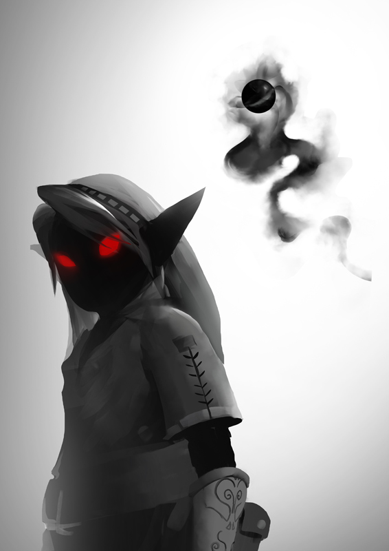
Loving your rendering style, pretty cool.
Haven't seen Battlefield Heroes for quite some time, are those just studies or official art?
Posts: 19
Threads: 2
Joined: Aug 2014
Reputation:
0
Posts: 448
Threads: 1
Joined: Feb 2013
Reputation:
6
Ah nice nice, I think I played a bit right at release but didn't have much time, it was fun!
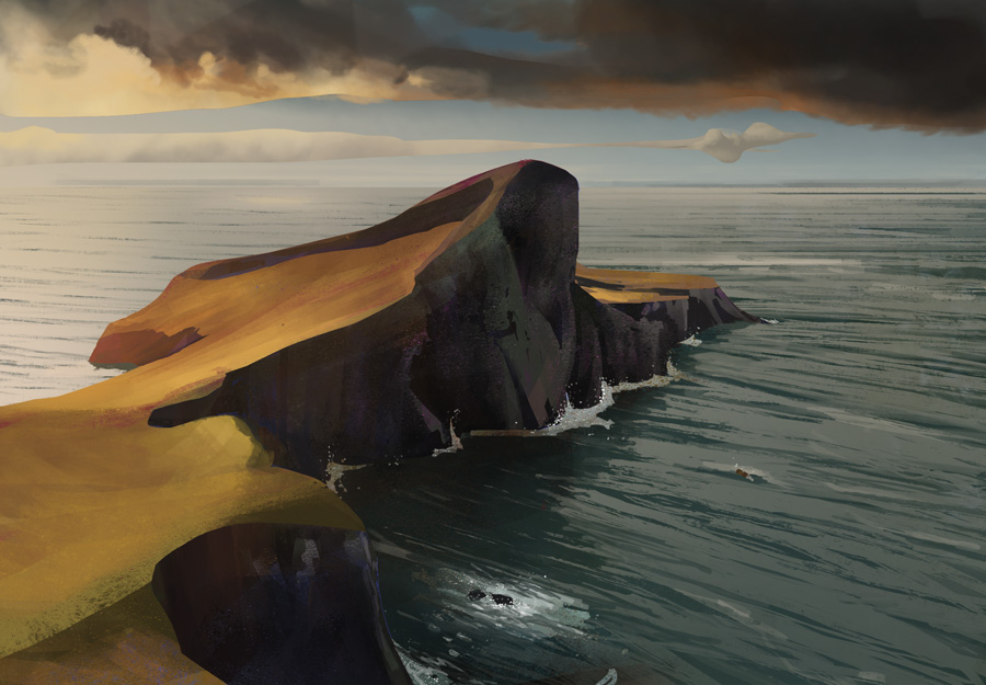
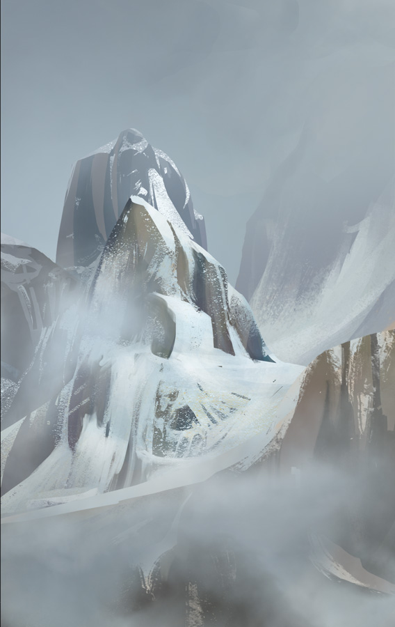
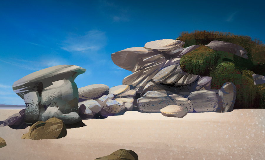
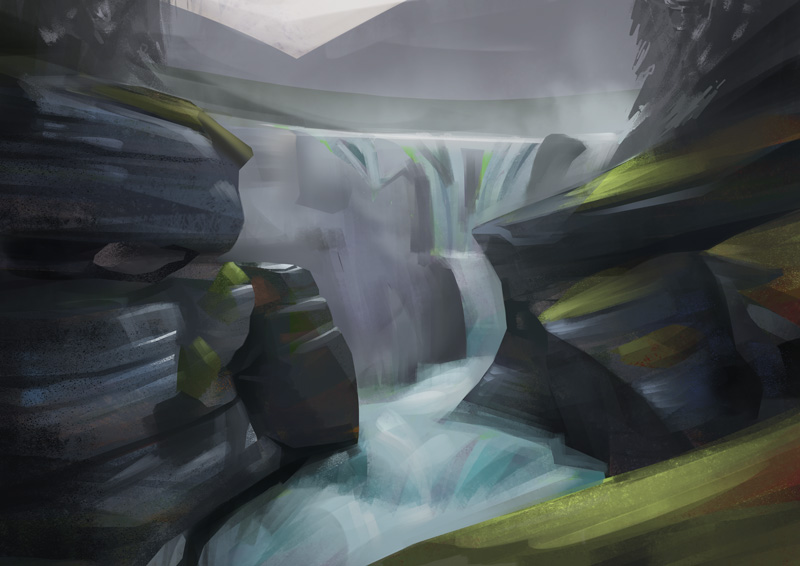
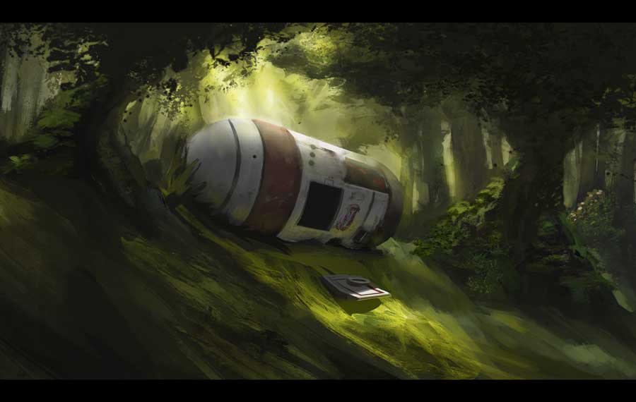
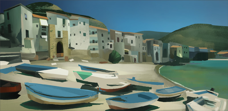
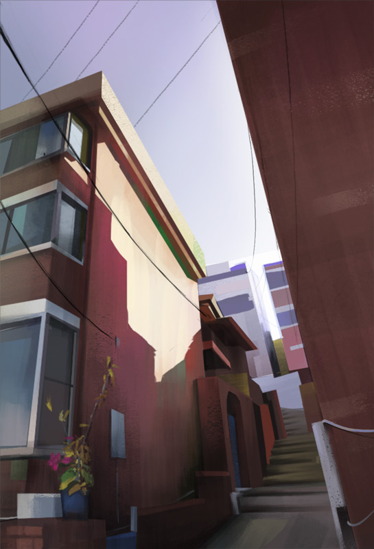
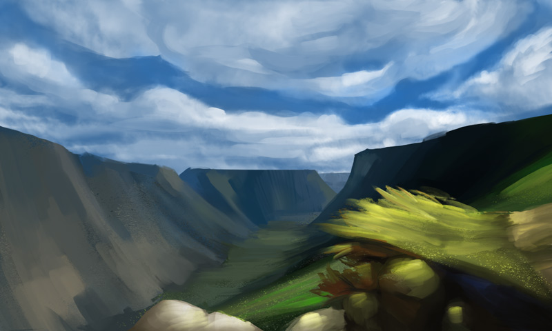
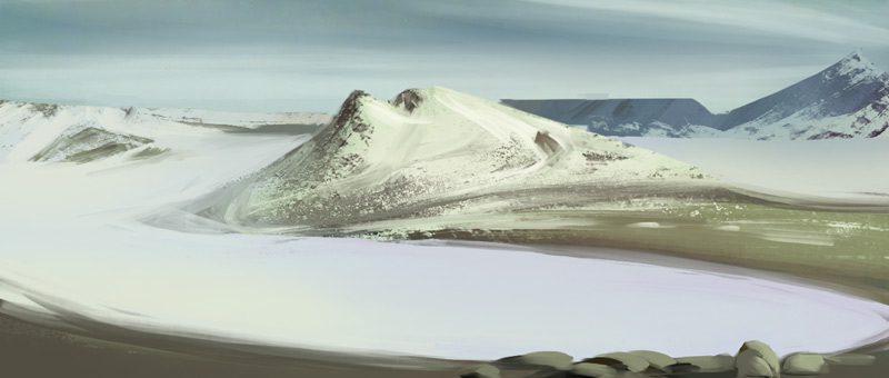
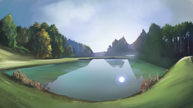
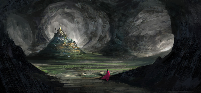
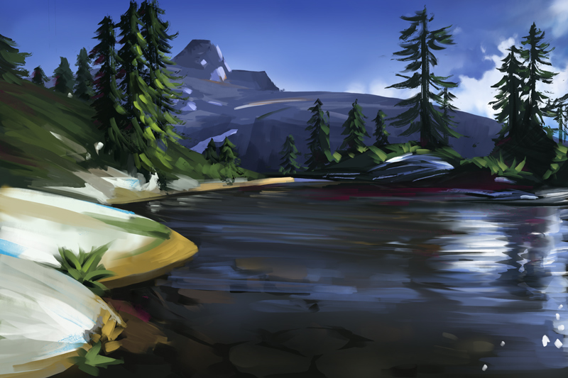
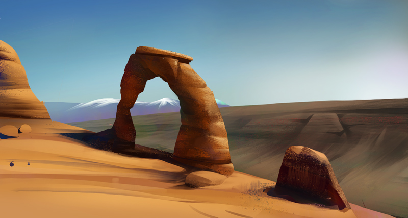
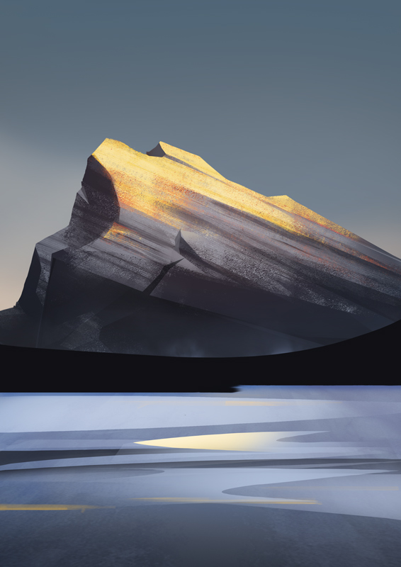
Lovely landscapes man, making me jealous! Made me realize I need to use lasso tool more.
Posts: 30
Threads: 2
Joined: Dec 2013
Reputation:
0
Welcome dude, really like those concepts. And the environments kick ass, great colors and that water looks so good. Keep posting!
Posts: 19
Threads: 2
Joined: Aug 2014
Reputation:
0
(08-27-2014, 04:50 AM)rafa zanchetin Wrote: Ah nice nice, I think I played a bit right at release but didn't have much time, it was fun!
Lovely landscapes man, making me jealous! Made me realize I need to use lasso tool more. I enjoyed it a lot, the style fits me very well! But unfortunately I didn't get to make as much concepts as I wished for and I left the team last year.
Thanks, very kind words! Let's paint some together on hangouts some day?
Also, did you see Shaddy's tutorial in making landscapes?
(08-27-2014, 05:35 AM)Amaral Wrote: Welcome dude, really like those concepts. And the environments kick ass, great colors and that water looks so good. Keep posting!
Thanks!! I will definitely. Feel free to tell me what's wrong also, haha
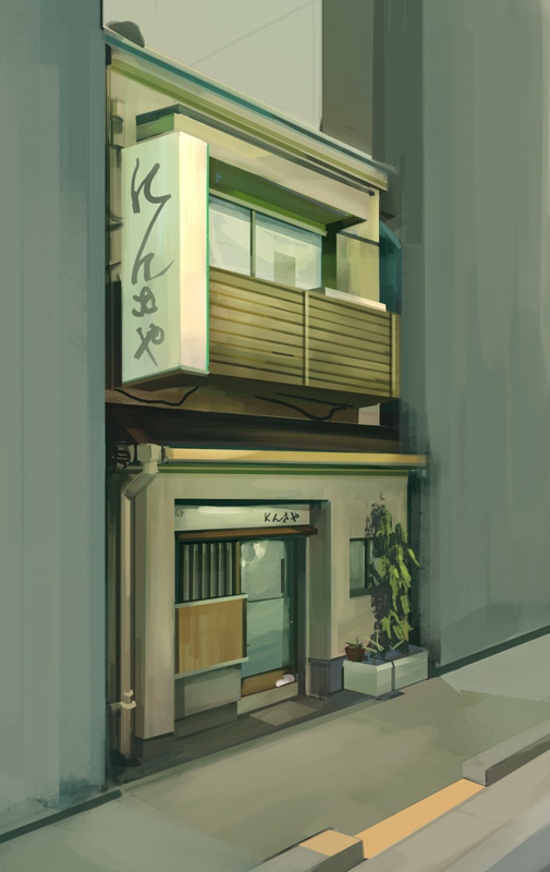
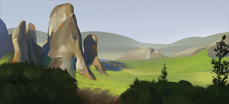
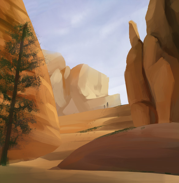
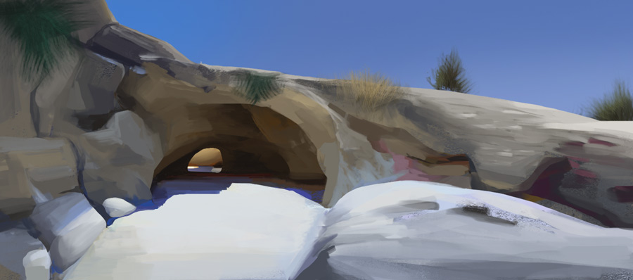
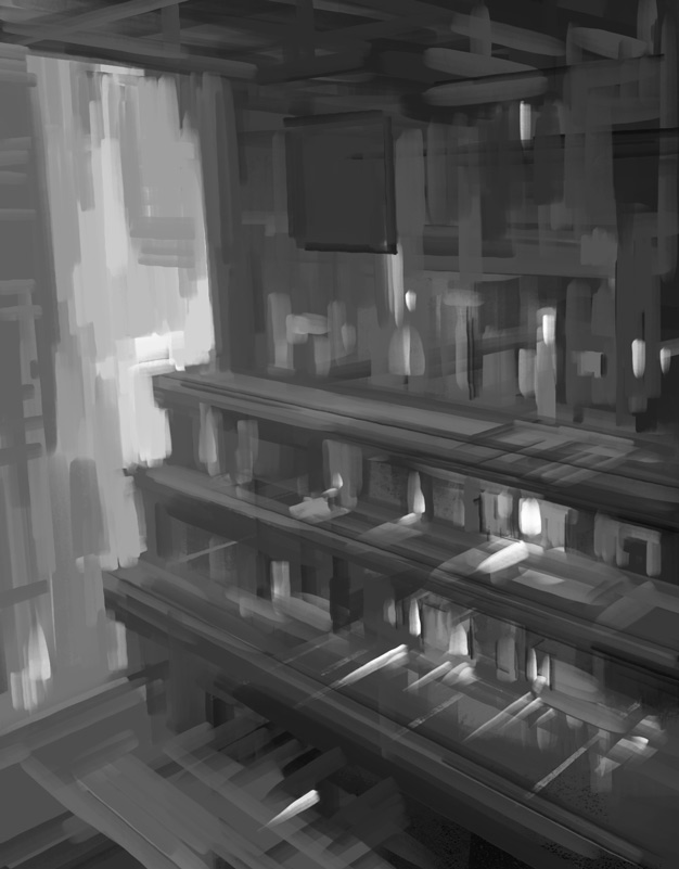
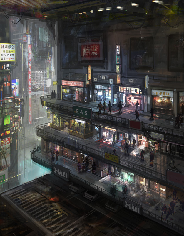
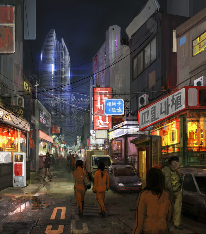
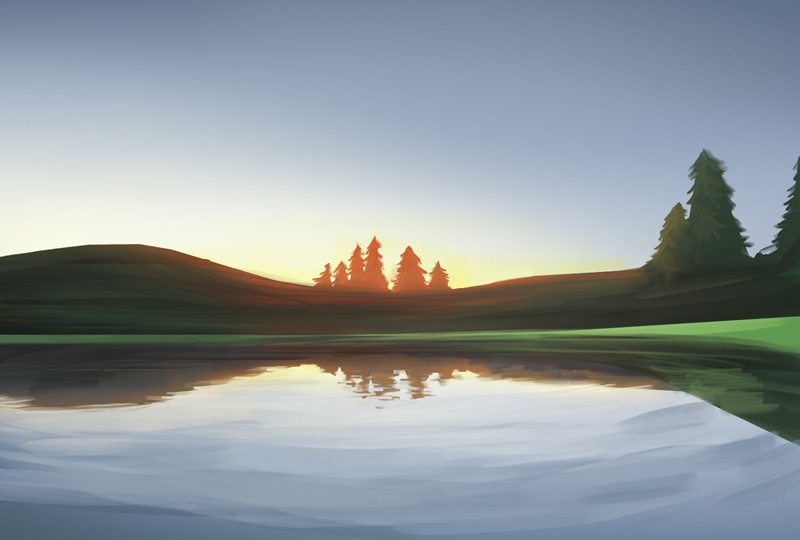
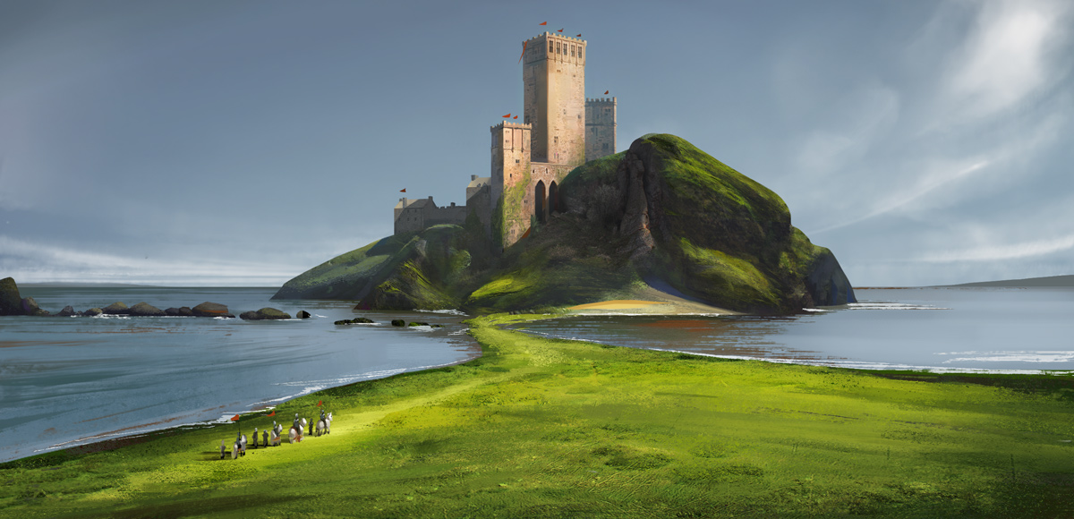
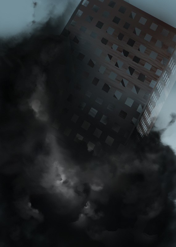
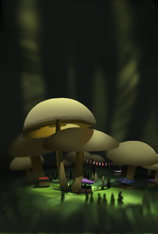
Here's some more environments I made these last days. Most from google maps


Posts: 19
Threads: 2
Joined: Aug 2014
Reputation:
0
Experimenting with using photos and textures while painting. I didn't get comfortable with this type of work yet.


This one is WIP. Obviously using a lot of textures and stuff.
It's quite far from my comfort zone so feel free to give some critique.


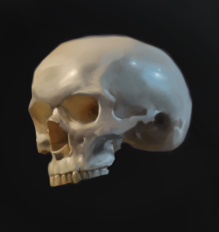
And a short skull study as warmup

Posts: 109
Threads: 6
Joined: Jan 2012
Reputation:
1
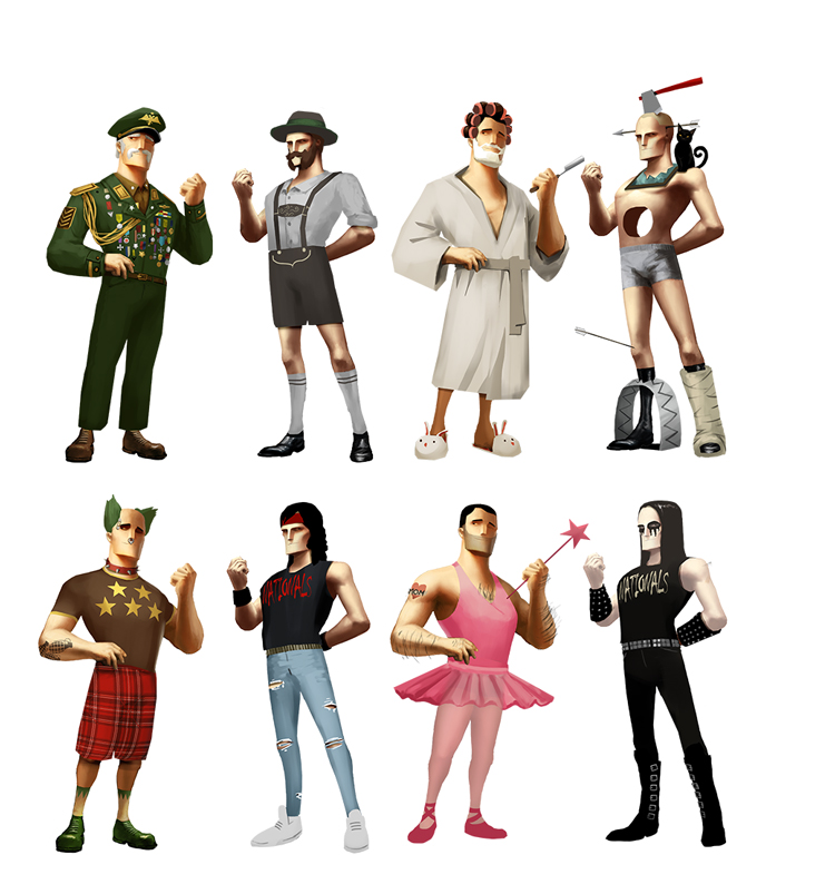
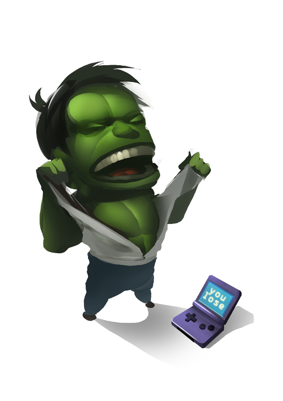
Haha yes, I love the contrast between ballerina and Black metal dude. Also really like that cyber punk image. Keep pushing these environments, quite obviously improving on them.
Posts: 198
Threads: 2
Joined: May 2013
Reputation:
5
Woah man, really awesome stuff you got going on here!
I really dig the simple yet effective values you're using for the enviros. Really nice contrast and color comps too. And to be new to photobashing you manage yourself very well, there's nothing that stands out as a copy-paste so it's coming along ok.
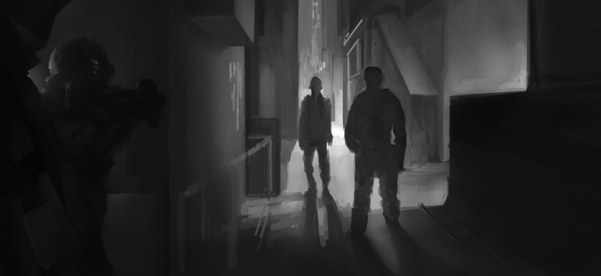
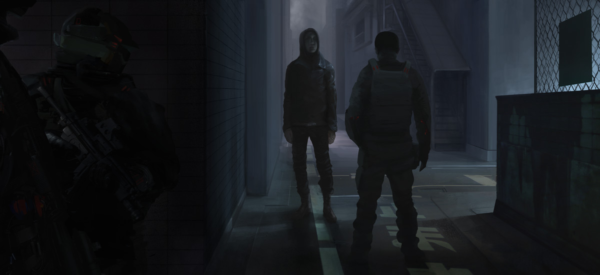
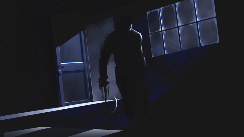
The piece with the guys in an alley is a really good idea and conveys a good mood too. I only have too crits about it:
a): I don't know if the guy with the hood is supossed to be super tall, but if he's not then you have a wrong perspective, the cop/whatever standing in front of him should be , either as tall as him or taller to follow the vanishing point, unless he's some kind of midget. Also the guys in the foreground are too small, we should be seeing their head "cut by the frame" and the shoulders should be close to the end, I understand you did this to avoid a tangent. The quickest solution would be to get the guy with the hood to be shorter , at the same level than the cop he's facing or so should do the trick.
b) This one is more a nitpick than anything but here we go: the hooded guy would be better with his face more difuminated so to speak, the one painted right now isn't too strong, and it kills a bit the overall power of the piece ( not much, the piece is really awesome still), so I feel that fixing a bit the proportions and making the side of his face in shadow be more lost into it would add to the mood of the piece.
Overall REALLY AWESOME stuff, I'm diging your works a lot man, keep posting more gorgeous stuff please!
Posts: 448
Threads: 1
Joined: Feb 2013
Reputation:
6
Man, can't say enough how totally jealous I am of your landscape studies.
Haven't seen yet, is that one where he starts off with the red background of a beach? I caught the beggining but didn't watch it entirely yet.
I don't do much Hangouts anymore, I tend to get too chatty and don't focus on studying, lol. I do spend like an hour on pnate's livestream whenever I can, starts around 9am PST. Check it out! Link goes up at the shoutbox whenever it comes up.
Posts: 19
Threads: 2
Joined: Aug 2014
Reputation:
0
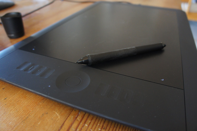
One week of traveling, one week of doing web stuff and one brand new wacom later!
(08-28-2014, 10:41 PM)JacobJanerka Wrote: Haha yes, I love the contrast between ballerina and Black metal dude. Also really like that cyber punk image. Keep pushing these environments, quite obviously improving on them.
Thanks! I'll keep working then :)
(08-28-2014, 10:53 PM)Suira Wrote: The piece with the guys in an alley is a really good idea and conveys a good mood too. I only have too crits about it:
don't know if the guy with the hood is supossed to be super tall
..the hooded guy would be better with his face more difuminated so to speak... I quoted your's down a bit here.
Super tall, you got me there already haha. Nothing to defend here, just have to rescale the guys.
What do you mean by difuminated? I'm still working on this and I'm very open to input around the face of that guy. Can I be so rude to ask for an example of what difuminated means?
Anyho, super thanks for the comment! It really keeps me going :)
(08-29-2014, 12:54 PM)rafa zanchetin Wrote: Man, can't say enough how totally jealous I am of your landscape studies.
Haven't seen yet, is that one where he starts off with the red background of a beach? I caught the beggining but didn't watch it entirely yet.
I don't do much Hangouts anymore, I tend to get too chatty and don't focus on studying, lol. I do spend like an hour on pnate's livestream whenever I can, starts around 9am PST. Check it out! Link goes up at the shoutbox whenever it comes up.
You big fat liar! I've seen your landscapes, we both know who's jealous :)
Yeah the shaddy one is the one with the beach. It really kicked me in the butt for starting enviros. He talks so much and is quite badmouthed, I love it :). In hangouts I'm usually the opposite. I shut down all crap, listen to other people talk and just focus on painting. No chance to youtube surf when your screen is shared to everyone haha
I'll check pnate if I can see it some day. I'm in northern europe so maybe I'm off the time schedule.
Old wacom is dying so I hunted for a new one. Found this big one second hand from a company. I think they got the wrong price somehow because I barely paid $200 for it and it goes for a good $800 new here. Works like a charm so far!
my baby!

+ studies and a environment


Posts: 374
Threads: 16
Joined: May 2013
Reputation:
59
I must say that you are doing well! The studies look good. Some of it reminds me of Eytan Zana, just a little less grungy. Keep at it! I hope you start to share some figure drawings, still life paintings and all that good stuff.
Discord - JetJaguar#8954
Posts: 448
Threads: 1
Joined: Feb 2013
Reputation:
6
Damn, sorry to hear about the tablet, and for that price I'd buy 2! No, 3!
Got nothing to say really on the enviros, they're great, maybe on the last one the contrast behind the sword mountain should be really small so the eye dosn't wonder too much, but that's just me. :)
Posts: 19
Threads: 2
Joined: Aug 2014
Reputation:
0
(09-17-2014, 08:14 AM)Tristan Berndt Wrote: I must say that you are doing well! The studies look good. Some of it reminds me of Eytan Zana, just a little less grungy. Keep at it! I hope you start to share some figure drawings, still life paintings and all that good stuff. Don't compare me to that beast, although I wish to be there some day! Thanks for the comment. Will try and keep some figures up too!
(09-17-2014, 01:31 PM)rafa zanchetin Wrote: Damn, sorry to hear about the tablet, and for that price I'd buy 2! No, 3!
Got nothing to say really on the enviros, they're great, maybe on the last one the contrast behind the sword mountain should be really small so the eye dosn't wonder too much, but that's just me. :) True I redid it in a similar way (small guys, big point of interest). I think it needs more work but not sure what's missing! And yeah I should've bought more but it was only one in stock, the others were expensive. I think they mislabeled the price for a small version!


Posts: 448
Threads: 1
Joined: Feb 2013
Reputation:
6
Sweet update dude!
Just brushes on the first one or any photo bashing? I can't really tell. D:
Posts: 19
Threads: 2
Joined: Aug 2014
Reputation:
0
(10-02-2014, 01:06 PM)rafa zanchetin Wrote: Sweet update dude!
Just brushes on the first one or any photo bashing? I can't really tell. D:
I used some photo texture, referenced a real island but exaggerated the shapes. I'm not all sure about the result. I really need some environments for my portfolio.. Thanks for the reply!!
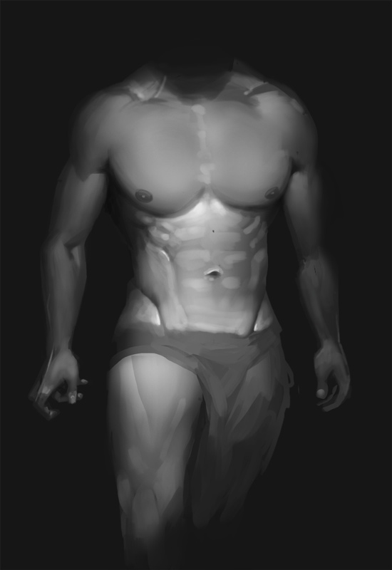
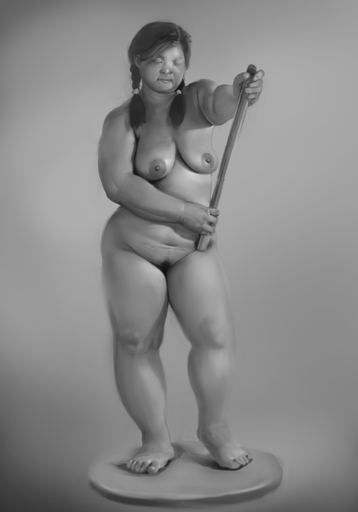
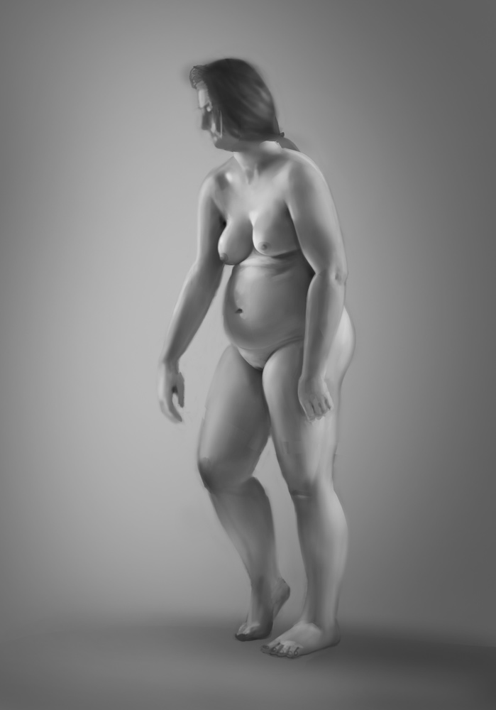
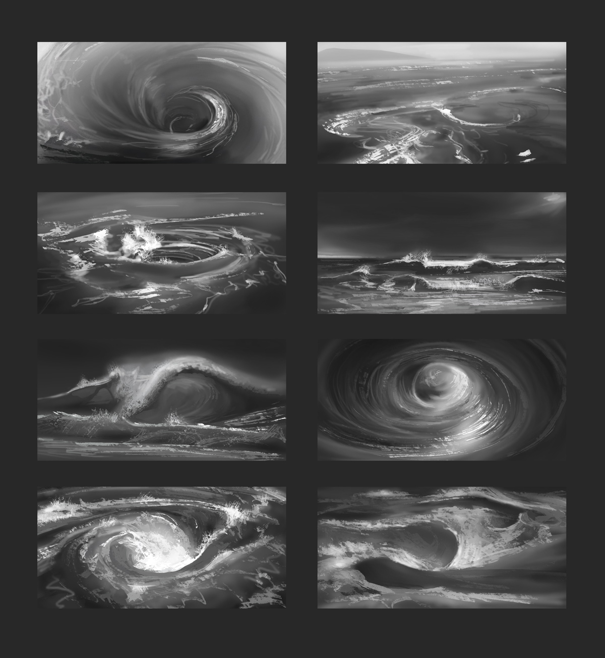
Figure studies and water element thumb studies.


Posts: 448
Threads: 1
Joined: Feb 2013
Reputation:
6
Oh no, the island is looking fine, it has that sharp looking to it, made me wonder.
Water studies are looking gorgeous and so does the anatomy ones, but the inside elbow is kinda weird, especially on the second one. Loving the rendering too!
Posts: 19
Threads: 2
Joined: Aug 2014
Reputation:
0
Thanks Rafa for your comments. It helps.
updated website at
www.squareroot.se
updated old works, maybe better or worse. not sure
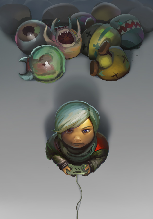
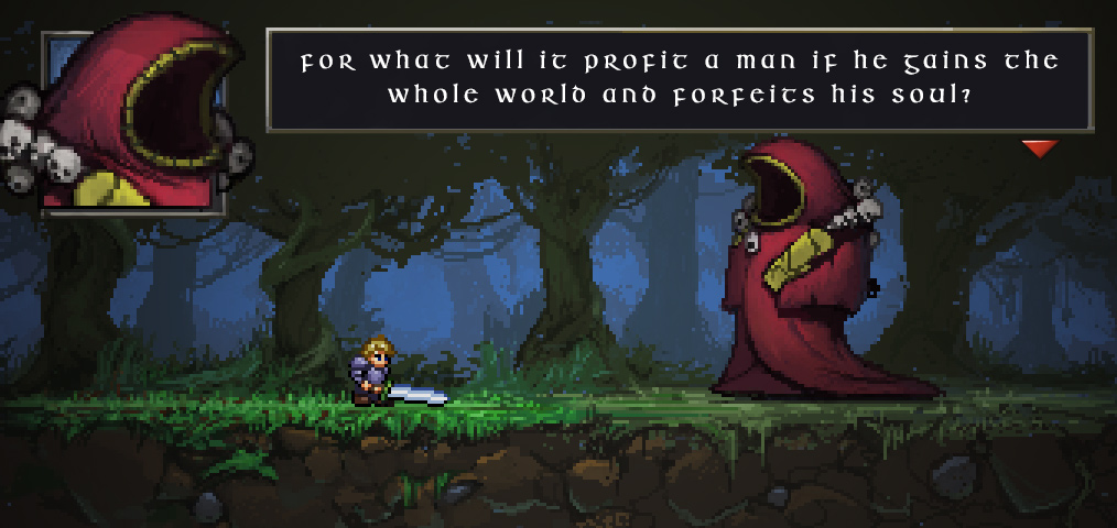
working with pixel art, not complete
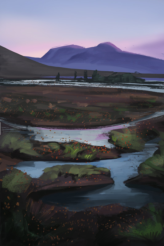
and a lonely environment


Posts: 19
Threads: 2
Joined: Aug 2014
Reputation:
0
spitpaints and enviros
Parachute


Dark Fairy


The King Visits

Posts: 19
Threads: 2
Joined: Aug 2014
Reputation:
0
|
