11-07-2014, 07:57 AM
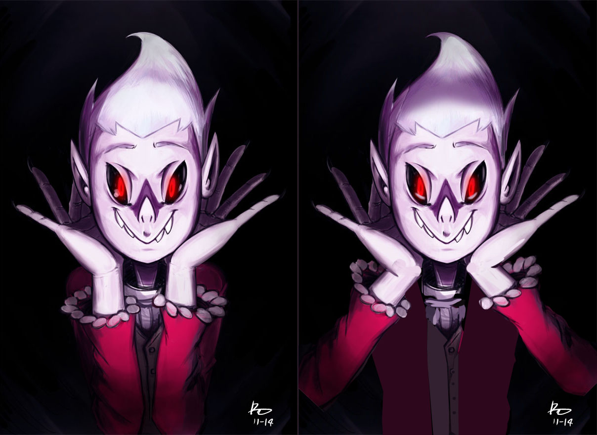
I haven't done much digital painting in a while, and so I thought I'd try out a new brush set and give it a go. Still have alot to learn.
![[Image: tumblr_nen04oCdp01s6dh1ho1_r1_1280.jpg]](https://38.media.tumblr.com/e5cdc89b0e1f79e459eca69a3aff6c56/tumblr_nen04oCdp01s6dh1ho1_r1_1280.jpg)
![[Image: tumblr_nen04oCdp01s6dh1ho1_r1_1280.jpg]](https://38.media.tumblr.com/e5cdc89b0e1f79e459eca69a3aff6c56/tumblr_nen04oCdp01s6dh1ho1_r1_1280.jpg)
|
Vampire kid
|
|
11-07-2014, 07:57 AM
I haven't done much digital painting in a while, and so I thought I'd try out a new brush set and give it a go. Still have alot to learn.
![[Image: tumblr_nen04oCdp01s6dh1ho1_r1_1280.jpg]](https://38.media.tumblr.com/e5cdc89b0e1f79e459eca69a3aff6c56/tumblr_nen04oCdp01s6dh1ho1_r1_1280.jpg)
11-08-2014, 01:58 AM
Hey buddy, how are you doing? :D
you have a very pretty character here! if you have any questions feel free to ask! now for what i think that would made this picture better: 1- the light is a little strange, its seems like its coming from below, but then her hair is not in shadow, and the reflection in her eyes doesn't seem to be consistent! 2- you have a lot of free room at the bottom of your picture, compare the room her head and and her arms occupy, you could make better use of this if for instance, she had her arms away from her chest, it would show a little more of your cool character! i hope i helped you somehow! :D 
11-08-2014, 03:46 AM
I was referencing a photo from Vogue for the pose and had some obsession with keeping the shoulders visible, but maybe I should go ahead and move the arms.
The reference image was this. Current progress. Looking back at older sketchbook drawings, I realized I missed a design element. ![[Image: lucianver2wip.jpg]](http://i32.photobucket.com/albums/d17/CaptainKRool/lucianver2wip.jpg)
11-08-2014, 09:33 AM
![[Image: tumblr_nen04oCdp01s6dh1ho1_r3_1280.png]](https://38.media.tumblr.com/7b615edfd87e76e5c24dae2a922d41b5/tumblr_nen04oCdp01s6dh1ho1_r3_1280.png) Sorta finished, hopefully it's better.
11-09-2014, 01:08 PM
(11-08-2014, 09:33 AM)Psychotime Wrote:yeah buddy, way to go :D sorry if i butchered you drawing btw hehe, one more thing, i fixed but forgot to mention, you characters ears are not aligned, an easy way to spot if theres something off like this in your picture, is to "invert horizontally" in photoshop, you will get a fresh view on it, making easy to spot stuff like this. anyways, this is nice man, good job!
11-10-2014, 05:25 AM
Nice job in general dude. Great character in this little guy. Couple of things niggled at me (using your latest update)
1. The lighting still seems a little inconsistent. That heavy underlit nose shadow seems to be out of place or maybe is over emphasised given that there is a distinct top light source as well (forehead, hands). Something just doesn't quite seem right. 2. Unless you told me it was a vampire I wouldn't have figured it. If this is a concept, then it might need to be made more obvious. If it is a painting of a character from your stories, then it doesn't matter so much. 3. General finish. This might be stylistic preference and not a huge deal, but you may want to consider tightening up the linework around areas like his collar and shirt ruffles. It just seems like it would benefit your comic style to be cleaner. Either that or make the sketchiness a part of the overall style rather than in small areas. This totally depends on what you are going for stylistically. |
|
« Next Oldest | Next Newest »
|