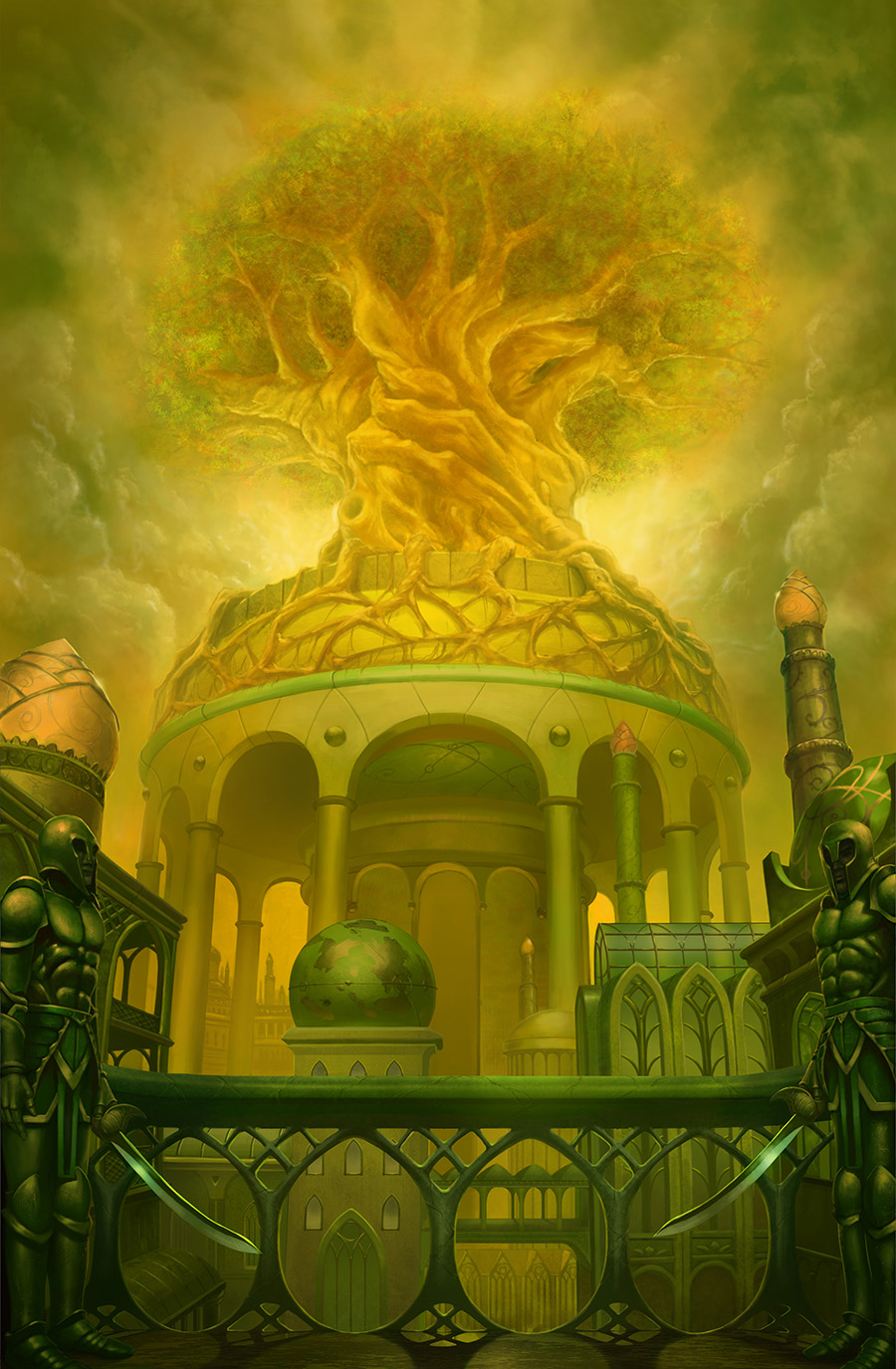
This is nicely painted and a clean render so good work on that.
For me I find the lighting a little bit inconsistent. The shadows on the balustrades indicate a light source in front of us and quite low to the horizon. The highlights on all the architecture and the guards suggest a light source behind us and relatively high in the sky. There is a lot of ambient light as well which seems to be coming from everywhere and nowhere.....guess it could be smog of some sort, but the shadows should still be consistent.
Anyway you might be able to get away with it because it doesn't look too off.
The composition is symmetric and balanced well, but you have this strange reverse effect happening, where the focal point (the tree and dome) has the least contrast and lightest values. My eye is drawn to the dark and detailed figures and architecture, even though I know I should be looking up at the tree. I can't actually say it doesn't work, but it is a little bit opposite to what you might expect.
The tree in the distance has some issues:
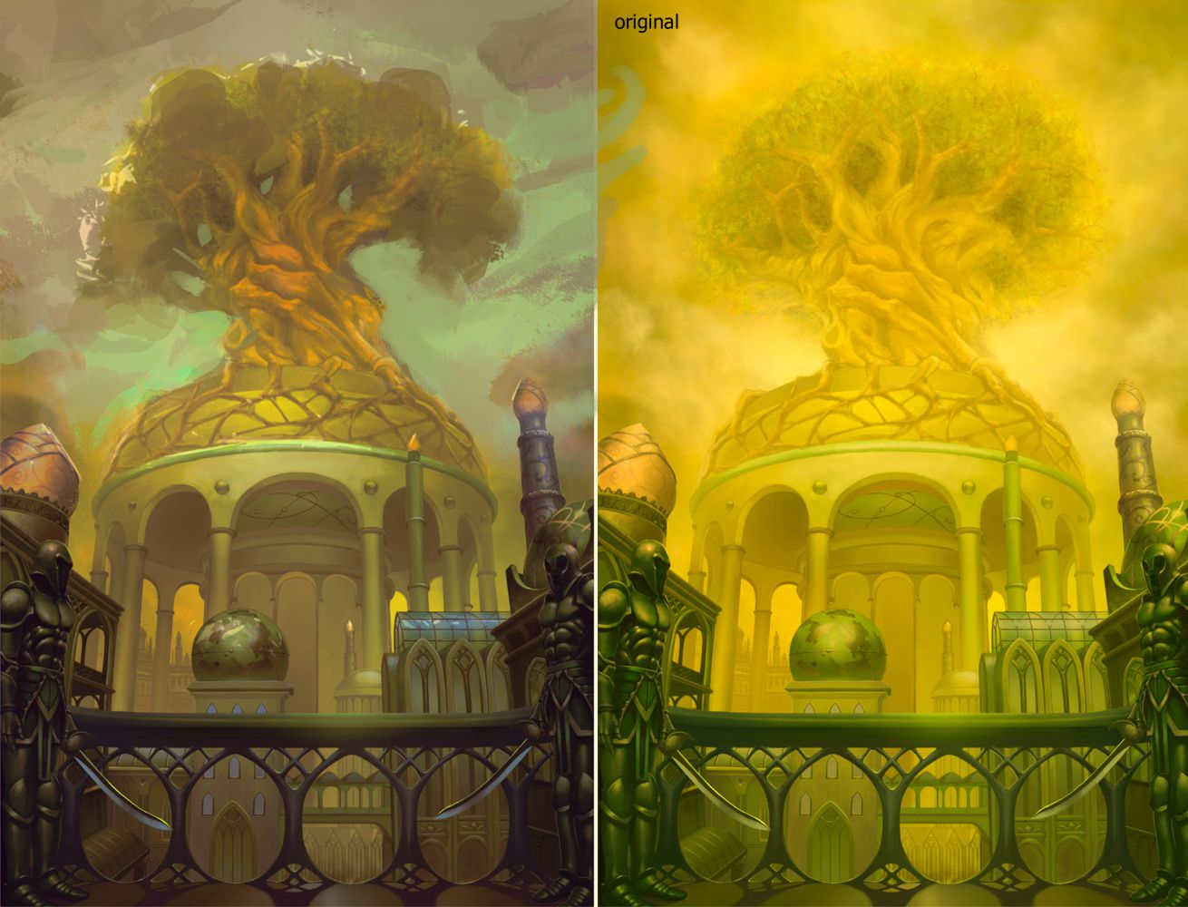
- The scale of the vegetal phototextures you used are way to big given the size of the tree and you also are somewhat attempting to show individual leaves instead of thinking about the overall 3D forms involved in the tree canopy. This makes the tree look particularly flat.
- I think in the first instance you should think about showing these larger forms of the leaves clumped together in large areas of shadow and light only. if needs be you can then indicate individual leaves with some texture in chosen areas.
Other than that I guess this place seems to be a bit devoid of life and dynamic movement, even though it has people and plants and a city in it. The composition, while working is very static. I think using more dynamic cloud forms and some more dynamic lighting could help this.
The palette is very monochromatic. Not a bad thing really. Just some elements of complementary colours in well chosen areas, such as the tree which is the focal point, might help add some vibrancy and help draw focus even more.
Because the render is so clean, it might benefit from some grime and texture in areas, especially in the buildings exposed to the elements.
The figures could do with a bit of perspective work in some of the forms. Eg the helmets look a bit flattened, and the torso's not as rounded around their forms as should be.
*edit tried to do a quick paintover. So rusty! I didn't attempt to fix the lighting overall, but tried to adjust palette and add some dynamic lighting, as well as simplify the tree. Didn't really nail anything, but hope it gives you some ideas.

Hope that is useful!


