Posts: 556
Threads: 5
Joined: Dec 2012
Reputation:
8
Rafa- Heeeeeey, thanks man! I'd love to get in on a CHOW one of these days. :]
Corey- Haha. I'm glad you feel the same way. I'll probably hop in on the next one. Maybe.
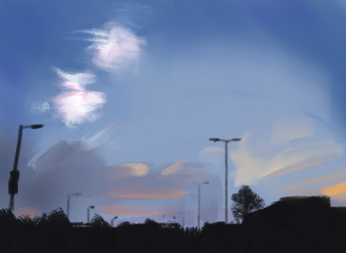
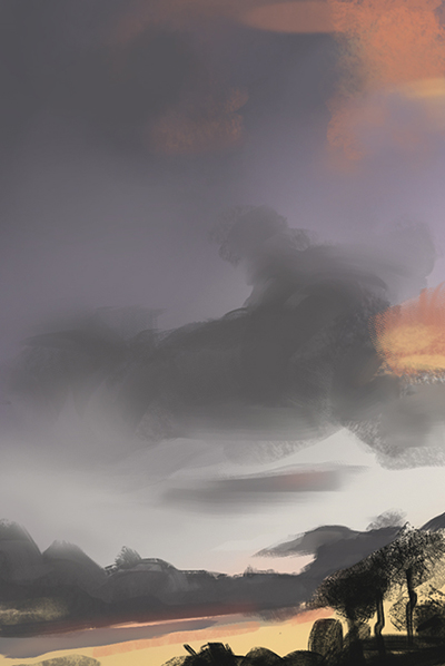
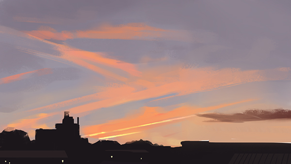
I finished this, it's sloppy, but I think I learned something from it. I'm going to finish the other thing before I start hitting studies again, and I've got a few ideas for some illustrations that I've been kicking around in my brain.
More design and messing around for now, though. There's also a few characters of mine that I want to start exploring again now that I'm not so scared. We'll see. :]

Posts: 429
Threads: 0
Joined: May 2012
Reputation:
7
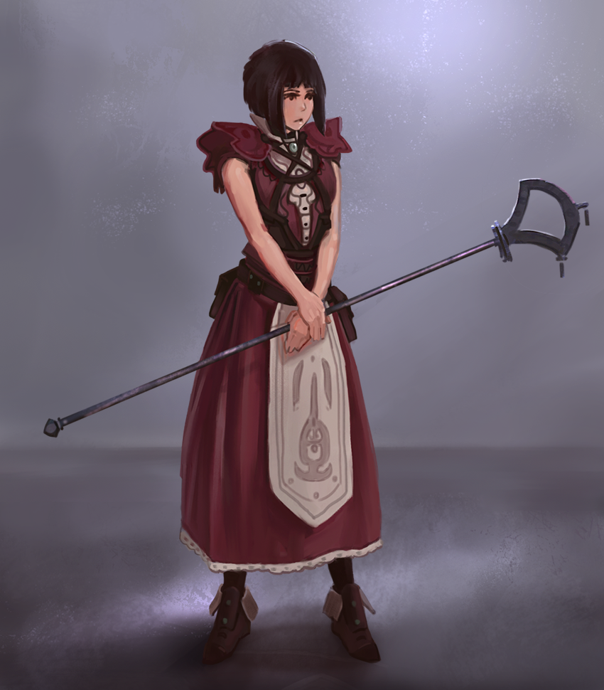
The last one is real cool, but the face and hands seem like something you should tackle and learn from. Waiting for the next ones!
Posts: 556
Threads: 5
Joined: Dec 2012
Reputation:
8
Ben- Hey man, thanks for the feedback. Wanted to try some stylized stuff with the face, issues were funny, and Hands are a horror. Haha. Gonna study up pretty soon. It's been a'while.
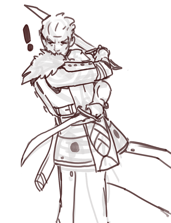
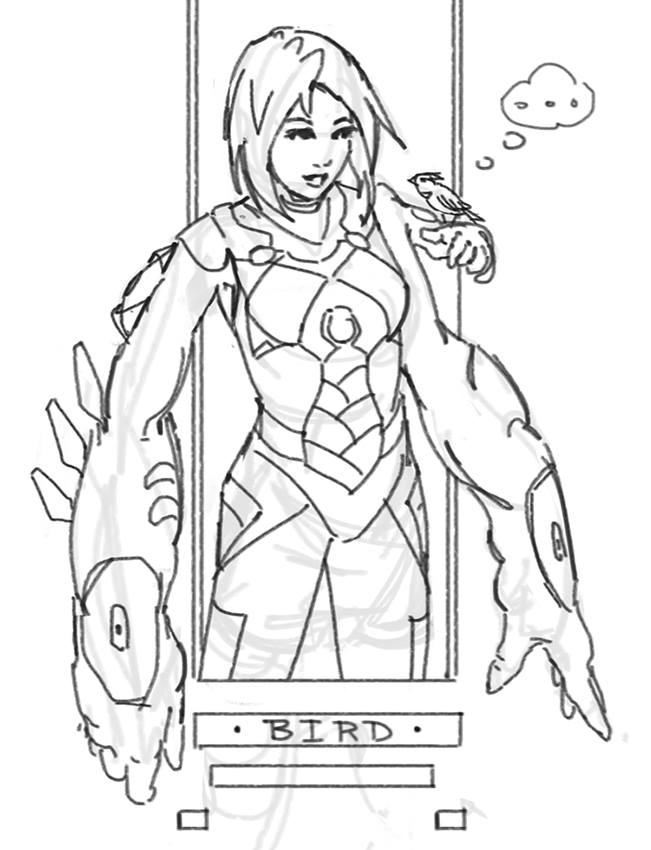
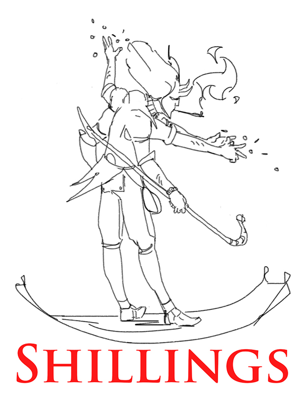
Sketch I did waiting for friends.

Posts: 227
Threads: 1
Joined: Jan 2014
Reputation:
5
Really digging your clothes design. The lady looks fabulous! As for the stylization, the face feels fine to me, except that the mouth could maybe be a bit higher. Keep it up! (:
Posts: 241
Threads: 0
Joined: Jun 2012
Reputation:
18
Loving the characters - you really improved your skills. Good job!
Posts: 556
Threads: 5
Joined: Dec 2012
Reputation:
8
Cyprinus- Thanks, I'm glad to hear you like the design! And I agree, the mouth melted a little down to the chin. Haha.
AngeliquevdMee- Thanks a'bunch! :D
Sorry for the no-post in a while. I've been busy finishing up the last bit of class work I've got for the quarter, but now I'm finally done with all the useless bullshit classes and finally have more time to focus on art before graduation. I need new stuff for my portfolio, so I'm gonna try and crank out an illustration a week to fill the gap of free time that I have now.
So, right now I'm about 6 weeks away from graduation. I really must seem to love doing things at the last minute...
I'll have some stuff to post from my internship in a bit, and it may suck but it's something I did for someone other than myself.
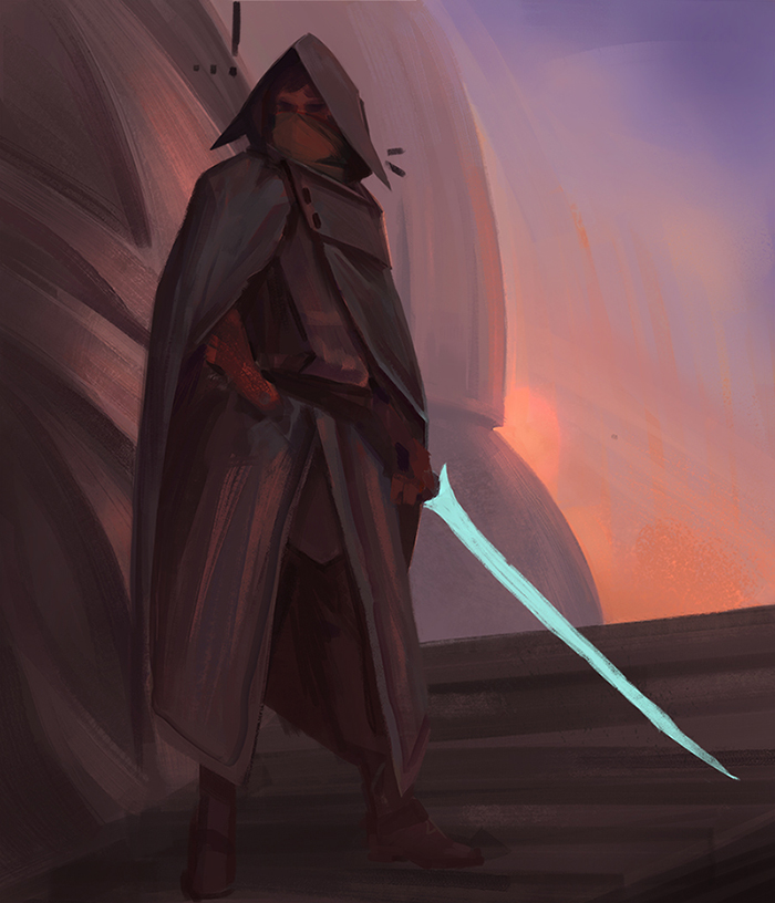
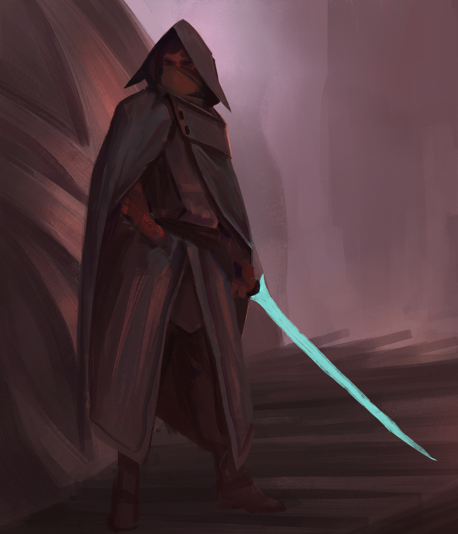
I'm not finished with this little thing down here, yet. Any input would be lovely. :]

Posts: 274
Threads: 0
Joined: Feb 2014
Reputation:
3
I like the colour palette you used in that last piece. I would say though that the sword stands out, which gives the impression it is luminescent (which I'm guessing is intentional). If that's the case, perhaps there should be some light cast from the sword onto the surfaces surrounding it (such as the figure's cloak).
Posts: 556
Threads: 5
Joined: Dec 2012
Reputation:
8
StardustLarva- Thanks for the feedback! Glad you like the colors, it's a bit different from what I'm usually used to, and that sword will definitely be glowing. :]
I've got some more stuff to post, but I don't want to do a huge stupid dump. There's a couple of the things I did for my internship. It's a lifestyle blog, vevelicious. The other stuff I did for the site I am not so proud of, so yeah. I'm trying to find a way to really put in the love when doing things for other people.
There's also a page of some miscellaneous studies I did last month that I forgot to post. Sorry about the size.
I'll get an update on the assassin guy in here as soon as I make more visual progress.


Posts: 556
Threads: 5
Joined: Dec 2012
Reputation:
8
Posts: 65
Threads: 5
Joined: Jan 2012
Reputation:
1
It's awesome seeing your improvement from page one to here! Wispy clouds at sunset seem so random to me, as though they can be such a variety of colors. These are looking really good though, and the assassin looks cool. Not used to seeing assassins wield such a weapon, but I like it.
Posts: 556
Threads: 5
Joined: Dec 2012
Reputation:
8
Jeremy- Thanks man! Yeah, those wispy clouds are so weird. I ended up changing the background. Glad you like the sword, I suppose he wouldn't be too good assassinating with a glow stick. :V
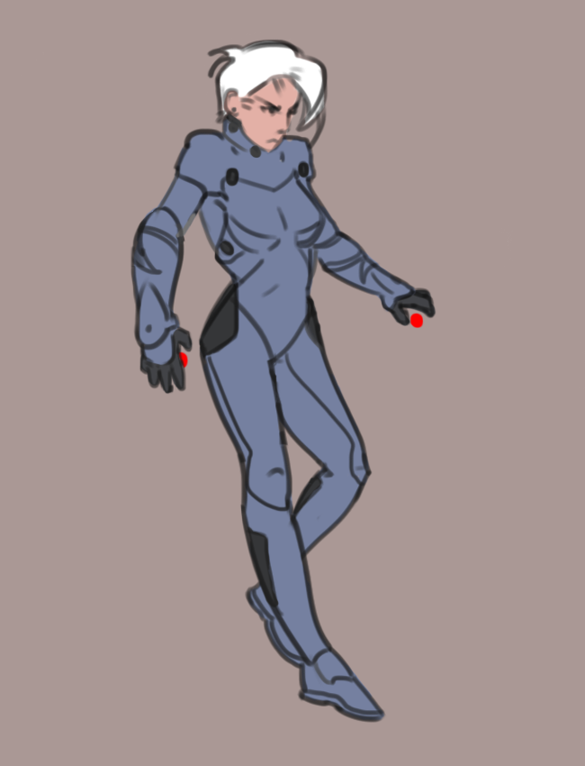
Doing commission work, so just a sketch.

Posts: 65
Threads: 5
Joined: Jan 2012
Reputation:
1
Oh I was thinking the sketch was the study for the assassin piece; I realize now you meant the clouds. My bad haha
Posts: 556
Threads: 5
Joined: Dec 2012
Reputation:
8
Jeremy- All good, man. :D
'Nother sketch.

Posts: 556
Threads: 5
Joined: Dec 2012
Reputation:
8
I suppose it's not much of an update on the assassin, but I got too tired of the clouds and shit in the back. The colors are feeling better now anyways.
Working to make time for the new CHOW that got started up! Hopefully.
Yes. I will. . . Maybe. :I

Posts: 690
Threads: 7
Joined: Jan 2012
Reputation:
12
Hey man, great sketchbook. Love those characteres you've been doing. Good luck with the chow. Fingerss crossed xd
Posts: 235
Threads: 9
Joined: Oct 2012
Reputation:
6
Man, the diligence is paying off. It's a pleasure watching your style emerge and to see that drawing background being dolloped on like GELATO.
Seriously though, looking good.
As for a blanket-crit, I would start thinking about separating your materials more so! especially in your blue-swordsman WIP.
Keep it up, pup <3.
Posts: 556
Threads: 5
Joined: Dec 2012
Reputation:
8
ramalooke- Thanks, glad you like the characters! Trying to make time for the CHOW. :D
Einver- Thanks dude, glad I'm pleasure worthy like the gelato.
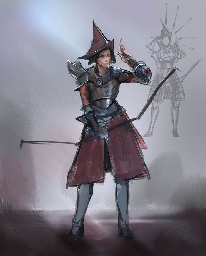
Sketch.

Posts: 429
Threads: 0
Joined: May 2012
Reputation:
7
Dat assassin, looks great . Liking the changes you made with the background too.
If you're still working on that one, I'd suggest changing the legs. If the ground were slanted like that you wouldn't be able to have both your legs straight out.
Posts: 556
Threads: 5
Joined: Dec 2012
Reputation:
8
Ben- Thanks man! I'm still working on it and can change the legs . . . or maybe he's got special secret assassin legs that are like rubber. Haha. Thanks again for the input.
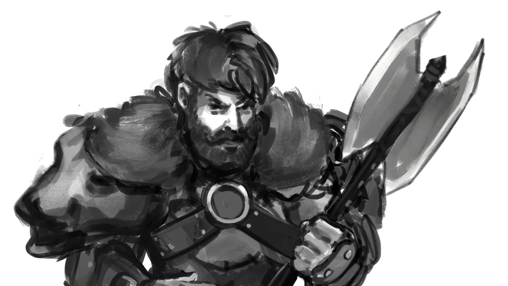
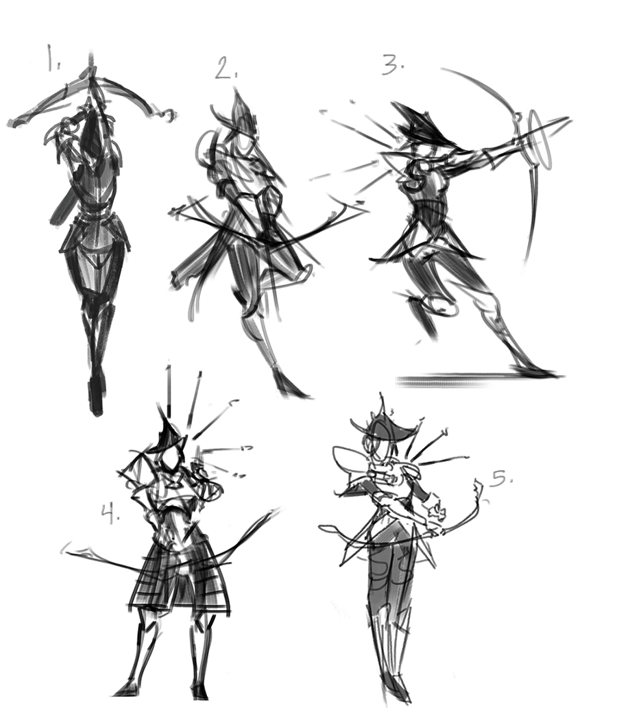
Finishing up client work. It's nothing fancy, but hopefully I'll be able to post it soon. Here's some thumbs I did for the CHOW. Trying not to waste too much time on other things so I can actually get some good work done on it.

Posts: 556
Threads: 5
Joined: Dec 2012
Reputation:
8
Here's an update on the CHOW.
I'm doing it! :D
I decided to go the route of painting myself into a messy corner to work my way out of. This will be an interesting mess test.

|
