01-02-2015, 11:50 PM
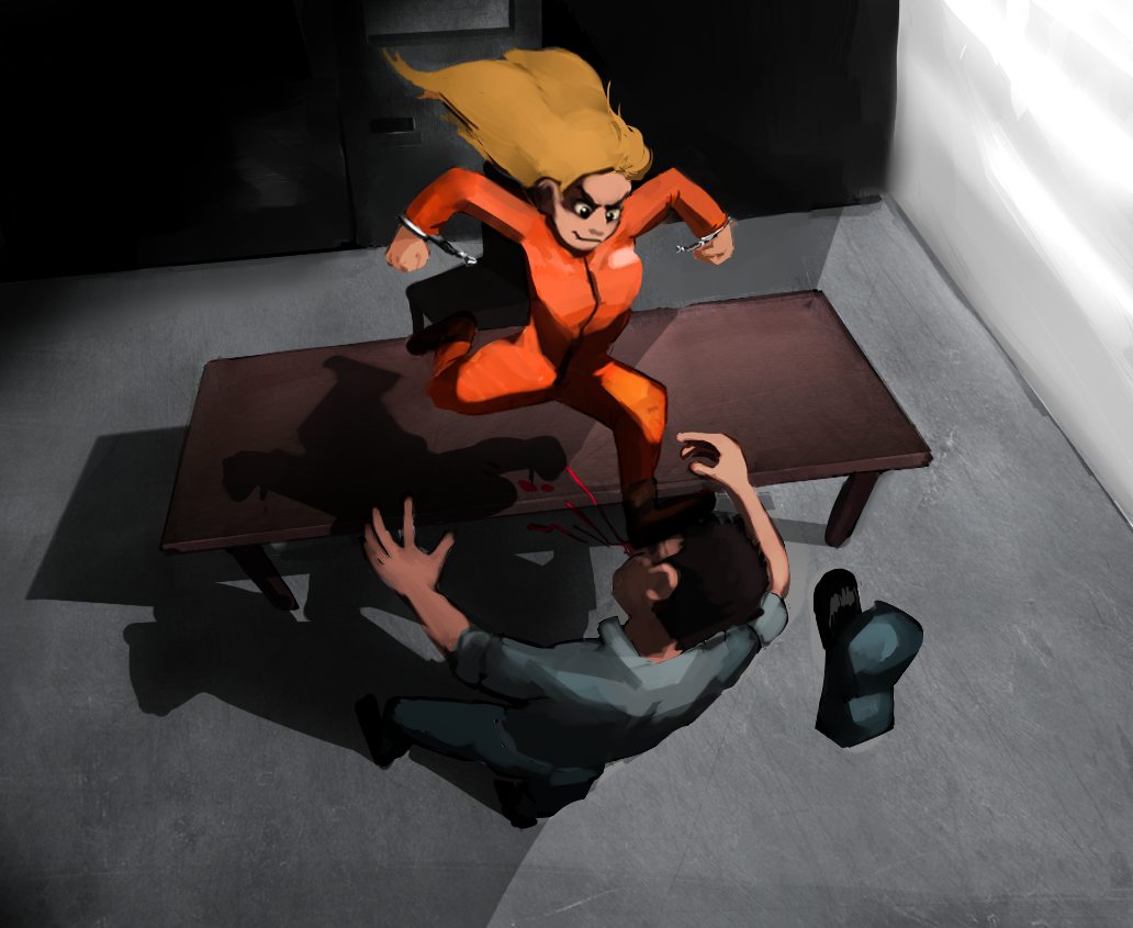
ok, I'm about to call this finished, but i feel like getting some input before I do.
Something that sticks out to you that I should change?

Something that sticks out to you that I should change?

|
What do you guys think?
|
|
01-02-2015, 11:50 PM
ok, I'm about to call this finished, but i feel like getting some input before I do.
Something that sticks out to you that I should change? 
02-17-2015, 06:02 AM
alright the reason you probably didn't get a response right away is because there is just so much to say about this image. This is gonna be a long crit, strap in.
First of all, it's good you're challenging yourself to do this really dynamic scene with crazy perspective and action, that can only help you. It is important, however, to get things looking pretty nice in more boring perspectives before even attempting something this ambitious and expecting to pull it off. It seems as if this girl is breaking out of some sort of prison thing in this cartoony universe by kicking a cop in the head. I'll just gloss over briefly what you should work on. Contrast: Why is the side on the right so bright? is it a light source? if so, why isn't it affecting her hair at all, which seems to be very flat and is only lit by an above light source. Why are the shadows so deep on the wall by the door? The contrast with the walls just doesn't make sense. look at some movie stills of walls from True Detective or something, see how they react with light Color contrast: i decided to make the really bright wall a warm light source and pour in some yellows and oranges. I made the shadowed side bluer with a colorize layer and it instantly helped the image a lot. Since this is a heroic sort of image, i felt it would suit it better and make the thumbnail more appealing. Anatomy; There are so many issues with the anatomy i don't even know where to begin. The hands need so much work, study the crap out of hands. She doesn't appear to have deltoids and her legs are really awkard and scissored. The cops arm is too short, she doesn't have a rib cage either, her body is just a straight line up the back. If she has breasts, they aren't even in proportions, while you could argue they are flailing from motion, maybe indicate that better. Look at photos of peoples backs and how they curve. The cops left foot is not following the perspective of the rest of the scene and if the light is coming from the right, why isn't his head casting a shadow on the left side of his collar? Lighting: i just can't tell where the light is coming from? the right? the top? why isn't the cops left leg in as deep a shadow as his ass? is light hitting there? Why does the girls eye socket have shadow but the opposite side of her nose doesn't? Where is the top of her ear catching light from? Why is the cops hat catching light from the left when there is no light coming from that direction? Why are the cast shadows from the table and figures so sharp when there is so much movement indicated? Why are they lighter values than the shadows on the cops ass? you gotta think about this stuff, make a little light bulb on your painting to remind you where the light or lights are coming from. Think about reflected light, subsurface scattering, how form wraps around things like a fruit or a bowl. My advice is to try to draw something simpler like a portrait, get that right, then a figure, get that right; get it right 100 more times, then do another illustration; it'll only help, and you don't have to do these crazy scenes to impress people, just get the basic stuff right and people will notice; i guarantee it!
70+Page Koala Sketchbook: http://crimsondaggers.com/forum/thread-3465.html SB
Paintover thread, submit for crits! http://crimsondaggers.com/forum/thread-7879.html [color=rgba(255, 255, 255, 0.882)]e owl sat on an oak. The more he saw, the less he spoke.[/color]
02-17-2015, 10:27 PM
Actually, in opposition to the Koala's view, I actually kinda like your image as a base.
It is heavily stylised, so 100% percent accurate anatomy is not a necessity. There are some things related to the believability of her motion and her general hip area seems the worst off (it is squished and looking a tad awkward). Mostly I think it comes to defining light sources and the forms a bit better. While you are going for stylistic theme, you are actually using quite a realistic lighting scheme and so there are small inconsistencies with lighting as Fedo mentioned. To me it seems obvious the lighting is from a light above them, and the bright surface is just a reflective wall. I agree with Fedo, that the wall probably takes a bit too much attention. Maybe really looking at the light as overhead fluouros or a single bulb would help nail that? Look up ref to help inform that. I don't agree with pushing the extreme warm v cold and overly bounced lighitng scheme Fedo used. It seems a bit heavy handed given what you are going for. Not putting down his efforts! Just my view, so take as you wish. I would be more tempted to push this in a stylised forms, but realistic lighting setup. Ref will really help you nail shadow fall offs for a down light situation. Also really pay attention to forms and shadow vs light values to get this to work. Perhaps do some studies to see what makes this tick. I also recommend adding some colour vibrancy to the scheme if you want it to pop in a more realistic way. Vibrancy is basically opposing hues placed right next to each other in subtle ways often. This creates a juxtaposition of the two colours in people's eyes on a subliminal level and something more akin to the way our eyes percieve real life. Check out Stapleton Kearn's blog posts on colour vibrancy. Link is 1 of 3. Lots of useful-as shit on his blog btw: lots of aha moments for me: http://stapletonkearns.blogspot.co.nz/20...ation.html Lastly adding some additional context to the piece would help. Papers flying and lying on the desk, pens, maybe cuffs on her opened up, a garbage bin , etc. Hope that helps |
|
« Next Oldest | Next Newest »
|